The Right Color: From Bathrooms to Outdoor Spaces
Lesson 20 from: Using Color in Home DesignTobi Fairley
The Right Color: From Bathrooms to Outdoor Spaces
Lesson 20 from: Using Color in Home DesignTobi Fairley
Lesson Info
20. The Right Color: From Bathrooms to Outdoor Spaces
Lessons
Day 1
1Class Introduction
10:02 2Color Models 101
26:46 3Color Schemes 101
45:39 4Debunking Color Fears
44:02 5Debunking Color Fears Pt. 2
25:23 6Evolution of Tobi's Color Style
42:37 7Evolution of Tobi's Color Style Pt. 2
44:12To Trend or Not to Trend
12:47 9Color & Design Trends
31:36 10Color & Design Trends Pt. 2
25:37 11Tobi's Color Inspirations
22:09 12Tobi's Color Inspirations pt. 2
23:29 13Using Inspiration Boards & Q&A
19:43 14Psychology of Color
36:34 15Color Meanings
17:04 16Psychology of Color Q&A
12:55 17What to Consider Before Choosing a Color
26:20 18The Right Color: The Entry & Living Room
19:27 19The Right Color: Family/Dining Room & Kitchen
21:19 20The Right Color: From Bathrooms to Outdoor Spaces
20:05 21Pairing Textile Elements for Success
28:49 22Pairing Wall Color, Pattern & Texture
24:42 23Floorings, Furnishings, Art & Lighting
19:04 24Intro & Top Color Palettes: NYC Showhouse
24:41 25Top Color Palettes: Hampton's & Richmond Showhouses
21:31 26More Top Color Palettes
33:46 27Layering Color Palettes in Your Home
38:16 28Transitioning Color Palettes in Your Home
28:08 29Historical Overview of Color in Design
16:47 30History of Color in Design Examples
43:59 31History of Color in Design Examples Pt. 2
16:32 32Color Mistakes to Avoid: 1-6
31:20 33Color Mistakes to Avoid: 7-10 & Final Q&A
40:06Day 2
Day 3
Lesson Info
The Right Color: From Bathrooms to Outdoor Spaces
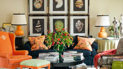
So this is a powder bath. We're going to show all kinds of bathrooms in this space. Yeah, the next life I get to show you that crazy psychedelic wallpaper was trying to describe earlier, but what do we think about this? I love the floor to glass tile, animal print floor, but this is the home that we were saying the turquoise lamps were starting to make it feel a little more casual and a little more global, so but still very formal, right? And this was their this cabinet was there dining buffet in their last house, and I made it into the bathroom cabinet and the patterns that wanted t it to still feel formal, but I wanted to be a little bit more unique, and we've seen a lot of furniture pieces made into vanities, but I think this one is especially interesting just because of all the gilding and the inlay and all of those things that really speak to what's happening in the rest of their house, but we've jazz it up with that glass animal print tile, which was quite fun um and dramatic, so...
pure designs interior says that floor is a showstopper was a powder room that's that well and think about, you know, we talked about the jewell box effect, it doesn't have to mean that the pattern goes on the wall or that it's a cut like a lacquer. Colors are a wallpaper. What if it's an animal print glass tile on the floor? Pretty cool, huh? Oh, and that it's in a small area? Yeah, we love it so much. Or would we grow tired of it if it was a huge exactly? The entire huge master bathroom was that I think he probably would grow tired of it over time. But how much fun to get to see it periodically in your pattern. And what is? Contrast it with, I think. Say that again and what its contrast it with yes. So it's very buttoned up, informal and then sort of it's sort of like quinn. You see, like a great fashion. Like a suit jacket on the inside it's a pop of color so that almost nobody else knows about it. But you, um so I love that idea. So here's the psychedelic pattern wallpaper I was talking about that's very groovy attached to the hollywood retreat for the sun. Uh, and so if that was in your bathroom every single day, you would go nuts because it is sort of this movement and and, like, visually tiring and fatiguing but he's not there all the time and so it's fun and hip and cool and mod but you'll see how much movement is in that water that pattern when you're looking at it, it's almost vibrating in person. So you makes a major statement and there's not really any accent in there, but a fun place, a bathroom, especially if you know how when I said earlier that a place if it's not architecturally interesting, you either just paint out all the moldings and don't draw attention to where you need to make it architecturally interesting. This was a bathroom that really looks like an after thought. It was a basement bathroom. It looked like it had been done buy, you know, d I y job kind of gone wrong, nothing that great about it, so we needed to do something. And remember, we've got seven and a half foot tall ceilings in here too, it's that shorter basement space we were dealing with, so we had to do something that distracted people from thinking about all the little details we didn't want to highlight because it wasn't super high quality or really, um, architecturally interesting. Interesting. So the high contrast in the choice to do black and white was very intentional, totally different serene, palate, reflective surfaces. This was interesting because I had this was actually a show house. But could ease was then sold to a family afterwards and I kept this bathroom the way the way it is I think but what was interesting here is I was dealing with a mere a window over the vanity and very little space for a mirror to go next to it and so is going to be hard tto hang a mirror next to a window and them not look weird like did you make them the same size? Do you try to match it? So I thought well let's just mirror the entire wall and let the window float in the middle of it and if we're going to do that it's kind of the idea of I felt like I had to really embrace this hole it's kind of like commit if you're gonna commit to mirror on the whole wall then let's make the whole space really support that in these shiny soft gray tones and medals and finishes on the frames even that support that sort of great on the great granite so every bit of this is monochromatic and it's just a play on the layering of all the different details and textures and it's all reflected in the mirrors all the time um and then something that's just very warm and neutral and very traditional and classic but the gold fixtures really warm this up so again this is the house that had the two who lease in it on and I didn't really want to start from scratch in their bathroom so we really just kind of made it feel like it could be a glamorous traditional bathroom whether it was in new york city or anywhere else it could feel like almost a hotel uh space and that's what they were really loving in the rest of their house what do you think about this is a boring do you like it? Um I wish it had that cold leopard print floor you know, because you would have the spice to say it I get all my bead safe from the bathroom and that might scare you from the bedroom I don't know um and then here's totally different. So this is the home we just looked at the kitchen that was much more french and had the reclaimed beam so you can see how sort of a craftsman style it's coming across in this space and her husband uses this a lot and he said I was putting the pale blue and white day mask on the wall and he didn't want it to be girly so I said let's let's really you know make it masculine let's punch it up with these chunky stained cabinets and give him a little bit more a little bit more of what he was asking for so it's a mix of masculine and feminine and it transitions to a very traditional bedroom uh but but it's not, you know again not totally stodgy a little bit a little bit interesting and fun with the blue and brown palate and here's that same color blue used in the opposite way no contrast everything sleek and clean and creating some interest with the horizontal accents in the shower so so we see all kinds of things for bathrooms, but look at how many of these had a more neutral wall in the bathroom um, because a lot of people are busy when they're in their bath or was particularly their master bathrooms and there's a lot of noise and hectic mornings and things happening all the time so not necessarily pissed a place you want to put deep red or some really strong kind of pattern on the wall because it needs to support you and your your routines morning and evening routines and all the activities that were happening there and you want to feel glamorous and beautiful and sexy and all those things in your bathroom as well right? Maybe not totally energized a few master bedrooms I think we go from warm coral tones that make you look healthy and beautiful and relaxing it fits the mid century architecture er of the space it's also for just a woman, a single woman that lives there on dh, then to my cool blue retreat that I wanted after I left the red room of horror from the last house uh we're hardly good oh yeah I guess she got down but she had to go outside right after the last one yes so I guess we do have a couple of images of this how funny but it's still warm with the wood tones say since not totally cold I wanted it to at least feel inviting because because I spent tens of time in that space and then to something that's really formal and glamorous here and has a little bit of that global peace and cem cem heritage coming in and you know still relaxing that because if it was a bold dramatic those burgundy if it was a green if it was something really dark it could have a completely different feeling that still feels glamorous to me um what do you think about this what you all think if I were to see this in a magazine at first thought I would not think toby fairly this is because this is a blend of the client and me and they were a client that had very um very different background than I have from their religion and their heritage teo there a little bit older than me not a whole lot but they came from a very formal traditional place so what I think is me about it is the scale of the wallpaper the forty light fixture the little pop of green on the pillows the grid of artwork so you can say definitely see things that are my signature style but that's great when you can see how it's not just about me because I don't live there so we had to blend their personal goals um yeah uh you're talking about the scale that's something I definitely learned a lesson on. I, uh upholstered my couch with this awesome actually looks like that pattern, but it was too small and I really hated the couch after I I realized I really needed it. A lot based scale was too small of a pattern. Yeah, it was a little intricate just started lady and almost like a little grandma are a little older than you because you're clearly a young, uh, fashionable person. I know that, but he did like a big day musky with well, it's cool and sort of even glamorous right going from bethany, which actually I was I was thinking the same thing bethany asks is this the same wallpaper that was used in your black about entry it's now it's the same one that was used in the entry with the aqua vintage murano lamps but in that entry the background is slightly green with the one with the blue lamps because the in the dining room we saw the aqua and kind of short truce mohair with the bank it and this one it's quite in gold. So the others like celery green with golden, this one's white and go well, spota. Bethany, it is good. You have it. I remember actually this welcome. It was also on the wall in the television show gossip girl. So after I used it in the client's house, it was actually in one of the dining rooms in that television show, which is fun. So set designers found it interesting, tio ah, and then what about kids room? So this pallet disharmonious being greens and yellows because they're beside each other on the color will on then it's really contrast id with the warm neutrals of brown and cream, which is graphic and great for kids, especially infants. I love to see strong colors and I love to see contrast. So the idea of the black and white chocolate and why was great. The funny thing about that? Those air wall details like you were saying that you had on the mom said those were really great until she got old enough to stand up in her crib and started peeling them off the wall. Maybe we should have a couple of questions earlier, but knowing that you were coming up to a whole kid. Section huh? I didn't ask him then about how you address the kid's room in terms of starting with the baby and hopefully having a room that khun transition tio this is a great example because how many of you really think about doing shock wide on the wall with chocolate piping for an infant? Not very many, but we wanted something that could grow with her for a long time so we used other elements in the space plus again remember this is that mom that's really edgy and quirky and her dream nursery was something that no one else had ever seen before something that was unique and different and then the david and the ottoman are both finalized fabric saw sent the fabrics out and had a vinyl coding put on them so they could be durable so we were able to bring in pattern and finding a pop of color but it was actually doing durable um and then this also they have three children and there were only three veterans upstairs so this needed to function as the guest room. So how many people as your guests really want to go stay in the nursery very often that's like pink and you know our blue or something really childlike so I think this made a really great, sophisticated cool hip gassed retreat when it had to do double duty too for people that were staying with them on and then there's something like this, which was my niece, is a nursery that's my niece when she was a little a little thing, and but totally what you think for a girl like embracing the pink and graphic and fun and feminine, and this was a person who was not afraid to have to change it later. She's like, okay, let's, go all out pink. We're so excited to have a baby girl, this is gonna be fun, and we're fine with it if we have to paint it in a few years, so let's jump in and they knew they had the confidence to do that on make it energetic and fun for her, and then we go to this like we talked about yesterday, these two these air sisters rooms in the house that was very, you know, full of antiques and said we were we were repurpose ing antiques and painting them and and doing fun things with fabric to make them a little more modern and updated on then making wall selections to support those two. And in both of these spaces, we've selected something on the wall that didn't have a big contrast from what was going on, because there's already a lot going on in the space. Ah whole lot going on in this place, this little girl said she was one of the ones who said absolutely no pink I do not like things don't make me have pink there's a little bit of ah pink flower only for the photo shoot I probably took it out before she got back home but she said, you know I'm not a paint girl don't make me have pink in the space and she knew exactly what she wanted. So on the other hand, this is the room across the hallway from the brown on white nursery for her, her sister and we've got lavender and pink and it'sjust again about his girlie is it could possibly be but in a little bit more updated way so the mom whose quirky and fun and cutting edge and fashionable didn't just want the walls to be pink she's like we gotta do something different so they became lavender and then these are this is connected to as you can tell by the carpet, the family room kind of space of the boys with the white self and the red ottoman this is their room that looks very menswear inspired with the sort of burberry plaid and the wool wing wing headboard, so I wanted to phil masculine and fun for them but also a little hotel ask I think it has a hotel of I've another boy's room with a great blue on the wall and the same for him, this needed to be all kinds of things. He sleeps on the bed, but we wanted to still look like a sofa, and we have the spun swinging chair and the great pattern on the rug. So this was to look like his game room all the time, except when he wanted to go to sleep, and he pulls back the covers and gets in bed so more kind of like a living space. This is a guest room at the lighthouse we've been looking at, and so you see that nod to the nature colors and a warm, warm retreat for guest on dh, then my former guests bettering, which is crazy, wild and fun. I fell in love with that fabric, and I thought, well, if people come and stay with us, they won't want to stay very long because they're going to get really agitated. Not really, no, I just happen to love this, and it was fun, and no one ever really said they didn't want to stay there while they were in the space, but this is a designer having fun. This is my personality, and this was a place for me to embrace something I loved, which was this floral fabric on really have a good time with it, is that a like seating area this was it's a bench at the foot of the bed that's holstered in the same fabric and what about the hanging fixed training lantern where'd it come from? Yeah is it like vintage is paying it out it's actually it's you can't get it anymore but it's made by a company called shine home that makes really funky things sort of inspired by vintage pieces and you'll actually probably see this um I have a new life in my new home, so I'm thinking that I don't want to get rid of it but I'm probably gonna paint the yellow part of it the medal another color and it's a maybe even going to go in my breakfast room in my next house so you'll have to see what the new it aeration is of this we can look at it later and you'll be like it was gonna look totally different with a lot less yeah so on and then quickly let's look through a couple of spaces for an office. This was a client who said I want formal you believe saying the rest of their house the leopard tile bathroom floors across the hall but he said, don't give me study and library I don't want stained cabinets there's nothing about that that I want I want something totally different something what's totally opposite of stained dark wood like a library study how about powder blue walls in a plaster with gilded trim? And he loved it on dso. The space has been featured in a lot of places, including on hd tv, because they just thought it was a really different approach to a study space, and he was very clean and cool and, uh, for him, but still formal, like his personality on then there's something like this, which is just a little nook in my last house where I had my office space, and so it was even about pulling down the front of the cream secretary, which always looks so sleek. Tio have this kind of warm space, which energized me, it's, where I like to sit and write my thank you notes or work on, uh, business or use my computer, and so it really kind of as it says, draws me and it makes for a cozy space, and then I can tuck it all away when I'm not using it. So multi purpose right in the middle of it, says guestroom, but it should say office those birthday, so we didn't change our our title, but those air offices, and then I think finally one little one little space to look at for an outdoor room, and we do tons of outdoor rooms, but just starting to set the tone for that of what your goals are this when obviously speaks to nature on the outside it's an extension of nature, we also do lots of outer space? Is that aaron extension of what's happening there like the pool and it might be inspired by the tile in the pool or turquoise is or maybe a destination like palm beach there miami that people love to bring to their outdoor spaces so, um, letting the color be inspired by all sorts of things depending on again with their goals are so well that one a lot it was truly a beautiful inspiration for all the different rooms and what to think about for each one of those so much to think about so much to think about now so exciting, maybe we'll take one question we share with us who? The glass animal print tile wass yes, and I can never pronounce it right, so I'm sure if the people that by some crazy chance we're watching, they would think I butchered the name of their company, but I think it's like si ci or it's it's, we'll have to look it up, but I think it's s I c I s are you confined it it's a title company? That is something close to that aunt? I'm not really sure how to pronounce that I have a fabulous show room in new york and soho and which makes sense because there's a lot of fun, artsy things happening in soho, and they show using tile on all sorts of things, including the head, a big, almost disco ball that could go in your kitchen maid of tile, which is really interesting. But they do amazing mosaics, and they will do customize patterns. Or they have a lot of their own patterns, including the, uh, the animal print. Was that a case of you saw something and wanted to remember to use it in a project? Exactly. I saw that tile, and I thought that is so interesting and gorgeous, and I even saw a real sample of it. And so it was one of those things that I had, like, pinned up physically or like in my tucked away in one of my mental file cabinet says, I call it, and when I got ready to do that space, I thought, what would be the perfect thing to really jazz this space up? Because, like you said, otherwise, it could just be a little stuffy and boring and really, really formal. And all of a sudden it was that one little expect, unexpected piece that made it unique.
Class Materials
bonus material with enrollment
Ratings and Reviews
1st Carpet Cleaning Ltd.
Very convenient and creative! Continue In that way!
a Creativelive Student
Fantastic Course!!
Student Work
Related Classes
Interior Design