Choose a Color Palette
Lesson 4 from: Visual Notetaking: A Beginner's Guide to SketchnotesGiselle Chow
Choose a Color Palette
Lesson 4 from: Visual Notetaking: A Beginner's Guide to SketchnotesGiselle Chow
Lessons
Visual Notetaking Intro
04:50 2What is Visual Notetaking?
26:04 3Start with Lettering
16:26 4Choose a Color Palette
08:01 5Draw Icons from Basic Shapes
24:32 6What Makes a Great Icon
09:08 7What's In Your Toolkit?
07:31 8Getting Started: Logistical Planning
23:55Lesson Info
Choose a Color Palette
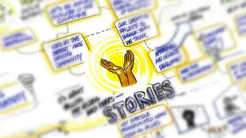
The next thing we want to talk about is color so now that we talked about littering we will move on to color you have lots of great colors in front of you we'll talk a bit about the psychology of color how it works on us this is a whole area of study were being super brief on it but I think it will give you enough for what you need for today also the benefits of a limited color palette so how that can actually be hopeful matching the tone of the conversation and the event to color can actually be an effective tool as well. So if you are um you know in a particular kind of meaning kind of engagement right knowing a bit about what about having some context around what that meeting is going to be like can actually give you some choices and direction around color okay, so a bit about the psychology of color we carry around all kinds of associations whether we know it or not around around color right um color can affect our moods that can affect our actions that could affect our our behavio...
rs and those of you who graphic designers and you know this well, right? So for instance, you know green people associate with nature the color of life blue is a cool color people often find it calming the ocean the sky something vast, something open um red, if you even think about stoplight, right, red means stop danger conflict so the more that you can leverage what people already know in terms of color, the more powerful your sketch notes khun b, because people are kind of inherently carry these around with us, um, they are culturally rooted, so it's, not absolute. So it also has to do with knowing your audience and knowing a little bit culturally what works with that with that group, but there's some generalizations that can be made around color. And then finally, this point, the color choices could influence the way people interact with and receive your schedule so you can actually, you could actually have someone. I think, um, have a kind of different emotional reaction based on colors that you might choose. Ok, so, um, the benefits of a limited palette, I learned this really the hard way, because I'm someone who just I love the markers like I love them. I love them. So when I'm confronted with a set of thirty markers, like, I want to use thirty markers, um, but what I found is that fewer markers actually can equal more impact. Um, it's. Easier to create a sense of structure and order, so color coding becomes easier if you use fewer colors and in the beginning, you'll see that I do this thing like I have the claw of markers and I'm moving them in and out okay? And is your sketch noting you might you know even with the small ones might want to practice something like this, you can switch them in and out of your hands more easily, you know, have the caps off all the time so they're always kind of loaded and at the ready it's easier to hold three markers in your hand and switch them in and out of your non dominant hand and, you know, hold five, then have five others on the table with open caps, right? Um so there's also a logistical part of it that that makes sense, so, um, let us look a little bit. So this is a chart that I made yesterday on, uh, another creative live workshop called make work that matters by james tori. This, of course, is the alex bloomberg chart that we just made. Hey, so what I'd like you to dio is take a look right and talk about what are some of the different kind of, um, emotional kind of the worst of the different emotional words that come up for you as you look a tte say the red one we'll start with the red one like just what are some word associations that you come that come to mind when you look at the colors that I've used on that one active well it's not like energised energised yeah great what else strong strong right yeah right assertive you have a sense of why strong and assertive the because it's bold because it's red the outline yeah the size of the overall graphic ok anything else what about this one? This one we just did kind of ignore this this is our work area but you don't have quite so much content but this one I did mostly in blue and black right so what are some associations you have with this with this one interestingly the words unbridled joy or the brightest colors on there so it's really popping out and then honest moment also is orange it's really popping out yeah having a happy emotion connected tio mmm so using that color for joy honesty which were some of the the bigger ideas right? Okay, what else? The shading that you use in the thought bubble and the television really just makes everything tied together so visually just great so engaging toe point out the icons they make themselves stand out more in contrast to the text right given enough waiting and importance right? So the blue so germany was talking about the blue around around here and you notice I did that also on this one but what color are the highlights on that one a great they're gray right? So do you have other associations or words that you said that that you can use to describe this one in terms of the impact of the color it looks basic like this one feels like it's information delivery was very matter of fact harnessing the power of honest connection and then unbridled joy and honest moment is jake was saying like pop right but the other one feels like the whole thing is more more important somehow like more intense like listen to this stuff make your work matter like it's not yelling but it's insistent in a different way so if you have time tio actually go back and look at this and you can find it on creative lives youtube channel it's the one minute and forty five uh like a promo for this for this workshop and you see the way he delivers you'll understand may be why these colors right the deliveries like very intense it's very brash it's not unfriendly but it's very direct right? So using these colors to help capture some emotional quality whereas this is about story, honesty, human connection right? So I tried teo all right, I'll try to make different choices to emphasize that, okay, great. So we talked about that uh matching the coat, the tone of the conversation or the event to the colors you know, so what is the subject matter? Are you at a scientific conference, maybe pink and red or not? The best choice is like, I think that'd be awesome. Maybe the people there don't think that's so great. Okay, um, is it something about children's literature, like what kind of sort of, maybe that's the crowd that is open to more whimsy, right? You could be more playful. Um, also, what feelings do you want to convey? So what do you want people to feel when they're looking at your chart, whether they were there or not? Also, one more point about that is, um, is it something celebratory, right? Sometimes people are celebrating something. Sometimes people are standing on tradition and want formality, right? So if you leverage those pieces, they'll really a line, um, color choices will align with the larger context of the event.
Class Materials
Bonus Video with Purchase
Ratings and Reviews
Sara
Wonderful overview of sketch noting with tons of opportunities to practice, learn, and refine skills! Appreciated the side benefits of recognizing sketchnoting involves active listening and the opportunity to practice that too. Thank you! 110% recommend this course.
Tran Phuong
Great fundamental skills for effective notetaking! I love Gisele and all her lessons! They are super easy to follow and understand. Would recommend it of course!
Lisa Houghton
I really enjoyed this class. I am a beginner sketchnoter and found it very helpful. Great pace and delivery by instructor. Every minute was worth it. Thank you!