Lessons
Day 1
1Class
1:11:27 2Q&A
35:31Day 2
3Basic Introduction
04:30 4Paint and Paint Properties
35:33 5Understanding Color
08:06 6Hue: The Color Wheel
14:16Mixing Colors
15:56 8Other Color Terms
17:07 9Light and Shadows
03:14 10Layering and Glazing
06:19 11Homework
07:47 12Q&A
08:15Day 3
13Watercolor Papers
23:36 14Paper Characteristics
34:12 15Watercolor Brushes
19:15 16Basic Brush Techniques
32:32 17Putting It All Together
09:28 18Q&A
07:08Day 4
19Drawing for Painting
1:03:45 20Proportion and Perspective
06:41 21Good Composition
29:16 22Last Class Preparation
05:40 23Q&A
09:10Day 5
24Introduction
06:29 25Creating Textures
19:45 26Other Fun Techniques
33:13 27Reserving Whites and Lifting
53:13 28Things to Remember
21:54Lesson Info
Mixing Colors
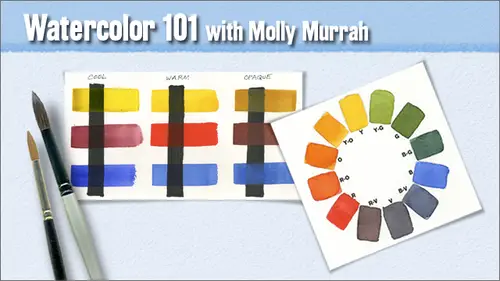
Now we're going to talk a little bit about mixing colors. So far, we've just been using our colors together. We did just that little bit of mixing the secondaries, and we're gonna talk about mixing colors now. So there are some things you really need to know in order to, uh, understand color mixing and get to the place where you have your colors, the way you want them to be. You need to understand your color wheel basics, that's one of the reasons why we just painted it and why I really encourage you to finish these up when you go home, you know, finishing up this week, if you can uh, so understanding of color wheel basics is crucial uh, mixture mix with various shades and intensities and tense, you know, at a lot of water and do your color wheel and almost no water and do your color wheel. You'll learn a lot from doing it that way. Now how to paint colors with that glow we've we've touched on that a little bit. You pretty much stay with your transparent in order to have colors that gl...
ow because of the way the paper reflects back through the smaller paint particles uh, you can use semi transparent sis well, but don't be heavy handed with them. And try not to mix more than two colors together. As soon as you start mixing more than two colors, you start running the risk of jumping off the cliff into quick sand and mud. Uh, so try to stay away from that dude. Howmany pigments direction in the color. Exactly. Yes, there are. They're they're single pigments and then their pigments that have more than one pigment in them. In other words, the color is made from adding too pure a single pigments together. So if you use a pigment good point. I forgot all about that. If you use a pigment that has that is not considered a single pigment and you can find out which ones they are, then you, uh, run the risk of creating might also so try to try to keep that in mind. I know it's a lot to think about you guys, but like I say, I'm just putting the notions out there so that on your own, if this is something that you love to do, you can go and find out whatever else you need to find out. Um, let paints mix on your paper as best you can that creates a luminosity that I, you know, when you mix it on your palate, you have a tendency to two work the pigment particles together so that they sort of lie evenly on the paper they don't reflect at various varying degrees and paints just end up being a little flatter that way and then for, uh I'm sorry. I'm forgetting to go through this, uh, how to avoid over mixing. We just sort of talked about that, not mixing too many together how to make your neutrals and graze like I said before earlier, I try to make my neutrals and graze from colors that are already in the painting. If I if I've got a very cool painting that's got a lot of blues in it, then I'll probably mixed my grace from maybe eliza rin and ultra marine if I have a very warm painting that I want to have graze in it and I've got some lots of pira ls scarlet and there are lots of yellows. I'll use colors from the painting to make my neutral stingrays, and they just blend better that way and they make the they integrate the painting together better that way now here's that opaque uh, sample that I was telling you about deb these air are three opaque indian red, yellow cur and cerulean blue this top line here is pure indian red and then as you go across the line, I added more and more yellow poker until I got, uh just almost pure strength yellow ochre here very thick I put it on very thick so it's pretty dark and then from there I started adding tiny little bits of blue and as you go across that line I was adding more and more of the blue and then you get down to the bottom and, uh that's the pure blue the purest cerulean and as you go across there I started adding tiny bits of the red to it and so you get a very muted uh what I tend to think of his very earthy colors I love this pallet I think the colors in this I mean, you know, decorate your living room like that and you've got a smashing room so it's ah, definitely do this this is so much fun and try to figure out your colors and you'll have just a load of fun doing this. Uh these colors have the high refractive index that I was telling you before and they are more of the earth they have a sort of mineral like look to them and this is what I what I did here was I mixed two of the warm colors with one of the cools and so the coolest the ultra marine blue and pira ll scarlett knew kambo show the warms and I did the same thing I started with a pirouette scarlett kept adding yellow got to the new gambo. Jai started adding the blue got to the altar. Marine started adding the red back in these air fun little tests, they take no time at all. And you you just get used to to your colors that way. But you can see when I got down to the end because the yellow is in the red by the time I had blue to it, that last square on the lower right verges on a brown because it's got all three primaries in it. Now this is the fun exercise. This is what I call doing your mouse ears. So take out this peace this piece right here that has the circles on it, and we're gonna do something really fun. I would take your number twelve round and you're definitely going to need your clean water on this one. Get your brush back as plain as you possibly can. And I've put three little three circles in a group and each one of the good, those three groups under each column. So the first group is going to be our cool primaries. The second group is our warm primaries the third group is our opaque primaries now we're not going to do the warms and the pope aches today we're just gonna paint the first column so that you see how to do it and then you can go home and finish that up over the weekend or over the next week if you want to so what you do is you take pure clean water and you drop it in your circles doesn't have to be perfect, but you want a wet the paper inside the circle then you want to paint a channel between each circle down to the circle below and then wet the circle below you don't want it to be so soaking that if you tilt the paper up, the water would run down you want it to be, you know, wet but not with so much water that it would literally drip when you tilt the paper because we're going to be tilting the paper when we dropped color and now go to your oriole in yellow, which is your cool yellow get a good amount on your brush and just drop it in that first circle just dropped the paint in the circle and if you've got enough on your brush you could just touch the brush to the paper and it'll flow off into the water then go to your eliza in so I need more water everywhere does it have that doesn't have a nice shine on it it does if you can see the shine and then it should be okay then drop your lizard and crimson in the circle at the top on the right and you can really load your paint up because it's you know when it hits the water it's gonna get deluded now if you have too much water like I do once I dropped the paint in you khun soak up the bead along the bottom with a thirsty brush now tilt and let the paints run together in that bottom circle tilt your paper let the eliza and flow over the yellow and then let the yellow flow back over the eliza in this big a technique using one of your paintings if you wanted to mix colors on the paper absolutely this's the technique that you would use I'm gonna put a little more yellow in here because I like the yellow to push the eliza ran out a little bit more that's a characteristic of yellow paint I don't know why but yellow is a is a pushing paint it tends to push darker colors away so if you've got like see what the sea I had that was just so full of lizard crimson and then I dropped that yellow in and it just pushed the eliza in crimson right out of the way so it's it's a it's a thing to remember if you have you've put down a swath of paint say you're green or blue or something like that and you want to put a bright highlight in it that's yellow where something like that you could drop yellow right into your wet paint and it'll push the other paints right out of the way okay, so the thing is the number twelve yeah sorry you want to be using your number twelve okay then let's go on to our eliza rin and our blue don't forget to wet your channel in between I love this exercise it's so much fun every time I do it it looks different some look better than others. Okay, so pick up a good amount of eliza rin and drop it in I really have a lot of water that just bled like crazy. Now go to your ultra marine and drop that in oh wow now see, I didn't I didn't forgot to cover this little part and I've got a lot of extra pain here so I'm gonna so some of it up right you're actually bled down in and then back up to the other? Yep that's fine, there isn't anything that can happen that you can't learn from here there are no accidents basically right well, there are accidents you you turn him into telling yeah right you turn him into a happy accidents is what happens well, like what you said last week about it's only a piece of paper right? That's true you have to remember that it's only a piece of paper so don't forget to lift and tilt your paper to see what happens when these things run together they really make beautiful colors that way. Okay, let's go on to our ultra marine and then our oriol and so wet our circles went our mouse ears as long as you end up with a nice wet shine on the paper than you should be wet enough susan okay, I'm thinking this is not a sport for control freaks. Yeah, yeah, but some of the most gorgeous water color paintings are so loose I mean that that one of the one of the artists that I put, uh, last week on the web links calvero keston yet right. Hey, he's got a he's got a big dancer couple oh, my gosh. He has videos where he you can stand there and watch him paint youtube it's wonderful. I mean, you could just type in these people's names and and you know, they're they're just amazing, absolutely amazing and, uh he's so loose and he's not a control freak at all, so go see somebody like that and you just won't believe what you can get in terms of looseness and lack of control and how gorgeous they can absolutely be okay so that was our ultra marine now we're going to go with her really? This is so much fun really I mean you know, I've been doing this for a long time and I still have a ball doing this just doing this now I will I will say I know that there are, uh students watching this class who watched the first class and and I apologize for I don't know how many there are maybe there's a half a dozen or a dozen I don't know I apologize that everything really pretty much is the same I really wanted to go in and upgrade the presentation and make it totally new but you know, these are the fundamentals and you know, I for me just to go in and try to figure out a different way to do it when this way exists in this way works and does exactly the job I wanted to do it just wasn't worth it and I only had so much time anyway I mean I'm trying to support myself is graphic designer at the same time so you know, so this is quite different from this pretty particular little test that I did the first time that we showing on the screen and when action just you know every time you do it's always every single time thing so it's not the repetition of the same exercise exactly every single time you do it, it's gonna be completely different. So these are the two side by side. This one is the one I did, and this is the one that I did before class and is shown on the screen in the presentation. This is the one that we just did very different, no right or wrong this way and this one, the colors mixed ever so much more in the middle. Here, they didn't make that much down here. The colors mixed more here, you know, there's, a discerning difference, discernible difference between the yellow and the red. But, you know, when you're looking for a certain effect and you do something like this and you go, wow, I love that. I'd love to see that in my painting, because you've done it, you know how to go in and recreate it.
Class Materials
bonus material with purchase
Ratings and Reviews
user-9ba4d8
I would also recommend this class with some hesitation. This course is a broad and sweeping overview of watercolor painting. It is a good reference course and I will probably be treated like a reference book for watercolors. The skills we covered were valuable. It was beneficial to hear about the watercolor artists that Molly enjoyed and to have a list. The exercises were appropriate. I would recommend this course to someone who likes to know all the details of things before getting started. If you are someone that wants to jump right in this may be frustrating. Obviously, I am the latter. A few suggestions from my perspective....limit the product pushing. The references to Daniel Smith were off putting. I will try to avoid purchasing their products at all costs even if they are the best. It was very difficult to get access to the paint colors that she wanted us to have as some of the names are slightly different than what is available to me locally. I have already taken a beginner color watercolor course which I loved!! If I had not taken that course I probably would have been lost here. In that course(also online) we finished a project for every 10 minute lesson. I learned the basic technique's and it was FUN! I wish this class had more projects to practice that can be completed by a beginner and intermediate. Portraits seem like a large undertaking and it would be helpful to build confidence with smaller and simpler projects. I just felt a little discouraged. Molly is very talented and the work she shared was very thoughtful and showed incredible skill! I am very thankful that she took the time to teach the class and share her knowledge.
a Creativelive Student
This course was fabulous. Molly is a great artist/teacher. Her instruction has really unleashed my creativity and given me confidence to create.
jennymak
Looks like a really fun class! I'll take it soon!
Student Work
Related Classes
Mixed Media Art