Lessons
Introduction to Wireframing
06:41 2What is Wireframing?
04:21 3Setting Wireframing Expectations
04:48 4Defining The Problem To Solve
05:08 5Sketching and Refining the Idea
33:14 6Overview of Sketch Software
09:13 7Create a Wireframe in Sketch
17:31 8Effectively Presenting Your Work
02:12Lesson Info
Overview of Sketch Software
Cool, so what we're gonna wrap up here is reviewing critically. So a really important step of this process, which we've definitely touched on as we're working through this, is to stop and look at what you've created and make sure that the problems that you think you're solving for are actually solved. When I first started I would have this great list of all of these things that I should do and then I would go and do the work and I would never look at my list again. Please look at your lists, you made them for a reason, they are so good for you. So we talked through that, I don't think we need to really review it again, but the basic concept is look at that list of your goals, your capabilities, and make sure that what you're proposing to do for your site is something that you actually can do. And then of course the next step is to bring that into Sketch. So I don't know how familiar anyone is with Sketch. I'm gonna be going back and forth from my computer here and then looking at my no...
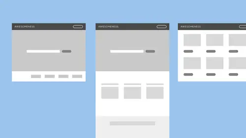
tes, but this is what it looks like on the inside. It's a piece of software, some of you might be a lot more familiar with the Adobe Creative Suite, Sketch is a piece of software that's come out within the last few years and it is what I currently use at work and what a lot of designers are starting to use more and more. So I wanna show you just kind of what the layout of the software is so that everything is clear. Essentially here on the left side is your pages so that's what you're looking at. You can see any art board or any content that you have on this page, you can also go to another page and this is where you guys might recall the examples I showed earlier in the class where those art boards are; and when I say art board I'm referring to this space here. What I was showing you here, we have an art board selected, it's highlighted in the layers list and you can see that everything underneath it it's kind of organized like the folders on your computer, everything underneath is is what is on that page so you can see that we have folders, indicated by a folder icon, we have objects, this piece of text has a sort of A symbol and the rectangle, whatever. And then these arrows here indicate that something is a symbol, and a symbol is, I think the Adobe Creative Suite definitely has their version of symbols, but it's a super awesome part of Sketch that makes designing really really easy, and we'll get into that a little bit more later. But so let's see, what else can I show you? Over here we have the inspector pallette, and this is where you're doing all of your editing basically so you can see you have your alignment pallette, you have the positioning and size of your objects, and all different kinds of ways to edit it. If we choose a piece of text here-- Oh! And that's another thing to tell you about Sketch. If you hold down the Command Key, something that's in a folder here, you can sort of ignore the bounds of the group or the folder and directly select that layer. So you see when I click on my text layer here, we're getting a lot more that shows up in this inspector pallette. It's always going to be offering you whatever tools you need for that type of object or what-have-you that you're working with. So I'm gonna go back to this page here, the wireframe page, I'm gonna hit Command- which sort of pulls up my selection to the life size and I've started a little bit here and I want to show you guys a little bit of Sketch before we actually start re-creating our wire frame. Again, when taking your sketch into this next-level fidelity or detail we're still just going with basic shapes, simple text does not really matter what typeface you choose, just something that's legible and basic, and we're gonna be using a lot of gray and black. Not super exciting design stuff, we just want to show the functionality and we just want to show what things are and how they'll work. Here I have a dropdown selector which is a symbol right now, so I'm gonna click into that and to get into the symbol you can double click and this actually just takes you to the symbols page. You can see there's this "Return to Instance" button up here which is gonna take you to whichever page you were just on. But what this does, essentially, is I designed this element here, this group of layers, so I have the piece of text, the dropdown arrow, and a rectangle sort of filler shape and that group, any time I want to insert a drop down, I can do that in my file without having to re-create it. What it also means is if I wanted to change, let's say, maybe wanna actually get into the visual design, the color of this to be red, it's gonna change it any time I have that symbol used in my file. I'm gonna undo that, delete it. The other great thing is that, this is actually a pretty recent update to Sketch, I believe, but here where it says dropdown, I can look in my inspector pallette and there's this override pallette within there, and it says dropdown because that's the name of, that's what the text is in my symbol; but when I want to actually use it in my design this dropdown might be French, and spell French correctly. So I write it in here, and then when I click out of that it updates here. What this does, so let's do it with our button too, I'm gonna hold down Option and Shift, Option is gonna duplicate the layer I'm holding onto and Shift is gonna hold it into basically a perpendicular or parallel orientation to the object that I'm copying. But here, so let's say we have several buttons, this one-- oh, this one's not a symbol. This is a great opportunity to teach you guys how to make your groups into a symbol. So if you right-click either on the object itself in the art board or if you right-click in the layers list on the group, you can scroll all the way down to the bottom of that menu and hit "Create Symbol". What it does is it queues up this field to name your symbol. I'm gonna leave mine as "Button" because that's descriptive enough and we're not really gonna be doing much else since it's just a wire frame. But now that this is a symbol, you can see my overrides pallette comes up and if I duplicate it here, I can write, let's see, "Click here", and then I can change it again and I can write "Submit" and it's not affecting my original symbol. But I've noticed here, let me zoom in on this so you guys can see a little clearer, I've noticed here that when I wrote in a longer call to action, so a longer description of what this button is gonna do, it's not centered anymore in my sort of rectangle, so if I double click I can select this piece of text and change it from being left-aligned to centered and it should update my symbol to be, exactly, centered here so instead of having to change that specific symbol to be different, I'm able to make changes like that that are gonna affect all of my buttons and make my design process faster and more efficient. So that's a little bit of an intro into Sketch. If you guys have any questions on how the functionality works, please definitely ask. What I'm gonna do now is move into re-creating our wire frame that we've sketched out into this document, and I'll do my best to talk through everything that I'm doing, but any time if there's questions, let me know because I want you guys to feel really really confident in Sketch after this class. Okay, what I'm gonna do is I'm gonna start with the homepage sketch that we did and I'm really just taking what's here and I'm pulling it into Sketch. I always wanna be critically thinking about the work that I'm doing and if I do notice something here that doesn't seem right, I will update it, but really this stage of the process is just adding polish to this and just creating it in a way that is easy for me to share with the other people that I'm working with and make it look a little bit more professional and easier for them to understand.
Ratings and Reviews
Lisa Brink
Great information. Would have been nice if she had a large pad or dry erase boards for the sketching so both online and people in the room could see better - as opposed to the 8.5 x 11 laying on the desk.
China Rose
Alexandra shares useful specific ideas to build confidence in website planning and shares her clever techniques for wire framing.