Catalog Editing Continued
Lesson 9 from: Wedding Post-Production WorkflowJennifer Cody, John Aarnio
Catalog Editing Continued
Lesson 9 from: Wedding Post-Production WorkflowJennifer Cody, John Aarnio
Lessons
Day 1 Pre-Show
05:29 2About Us: Post Theory
19:41 3FreePreview: Tools We Use
22:15 4File Management
22:24 5Photo Mechanic
17:02 6Building Proxy DNGs
31:18 7Metadata in Lightroom
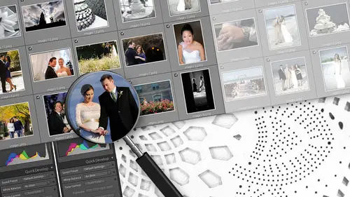
38:49 8Catalog Editing
36:37Lesson Info
Catalog Editing Continued
We're taking a series of like photos, isolating them, working on him and just ignoring the rest of the catalogue. So, like Jen said, you use it ti select a series of exactly the same photos. Or if it's more complex, you can come in and start looking at your one metadata. And let's say you had multiple cameras, multiple shooters. You could start isolating a specific camera at a specific point in time and say, Look, I just want to take the D three s at this point in time. These photos, Let's isolate, thes and work on him. And that's how you can start to maintain this continuity between sets of photos, regardless of the camera and regardless of the shooter. So that's how we make use of it's more collections. Yes, I know. When we built the project folder, initially it came with a template ID catalogue, if you will. Your smart collections were pre built in there. Yes, with all the rules. That's a great question. That's a great question. So you kind of have in order to do a lot of this templ...
e ization. You kind of have to just dive in and start working on stuff and then disassemble what you've worked on in order to save it as a shell or is a template. And that's that's more or less how light room has to work. So things like the smart collections, these things here you can't make them unless you have photos in the catalogue to make them work. So my recommendation is build a catalogue. I start making these things or go back to your last catalogue and use that to build these up, right? So that's what we've done. We've taken arm or some of our older catalogs, and we've we've kind of pieced together with workflow waas. And then we started building these smart collections in, and when you're done, you just get rid of all the photos. So what you're left with is all of this logic without all of the photos. So the things that you can set up, obviously the presets are stored in more of an application location that all light from catalogues can see smart collections, our catalogue specific. You do want to save those there. Um, the other thing that you could do as little tweaks is set this filter panel here this is in library mode. You can actually define this panel, said it and then leave it open. So the next time you open your light room catalogue, that's the default view that you get. That's the look you gets. You're not constantly clicking this and then clicking this and then clicking this field in this field in this village and its seven clicks later, you finally got it. What you want. Set that first, leave it blank, and the next time you open that catalog, it's always there. But what it means is that next time is every time you open the catalogue for every project because it's a template. So these two things right here, I think, are probably the two biggest that we would that we would configure. And yes, I would make a copy of a catalogue, said it. Clear out the photos. Also, make sure when you do that you remove this source folder when you clear out the photos, so what? We don't for this catalogue, and this is this is kind of ah, like a special situation for this. I've set up actual collections based on the types of photos just to try and help illustrate, Um, you know how we handle specific photos in specific situations. So typically what you would see in our catalogue is the smart collection set. Like I said, these updates dynamically. As the catalogue changes, you can make normal collections. And if this concept helps you to, you can certainly make use of it. I made as a series of static collections. He's just normal folders that you could drop photos into based on the timeline, more or less. And then we've categorized the photos. So I know that ceremony contains only ceremony photos. I've got Susan Stripling ceremony photos, you know, details. I've got her details. So what we'll do is actually go through some of these portions of the timeline. And the reason we've isolated these photos in this way is because in addition to all of the workflow rules and the steps and the processes that we put in place, we also have rules for how we handle photos based on the type of photo that it is. And that's our style. Guide kind of mentioned it the other day, and we kind of, you know, alluded to this in our operations manual, and we put together, We ended up putting together, like a 30 example document that has the foreign after images and exactly the steps that we used to get it from before it after because a lot of times people will ask us, like, what? Can you show me exactly what you did? So the style sheets were just all about showing exactly how we got there, And we're gonna do that now, too. We're gonna take before we're gonna go through all the steps and then we're gonna show you the UN result side by side. But we don't. You know, we don't just go into the photo and start editing. We actually have something in mind of where we want to end up. There is there is a set of rules that we live by that we do these edits. So getting ready as a good example, you go through some of the rules that we want. Yeah, follow us. We do. I mean, for the getting ready, you know, typically, it's pretty broad centric. Even if you're photographing the groom getting ready. I think the emphasis here is on the broad because it's kind of beautiful toe. Have her there with her friends and her mom and her family putting together her, make up the finishing touches and getting into her beautiful, ethereal gown. You know, guys getting into their boxers little less romantic, you know, depending on who you are. But I think that for me, the getting ready is really about making the broad look beautiful. Um, and having kind of these classic moments. So we tend to do more black and white for getting ready, probably more so than any other portion of the day. So I would have a tendency to mark a lot of be getting ready from black and whites. Um, we're editing Susan's photos now, and I know that Susan likes a very dramatic look. She likes to expose for the highlights. So when I'm editing her work, I'm keeping that in mind. I'm not brightening up the image and trying to make it, even because that's not what she's going for. She's going for this beautiful room light on this girl's face, and she is wanting to maintain that look. So John is just are you, like she's saying, I would probably choose as I'm going through. I probably make this one black and white. Because I know that because the trust is good, it's gonna make for a good block. It's gonna make a good black and white the only color factors that are in the image to me or just distracting. And that's the blue T shirt and the tattoo art on the makeup artist. You know, arm. Those were both taking away from what we really want to be looking out, which is the broad space. So I would go with a black and white here because I think it's gonna eliminate those kind of distracting things and really bring your attention back to her. And a lot of these air really good out of camera, too. So that's the other thing to consider is that don't don't over edit these photos if they're if they're really good at a camera and your baseline Preset has done a lot of the work, which in this case ours has. It's gonna look good pretty quickly. Ain't broke. Don't fix it. It's true. So I might keep this one color we've done a black and white will keep this color. We know that season's photos tend to be a little warmer, so we're always gonna keep things a little bit warm. You know, we're not gonna be going for a neutral or colder kind of look just because we understand what her body of work is, and you should you should evaluate your own work in that way, If you know that you like to deliver, you know, images that are more neutral in terms of color balance, then you're not gonna want to make them warm like this because that's just not your style. That's not what you're going for, you know. And if you know that you do deliver your images and they are warm, then you want to be consistent about that. You don't want to make half of the getting ready photos kind of warm, and the other one's kind of cold and neutral because there's just a disconnect there, and I feel that the client is gonna look at that and not understand what's going on. And while you're looking at in, this applies specifically to these kinds of photos, as well as to portrait. So I would say your focus as you edit this photo needs to be on her face and nothing else If you're adjusting the white balance of this po, you want to make sure that her skin tone looks as good as it possibly can. Natural. Clean if you want it warm, fine. But it can't be so overly done that her skin just looks unnatural or right. Shallower. True, you don't want to project that hepatitis look on your broad space Trust John does thing not. Not in so on. Top of the white balance and the tone of of the skin. You want to make sure that areas that are in the shade you know the back of her nose, the back of the chin here aren't so drop down in shadows that you lose some of the nice color on the cheek. You want to be very, very careful about that. We're losing huge sections of her hair. If you just completely black it it down. Unless the point of the photos a silhouette, which in this case, it's it's it's not It's really not, Um, and then be mindful that, you know, you've got you've got areas of contrast between. You know her, the shadows of her hair on the white of the wall. That's good I would keep that for me. I might actually take it one step further and go in with a local adjustment and darkened down this right side and take this brush and actually just bring this down because I don't really need to see all of these, you know, folds in the fabric of this curtain. I might just bring him down a little bit. And it's worth noting that, you know, obviously, Susan specifically shot this wedding for creative lives. She really shot that to show you what you could do in a kind of average situation. And if you're in a beautiful room at the Ritz Carlton in the background is gorgeous. You don't necessarily have to think about eliminating it, but in this case, there's no we don't want to highlight the background. It's There's nothing to be gained from highlighting the background in this image. It's a lot of these are pretty soul. And here's what. Here's another perfect example like this one. I want to make sure that as I go through, um, I'm looking at her skin First. The skin has to look good and bear in mind if on your feet it doesn't look good. We're going off our monitor here. But if I see any detail in the right side of this image here, to me, the way this was shot is that this needs to go black. It needs to disappear. She she almost needs to just blend and melt right into the black here. So I want to make sure that I give it a little bit extra, you know, help along the way and make sure that I'm darkening all this stuff way, way down. And he sort of glossed over it. But John copying and pasting settings from the last image because these two were shot in the same light even though she had somebody has this turned pulling the curtain over on this photo, she didn't change the way the light was on the bride's face. Right? All right. So, as a quick aside because I know what I promised to talk about this the way the brushes work, we mentioned that a tablet is an absolute must necessity. One of the key factors of the tablet is pressure sensitivity in the tablet settings itself. You can tell it to be pressure sensitive. That is at least aware of pressure sensitivity. The way this works light rooms that when you activate a brush, you want to make sure that your flow rate is something less than 100. And you can adjust this to however you feel works best for you, because this is all about how hard you're actually pressing on this tablet. You can define this setting in the tablet configuration of how hard it it could accept your pressure of your pen, and then you match that to a flow rate of the pain here until you get to the point that you can actually control. You know, in this upper right corner of the photo, I could sweep across and put full pressure down and then let up right as they get to her face, and it actually one's right in. It's like a pencil. You know, if you draw really lightly with pencil, makes a very light line really scribble hard. It makes much darker line. It's much like that because you are able to kind of create nuances by making one area darker by pressing in and then lightening up as you get closer to the subject also helps you to avoid halos, which is very helpful. I hate halos, right, and that's that's a critical part of the Russian, and it's maybe hard to see in the feed. But the way the brush is set up is in the outer ring, in an inner ring of the brush and the brush feathers from from the center out on this brush so that it's it's actually going from full power, basically to no. Zero power, and you can adjust the size of this feathering, but as well you could combine that with the pressure sensitivity. So as you swipe this brush across, you could basically come right up to the edge of her and not create that halo or that hard edge that makes it look obvious that brush work's been done. So that's what we're doing. We're gonna apply a little bit brushwork. I'm putting a lot of pressure on the tablet as I get to this outer edge, and then I'm lessening it up as I get in here, because I don't want to actually paint over too much, and that's how we do the brushwork. So again, I'm picking this up and this just becomes second angels to go from photo photo on picking it up. I'm moving forward on pasting. It's the blink of an eye. I'm just doing it like that again. Same thing I could decide. Like I like the look of this. I don't like the look. I can adjust the white balance, apply some brushwork if I want. This is the right edge of the photo. Like I'm not gonna fight this. This is meant to go white, so I'm not gonna try to darken it. I'm not gonna try to give it a contrast brush. I'm gonna let it be and to refresh memory, You know, this this season using, I think, a glass or a bottle of water or something to block out. You know what? The makeup artist kind of recognisable because it's about the broad. She's bringing your attention to the broad. And that's smart because what she's doing is she's creating something in camera that we now don't have to fight to try to darken down the makeup artist in order to draw your attention to the bride. This one I might do black and white. I think it'll look pretty good. A Z. We go through these photos are very similar, the same kind of look, same kind of thing. Copy. These will pace this over. If it needs some brushwork, it might. And I feel like he's done it again with the veil. That's great, because she's she's really made the bride the focal point. It's like she does this for a living. Raising the question here is the question here is, how much of this do I want black. And this is something you have to really carefully consider and think about. Give it. Give it a second thought before you actually dive in and edit. Do I want the back of her head to be completely blackened out? Which on my screen, it looks like it is or you want to try to bring up some detail of the shadows. So for me, I might actually trying to bring that up a little bit. Will just raise the shadows. I know based on looking at the photo based on looking to hissed a gram. It was pretty blocked up, and I know that from my from my sliders, I could actually afford to bring the shadow levels up a little bit. The blacks are down a little bit to 15. So we've got some room to play with this. If I want to bring this up and have her not as dark, I can. But I mean, really, for someone like Susan, you know, I know that she doesn't want to lose a ton of detail. She doesn't want things to get blocked up, but at the same time, she wants to maintain the drama. So we're not gonna bring the shadows up so much that it takes away from the type of image that she was really shooting when she took this one. So again, this is very similar looking. Go through these, but we'll actually gonna jump ahead real quick and show a little bit of a transition because you've got thes thes, same window lit photos. This is basically what you're doing is you're debating whether you want really dark areas of the shadows. Bring them up, leave them down, keep it dramatic or go black and white. That's kind of your thought processes. You go photo photo through all of these and again when you talk about black and white. You don't talked about using more Bach and white and getting ready as our personal. You know the way that we sort of look out of the way that we judge it, but also, I think, a really important criteria. And I didn't go to art school. But for me, a really important criteria also is what's the most important thing in the image now. What is colored doing when it comes to that element is color. Distracting you from that element because of color is distracting you from something that's really important, like, Ah, bride, you know, crying, you know, with her mom before she walks down the aisle. And that's a good candidate for black and white to really bring the viewer in to exactly what you're trying to show them. And this is a good example. The photo has really good contrast. Um, it's it's very interesting because of the single window light, but it's debatable whether you want to have all these distracting colors of pinks or if it just might make a nice, simple black and white and be much more effective. So again, this is probably one that we would mark. Now we have a situation where let's say we like this photo we knew this photo was the next one in sequence, but it's obviously under exposed as we go from photo photo. There's a very big difference in exposure levels between these two. So if I wanted to, I could actually apply the work that I've done to the previous to this one. If I made a huge amount of white balance adjustments that wanted to carry forward or might just start fresh because they're really not that they're not that similar in the based on the amount of stuff that I'm gonna have to do this photo they may not. I may be undoing a lot of the work that I set up, right? So if he had light in the shadows in the last one, you know, that might not work here, because here we just need a significant exposure. Increases. Well, right. So what I'm actually doing to try one of our variant baseline presets, Remember, we have a standard and over and under someone apply the one that is yes, which one we're going to apply under Under applies the basic same settings that we would normally do. But it compensates for under exposed image a little bit if if in images one or two or three stops under exposed, there's only so much that presets really gonna be able to handle. This one will do a good third half, maybe 2/3 of a stop, you know, about of exposure come so it gets us closer to where we want to be. We still have to work on this one. Um, and the exposure. He's actually pretty good. We're stopping 1/2. At this point. We'll drop the shadows a little bit. Just get it dialed in where we want it. So now we have a big change. So this is still part of getting ready. But this is a little more portrait focused. The rules are still the same. Um, this photo is a little more intimate. It's a little more specialized, but it's all that more important to focus, really on skin tone. That's what this entire thing is about. So we want to make sure that whatever white balance we go with it, we're not ruining her skin. It has to be flattering when it comes to images like these. Flattering, flattering, flattering, right, because it doesn't matter how cool it looks. If her skin makes her look like she's corpse. I've seen it done or new. Columba. Yeah, beluga. And we get it. You know, some brides, tan. You know, those of you who are, you know, in certain parts of the country may have more tanning than others on that orange can be hard to fight. But you still want to try to make the bride look as beautiful as you can, especially in the portrait. It's the one thing we have to do here that this is the only additional step that we have to keep in mind. As part of our rules, we are focusing on her skin tone. We want to make sure she looks natural, but at the same time, we realize that we're probably dealing with a dress that is pure white. It looks to me like it's a white dress. Pretty close. Yeah, I want to be careful of color casts on my screen. At the moment, this all looks very purple and blue, so I wanna make sure that if I'm adjusting her skin tone that I'm not fighting against this. If I'm having a lot of color balance issues, if I can't get her skin tone right and the dress looks really awful. I may have to go to black and white because I can't fight that That contrast of white balance colors. So those are the two things you really gotta keep in mind. And I've seen situations I remember once Susan was in a getting ready room that had no windows, which was very sad, and she had to use a video like to take a portrait of the broad toe like something that the bride was getting into her gown and the video like that she was using This is not the ice light. She was using a different video light had a real greenish cast to it, and it was very, very difficult to find a way to correct for that because there was like, some kind of fluorescent lighting in the room. And then this green led light on, and in the end, most of those had to get a black and white because, you know, it's not a miracle you can't fix every single thing that happens. Sometimes you just get overwhelmed. If you were taking pictures in the evening and you were under sulfur lights ever bend down you know, on the water yourselfer lights, those actually stripped out spectrums of light, I believe on. Do you actually can't remove all of the yellow without stripping out other colors? So sometimes you just have to say this one's got a black and white. And then as we're doing this to this, this goes back to that work triangle concept. I'm looking at it and it looks a little under. I mean, it looks like it's exposed. Well, it might be under in it. You The suspicion could be confirmed because I'm looking at my hissed a gram. I realized I don't have a white point, and I'm really not even close to a white point yet. And this should be white. This dress should be as close toe white as possible, and I'm still not hitting it. So if you're editing and you're noticing thes discrepancies where you've got a white dress that should actually be on the hissed, a gram as close as possible. But you don't see it that way visually, with your screen, the screen may not be calibrated right, And that is kind of one of your first clues that maybe you should do that Because if you're looking visually at this photo, the edits you make aren't really matching what the data suggests you should be doing. So that's one thing I noticed. Just sitting here is that I have no white point yet. This looks very bright to me, so that could indicate a calibration issue. So again, same deal will go through here. I need to pick up the settings from this one, apply them to this one, and then again, same situation with the brush. I notice on these edges that we have a little bit of color bleeding through. I may choose to black in this down. The other thing that we do with our brush presets is we map the resize to the arrow keys on the keyboard itself. You can do this on the tablet. If you have buttons on your tablet or a little rotary knob, you can do that too. It's a really quick shortcut when you activate a brush, quickly resize it so that you're not going over moving your mouse, adjusting the brush, stunning like just quickly activate the keys, do it every second counts. That all adds up. Having it on there just moves you along every time you use the brush. And it's also just really handy because bigger brushes are often better for making things, you know, darkening things down without creating halos or making it really obvious. I think black away from that one. Yeah. Okay. All right. So this is the situation. ALS for the getting ready, These air Susan's photos again. Any questions about these? You are all. Actually, there are some questions with minute coming one from tough toodles. Wondering if these air the final edited images that you're actually going to give your client. Is that what you're editing or you editing others that the client won't see? No, we're only editing the images that will go to the client. Thank you for clarifying that. And then quite a few people are wondering about the workflow time, and Marion and Romania is asking. So when you edit this way, photo by photo, once you become a pro like sidecar doesn't take you to edit, let's say 1000 photos, photos. I'm gonna go with a day and 1/2. Um, I think that my max years, probably about the same, I think about 600 to 700 in a day, right in that counts 700 image wedding. I can do it in a day, and that's importing. Made a data. It's the full. It's not importing the cards right. It's from when the cards are imported. It's making the proxy. DMG is making the full size CMGI's, loading it into light room and editing it, and then the export just a little window into my life. The way that I usually works for me is you know, I will have called. I will have gone in and, you know, pulled in the cards and then called. Maybe on a Sunday after I shoot a wedding. And then on Monday, when I get up a to crack of 10 I will go. I will go on down and I will have made. I will neither make or have made the proxy and the full size C and G's and I'll import the light room catalog and I will start working on it. And then I might do some other things throughout the day with your email getting back and forth. But then when I'm done in the evening, I typically once I do the noise reduction will set the export and go to bed so that the export happens overnight. So some of this is a matter of scheduling and timing a little bit. Smartly said that rather than setting an export in the middle of the day when you could be doing something else with your computer, and now your computer is being slowed down, just wait until you're getting ready to go to bed and then go downstairs, said it. Get it done, and then you can in the morning. It's miraculously, it's all done. You're literally working in your sleep. Yeah, you're working. You make your computer work 24 hours a day. Don't give it any vacation days. You paid a lot of money for it, Make it work. And then that prompts another question. From Firefly. Photo, 13 16 will touch screen computers or laptops work instead of the meantime instead of are instead or in the meantime. So using a touch screen computer or a laptop, can you work? Use that instead. I don't think it's is fast. I think the I mean it looks a little archaic. I mean, it looks strange, but I mean, having these physical keys on this separate device ultimately is the fastest thing that we can think of at the moment. Um, I mean, I can tell you I was a faster type or on my BlackBerry than I ever was on my and I have been on my IPhone, and it was like somehow the physical keys made me faster. I've never tried to use a touch screen computer for this, so I couldn't answer that with authority. But I don't think it would be faster for me. I don't think the only other interface that I know of is on the Windows platform. There's a new application called Patty Ph. D. D. Why? And it can actually work with MIDI controllers, which are controllers that you can mix audio with. So there's like sliders and rotary knobs and all sorts of different things. I still think there's so much motion handing wasted music a little bit. Yeah, well, a slider on a midi controller controls a slider in light room, so I think the range of motion is still too much. There's a lot of wasted effort doing it. I never used it. I mean, it looks like it could work really well. But for us, part of the speed is from learning the system and sticking to the system. Just being very familiar with it. I guess you could get very proficient at a touchscreen. Just sure. I don't know that we could. We're not. You have fashion that touch screens. So when you're coding for blue, black and white, you're just kind of putting them to the side so that you can come back later and transfer those two black lights. And then do you ever make a virtual coffee? Um, according to, like maybe the girls with the pink dresses on And you kind of think that could be black and white, but you might go the other way. The family may enjoy that. They had those dresses on that photo. Do you ever have a virtual situation? We want to deliver a black and white plus a color. I don't personally, I deliver my images the way I want them doing. I see I deliver black and White Teoh a client. If that's what I think is the best format for an image. But I know that some photographers do you choose to do that they do make virtual copies. They added everything in color, and then they designate certain copies to go to black and white, and I think that that's a fine way. It's just gonna add a little more time to your work flow. But if that's something that you want to offer your clients, I think you can definitely do it. You know this. This will definitely allow you to continue to do that. Yeah, for our set of rules for the work we do for who we work with, it's It's an either or right, so it's gonna be black and white or color, not both. So it doesn't make the work for a little bit easier there. No, just that's how I tend to do it, too. But I was just questioning that, like, even if you were making a virtual copy for yourself so that you could re edit in your mind later on, like which one do I really want to give them based on? Maybe if you're doing an album or something, and and maybe the color would have worked better on that page than a black and white. I think like that I just close the door on that you did you? Because I feel like they have to trust me to make some artistic decisions. You know, there are certain images that I will never go to black and white with, not pursues him, not for myself. And I don't think for Christmas studios, either. We never got a black and white on family formal portrait. It's because I do feel that people do. You want those in color and I understand why they dio. I don't think there's anything artistic, you know, any kind of artistic advantage to be gained from going to black and white with those portrait's. So there are certain things that I will never go to black and white, because I do understand that they might be important in color. But other than that, I make the call, and it's very rare that people push back on that, you know, unless it's a photo that becomes important. You know, a grand parent that may have a health problem later. You know, something like that. If they want to come and ask me for a color photo of that, I'm gonna do it for them, you know, But it's pretty rare, I'd say maybe once a season someone comes and says, Hey, could I get this una foto in color? Yeah. And what Jen is talking about here, just briefly family formals. As faras rules for processing, this is these are one of the things that we have a very specific rule for no black and white, no vignettes. The splint own split tones, new black and whites. It is a clean archival like meant to print. Like this is the thing that everyone's gonna print put on their mantle. So you can't go crazy with a lot of style effects and things like that, especially blanket. Right. And in my experience, parents are always even less interested in doing anything unusual with the family formals. And, you know, sometimes Mom and Dad pay the bills, so we don't want to make them unhappy. I I have a question, actually, for the students here, and I was wanting what you guys think of watching their workflow with the RPG keys. Okay, It's called to see how fast, actually, one thing if you don't see it on their website, but to see how fast Yeah, When I started using a graphics tablet a couple of years ago. It was hard at first, but once I learned out of you so that I can't imagine going in any direction. And I sort of have been keeping an eye on the RPG for a while. And I think that's probably buying other things because you all are getting one. Wait, So you this is one of the versions that that he has, and this is meant to, like get you started and see what you think of it. So, um, do not get discouraged, stick with it. Because, like every every other change, it seems hard at first, like switching from the mouse to the pen seems hard at first. But once you get into it is gonna save you so much time. And if you want to move from this to a larger 58 with the full layout, all of that stuff too, you certainly can. But at least this is a good way to get it's a baby step
Class Materials
bonus material with purchase
bonus material with enrollment
Ratings and Reviews
Misty Angel
AMAZING! Jen and John are humble pioneers in their expertise of business, photography and workflow! Sharing their workflow secrets, along with offering their manual, presets and brushes (via their website) has already been an enormous timesaver in my own workflow! The workshop will get you THINKING and FOCUSED on how you manage your time, considering all that goes into running a successful photography business. While they focus on weddings, this is applicable to ALL photography! The introduction of the DNG proxy process is critical to optimizing LightRoom's functionality! THANK YOU! Love the process, the delivery of the workshop and their honest method of sharing their brilliant business structure!
a Creativelive Student
This workshop is fantastic. Being a creative is not synonymous with being organized, and this course has helped to begin to bridge the gap. I love how easy it is understand and follow. If you are looking for help in getting and staying organized, this course if for you. P.S., I purchased the Sidecar Post LR presets, and they are as good as advertised as well. Definitely as class to add to your CL collection.
Tracy Hope
They show a great workflow that can be modified as required. It shows the benefits of being organized and how not to have 3 versions of each photo clogging up your back up files. it shows how an editing company can be efficient and I have learned a great deal of how to speed up the work flow.