Dave's Post-Tether Workflow
Lesson 18 from: Working with Capture One Pro 9Nino Batista, Dave Gallagher
Dave's Post-Tether Workflow
Lesson 18 from: Working with Capture One Pro 9Nino Batista, Dave Gallagher
Lessons
Class Introduction
14:41 2History of Capture One
11:50 3Dave's Capture One Workflow
07:03 4Licenses, Versions, Keeping Up To Date
05:27 5How & Why to Upgrade
12:15 6Workflow Organization Tools
28:57 7Raw Files & Sidecars
13:46 8Sessions & Catalogs
19:23Why Shoot Tethered?
15:55 10Tethering Styles & Presets
10:30 11Adding Capture Folder To Session
05:27 12Studio Tethered Shooting Demo
14:53 13Nino's Post-Tether Workflow
06:34 14Color & White Balance Adjustments
23:01 15Clarity and Retouching Tips
05:29 16Layers and Local Adjustments
12:59 17Capture One vs. Photoshop Workflow
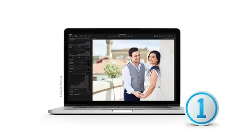
11:14 18Dave's Post-Tether Workflow
15:13 19Overview of Tools
09:17 20Using The Color Editor
04:11 21Using Capture Pilot
09:51 22Capture One Styles
10:21 233-Way Color Balance
04:00 24Creating a Color Mask
03:12 25Skin Tone Adjustment
06:59 26Advanced Color Mask
05:07 27How to Make a Smart Album
06:02 28More Ways to Sort Photos
12:47 29Histograms
10:09 30White Balance
05:47 31Color Balance
10:07 32Exposure & Highlights
06:45 33Levels & Curves
10:19 34Clarity
04:07 35Vignetting
01:44 36Lens Correction
04:43 37Keystoning
05:06 38Chromatic Aberration
04:05 39Lens Cast Correction
12:08 40How To Fix a Dirty Sensor Image
03:50 41More Ways To Use LCC
02:52 42The Crop Tool
06:34 43Rotation & Flip
01:59 44Advanced Keystoning
04:05 45The Overlay Tool & Navigator
02:23 46Focus & Sharpening
04:14 47Noise Reduction
03:43 48Adding Film Grain
04:09 49The Spot Removal Tool
05:53 50Adjustment Styles
03:51 51Keywording & Metadata
03:40 52Nino's Outdoor Image Workflow Overview
56:57Lesson Info
Dave's Post-Tether Workflow
alright. So back to tethering on back to some of the things that you did now I went from default. So when Nina was in the workspace, we were back a default workspace. But I went back to my workspace here so we could go back to Dave's tethered workspace. So here's the tether workspace. The way I would set it up importantly again are captured. Select Strache Out Output folder. If we find that this is a file, you know, you want to say the pilot ah, file of Kate that we did not like And we trash. Okay, Too much headroom figure. Right. So that so? Of course, that one to a finger scroll moved me up is now in the trash. All right, so I did go to the trash window. Let's see, where do we start? Let's start from the technical guy. And where I would start from order of importance of tools that I put together for tethering legal question. Yes. So something that Nino, um, I didn't do it is in your workflow. I don't know if you doing yours, um, using the select folder. You know, you picked you just ...
five star room or nothing. Do you ever move over to this Lex boulder to see you have him in a different location? So, you know, these are the ones that are selected pretty strictly. Go by ratings. I go by writing only because again, I don't I don't have a very complicated calling process. I'm very particular high call in terms of what I look for, but that's a different thing. I literally like I said, I do five star none. And then I few buy rating. And then my rating there are up top. And once I finished culling and I have my 43 or two hero shots there up top and I'm good. Other better organized ways, Absolutely, but I don't have a burning need for them myself. But that's not to say that one shouldn't do them. Sure, sure, So let's take a look at other ways. We could do it right. We can place before we can place a three. We can place them as we as we go another three. And so if they're rated by five fours and threes, you'll see the five stars come up first, and then the So again it's your personal preference how you would rate them if you wanted to say, I want to rate by color. You know, we can come and select and make a short cut key to a color or were selected by color here, so that can ever star rating and a color. And as we rate them, we could go rating color tag that. So now my yellow or orange or whatever color you want to see that that is your monitor. Are we, uh, color blind right there. They're up of the top home to go buy rating and put the five stars a topper. You know what for now, we could go by date as they were shot, so we can do more of our of our technical work flow through it. So the reason I have added certain tools in order him to tell you why and why I put them there and we're gonna talk about how we would put the output for that tool as well. This tool, remember, this whole tool tab is only while untethered. What happens next to the next image coming in? You'll see. It's all blank because I'm not tethered and it's not. There's no image coming in, so needed even worry about it. So here's the images that are ready after the tether with things that I would do importantly, as I was shooting. So as I was setting enough, I would go in personally, grab my color balance and you watch if I if I change my color balance, uh, well set will pick white color balance. You'll see it change. The funny thing is, unless I do a major adjustments not changing much, you don't see it much on the computer. Even that that gray background isn't much different than my 18% gray, and so you'll see very minor changes. But if I were to try to neutralize on a blue, yes, you'll see it now, since the color checker is there since this color checker there, these air warming filters. And so if I wanted to break balance on a blue, I can warm it all up. So these are our warming filters or cooling filters here that gives me a consistent, warm, consistent warming or blue are a cooling filter. Uh, some people really love them again. How do I get consistency from shot to shot. That's if that's what we're looking for. It's a really nice way to grab that consistency. So that Kelvin that gives me that Kelvin. That's neutral. And that's typically where I'd say, Guys, this says 5900 Kelvin, What does it mean? It really means nothing. It isn't relative. It's relative to the next shot that it isn't really 5900. Kelvin. What I would do, and what I see is that I need to add 200 Kelvin to it. So let's go ahead and make this course 6100 Calvin or 6200 sickle at 6200 Kelvin and Tab and you'll see it warm up. So remember Command Z undo command shift Z is redo command Z undo command shifts. You redo so you'll see that back and forth. So that adds just a slight hint of warmth. But what that does do. If I did that from the beginning, I would then have that same amount of warmth rights on every single image as we're tethering as we're tendering all the way through. So they're all consistent all the way through. So again, that great balance minimized the balance coming off one light versus the next. It gave me a consistency, and then I warmed them all up. 203 100 Kelvin from there to give me that warmth afterwards. So I keep that white balance really close Now we could use auto some of these tools. Let's go into one. Some of these tools have an auto, or, if you choose, you can come up and customize your toolbar, and you could go ahead and put the auto adjusting your toolbar right? So in auto Justin YouTube are you have all the tools that you'll be able to auto just from back here. You can come up and click on that little arrow, and you want on a Web balance outlooks, village water levels that you can auto a bunch of things that's going auto this and see what it does. That's what it decides to do, is not a right love. It love it. So there's a reason why I don't have it in my toolbar. The reason I don't usually put it up there. Usually I'm thinking ahead and bringing that the color balance, uh, the color checker with me. But there are times where I've gone in. I forgot it. I've got murky manuzzi mind. I'd hate halogen lights. Who knows what? There's these lights that that are horrible color, and I needed to guess I've got nothing in my subject that's neutral to click on. I need to guess so every now and then. Not often. I wanted to choose, just made been auto white balance and click on it. So So you can go to that auto Waterboy balance here. And she was a click on auto White balance, of course, and it doesn't and again that it tried to choose it. And because, like I said, like me, I will play around. If I don't use the great cards and whatnot, I will. I'll get my hero shot that I like, and I'll make it just where Field looks right, I'll play with the Kelvin. I'll play with Tent until I like it, and then I'll apply that to the rest. That's the visual way to do it the aesthetic way to do it. But when you like, you said, when you're trying to find a baseline for consistency for something that needs it, Yeah, totally. I would tell you that it's a big It's a big word in my office, right, Consistency. Consistency is a really big word for me. And I use it all the time because you can judge repeatability. If you've been consistent before then I If I don't know your consistent I don't know where to judge you from here on out. And so if I've got multiple studios and multiple bays, I need to get them all in the consistent workflow. So I'm getting the same kind of repeatable color out of all the base. I need to set up a workflow that that I can can rely, that they're all shooting the same and not Hey, I know I heard this on this lecture. So I'm gonna choose this tool and use this tool instead. No, you know you're gonna do it the way this way, and so we all can have repeatability. So there's a reason why I don't have curves down here. So let's go ahead and add a tool and go ahead and add curves on him when let's go ahead and do occur. Right? So, typically it added curve. I want to do a little slight curve await, undo. Let's make sure, let's go back to default because Nino has played with this one. So let's just no eyes enhanced. INGE it control customized toolbar. That seems to be things that keep on going away. Like reset adjustments, all which I love. And and I'd like to have it up here and reset the whole one. There you go. All right, I'm gonna go through processes, go great balance, and I'm gonna go ahead and make it 60. 300 Kelvin 5300. Boom. Now it's a consistent Calvin, uh then curves what would happen if it occurs? Will curves would typically be pulled down. A little bit of the shadows make a slight s on drugs, booze gets light s and that's what curves would dio Now the problem with curves is that if you look at that background, it's the same background from left to right, and there are no numbers in that curves. There's no precision in that curves. And if my student, if on shooting this curves on that that background that back is gonna be different from one day to the next. If I'm using first and I can't have that, I gotta have consistency so curves is great. If you're a one off photographer like curves, play with it. If if we're in a multiple production studio, I've got to say Curves out of your hands and you can't take it. You can't use it. When we were shooting before, we were for a large clients, like a catalogue client. Between catalog, we would have a big fridge aerator on the side and have a large amount of the same emotion all the same emotion film. And if we're shooting for that client, we'd all ground that same emotion base. So we have consistency throughout. Well, now that Digital's come, I hope that's probably curves and let's pull them all over the place. Let's let's do this. And I heard I could do no, no, stop someone else's fixing your mistakes elsewhere. I promise you there's a colored guy that's pulling his hair out. There's a colored guy in the back somewhere that has pulled his hair because he's looking at all these curves and going, How do I make all these images that in this catalogue looked the same off the soapbox, but for Kristen's consistency, there's lots of things that I need for consistency out there personally again. I'm coming from the technical side and just talking about technical side of the software, all right, so exposure is important next. But the reason that color balance I do first is that I won't be able to judge my exposure unless my balance is done first. If I'm way off in balance, I can't tell with them to expose, not or not. Let me give you overexposure because my red might be completely shifted and I'm not overexposed. But that red curve is overexposed. So unless I get my color balance first, I won't be able to judge my exposure second. That's why I put them in order of importance. I just said I can't even call unless I have the color worked out and the colored exposure worked out. Then I applied to all and then coming. I can't call completely on touch raw. Thank you. So that's exactly what I would do. I would take a look right? Let's Let's look and I'm gonna do this by color readout at a Colorado grab my hand tool or the space bar at a color read out to All right, dear. I thought I had it selected had ballerina. There we go so of to 44 or excellent to 44 to 18 ah 1 96 in our highlights in her flesh tones, we know that with digital have to be very careful to blow the highlights. If I blow the highlights, sometimes I blow them out too much of one channel. Then I have that digital look, and I have to be very, very careful of not blowing out that highlight too much. So in the exposure of that one image, it depends what it's for print, and it depends whether it's for the Web, right? I want to be careful of going over to 50 in that red Channel and going on to 50. That transition from detail to non detail can give us a pixelated edge of defense, which camera I'm using, of course, in the gradation quality of that camera, but again, something I need to be aware of in numbers. So that's why I look at the readout and then looking at something else again. The reason we're doing this is a technical perspective versus on aesthetic perspective. Yes, that you can do it by C. m y que for skin tones. Absolutely. Okay, Absolutely. And how do you change that? That's excellent. Um, if I'm looking at a c m I k look, so I'm not having got into process recipes yet, so let's go ahead into my options for it. If this is a tiff, uh, my I c c profile show all of my profiles. So all the profiles, I'll have some Some canned. Uh, I see profiles that are seeing, like, image that Sam Wyche age people to get it. Nobody just previewing in that one. Now, of course, that was probably not the right one to grab, but I'll go into us sheet, foot, sheet fed, uncoated right, which is a little bit less. And that was a little bit much to, um that is the one way by looking at it. Just if you see that it's previewing s you, Micah. That's one way to do it. Now, add color read out. It's a really good question. Can we do a color readout without previous Do it that way and see him? Okay. Yeah, because like in photo shop, you can kind of go in there under info and change it to like RGB two. Sam y que We have to be so complicated. Becky, I think these are good questions. I just You seem like a lot Teoh. Determine skin tone rather than RGB and photo shops pick loom a peak color. Correct. The unfortunate part is none of these from the drop down menu there is. So I am going to importantly, check on that later and get back to you on it. Uh, that's the quick way that I know, but by it will show you the preview if you haven't already set selected as your output. But I do not know by just selecting it there. Do you define it? Seemed like a space is sure. So, uh, are pixels are rgb red, green and blue filters over each individual pixel of our of our camera system. However, one that's light. That's the way we see Like on DSA separating it into the spectrum. Rgb when it goes to inks on paper, inks on paper have to be reproduced in a different process where those inks were laid on top of each other that it's sighing yellow, magenta and black. Okay, being black. So K c M y que is how to preview in your output for typically for reproduction to to the press. So the one of the reasons that that you saw that go go gray is that the same, like a color space is substantially smaller. Then the RGB color space and how much color we can reproduce on our screen versus how much color we can reproduce on the press is substantially less on the press. So that's why it looked that way. Yes, I have another question about Sam y que, um, if you are editing in capture one under Sam y que That preview that showed Is that how it's going to print out typically or is that it's giving you a proof profile? Yes, OK, so the contrast completely drops like it like it's a smaller color space. What you would do is then modified to that color space, so it's helps you to see how much less you're going to get on the page, so that you can then make sure you have it properly here. Got it. It's a nice proofing device. Yes,
Class Materials
Bonus Materials with RSVP
Bonus Materials with Purchase
Ratings and Reviews
Jesse Furqueron
Yes, per some other reviews this started slow. What turned me off was the sales spiel for the class. It also came across as a sales schtick for C1, which is ok given the presenter. Stuck with it (well most of it, had to step away at times) and found it useful. I've had my eye on C1 for a LONG time. I'm not a pro, but would consider myself a pretty serious amateur. I document old mining and narrow gauge steam engines, general travel and now do our product photography (started a new company, so all $ goes to that rather than C1, which I would LOVE to own after seeing C9). Went with Aperture back in the day because of its cataloging and price. Back then C1 didn't have cataloging, though it DID have a 2 tier price structure...(Phase WHY did ya'll do away with this?????). Back to the class. After lunch on the first day I think they found their stride. Second day, especially Nino in the afternoon was quite good. That was probably my fav session. Seemed like most questions came from the in-studio "captive" audience. Expected more from the web? Constructive feedback. 1) Could have condensed things down quite a bit. I liked the more casual approach it took later on first day and on the second day. Dave especially seemed more at ease. 2) Ya'll (Dave especially) seemed to have his topics scripted out. Given the two day nature of this, would have been nice to give the attendees an idea of agenda/timeslots for topics up front. If an agenda/timeline was presented...I totally missed it. But then, I couldn't back up or rewind the live stream when I had to step away several times... if I paused it jumped to the realtime stream :-( 3) C Lve was pushing the "free trial download"...isn't there already a trial download from Phase? What value are ya'll offering in this area above what they offer? I found this annoying, if there's an extended trial period or something through ya'll cool. If not...I'm back to the annoying aspect of it. 4) Nino, get a Cintiq :-) If C1 doesn't have a profile for Cintiq (I'm going to download the trial from Phase) Phase you need to add support for it. 5) Dave's material he presented should be in vids on his website to help him expand his C1 market..fantastic selling tool there Dave....or even better....embedded in the product itself (ala SilverFast). Phase, you listening? 6) Nino, given he's coming from a different angle, eg no skin in selling C1?, he could do a 3-5 hour intensive vid(s) and I'd pay something for that. YMMV but I liked his approach and presentation. Was disappointed no C1 on his YouTube :-( Would I pay 99.00 for this class? Honestly, no. We use 3D graphics (ZBrush) and CAD (Rhino) in our company and have been learning those over the last year. To compare. There is another tutorial company whose name I shall not mention (no, it does not start with an 'L') that specializes in vid classes for those and other 3D products. They structure their offerings on a AFFORDABLE monthly/6mos/yearly all-you-can-eat fee structure. Much more consumer friendly, and quite honestly their videos are very focused and about 4-6 hours per course. I don't see myself paying 99.00 much less 129.00 for just one course like this (especially with the sales spiel content) when other companies have a more customer friendly consumption model. A value for the $ thing. In the end I did learn some things, and I'm glad I watched what I could of it. And yeah, I'm pretty sure after this review I just got taken off the free C1 license contention list...but I'm just being honest...Dave, I will be ordering some of the LCC pocket accessories if I ever get C1...those were cool IMHO. C1 has come quite a ways. When I can, I'll add it to our software arsenal.
ira potter
I have been a user of Capture One for a couple of years but have strugled to get my head around the way to use this software as my chosen raw converter, I love the improved quality that Capture One gives me but always seem to end up scratching my head and going back to Lightroom to save time. I haven't been able to watch the full presentation due to time difference, (I am in the U.K), and other commitments but I have learnt so much in the time I have spent watching that I can finally see me waving goodbye to Lightroom in the very near future. The presenters are excellent teachers, they are funny, engaging and thanks guys you really have made a p[ositive difference to how I interact with Capture One software.