Lessons
Class Introduction
02:37 2Color Overview
11:38 3Color Panel
13:51 4Swatches Panel
12:22 5Creating a Tint
09:47 6Creating a Gradient
04:13 7Creating A Color Group
05:55 8Applying Swatches
17:15Lesson Info
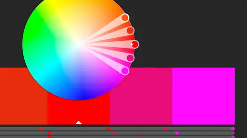
Color Panel
So, the fill and the stroke, we just need to make sure that we're effecting the right one when we're working with color. And we first need to open up, we've got the color panel open, and usually when I'm creating a color, I like to have a big item to actually colorize while I'm working on it, because seriously, even trying to see something here, is a little difficult. Especially when it comes to a stroke, that might be really hard to see when you're making changes to it, and it's certainly difficult to see over here in this tiny little icon over here. Also, we can pick a color if we're not putting in the actual values, we can use the slider down below. And in Illustrator the color panel we can actually make it larger just by grabbing this little handle at the bottom and pulling that down, so I can actually see more, which is great because I have just as many shades available to me as I do here, but now they're stretched out a little bit and a little easier to find. So, I can just move,...
I'm just clicking on it and holding on it, and you see the sliders changing like crazy until I find a color that I like. Then the reason I have an item selected is so that when I do find a color, it actually changes that item so I can actually see if I even like that color. So, basically, because we're working in this case, let's actually go with RGB, just because I don't wanna confuse you, say we're working digital, have unlimited colors, we should be working in RGB. So, I'm gonna go ahead and open up the RGB sliders for you here and I'm just gonna move around until I find a color that I like, and once I find one that I like, I'm gonna go ahead and save it to my swatches. So, I'm gonna go up to the panel menu and just choose create new swatch. So, it's just gonna send it there. Right now I'm just gonna hit okay. We're gonna look at what all these numbers mean later. Right now I'm just throwing in a bunch of colors into there. And as soon as I do that, suddenly that changed. It went away from RGB. Well, basically it says great, now you can start making tints of that particular color. Again, I don't wanna do that yet, I was just trying to get some colors in here and we're gonna look at the swatches panel in a little while and we're gonna see that there's actually a lot of swatches already in there, but these are ones that we're creating on the fly that we like. So, again, I'm just gonna bring this back to the RGB and I'm gonna choose another color and I'm gonna go ahead and save that as well. And what I can do, if I'm assigning this, if I assign this to a color and leave it and don't add it to the swatches, and then go on and work on something else, I can later on add the unused swatches, but what I'm doing is changing it each time so nothing is getting assigned, I'm just looking at it for a second so I'm adding it to the swatches right away so it's there. Even if later I decide I don't want most of those colors and I wanna get rid of them, I can, it's just an easy way to bring those into your document super quickly. Now, it's not exact, like I said, I'm just visually looking at each of those and as I'm sliding up and down I'm getting more into whether it's the brighter colors, so even if I change it to my HSB sliders, I can look and see that my hue goes from left to right. I also can do saturation. Again, how saturated is it? So, the first half is how saturated from kind of the lighter colors to the more saturated colors here in the middle. You can almost kinda see a separation of bar there. And then from there it's how bright or how dark that color gets. So, again, no matter which slider we're using, because we're just picking visually, and we're basing this entirely on our screen, so keep in mind how it looks on our screen might not be the way it looks on Kenneth's screen and how it looks on everybody else's screen that we send that to, so we don't know what those colors are going to look like necessarily, but again, we're trying to come up with that happy medium and just find a color that looks good together and we're gonna start playing with colors and how they interact with each other. So, I'm gonna find like I say a couple more colors. Let's add a blue, I don't think I added a nice bright blue. We'll add that to the swatch and just hit okay, and we'll come back to that. Let's go back to RGB. And then I can come in here and let's choose a color again, I'm just gonna choose a new color. And I decide I want this nice orange color, but then I decide I want something different, maybe I want something else that's the exact opposite, the invert version of that color. So, I'm actually gonna shorten up this piece here and copy it. So, I'm just gonna option or alt drag to copy that. And in this one, I wanna come up to the panel menu and choose compliment. I wanna use it's opposite color. So, now I know that I have two colors that are complimentary colors. Now, if you're like me, and you understand briefly color theory, which is something that I understand in theory but I'm not really good at it and it's just one of those things that I know I'm not good at and I don't mind. I'm one of those people that I might not know what colors go well together, but I see color combinations together and I know how much I love those together and that's why I love the color tools in Illustrator 'cause it lets me kind of explore and play with those and find those and save those and use those again and again. And also we're gonna see we're gonna be able to go out onto the web and find other people who have created cool color combinations and we can use those as well. But for me, I know that complimentary colors go well together many times. So, I might make little color patches of each of those and create those colors. I can also if I undo that, come back and choose the inversion of that color as well. So, what that's gonna do is also flip the saturation and the brightness as well, so it's just gonna flip it. And again, how and why, I don't know, I didn't pay attention that day in school, I didn't go to design school, I went to film school but we also had to learn this and I also didn't pay attention to it, but again, I've got the tools that let me actually play with it and look at it. And I can look at it and go, I don't think I like that very much so I might change this color to something else and then I might do the same thing, is option drag that across and find what the complimentary color of that is. So I can work with that until I find a color combination that I like. That's like at the most simplest. That's kind of a manual way to do it, we are gonna find some automatic ways to do it, but that's a quick way to take a color and just flip it and just use the complimentary color across the color wheel from that. So, again, I'm gonna find colors I like, I wanna make sure I add this lime green to the swatches as well. And another way I can pick up colors is I can use the eyedropper to pick up colors. So, I can click on an item and it picks up not just the color that I've picked up here, but it's gonna pick up some other items as well, so in fact, if I grab this item, like I said, it picked up not just the fill color but also the stroke color. So you can pick up entire attributes from whatever it is you're clicking on. And so to do that, we double click on the eyedropper tool and it says, what are you picking up and what is it applying? So, you can pick up a lot of stuff though I don't know why you'd pick it up and not apply it, but you can. But I can choose what all it picks up and in this case it's picking up everything. So, what I might wanna do is get rid of everything and the only thing I really want is basically the fill color, because otherwise it is gonna pick up things like transparency and things like that, so in this case I might just want the fill color. So, I'm gonna say okay to that, I'm gonna pick up the fill color, that's all that picked up. Notice it's got a question mark, it doesn't know because it didn't pick that up, and then I wanna come up here and I want to just pick that up and then I want to apply it over here. So, I'm gonna click on that and apply that, and I'm holding down the option key to do that, so it's applying whatever is in my eyedropper. That's there. So, it's picking up color and it's picking up the stroke color as well. So, it picks that up and it applies it to the new item that we're applying that to. We can also do that if we have a picture. So, I'm just gonna create a new document. If you do it too fast it does not like it, I've noticed with 2018. Just picked it up way too quickly. And I'm going to just place an image in here. So, I'm just gonna come in here and pick an image to use. Let's actually use a photo that we have. That's actually an illustrator file, we'll go ahead and use that. Actually, I wanna use an actual photo. So, let's do that. Come in here and I'm just gonna grab an extra image that I have laying around. When I do that, I can actually sample from a photo, so I can use that same eyedropper. Now, with the eyedropper with a photo, it's just going to pick up the color because it can't actually get in and figure out there are no strokes and fills and things like that, so it's not getting into anything except for the color specifically. So, when I click on that color, you notice it automatically put that color into the fill. Maybe I want this orange, I really like that orange. That looks good. The red from here. I'm not saving any of these, I'm just clicking on them to see what I like, but the great thing is, if I say, had some text here. Let's just say we have ice and snow is here, we have that and we wanna go ahead and we want to pick up that red color again, I can go ahead and just click on that color. Not only does it bring that into the color panel, but it applied it to the text that I had selected. So, I had the text frame selected and I used the eyedropper tool and just clicked. So, I can keep clicking and just keep changing the color until I find a color I like that works well with the text that I have in there. And it doesn't necessarily just have to be text, it could be any other item that I have selected, as I click, it automatically fills it with that color. So, maybe we have this item here, and I wanna go ahead and use my eyedropper tool and just click on the different parts of that image. I know there's not a lot of colors to choose from in this image, but we can have a nice palette of different grays and whites that are there, and some blues. And so, I can just select an item, use the eyedropper tool to sample from that image, and create that as well. Now, you notice it brought it in as CMYK, it is gonna grab it in whatever color mode the image itself is in. Let's jump back over here to my fills and strokes. And the other thing I can do if I don't wanna just move around, let's actually go back to the RGB, if I don't wanna just move around and try and visually find something, because seriously, trying to find the exact color here is sometimes difficult or punching in the different colors here can also be difficult. I might wanna actually work with the color picker that is in all the different Adobe apps. If I double click on whatever it is I'm working on, the fill in this case, if I double click on that, I also get the color picker that comes up. And I can limit it to just the web colors, those are those 216 colors, so we don't have a lot to choose from there. I'm gonna deselect that. But what I can do is I can start wherever it was that I chose, I had clicked over it and it came with this yellowish green, and I can actually start with that. Let's find a kind of a range or a region that I like, this is pink, I can actually now go up and down through the brightness of that and just slide there 'til I get sort of the feel of the brightness that I need and I can also play with saturation as well, move that up and down. So, I can actually use the sliders for that or I can see what the different color values are. For instance, if I'm working in RGB, but I know what my CMYK values are for a particular item, I can go ahead and enter that here and it gives me an RGB, and because I started with RGB, that's what it's going to actually create that color as. So, I'm gonna go ahead and say okay to that. So, I can choose colors that way. And something to keep in mind if you watch here, I have this little alert button here, and that's basically telling me whether or not it's in or out of gamut. And what I find interesting is this works, if you're coming from in design and working on this, it works slightly differently. In design if you are in a CMYK document and you use an RGB color, you create an RGB color, and it's out of gamut for the CMYK, it will give you that alert, but only if you're working in a CMYK document. If you're not, it knows it's fine. You're within that color range, the RGB is that wider color range you're fine. Here, even though I'm working in an RGB document, it's telling me this color might be too bright and too out of range. You notice there's a slight different color between that. This is what it's gonna look like if I print in CMYK. But I don't care because I'm not, I'm printing in RGB, so I'm not sure why that alert is still there telling you it's out of that, but don't worry about that, if you're not goin' to CMYK don't worry about it. But basically what it's telling you, let's say we filled this item with that nice bright yellow, actually let's do that one, you can see a huge difference between those two. This is what it looks like, what we're expecting it to look like here, but here's what it's gonna look like, so it's gonna go from this color to that color. So, by clicking on it, it's gonna shift and you can see that color shift and now it'll print fine in CMYK, but I'm not printing in CMYK, so I don't really mind about that, I just think it's odd that it gives you that warning, but just keep in mind that that's a warning that may not even apply to you. If you're working in RGB, you set up your document in RGB, and all your colors you're creating in RGB, you're gonna be fine. And this is for web, again, if you're outside that web safe, the 216 web safe colors. If you're not working in such that restrictive mode, also not a big deal.
Class Materials
Bonus Materials with Purchase
Ratings and Reviews
Anka
A lot of useful information about work with colors. Solid colors, Gradients, Global Swatches, Color Groups, Object Mosaic for grabbing colors from images, Color Books, Libraries...and so much more! This is a class for those who want to know everything about color management and use of colors in Adobe Illustrator (some information is helpful even for Photoshop and InDesign users). Erica is a great teacher! She has a good articulation. It's important for those like me whose native language is not english. She speaks evenly (neither slowly nor quickly) and to the point. I definitely recommend this class!
Gemma Kelly
Erica is a really clear instructor. I found the class really useful and the pace was great. This will make my workflow much quicker and I cannot wait to put what I have learnt into practice.
Student Work
Related Classes
Illustration