Lessons
Class Introduction
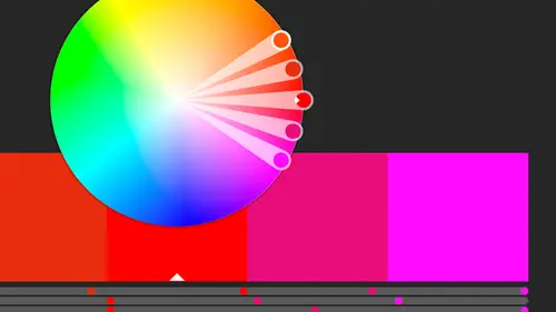
02:37 2Color Overview
11:38 3Color Panel
13:51 4Swatches Panel
12:22 5Creating a Tint
09:47 6Creating a Gradient
04:13 7Creating A Color Group
05:55 8Applying Swatches
17:15Lesson Info
Swatch Libraries: Pantone
We're gonna jump in and talk about swatch libraries. All right, we're gonna talk about things that are libraries that we're using over and over again that come with the program and also the ones that we work with out in the real world. There was a question earlier about Pantone colors and Pantone's always on everybody's mind if you do printing because, at least in the U.S., we use a standardized version of colors. Pantone, talked a little bit about spot colors, you know, printing something on a press, we've got black and another color, a Pantone color, it needs to come in a tin that's labeled Pantone 199 or whatever and so I need to find, where does Pantone live in Illustrator so that I can tell it to apply that color so we can print that color as well. So where the libraries live are in the swatches and they're in this tiny, tiny little icon down here and it's called the Swatch Libraries menu. So we will talk about Pantones first, and then we'll see that there's a lot of other cool o...
nes that are in here as well. So the reason that it might be hard to find is that we don't have anything called Pantone. So we have to go into this other menu called Color Books, which sounds a lot like coloring books and that's not what they are, although we can make coloring books with it, but Color Books is where we have it. The reason they're called that is in the old days, as I like to call them, which is my entire career, we had books that were actual swatch books, and they're still there, and basically it is a printed sample so that you know exactly what Pantone 199 looks like. It's in a swatch book. You've seen 'em at the paint store. They've got those as well, the chips in the books, and so this is where they live, in the Color Book, and there's a lot actually, there's different ones that are used around different parts of the world but we use, like I said, Pantone, and basically the two we use the most are the solid coated and solid uncoated. That basically depends what kind of paper it's going on. So going back to the very beginning of the class, I said make sure you know where it lives in the real world. If you're going to print, and you're going to a paper, you also need to know what kind of paper it's going on. I know that sounds crazy to have to know that ahead of time, but you do, so is it going on coated paper or uncoated paper and the difference being that the colors do look different, the mixes are different, and it will effect how it looks on the paper when it's printed. So we wanna choose one. I'm gonna stick with uncoated for everything that we work on today, so I'm gonna click that, I'm gonna open that up, and what I get is this floating panel with all these colors and there's a lot of them. I'm gonna actually do them by list, here. Come here, and let's actually do a small list. I don't really need really big, really big swatches for that, so these are where all of my Pantones, my uncoated Pantones, live. So they're named by the name that they are in the book, so in this case, we've got different, some that actually have names, and most of 'em have numbers. Now, going back to that find by, you notice the find by is now open, it's just there, and so in the panel menu, it's gonna go ahead and be open for us, but if I don't know where it is, or I know what number it is, it's just really far down, I can say Pantone 199, I can just type that in. Now if there was one that was 2199, that would also show up as well. But I can narrow that down, and say, okay, Pantone 199, there it is, I'm just gonna click on it, and when I click on it, it automatically adds it to the swatches panel. So all I do is click it once, I didn't have to use it or anything, I just clicked on it once and it appeared there. Now, this one looks a little different. It's got the little triangle that we're used to, but it also has a dot, and that dot is that it's a spot color and in this case, it's a spot color that we can't change. In fact, if I double-click on this, I can no longer change that. I can't change the name, I can't change the spot, I can't make it not global, it's just automatically there. Now, it says LAB, that's the lab color space which I don't normally work, and that is actually how the Pantones are derived, but I'm not gonna change that because I chose Pantone because I know that it looks and it's made of the component colors that I expect it to, and so when I do something, if I decide to change it to a CMYK color from the spot color, I know that it's starting with the right base. If I'm only using it as a color here as a spot color and I decide even though it looks pink it's supposed to be reddish color, but a redder pink, and I decide at the last minute I want to print with blue, I can just simply have them use a blue color on the press. Some things may change but the color is easy enough to change. It's just when, if I take this Pantone color and then I say, later, convert it to process colors, it's going to take the colors, the LAB values, and convert those to CMYK values based on what you originally chose, so when it comes to Pantone, don't make any changes to it. The whole reason we're using Pantone is so it's consistent across the board. So I can change it if I wanted, though, to another CMY, I can change it to CMYK, RGB right from here, but I'm gonna leave it at book color. I could add it again to my library. So basically that's what that means. It's a fixed color, it's a spot color, and we can't really make many changes to it.
Class Materials
Bonus Materials with Purchase
Ratings and Reviews
Anka
A lot of useful information about work with colors. Solid colors, Gradients, Global Swatches, Color Groups, Object Mosaic for grabbing colors from images, Color Books, Libraries...and so much more! This is a class for those who want to know everything about color management and use of colors in Adobe Illustrator (some information is helpful even for Photoshop and InDesign users). Erica is a great teacher! She has a good articulation. It's important for those like me whose native language is not english. She speaks evenly (neither slowly nor quickly) and to the point. I definitely recommend this class!
Gemma Kelly
Erica is a really clear instructor. I found the class really useful and the pace was great. This will make my workflow much quicker and I cannot wait to put what I have learnt into practice.
Student Work
Related Classes
Illustration