Lessons
12 Pre-Show
11:05 2Why Infrared?
18:54 3Infrared: Behind the Image
26:56 4Infrared Q and A
33:41 5Fake vs. Real Infrared
22:19 6Types of Infrared Cameras
22:31 7White Balancing Infrared Cameras
16:57 8Infrared JPEG vs. RAW
20:01Lesson Info
Fake Infrared Demo
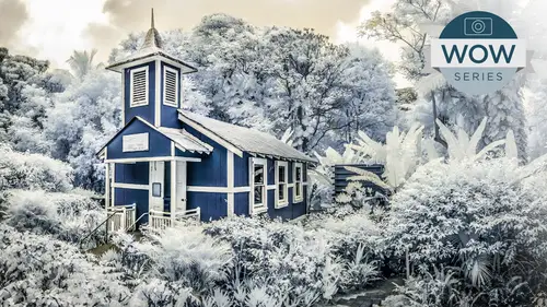
Let's do a "Full Infrared" because I really want you all to get used to this HSL, not only for your infrared work, but also for your color work and traditional black and white. We will be doing a little hand tinting after the break, as well as some more sepia toning and cross-processing effects. Well, let's actually do a little full infrared here. So as we already know what it's known for is the dark skies and the light foliage. So I'm gonna come up here and I'll go ahead and do a convert to grayscale. And here is our vanilla image, having nothing to do with infrared. We're gonna come up here to our TAT tool. And simply by being in this area that TAT tool, which is used for multiple tools, like I said, it's also used for curves, as well as the color portion of HSL is gonna become active. And basically what I can do is do the same thing that I can do in Photoshop. But with greater control is I can say, would you please take a portion of this color range? And I can either click on the bl...
ues and move them left or right. Or you can see it knows that the blues actually contain some aquas as well. So that's why using the TAT tool can be useful because it's actually knows that there's more colors than just blue, rather than me just grabbing the blues. And the same thing goes for the foliage in the palm trees. As I come up here, I can actually increase not only what would be greens, but most greens and most of your photographs, actually the computer looks at them more as yellow than green. If you've ever done that using the TAT tool, you'll notice that what we consider green, the computer tends to think that it's more of the yellow range. So here I'm coming up. And I can, even if I wanted to, if there's a little bit of aquas in that mix, you can see where the aquas fall. So again, whether I take that down or bring it up, but the light portions of this file are in the yellows and the oranges and in the greens proper. And between those two, and then my blue's going down, I'm actually able to get, and let's see if our P is, now that's working nicely. So the P, tapping the Preview key is giving me the drama that I was hoping for. See, even we'll add a little bit of the red. There's not a whole lot going on there. And again, we can fine tune these. But you can see what we're doing and why this is such a powerful panel to be working on. Is I'm actually taking colors that are right next to each other in the tonal range, whether that's green, aquas to blues, and taking the blues all the way down and I'm taking the greens all the way up and I'm kind of stretching them to the point of breaking and Lightroom and ACR is actually quite excellent at being able to maintain that without the image freaking out. If I was using a straight, a curves adjustment or I was coming in there, there's a good chance that at some point, if you've ever worked with curves, as you try and change your contrast on the file, if your line of a curve ever gets anywhere, even close to a horizontal line, it flattens it out and becomes muddy. It does banding to it. Whereas you're able to get away with murder with not only these HSL sliders, but also the sliders associated with shadows highlights and exposure that we've talked about before. So that is a one first step for doing a dramatic landscape. If you're trying to lighten up your foliage, but there's more things that are typically associated, especially with a traditional film-based infrared. Not only would you have your photos going light and your sky's going dark, but often in the olden days, you'd get a significant amount of vignetting from the lens, older lenses and older systems in the film process you were getting a vignetting. So let's come over here to our Effects panel. We use that yesterday for optimizing and we'll do that same sort of thing. I like that color priority is the more subtle, and I'm gonna come up here and I'm going to again, darken the parameter of my image by taking that down. It may start to darken the highlights, but remember the great thing about this type of vignetting, as opposed to the olden days where it got a really bad rap was not only can you come up here and shape where that vignetting is and it's feather and all these other parameters, but you have a highlight slider and you also have a highlight priority version of doing vignetting. Both of those are gonna allow you to get the darkening of the edge of your file while not darkening up the highlights. And that's, again, you're not seeing a whole lot going on in that. I'd have to darken it up a little bit. In a monochromatic normally I mentioned I use color, but since we're turning this into a black and white, we can come up here and do color highlight priority, and see if that does it. It's not really doing, I don't like it. It's a more exaggerated, more extreme. And even with highlight all the way up, you'll notice it's actually darkening the highlights on the edge even more. It's not protecting them where you would think that was the idea of having a priority. So again, I prefer the color priority and it does actually an excellent job of maintaining that highlight. And again, I like adding more feather. So that is giving me and I can come over here also. So we've done one HSL is gonna give us a general tonality two by going into effects and doing something like a vignette we can exaggerate that edge distinction often where our skies are. We also have, there's nothing stopping us from using all the basic tools in our basic panel for taking things like our highlights again, up to further kind of get our lights in the file up that's gonna affect middle tone values as well. The last thing that I'll do, or two last things, if we are trying to imitate more traditional infrared, it has that haze or that glow that I mentioned before, based upon the fact that the film tended to haze, if it wasn't handled correctly and two have the long exposures, if you're dealing with something that is seconds long, the exposure sort of building up also had a certain amount of glow associated with it. And we've talked about our edge contrast here being associated with clarity. We can take that up if we're trying to exaggerate that tonality in the file, or we can take clarity up and we start getting just a nice glow to the file. So we're actually get that haze that we had with traditional infrared film, which again, you could say there was a bug, but it's, what's associated with it and it gives us this nice glow. If it is starting to flatten it out, we do have our highlights. We could have play around with that. We also have, as I said before, we've got our shadows. So if we want, we can actually take our exposure or our shadows down if we wanna kind of exaggerate that. So that clarity, we don't need that much, but our clarity is gonna give us a bit of our glow that we associate with traditional infrared. Here's our before and after. And you can see we're getting a nice imitation of infrared because we're getting our blues dark, we're getting our greens light and we're getting the drama if not, what we would get with true infrared. If we look at the shadow portion of some of these things, we're never gonna really look into the shadows, but fortunately, there's not a lot of harsh shadows, even though this is at the end of the day, we were heavily side lit in. This is the same area that these was taken is right here. These are actually the same palm trees. You could probably even pick out the same palm trees and here. But as we get down into the things that are shadowed looking down at the bottom, you'll notice that they're not getting anything close to what we have here of the glowing. So we can get drama, we're not gonna get that same sort of glowing. The last thing associated with a traditional infrared film is going to be noise. They were high ISO by definition. And so going back to our Effects panel, where we found our vignetting, this is where we can add our film grain, and let's zoom up even more. And this is where you can add a bit of grain, not noise, but grain. It actually has an irregular pattern to it much like little silver granules. It also has a size and roughness option again, to kind of approximate what you would get with silver-based printing. One thing I would caution about just as with higher ISO film, at some point you start losing detail. So if you were to take that size up, you're gonna notice that it starts softening up the image. It's not just the size of the grain it's actually changing how it's interacting with the image. If you wanna change roughness, that's how irregular it is. You can add as much roughness as you'd like to exaggerate that grain and it maintains the detail. So you use roughness rather than size to exaggerate the clumpiness of the noise and or grain and then just add the amount slider for as much as appropriate for what you're going for. This is another good thing. The grain is an option. Anytime you've pushed an image, which we've done here in this manipulation, and you have the potential of getting banding in your file, little bit of grain goes a long way to cover that, the sins of banding on your file 'cause it's dithering so to speak, the colors in your file. So adding a little bit of grain is helpful for a file that's challenged in terms of banding of the color or tunnel range. The other thing that's very useful for it, which we'll do in other classes, we may even do it in this one, just for fun. We've got another shot here that'd be appropriate on is changing the apparent depth of field of the file by blurring a portion of the file. If you blurry a portion of your file, like your foreground, or maybe, the back portion, you have flyaway hair on a portrait, you wanna soften that up by actually blurring it, which you can do in ACR and Lightroom. Well, your sharp image is gonna have the natural digital noise into it as was shot but anything that you blur just like in Photoshop is gonna have no noise whatsoever on it, and that's not natural. So adding just a little bit of grain back to that file will match your artificial blur with the natural blur in the file, as well as the natural sharp areas. So Grain has got a lot of nice features to it. If we zoom out a bit here, just looking at this area, here's our before, after, before, after, and that's how we're gonna get kind of close to our full infrared inside of ACR and Lightroom. And of course, before I answer a question, anytime you see anything vaguely useful in ACR or Lightroom make a preset. We did that with a white balances. If I did this and I never wanna have to go through that again with a color file, then simply come over here to your presets and we're gonna call this, "Full IR One" and use only the parameters that are appropriate to it. So in this case, if that happened to be primarily the gray scale conversion for it, maybe my clarity setting, maybe my sharpening and noise reduction on here and maybe also the lens vignetting we used the postcard vignetting is what we used on that. And we also did our grain. So saving that is gonna allow me to go to another full color image, click on it and use that as a starting point. That is based upon this image. This is a sunset palm tree landscape. Don't expect it to be hazy Downtown Seattle in the rain and do a great IR to it because this is specific to that. But yes, the question. Yeah, I use silver effects a lot and I love their grain. I think it's way better than Adobe's. Would you go into a whole nother step and do that? That's a good question. And again, Silver Effects Pro also has all sorts of texture, not just grain, but has all sorts of grudging on it, and it has framing effects and things like that. So that's up to, in terms of your effects that you're doing now you're talking about kind of special effects when you're adding in a photo texture or grain or a framing or something else like that, that's really kind of up to you, whether that is something that is going to enhance the story enough to add that step. If you're a Lightroom user, the nice thing about Lightroom is you can set up your external editors, so you literally right click on it and go to an external editor. In this case, if I had that built into Photoshop, I could open it up as an object so I could take advantage of smart objects and apply those filters there. So yeah, absolutely. I mean, the whole purpose of whatever you're doing is to make the most potent image possible to tell the story as powerfully as possible. So if that's gonna be done in another location, absolutely. The other thing I mentioned that I haven't done here, we did a little gradient. I'll get that question in a second. The gradient for doing that little ND effect, but I also love coming up here now with the new radial filter is coming up here and we'll make sure that it's on the inside with a little feather. And if I'm trying to exaggerate this and kind of get more of that effect in certain areas on the file, I can just drag out and basically I'm doing a little dodge and burn, and I'm exaggerating the tonality and little spots with these nice, wonderful little soft edge, dodge and burn effects. Try not to get too carried away with it. It also would allow me if I wanted to come up here with shadows, exaggerate that, and manipulate a targeted adjustment even more so. So remember that you have all these targeted adjustments, not for something like I did on the sailboat, just a gradient, but also things like the radial. And again, that is gonna further give me the ability to get a little bit closer to my infrared. Yes, question, before we take a break. So if you were creating presets, would there ever be a situation, or I don't know, is there a way to have like a preset just for vignettes or just for your HSL and then apply multiple to the image? Absolutely. As a matter of fact, that is how I create a lot of my presets is rather than have them globally because really every image is different. So basically what you're saying is that you would add these sequentially. I love this black and white. I love this vignette. I love this CPO Toni. And yes, basically, if I like this black and white conversion, as I did before I can click on this and only save what would be the grayscale conversion. And that's only that, and then I could come up here and say, you know what, I love this vignette. I had all those settings and parameters just set. So I would go click on the same dog-eared page icon, come up here to my postcard vignette, called that vignette one dark, vignette light, do exactly that sort of thing and the same thing with grain or whatever. That allows you to customize that without needing to actually do it. And you can actually, like I said, you can even access all of these in the Bridge. You don't even have to open up ACR. So you could sequentially say this black and white, this vignette, this CPO Toni and be done without even opening up ACR. In Lightroom the benefit of these presets in Lightroom is that you have that little preview window in the upper left. So you literally just scroll down and you can actually, I give you my Facebook page, the Facebook page, remind me to dig that out after the break. Because I've got a bunch of presets related to other classes that I've taught here, both ACR and Lightroom. If you've bought the other ACR Lightroom classes of mine, they come with, I think a hundred presets for each one of those classes for both ACR and Lightroom. But in Lightroom, you literally just hover over it until you find the tone. So it will be set up with like, I've got here. You'll notice that these are tango for exposure, clarity, vibrance. So you literally, you just hover your cursor over until you go, there's the right tone, click, here's a little clarity, click. And here you actually have to click through each one of the files, click, click, click, and do that. So yes, targeted presets, I think are excellent. They do expedite your whole workflow. You just wanna make sure that when you do click the little plus symbol and it asks you, what would you like to save for the preset that it's specific to what you want? Is there a way to multi-select and just, if you know, I want this, I want this and I want this, can you multi-select and then just boom. Absolutely. So as an example on this, when we did this infrared, I would come in here and you can set, I did the gray scale conversion and I did my post crop vignette, and I added grain and I added the clarity. So this I'm choosing which of the parameters. I may not do anything related to exposure or contrast or anything else, because that will be different for a different shot. But the look, and I may have even changed things like split toning or whatever effect. Whatever is appropriate to the effect that's global, I can select and make the preset. Anything that has the potential of being not applicable for global I would not choose. Some things are so carried away that if I come over here, let's actually, we'll make a little snapshot of here, and that will go back to our original file. Some effects, when we come up here to Special Effects, like antiquing, some of them are so exaggerated. These are my level Instagram Ask kind of effects. So most of these actually are doing a dozen little effects at one time. So I'm doing an undo between each one of these. So this is a case where I am clicking on almost each of those parameters, certainly not targeted adjustments, but it's allowing you, you can see that you're cross processing effects and little vignetting, I'm adding that little pseudo border using a vignette, a very tight vignette. And so you can push things really far. And that's up to you, how much you do it as a sequential set of presets for how much of it is global. Are you sure you don't have a secret Instagram, Jack? (laughing) I see it all these awesome filters and- They're really fun. That's an example, most people don't know that Lightroom and ACR can push something that far.
Class Materials
bonus material with purchase
Ratings and Reviews
a Creativelive Student
This was an excellent course, clear and informative. I teach Photoshop but learned some new tricks as well as the great info on infrared photography. As one of the 5 people left in the world who isn't on Facebook, a link to his Actions would be appreciated!
a Creativelive Student
I thought this workshop was great, and really enjoy the creative uses of the gopro. There is a gear segment, and gear guide to download. But what I want to know is what card reader he was using. For some reason I can't find it.