Lessons
Day 1
1Free Preview: Camera RAW: Exposure & Contrast
42:43 2Camera RAW Q&A
20:25 3Camera RAW: Color
23:03 4Understanding Histograms
07:57 5Camera RAW: Localized Changes
35:36 6Understanding Saturation Clipping
09:42 7Camera RAW: Noise Reduction & Lens Correction
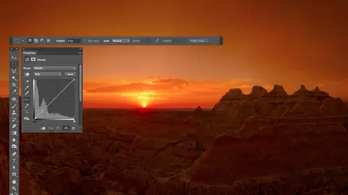
16:34Curves
44:44 9Curves Q&A
20:46 10Keyboard Shortcuts & Adjustment Layers
24:41 11Review of Curves & Adjustment Layers
16:13 12Hue/Saturation
19:08 13Day 1 Q&A
14:27 14Day 1 Wrap-Up
03:40Day 2
15Day 2 Pre-Show Banter
13:26 16Review of Day 1 Process
38:53 17HDR
33:41 18Advanced Layer and Masking Techniques
29:29 19Using Curves with Color
39:42 20Color Correction
35:04 21Color Correction Q&A
14:30 22Example Photos with Curves and Adjustments
25:09 23BONUS: Printing Tips
03:42 24Retouching
23:27 25Advanced Retouching
19:49 26Directing the Viewer's Eye
16:43 27Day 2 Wrap-Up
01:12Day 3
28Day 3 Pre-Show Banter
10:52 29Fixing Lens Flare
14:36 30Hiding Clouds
15:47 31Color, Hue, and Saturation
08:21 32Essential Keyboard Shortcuts
13:18 33Technical Issues
15:00 34Preparing Images for the Web
18:36 35Exposure Bracketing and Photo Stacking
15:52 36Blending Modes
35:07 37Review and Q&A
05:05 38File Formats
21:12 39Brush Tools
14:34 40Transplanting Clouds
20:39 41Selective Focus
18:00 42Converting to B&W
20:03 43Color Spaces
22:03 44Thanks + Credits
03:56 45Fixing Extreme Problems
20:33 46Sharpening Images
23:41 47Day 3 Wrap-Up
04:59Lesson Info
Color Correction Q&A
just gonna ask. Do you prefer Teoh? Use the lower opacity brush before you use the lower capacity clipping mask. I mean, cause I know you can change both of them, but do you have more control? If you do the brush first, you being the brush versus the thing at the top of the layers palette cause the clipping mask is something different. No, I know I've used layers before where I've done in that I've lowered the opacity of the entire layer. But is the brush a better place to start? It depends on what it ISS. If what you're trying to change needs to be done evenly and you just did too much. Then it's the opacity at the top of the layer because it needs to be even. It's just too much. But if it's something like a face where the cheeks might be more read, the tip of the nose might be more red. It might be less red, near the eyes and in shadows. Then it's the brush where if it has to vary quite a bit over an area, then it's the brush you want to use a lower capacity building up. Yeah, and so...
metimes you need more than one adjustment. Sometimes there's one for each person's face or one for multiple areas of the photo. Yeah, everybody else, Yeah. Question from Kim Warner. What is the difference between flow and opacity and using the brush? Great question, because they seem to do similar things, Right? So what I'm gonna do here is I'll choose black to paint with just to demonstrate this and we have flown. We have opacity, so let's look first, it flow. If I bring flow down, let's say Bring it down to and I show you how I did that automatically in a second because I did it with my keyboard. I'll mention it after you know the difference. If I bring flow down to 20 and I start to paint, you can see through my paint stroke, right? But if I paint over the same area again and then paint over the same area again and then paint over the same area again and do it again, you see a building up right? I have not released my mouse button, So what flow means is give me less of full strength, but let it build up if I go back and forth, huh? I haven't let go of the mouse button there, so I didn't have to let go and click again. Let go and click again. Anything like that. Let me turn flow. Now up to 100 in. Let's instead turn opacity down to with capacity of 20. We get 20% of what we are trying, 20% of whatever it is we're painting, Let's say 20% of black we can see through it just like before. But if I go back and forth and back and forth back and forth, it does not build up. So with flow, it builds up with their passing. It doesn't doesn't make any sense, but the two are connected. If you change them both, think of opacity of as the maximum. You'll get the maximum you can build up to and flow as how much of that maximum you want and your first paint stroke. So if I set opacity to and flow to 20 I'm getting 20% off 50 on my first pain struck, and if I build it up like this, I can build it up, but it's never going to go above 50 because capacity is at 50 in. The only way I could get above 50 is if I release the mouse button, then it thinks that that's the original picture, the one that has the pain on it already. And you click again and it can build up more, 50% more You could think of it. And then I have to let go of the mouse button in order to get it to build up even more. So again, if you change them both, capacity is the maximum you can get without releasing the mouse button. Inflow is how much of that maximum you want on your first paint, stroke and subsequent ones as you build it up to change those numbers. Using your keyboard, you press the number keys on your keyboard. Three will give you 30% 5 gives you 57 70 type two numbers very quickly, like seven and then 5 75 and to get it down, Teoh up to 100 type zero. What word? Just type of numbers. It is long as you're in a painting tool. Doesn't know whether you want number on. It's only going to affect opacity when you type numbers, if you want to affect flow, add shift. So if I do shift five, shift to you get flow. So shift zero. Bring that up 100 right? Thanks for that. Great. Sure. Since we're on that, let me cover something else that is completely unrelated but related. Meaning that it's one of those other questions just like that one that somebody else will ask. And that is at the top of your layers panel. You have opacity, and you have Phil, what the heck is the difference? So with that, I'm gonna choose a different colored paint with maybe a red or something else, and I'm going to paint with a relatively hard edge brush. Just so I have something for you to look at, it's not gonna be pretty. Remember, I can't draw. Um, okay, so now we have a passage. And Phil, if I bring down opacity, you're gonna be able to see through what's in this layer. So you're saying how much of what's in that layer should show up 6% of it 25% or what? When you adjust fill, it looks to do the same thing in fact, it is identical visually. But there is one important difference. And that is, if you ever go to the bottom of your layers panel where you find the letters f x down here and you apply any of these effects like bevel and emboss or drop shadow supply few of these to this layer, you know, at a, uh, drop shadow click. OK, now you're gonna see a difference with opacity. It's gonna lower the opacity of both the contents of that layer, meaning the paint and the effects that have been applied to it. If instead I just fill it will lower the a pass ity of the contents that layer, which is the paint, but not the effects. So the bevel in Boston, the drop shadow Stanfel strength. But we're going to start seeing through the red stuff. And if I bring it all the way down, the red stuff won't even be there. But the bevel in Boss and the Drop shadow is so that's the difference between opacity and Phil. If you haven't really applied any of these effects, then you're gonna find that opacity of Phil seem to be identical. So that's the other one that's related in that same kind of question, but still different. Any other quick ones? Sure, Another one that's a little bit of Ah, just looking back from a vital photo. Who, after finding the numbers when you're writing them down in a piece of paper he was having here? She is having trouble finding where he can put the output. No curves. If you could just look at that, let's do this picture right here. Perfect. So I'll open the info panel and I put my mouse on what it is I want to match, which in my case, is the dark part of the sky. Grab my mouth, my mouse, my pen, and write down the numbers. So 72. 80 on 1 So I got my numbers. Now in order, use those numbers. I go to curves in in curves. I need to click the hand. Go to the area that I want to change. Click the hand, go to the area, want to change and I need to hold on to keys. The two keys are shift and command on a Mac that shift in control on windows. I'm holding them down right now. and I'm gonna press the mouse on the area that I want to change. Hey, click. And it doesn't look like anything happened other than Little Ring showed up. But you're not gonna notice that anything happened until you get into the Curves dialog box and you change the menu from RGB to read. Then there's going to be a dot on that curve, just trying to click on anything within the curve because there's a dot added and it's active. If you click somewhere in a weird spot, it might become not active. And then the numbers at the bottom disappeared. So you know, I'm not clicking anywhere in here where the curve is leaving that alone and I'm coming down here. That's why I find input and output. We live input alone because that is the before number. It was, um, created at the moment I clicked the image it typed in numbers there for me and right here is the output number. So I'm gonna type in the numbers I wrote down the first number I wrote down with 72 which is for red second number. I need to put in for Green Waas and then the number four Blue Waas 1 Now it applies to the entire picture. And so I need a pain in the mask to make it only effect where I want it to and let me add one other detail. And that is after I type in the numbers, I look at my curves and if they either bottom out or top out, I try to prevent that. So you notice this curve here bottomed out if you look close at it. So you have just went boom down to the bottom. I'll add another dot and just try to get a smooth landing instead of a bottom out. You know, so doesn't go. Comes down nice, and that will make it so if there's any transitions into other areas, they're not gonna be abrupt otherwise, right where it bottoms out to be abrupt. So usually I would double check all of the curves and see that one bottomed out at another dot get a smooth landing going, and then I'll go to read not kind of bottomed out. The more extreme your adjustment is, the more likely it will be the bottom out or top out, depending on what kind of change you're making, and you got an extra dot in there and just finesse it until it's got a smooth landing instead of a bottom up. All right, now I have this, but it's applying to the entire picture. So what I might do here is grab my brush paint with black in with of soft edged brush. Get a huge brush because larger your brushes, the softer the edges. And so what happens is if I use a small brush like this, look at how quickly the edge fades out. Well, if you look at that a relatively abrupt transition, it's only about the width of this hand icon is not. That's not what I need. I need one that's about this wide, because that's the fade out in the skies about that wide. So if I get a huge brush now, look at how soft the edges you see it's much softer. In that way, I can come over here and get Mawr. Ah, more better transition. So I'm gonna right now. You probably don't want this applying to the bottom of the photo, but for now, let's see what it's doing to the sky see how it's getting the left side of this guy to be closer so I could come in here, then with my brush, maybe on a smaller one now and I can come down here. Or I could use something like the quick selection tool quick selection tool. I had come in here to get these buildings, and I could possibly get the doughnut. And to fill this with black because black in a mask means don't apply. There was a keyboard shortcut I mentioned probably mentioned it yesterday, but I don't know if you remember. You could describe the paintbrush right now and paint within that selection if you don't remember the keyboard truck cut. But it's option delete. That's all backspace and Windows. Now that's not perfect. It was missing the little, uh, areas of the sky here, in here and through the window a little bit, so I'd probably touched that up. But in general, this is what I'm getting Now see how the skies becoming little more even? Did that give her the you know where to put the numbers stuff. It's always good to do it again because with this kind of technique of its when you haven't done before. That's great. No, that's wonderful. Thank you. Otherwise, when you're adjusting color with curves, often times it's simply looking at your image. And you see something you say that needs to be a little warmer, where that needs to be a little cooler, and it's a matter of isolating the area that needs to be adjusted. And then, if he needs to be warmer, you either want more red where you want less magenta. I'm sorry, not less magenta, less green or less blue, which really means mawr of their opposite, which is that magenta and yellow? That would make things more warm. And sometimes that's what you need. So it's not always using eye droppers. Teoh Color Correct. It's not always using the numbers in the info palette. Sometimes it's just I need the color to be a little different. You can add a dot moving up or down a little bit, see if it looks better
Class Materials
bonus material with purchase
Ratings and Reviews
Jim Pater
I taught Photoshop (version 5) to graphic design students at the college level. I had great fun teaching. This is the perfect course to show others how they might go about teaching a Photoshop course. Congratulations Ben, on your excellent teaching style and methods. I thought I already knew quite a bit about Photoshop but this course made me aware that there's always more that you can learn.
Ron Greathouse
This course is one of the best Creative Live Courses that you have made available to us. I have purchased at least 12 courses and this course is my personal favorite. Ben is an excellent instructor and should be teaching at the university level. He is great!