Lessons
Day 1
1Free Preview: Camera RAW: Exposure & Contrast
42:43 2Camera RAW Q&A
20:25 3Camera RAW: Color
23:03 4Understanding Histograms
07:57 5Camera RAW: Localized Changes
35:36 6Understanding Saturation Clipping
09:42 7Camera RAW: Noise Reduction & Lens Correction
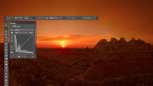
16:34Curves
44:44 9Curves Q&A
20:46 10Keyboard Shortcuts & Adjustment Layers
24:41 11Review of Curves & Adjustment Layers
16:13 12Hue/Saturation
19:08 13Day 1 Q&A
14:27 14Day 1 Wrap-Up
03:40Day 2
15Day 2 Pre-Show Banter
13:26 16Review of Day 1 Process
38:53 17HDR
33:41 18Advanced Layer and Masking Techniques
29:29 19Using Curves with Color
39:42 20Color Correction
35:04 21Color Correction Q&A
14:30 22Example Photos with Curves and Adjustments
25:09 23BONUS: Printing Tips
03:42 24Retouching
23:27 25Advanced Retouching
19:49 26Directing the Viewer's Eye
16:43 27Day 2 Wrap-Up
01:12Day 3
28Day 3 Pre-Show Banter
10:52 29Fixing Lens Flare
14:36 30Hiding Clouds
15:47 31Color, Hue, and Saturation
08:21 32Essential Keyboard Shortcuts
13:18 33Technical Issues
15:00 34Preparing Images for the Web
18:36 35Exposure Bracketing and Photo Stacking
15:52 36Blending Modes
35:07 37Review and Q&A
05:05 38File Formats
21:12 39Brush Tools
14:34 40Transplanting Clouds
20:39 41Selective Focus
18:00 42Converting to B&W
20:03 43Color Spaces
22:03 44Thanks + Credits
03:56 45Fixing Extreme Problems
20:33 46Sharpening Images
23:41 47Day 3 Wrap-Up
04:59Lesson Info
Color Spaces
So there's one other kind of technical junk you don't really want to know, but would be nice to know. Uh, or you should have some idea about. And that is, whenever you open something in, Let's say, camera at the bottom of the screen. There was a little line of text we've talked about before that you can click on, and you can choose the resolution that you'd like to have. One of the other choices in there is your color space. Also, when you create a brand new document in Photoshop, there is a choice for color space, and there are many other places where you'll see it. When you save an image, it will ask you, Do you want to save your color profile with your image? Many different places not going to spend that much time on it simply because you could literally talk all day about it. But I want to give you just a general sense, because I find that there's too much stress going on about it. It's somewhat I needed. So if you look at my screen, I have a shape up here that represents the most ...
vivid colors, at least out here on the outer bounds of it. It represents the most vivid colors that your eyes are capable of seeing. And it is in the shape because your eyes might be able to see more vivid greens than it can the others. So the green gets stretched over a little bit. And you remember how I mentioned that your images are usually an RGB mode in that when we've been working in curves, we had choices for red, green and blue into it. Adjust that well. Your color space defines what exact color of red of green and blue your images made out of. And so you could put three dots on here, one for red, one for green in one for blue, and make your own color space if you wanted to. That's all it is's in general. What color of red, green and blues. Your document Now what is that? Determine Well, if you make your image out of a really mellow red, not all that vivid green in a really mellow blue, then you're not gonna be able to create overly vivid colors because the the thing that your document is made out of the foundational colors are not all that vivid. Or you could make your image out of like fluorescent green in fluorescent blue and just ridiculously colorful colors. And then, by doing so, you could produce much more vivid colors within your document that you couldn't do if you were using mellow colors like pastel colors just about, you know. And that's really what this has to do with the main choices that you'll end up working with. R s RGB in S. RGB uses the color of red that you see at the tip of this triangle color green of the other tip and the color of blue. That's down here now. It's not the actual colors that are shown here at these tips, because remember, this entire shape represents the most vivid colors here I is capable of seen all the way around its edge in this screen. Can't show you those colors. I've seen a green much more vivid than that one. I've seen a red more vivid than that, but it represents that. So all that means is compared to the most vivid red that you could see the one used in Aus RGB. Is this compared to it then The other choice is that you're mainly going to choose between is s RGB Here's adobe rgb and then the 3rd 1 is pro photo. You can see a difference between the three. The shapes air progressively larger. And so what that means is that if you're in s RGB, which is the smallest of three triangles, you're going to be limiting the range of colors within your image somewhat. And if you chose Adobe RGB, your document would be capable of containing areas that would be more vividly green. Then you could have in us RGB also more vividly scion a little bit, just a little bit more vividly yellow. If you compare the two smaller triangles that are there, it does not mean at all that your image actually contains those colors. It just means that if you were to take the saturation slider and you were to push it higher and higher and you happen to have content within your picture like, let's say, flowers that are overly vivid or if you remember a picture of mine that had some hot air balloons and there were overly vivid and you pushed your saturation slider up higher and higher. You could potentially get more vivid colors if you were in Adobe RGB instead of SRT, because it is capable of pushing him out that way. Does that make sense now? The time you can tell if that would happen is if you ever look at a hist a gram. Remember, we talked about Cameron. We talked about adjusting color with camera. Are thinking about color. We looked at the history Graham, and we thought about color. We thought about the color part of it, and if you bought saturation up too high, you would see a spike at the end of the history. Graham that was colored. Remember that it's on Lee. If you see a spike at the edge of the history Graham that it means that you're pushing colors beyond trying to push colors beyond your color space, meaning you're trying to make them more vivid than you can in the color space urine, meaning If you're in SRG being, you shove it up and you get those spikes. It means you're you've made it to the edge of that color space and you're attempting to push beyond, But you can't and so you get the spikes in your loose in detail there. If you don't see the spikes at the end of the history. Graham, you have not reached the edge of the possibilities. Now you might think bigger is better. You're like, Oh, I'm going for the big one. Well, the problem without is most people when they see your photographs that either see him on your computer, screen your cell phone screen on the Internet or you end up printing them, and that's how you usually see your images. So if we look at what could be reproduced in different ways, let's see what we can reproduce in. Let's say the newspaper. If your newspaper photographer do you see that shape I just put in there? That's what a newspaper could reproduce generically mean. Different newspapers could reproduce different ranges, but this represents what you can reproduce in a newspaper. So if that's the case in your newspaper photographer and this is all you can reproduce in the paper, you can't get anything more vivid than that. Then why would you need anything bigger than the smallest triangle that's over laid on? Does that make sense to your head? Okay, but not everybody prints in the newspaper. Some people will print in a magazine or in other kinds of printing. This represents the higher quality printing process other than a magazine. If you print in, a shiny brochure can get bigger like that. And so now you notice that the smallest triangle would limit you somewhat in that. If you had very vivid content within your picture and you started poking pushing up saturation, you'd start getting those spikes on the end saying you're trying to push beyond what you can have. And if you had chosen instead of S RGB, he chose the medium sized triangle of Adobe RGB. You wouldn't have gotten those spikes. You wouldn't have started to lose detail because you only get those when you start trying to push outside of your triangle so I could get it out there and I could get it so I could get colors reproducible in in a nice coated paper brush. Er, but not everybody prints on a printing press. Some people print on a desktop printer. Now, unfortunately, I don't have plots like this for modern inkjet printers because I don't know the software that was used to create this and I would have to spend hundreds of dollars to get that in order. Remake him. It's just not needed for the the what I'm showing here because all you need to know is the general concept. You don't need to know the exact shape of everything. So here are some older inkjet printers. Here's spring on Premium glossy paper on an older Epson printer. Do you see how big that shape is? And if you compare it to the triangles, it looks to me like the smallest triangle might limit you a bit if you have vivid colors where if you try to push him with a saturation slider, if you ever get the spikes on the end is like if you would have chosen what's known as a bigger color space like Adobe RGB, you wouldn't have got the spikes yet. You would maintain the detail in that bright, vivid part of the picture, and you could push it out there further, and you could actually reproduce it on that printer, which would be nice. But regardless of what kind of printer I were to choose, you will find that none of them come anywhere close to the shape of the Big One big guy. The problem with Big Guy is first off, look at it and notice that it's triangle is so big that in some places it goes beyond the shape of that colorful diagram that's underneath it. What that means is, if use 100% green in that particular color space, it's agreeing that it's so vivid. Your eye cannot perceive that it's more vivid than the vivid ist green, your eyes capable of perceiving. It's like a theoretical green when it comes to your eye and same with the blue, it's outside of the range of your perception. So it's It's kind of a theoretical one that read Israel close, though to most vivid red that you could dio. And if you are in that color space and you increase the saturation, you're gonna be pushing your colors out and you can if you wanted to push really far out there beyond what you could print on your desktop printer. Beyond what you can print on a printing press beyond a lot of things. And so here's what I say about this. First off, don't worry about this. The only time it's really gonna be any kind of an issue is if you look at a history Graham, and on the ends, you see colorful spikes. If you don't see that on your pictures, don't worry about this at all. But if you work with colorful images and I need really colorful images, flowers, hot air balloons that are all vivid and all that and you crank up your saturation and you constantly see spikes on the end there colorful, that's when you might consider going to a bigger color space. So the smallest color space is known as S RGB. The medium triangle in there is Adobe RGB in the Big One is pro photo. I would not casually suggest anyone go to Pro Photo if you are a color nerd. If you're somebody that just absolutely geeks out about every little detail when it comes to color, I'm not gonna talk you out of Pro Photo, but there are disadvantages of it. It's easy to create colors that can't be printed to get him to vivid, and it's easy to get him where you can't even see the vividness of them on your screen because your screen can't show you much of that. The one of the problems that I find with pro photo, which is a big triangle, is if you ever make color adjustments and curves, and you add a dot and used up and down arrow keys to move in the tiniest amount. What you'll find is moving it up. Just one arrow key up, meaning that the smallest amount you can is actually quite a large change in the image. Because when you go up and down and curves to make an adjustment, you only have 256 choices. You could hit up 256 times to get to the top and then 206 times to get all the way to the bottom. And when you have this wide of a color space, it makes it so. It's difficult to make subtle adjustments, and so I find that I don't tend towards pro photo. I don't tend to talk people into pro photo, but I'm fine if somebody wants to be there, So what does it mean for you? If you're not a color geek? All I would say is I wouldn't do pro photo unless you have a very good reason. And you're very educated about what you're doing color wise. All right, For most people, it's a choice between s rgb an adobe Arjun. If you hate thinking about technology and you hate thinking about the technical stuff and you want your life to be simple, the simplest it can be s rgb. There are probably about 10,000 people online right now going in there going Oh my God! No way. But what happens is first off, you need s RGB if you're going to load your image up on the Internet to be displayed on a website because most software that thinks about that assumes your pictures and s RGB Although some modern browsers congee with other things, if you're gonna send your images off to a color lab that prints them for you Ah, lot of the color labs tell you to send your images and house RGB. That's what they require for their particular kind of output. So if you use s rgb, you're going to make it so your image doesn't have to have any conversion happen before you put it to the Internet or send it off to your color lab. It look fine on your desktop printer. His long as you don't have overly vivid colors that are like flowers that you absolutely cranked to the max. You can tell if you could use a bigger color space if you get colorful spikes on the end of your history. If you get those colorful spikes all the time and you hate it because you want more detail in the most saturated parts of your image, then consider Adobe Adobe RGB. And that means that in camera rock, bottom of the dialogue box or some text there that you could click on, you would want to change a setting them there to Adobe RGB in Photoshopped. You would want to come up here to the edit menu, and you would want to go down to something called color settings and right up here where it says RGB this means if I create a brand new document, what's my default setting for color space? And I would send it to Adobe RGB say OK, I'm not gonna be s RGB, which is default. I'm gonna be adobe and then one thing you want to worry about is if you ever send somebody an image that's gonna be uploaded to the Internet. Make sure that you use the Save for Web choice. In there is a check box that says Convert to S RGB. Make sure it's on because that is where it'll make sure the colors get transformed in a way that they displayed properly on the Internet, where if you leave it in adobe RGB, it might shift. It might look weird. So you say for web and turn on that little check box. And if you need to send a bunch of images to somebody else, then what I suggest you dio if you don't know how they're going to use the images. And they're not a high end place, meaning they're not a place used to reproducing things with high end color. What I would dio is select the images that you need to send them. Enbridge, go to the tools menu, choose Photoshopped and shoes Image processor. When you're all completely done with your images, you're gonna keep yours and adobe RGB. So if you print on your printer, you could get that wider range of colors. You're about to send him to somebody else. You're not sure if they're sophisticated with color and you just want to give him the safe choice which is s RGB You choose tools Photoshopped image processor. This thing comes up and this is just asking you where do you want to save the pictures? And I would say Let's save it out to J Peg and all that and you just turn on convert srg be right there. And that means that this is going to save out a copy of your picture. You can scale it down to a smaller size if you'd like, or you can turn off that check box to give it full size. And it will save a copy of your pictures in a new folder that are saved out of J pegs. And by having that check box turned on, it will convert inform for you. So if you need to send it out to a color lab that needs s RGB, where you showing them off to somebody doing the Internet or anything else? You could give them something that is in that that color space. So there's always a lot of questions about color, space and some things. The main thing I wanted to do here is not ended the discussion of color spaces, but just give your brain a little bit of an idea of what it meant. And hopefully that's that visual I have here just tells you Adobe RGB You can get more vivid and pro photo. You get even more vivid in the time you can tell if you're pushing outside and trying to go more vivid spikes on the in the history. Graham. They're colorful. It's only if you're getting that all the time. They might want to consider going to a bigger color space. And if you do, I would suggest Adobe RGB. I have no problem with anybody working in Pro Photo, but I would prefer it to be people that are completely educated about what's going on there. And they've made a very educated choice about it because it's easy to screw things up there. All right, so that's a questions about that. Oh, boy, we have questions. Of course you dio so many questions. Okay, so from mad Max, you up just to clarify when you convert an image from a bigger color space to a smaller one. How does Photoshopped do the conversion? What happens to the colors outside of the smaller one. Uh, so the question is, if I have a picture that is a bigger color space, let's say it's in pro photo. And not only that, but you've cranked up the saturation. So the picture itself contains stuff that's out side of what could be made in the others. If you convert it to another color space, it will kind of take all of the colors and squish him down to make a mellower so they fit within that you can actually define how it's done if you have a picture open and you and you choose Edit Convert to Profile There is a pop up menu right here that tells it how to do it, and so you can tell it to do it in different ways. Don't want to get into that in detail right now because people's heads will explode. But it's one of those things where it's going to shrink the range of colors to make it so It fits within, um so I don't know if we're opening up a whole other can of worms here, but James, he says, Does it matter if you shoot your pictures and SRG VR Adobe RGB only if you should. J Peg. That's what it effects. If you shouldn't raw format your determining that choice at the time you open it in camera. That little text at the bottom of the camera dialogue is what determines it. You can set your camera or whatever you want. There is for J pigs, and there's a selection. And later it's not a matter of when you import. It's in light limits when you export. When you export, you could make export presets and things, and in there you can tell it. I want to export this as house RGB or Adobe RGB. Yeah, maybe, maybe one more from Mr Sam Cox in Loveland, Colorado, who says is information about the color space embedded in an image files and metadata. Yeah, what happens is when you save an image, if I just open any picture and choose save as at the bottom of the save ask dialog box is a check box. It says embed color profile. And if you turn that on, then it includes the name of the color profile with your picture, and you need to have that turned on. If you ever see that in bed color profile, leave it turned on the only time it wouldn't really be critical is if you're gonna upload to a website in your images already s RGB Because if your image is what's known as antagonist me, it doesn't know what that setting waas It makes the assumption that s s rgb so but yeah, you want to have that check box turned on and that will allow it. So if you open this and Photoshopped, it will know exactly how to get your colors to look the way they're supposed to. And that's also why I mentioned, if you ever use the numbers to do anything like in curves like get a skin tone out of one picture using another need to make sure that those color spaces match because if one of them was in pro photo and it says use 100% red, you hear how far over 100% red was on that chart compared to S RGB, where 100% red would be quite different position. The numbers that would show up for particular areas would be considerably different between color spaces, so If you ever use the numbers from one image to apply them in another, make sure they match in another dialog box they had in bed I c c profile. Huh? What is that? Compared to color space? Uh, generically, you could call them the same. Any time you see something about embedding a profile, it means a color profile. Which is how would I say? The format that you define it in was, I think, came up with by the International color consortium, the I C C. So, officially, it's an I C C color profile. All it means is attached. The name s RGB, adobe RGB or pro photo to your picture when you see that.
Class Materials
bonus material with purchase
Ratings and Reviews
Jim Pater
I taught Photoshop (version 5) to graphic design students at the college level. I had great fun teaching. This is the perfect course to show others how they might go about teaching a Photoshop course. Congratulations Ben, on your excellent teaching style and methods. I thought I already knew quite a bit about Photoshop but this course made me aware that there's always more that you can learn.
Ron Greathouse
This course is one of the best Creative Live Courses that you have made available to us. I have purchased at least 12 courses and this course is my personal favorite. Ben is an excellent instructor and should be teaching at the university level. He is great!