
This guide to basic hand lettering for beginners is a great place to start whether you're a complete design novice or a working professional looking to expand your toolkit.
 Pens
Pens come in a lot more varieties. “I love working with really fine point ink pens, but I have many friends that prefer thicker brush pens,” Prima says. It’s all about finding what works for you. She says a good starter set of fine tip pens, is Micron. “They come in in a range from really tiny (for those little details that give your work a little something extra) to a nice thick size to fill in your letters with black ink. These are perfect if you really want to focus on clean, detailed letters,” she says. For a more loose, freeform style, Prima says brush pens for brush lettering are the best, and she recommends Tombows.
“The most important thing is to practice and find what tools work for you and your style,” says Prima.
Pens
Pens come in a lot more varieties. “I love working with really fine point ink pens, but I have many friends that prefer thicker brush pens,” Prima says. It’s all about finding what works for you. She says a good starter set of fine tip pens, is Micron. “They come in in a range from really tiny (for those little details that give your work a little something extra) to a nice thick size to fill in your letters with black ink. These are perfect if you really want to focus on clean, detailed letters,” she says. For a more loose, freeform style, Prima says brush pens for brush lettering are the best, and she recommends Tombows.
“The most important thing is to practice and find what tools work for you and your style,” says Prima.
 Prima starts each project with this simple warm-up. Using a ruler, make straight lines on your paper. Start by making some angled straight lines, moving to more complex curves and shapes. Try to keep your shapes the same and evenly spaced. "This will help you with balance and kerning in your future hand lettering pieces. And take your time—it is better to be slow and accurate than quick and messy,” she notes. “Shapes and lines are the building blocks for letters so they are really good for practicing. I draw lines and curves to practice my spacing and control of the pen. This is also a good way to get to know new pens and pencils and see how they work.”
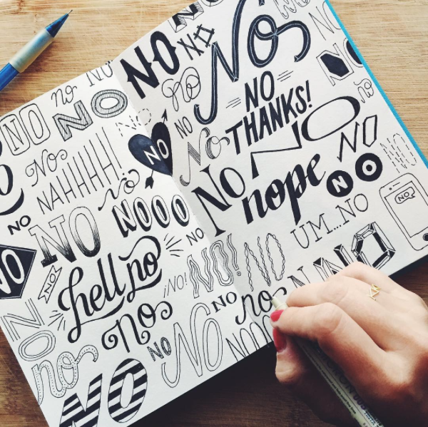 Take a small word, or just simply a letter of your choice, and draw it in as many ways as you can think of. Fill the entire page, or multiple pages and don’t think about it too hard. Don’t worry about it being good or pretty. The most important thing is to practice and try and do it every day. This is just about trying something new and seeing how far you can push your letters! “I do this practice regularly, and many times it turns out very ugly. But in those ugly sketches, sometimes I find something that inspires me to create something great,” Prima says.
As with any type of art genre, it’s a good idea to know what’s already out there and see what works and what doesn’t, and what styles appeal to you. Lydenburg says, “Start by examining lots of fonts. Particularly, look at where the weight falls and the white space that is created by each letter. White space is just as important as what you are drawing.” When she starts a project, she builds her letters from the inside out, noting, “sometimes it helps to start with a more skeletal structure and then build up the body of the letter around that.”
Take a small word, or just simply a letter of your choice, and draw it in as many ways as you can think of. Fill the entire page, or multiple pages and don’t think about it too hard. Don’t worry about it being good or pretty. The most important thing is to practice and try and do it every day. This is just about trying something new and seeing how far you can push your letters! “I do this practice regularly, and many times it turns out very ugly. But in those ugly sketches, sometimes I find something that inspires me to create something great,” Prima says.
As with any type of art genre, it’s a good idea to know what’s already out there and see what works and what doesn’t, and what styles appeal to you. Lydenburg says, “Start by examining lots of fonts. Particularly, look at where the weight falls and the white space that is created by each letter. White space is just as important as what you are drawing.” When she starts a project, she builds her letters from the inside out, noting, “sometimes it helps to start with a more skeletal structure and then build up the body of the letter around that.”
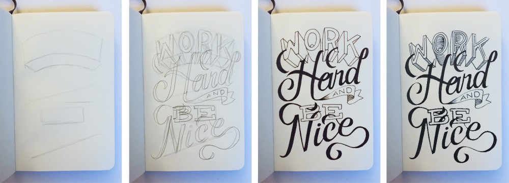 Take a short phrase and give it some life. Take a look at your page(s) from the last exercise, and pick a few styles of letters that really stand out to you. Pay attention to the words that are the most important and should stand out the most. Sketch each word in a slightly different style— don’t be afraid to mix very different looks together.
“I always start out with a very basic layout so that I know I have enough room for every word,” Prima says. “Then I lightly sketch in the words and make sure they fit and look right together. Don’t be afraid to have your letters interacting with one another. Next, I outline my letters in a thin ink pen and erase the pencil. Finally, I do all the details and shading that make the piece look finalized!”
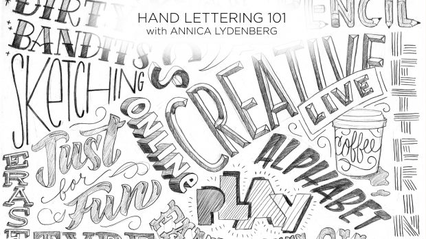
Don't forget to check out Hand Lettering 101 with Annica Lydenberg for the complete introduction to hand lettering.
Lydenberg advises, “Pick up a random piece of lettering, photograph a sign, tear out an advertisement, or pick up a cool package. Then select a short word and make up what you think the rest of the alphabet would look like. You may only have five letters to go on. Try making up the other 21 and maybe even numbers and punctuation if you feel ambitious!”
Hand lettering takes lots and lots of practice, so don't give up. Continue drawing letters with these exercises and you'll eventually see big improvements.
If you enjoyed this Hand Lettering for Beginners guide, you'll love learning more about the art form in CreativeLive's online class, Hand Lettering 101.
Take a short phrase and give it some life. Take a look at your page(s) from the last exercise, and pick a few styles of letters that really stand out to you. Pay attention to the words that are the most important and should stand out the most. Sketch each word in a slightly different style— don’t be afraid to mix very different looks together.
“I always start out with a very basic layout so that I know I have enough room for every word,” Prima says. “Then I lightly sketch in the words and make sure they fit and look right together. Don’t be afraid to have your letters interacting with one another. Next, I outline my letters in a thin ink pen and erase the pencil. Finally, I do all the details and shading that make the piece look finalized!”
Don't forget to check out Hand Lettering 101 with Annica Lydenberg for the complete introduction to hand lettering.
Lydenberg advises, “Pick up a random piece of lettering, photograph a sign, tear out an advertisement, or pick up a cool package. Then select a short word and make up what you think the rest of the alphabet would look like. You may only have five letters to go on. Try making up the other 21 and maybe even numbers and punctuation if you feel ambitious!”
Hand lettering takes lots and lots of practice, so don't give up. Continue drawing letters with these exercises and you'll eventually see big improvements.
If you enjoyed this Hand Lettering for Beginners guide, you'll love learning more about the art form in CreativeLive's online class, Hand Lettering 101.

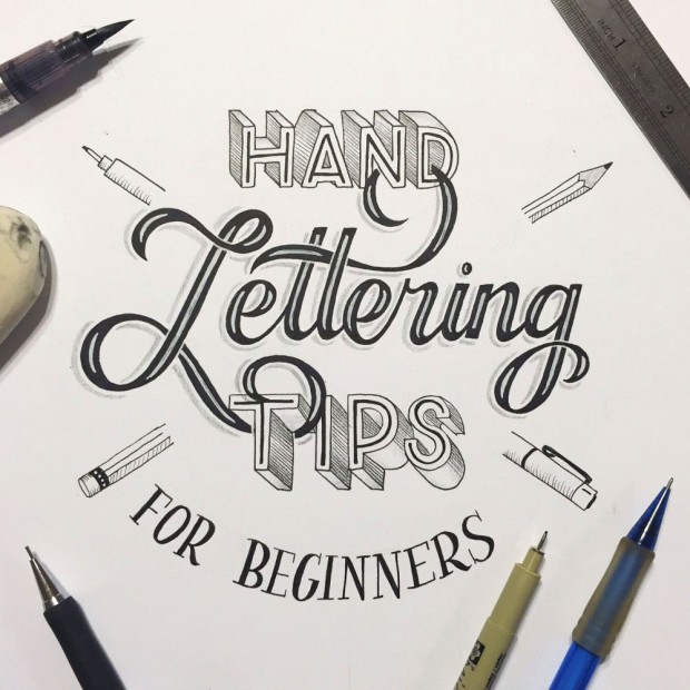
Hand Lettering for Beginners: 5 Lettering Tutorials to Get You Going
From street signs to chalkboard menus to national ad campaigns, you can discover hand lettering everywhere. But it’s also intimidating for those of us who are just getting started. It takes practice, so luckily we have two lettering experts, Annica Lydenberg and Roxy Prima, to give us some tips to get started.
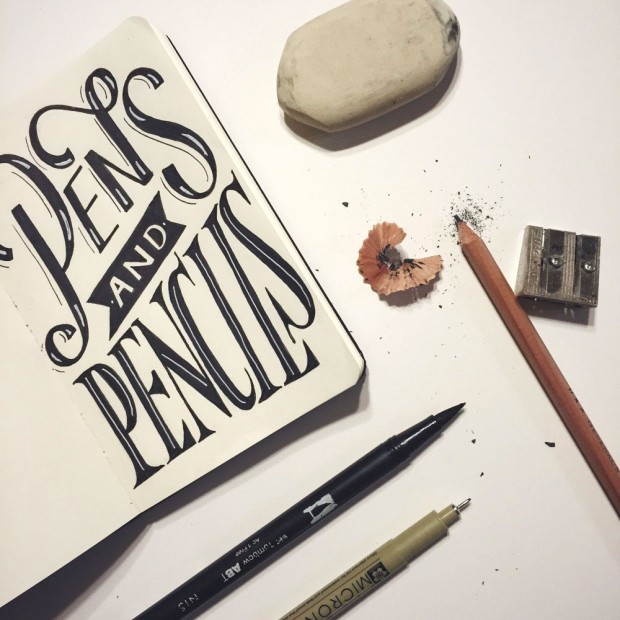
1. Choose Your Pens & Pencils
Having the right supplies will help make hand lettering easier, but you don’t have to go out and spend a fortune on pens and pencils or brush tips right away. There is an extensive range of devices, depending on what kind of style you are going for in your lettering. Pencils: Mechanical or Lead In Prima notes, “I like to use mechanical pencils because they always stay sharp. My favorite is the Koh-l-Noor Mephisto Pencil.” Lead in pencils can be hard or soft, ranging from 6H (hard) - 6B (soft), with HB being middle of the road. Lydenberg says, “I typically sketch at first with lighter pencils—meaning harder lead—and then move on to softer lead, darker pencils, once my design has taken more shape.” Take a look at this pencil hardness guide for reference. If you're just starting out, you can grab just about any drawing pencil set from your local art supply store. Don't forget to check out Hand Lettering 101 with Annica Lydenberg for the complete introduction to hand-lettering.
Pens
Pens come in a lot more varieties. “I love working with really fine point ink pens, but I have many friends that prefer thicker brush pens,” Prima says. It’s all about finding what works for you. She says a good starter set of fine tip pens, is Micron. “They come in in a range from really tiny (for those little details that give your work a little something extra) to a nice thick size to fill in your letters with black ink. These are perfect if you really want to focus on clean, detailed letters,” she says. For a more loose, freeform style, Prima says brush pens for brush lettering are the best, and she recommends Tombows.
“The most important thing is to practice and find what tools work for you and your style,” says Prima.
2. Choose Your Paper
This is a huge category and everyone works differently. Sketchbooks or lettering books are always great to have on hand, and one of Prima’s favorites is the Canson Multi Media Paper Pad. “I like it because if I am using ink pens, the paper is thick enough that it won’t bleed through,” she notes. Tracing paper is also really good to have when you are first starting out. “It gives you a nice smooth surface to practice on, while not draining all the ink in your pens.” Lydenburg suggests using graph paper. “It will help you keep the weights consistent as well as your baseline, x-height, and cap height.” Once you’re past the initial sketching stage, you may want to graduate to a nicer sheet for your final work-up. Prima uses Bristol paper for her final pieces for its smooth surface and thick weight.3. Do Some Warm-Up Exercises
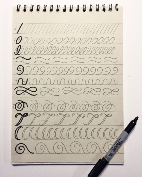
We’ve established the tools, so let’s start sketching different lettering styles.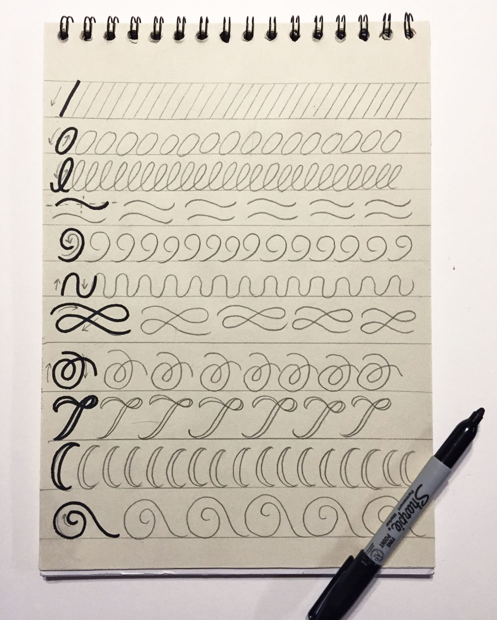 Prima starts each project with this simple warm-up. Using a ruler, make straight lines on your paper. Start by making some angled straight lines, moving to more complex curves and shapes. Try to keep your shapes the same and evenly spaced. "This will help you with balance and kerning in your future hand lettering pieces. And take your time—it is better to be slow and accurate than quick and messy,” she notes. “Shapes and lines are the building blocks for letters so they are really good for practicing. I draw lines and curves to practice my spacing and control of the pen. This is also a good way to get to know new pens and pencils and see how they work.”
4. Start Lettering!
Now that you feel comfortable with the basic shapes of letterforms, and your hand is nice and warmed up, it’s time to play! “Hand lettering gives you the freedom to do anything you want with your letters, so experimentation really helps me come up with new ideas,” says Prima.
Take a small word, or just simply a letter of your choice, and draw it in as many ways as you can think of. Fill the entire page, or multiple pages and don’t think about it too hard. Don’t worry about it being good or pretty. The most important thing is to practice and try and do it every day. This is just about trying something new and seeing how far you can push your letters! “I do this practice regularly, and many times it turns out very ugly. But in those ugly sketches, sometimes I find something that inspires me to create something great,” Prima says.
As with any type of art genre, it’s a good idea to know what’s already out there and see what works and what doesn’t, and what styles appeal to you. Lydenburg says, “Start by examining lots of fonts. Particularly, look at where the weight falls and the white space that is created by each letter. White space is just as important as what you are drawing.” When she starts a project, she builds her letters from the inside out, noting, “sometimes it helps to start with a more skeletal structure and then build up the body of the letter around that.”
5. Produce a Finished Piece
Take a short phrase and give it some life. Take a look at your page(s) from the last exercise, and pick a few styles of letters that really stand out to you. Pay attention to the words that are the most important and should stand out the most. Sketch each word in a slightly different style— don’t be afraid to mix very different looks together.
“I always start out with a very basic layout so that I know I have enough room for every word,” Prima says. “Then I lightly sketch in the words and make sure they fit and look right together. Don’t be afraid to have your letters interacting with one another. Next, I outline my letters in a thin ink pen and erase the pencil. Finally, I do all the details and shading that make the piece look finalized!”
Don't forget to check out Hand Lettering 101 with Annica Lydenberg for the complete introduction to hand lettering.
Lydenberg advises, “Pick up a random piece of lettering, photograph a sign, tear out an advertisement, or pick up a cool package. Then select a short word and make up what you think the rest of the alphabet would look like. You may only have five letters to go on. Try making up the other 21 and maybe even numbers and punctuation if you feel ambitious!”
Hand lettering takes lots and lots of practice, so don't give up. Continue drawing letters with these exercises and you'll eventually see big improvements.
If you enjoyed this Hand Lettering for Beginners guide, you'll love learning more about the art form in CreativeLive's online class, Hand Lettering 101.
Do you want to learn more hand lettering, typography and design skills? Shop all Art & Design classes now!