In his class Create a Knockout Design Portfolio, award-winning designer and art director Ram Castillo unveiled crucial design principles that should be factored into every design you make. Here, in Ram's words, are the first three:
1. Relevance
Do not be led by aesthetics. I’ll say it again. Do not be led by aesthetics. Be led by relevance. I cannot emphasize this point enough. This requires you to do adequate research before beginning any design brief. The more you know about your communication objectives, the target audience demographics, the culture of the brand, the perceptions of the market, and the environment the design will be seen in, the clearer your mind will be when making design decisions. Once you start uncovering this information, you can get to the solution quicker because you’re informed by the psychology of the people you are speaking to. In your attempts to create disruption, always ask yourself, “Does it create relevant conversations between brand and consumer?” Oftentimes, relevance is what creates the disruption you’re looking for.

2. A Grid System
Whether you stay in the grid or break out of it, you must have one. Why? Because you need to organize the information in a hierarchy that is easily digestible, alluring, and pleasant to look at. Do not start a project without one. Four columns, six columns, twelve columns – see what works best for the brief or task.

3. Typography
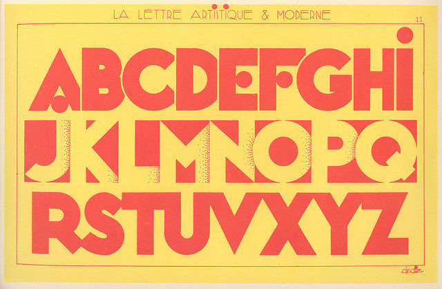
Typography can make or break any communication piece. It’s a craft in itself. Kerning and leading text should become second nature and be used appropriately. Your objective should be on legibility first and foremost. So if the heading or copy needs more space, give it some. If it needs to be tighter -- make it tighter. Font weights and size should be used in consideration of the information hierarchy. For example, using a bolder weight for sub-headings and a lighter weight for copy is common as it helps the reader scan the content of the page easily. Line breaks must flow both with the reader’s eye and with the content. A line break shouldn’t be disruptive. Typography overall need not be flat. You’re only restricted by your imagination. For instance, if you’re designing a poster with the word ‘SUMMER’, there’s no reason why you shouldn’t explore the letters with beach-themed objects. If it hits the tone of the brief, then great; if it doesn’t, it’ll reaffirm that the other design direction you’ve done is the better solution.
A portfolio is a designer’s calling card. Job-seeking designers must capture the interest of potential clients and employers, but the elements of an attention-grabbing portfolio are far from obvious. Learn how to showcase your best work with Ram Castillo's Create a Knockout Design Portfolio.