It’s that time of year, when the summer blockbusters are released to much fanfare with overblown, Hollywood budgets. But with so many movies hitting the theaters at once, it’s sometimes hard to decide which one to see. Fortunately, you can usually judge a book by its cover, or in this case, a movie by its title treatment and logo design. Here, along with Matthew Jervis, we discuss five movie logo treatments and how they stack up in the frenzied Hollywood landscape. We’ll ponder why some logos work and others don’t.
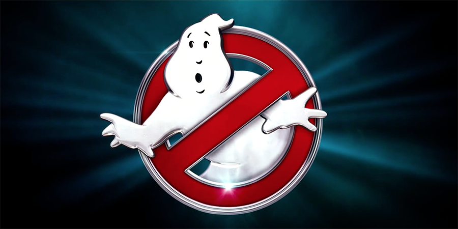
 But Gross never thought it would see the light of day, as he explained in an old interview. “The logo was in the script. The guys in the film had this logo on their shirts,” so he had to devise something long before the production started. He came up with the concept of a ghost coming out of a “no” symbol, and asked Boates to comp up several variations. Gross never expected the logo to take hold the way it did, yet here we are 32 years later, and it still endures.
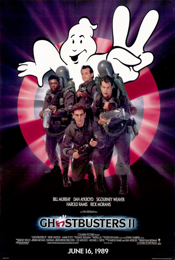 In the 1989 sequel, the logo was cleverly changed to show the ghost holding up two fingers. Ghostbusters merchandise has been flying off the virtual shelves of online retail outlets, showing that a good logo will stand the test of time, even if it’s for a fictional company.
Jervis: Don’t mess with success.


Ghostbusters
One of the most highly anticipated movies of the summer, Ghostbusters, has come a long way, featuring an all-female cast in this remake, but one thing hasn’t changed at all: the logo. Devised by designer Michael Gross and Brent Boates more than 32 years ago, the logo has not been cleaned up, touched up, or tweaked in any way. Its genius in its simplicity. But Gross never thought it would see the light of day, as he explained in an old interview. “The logo was in the script. The guys in the film had this logo on their shirts,” so he had to devise something long before the production started. He came up with the concept of a ghost coming out of a “no” symbol, and asked Boates to comp up several variations. Gross never expected the logo to take hold the way it did, yet here we are 32 years later, and it still endures.
 In the 1989 sequel, the logo was cleverly changed to show the ghost holding up two fingers. Ghostbusters merchandise has been flying off the virtual shelves of online retail outlets, showing that a good logo will stand the test of time, even if it’s for a fictional company.
Jervis: Don’t mess with success.

Finding Dory
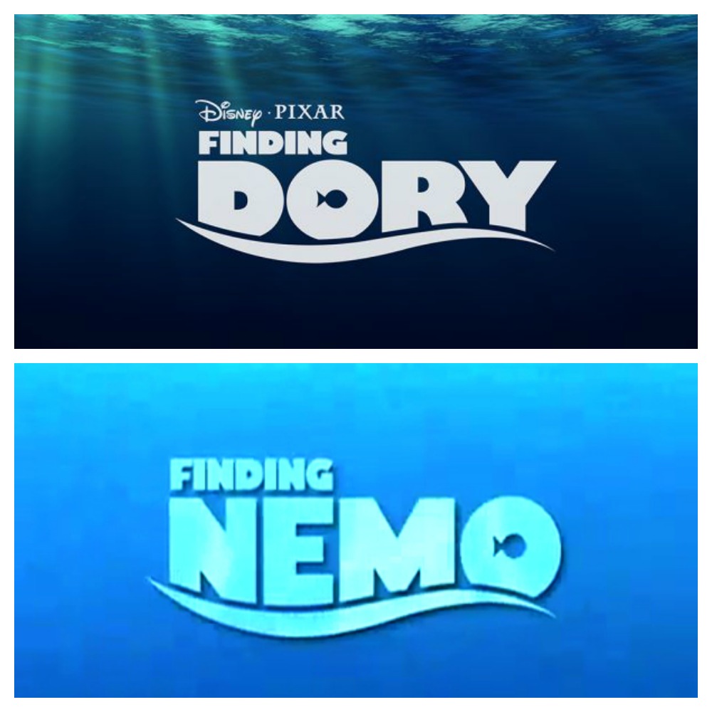
In this sequel to Finding Nemo, the studio went with a branded look, that doesn’t seem to work as well the second time around. But, whatever little design issues we have with the type treatment, doesn’t seem to affect box office sales, as Finding Dory had the highest grossing debut of all time for an animated feature. Jervis: A branded decision might not be the best option when it comes time to expand the brand in a way that was not in sight when it was created. I think this was the case with the Dory title. The letters seem too big and kind of clunky, and doesn’t relate to the storyline, which is about friendship and acceptance. In the end it’s easy to point to the franchises’ branded look to explain the design, but I still think they could have done something different to make it more aesthetically pleasing and connect better with the story.
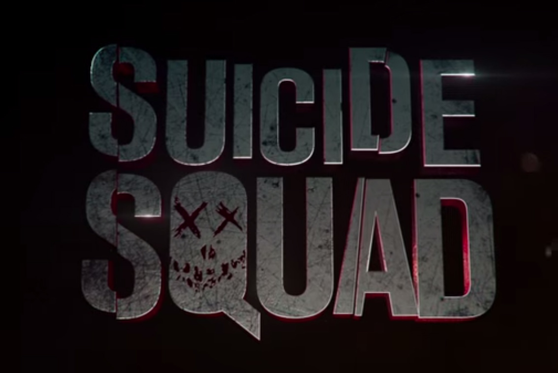
Suicide Squad
This movie, based on the DC Comic, has all the trappings of an action-based thriller, featuring a team of dangerous villains sent on a covert mission. Jervis says of the logo, “The punk rock aesthetic with a thrown-together placement really reflects the theme of the film. I like this logo for that reason.” Jervis: If there was one thing you could knock this logo on, is that it could be a little trite. Obvious. The hand skull with x’s for eyes, blah blah. But in a comic book universe for crying out loud! It looks like it could be stenciled on a street or a wall in an alley. I also like how they expanded the branded look to include cool icons for the characters. Thoughtful, memorable, consistent, and simple!
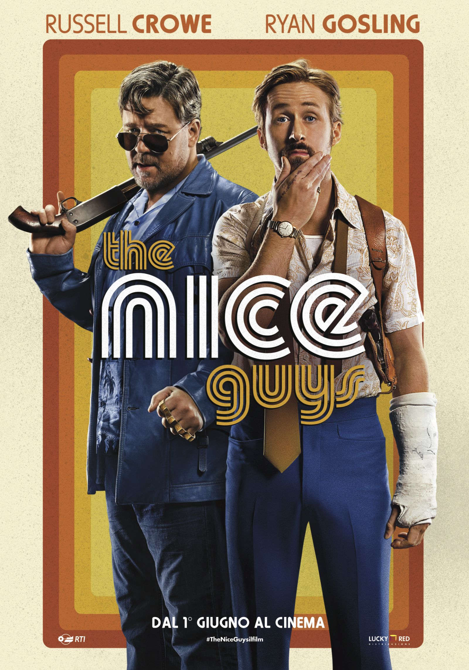
The Nice Guys
With leading men like Russell Crowe and Ryan Gosling, you can hardly go wrong, but the title type treatment may be a little misleading. It seems to indicate this is a fun romp through the disco decade, which is a little misleading, considering the film is pretty violent. Jervis: Boom! The 1970s always wins. Whether we’re talking porn, sports, or cops—put some bell bottoms and a fro on it and the movie-going public will be there. I feel that’s the story here. It’s a lot kitsch, but not a lot of connection to the story. Don’t get me wrong—they had to go this way to a certain degree, but they could have given us a little more. I say this, but I’m as guilty as anyone else—I love Pump Triline typeface. It’s cool and an authentic typeface from 1977. So props for doing their research!