
 The one thing all successful apparel brands have in common is a strong point of view, a unique perspective that informs every one of the many details that go into creating a garment: concept, silhouette, materials, graphics, presentation, and so forth. Few brands do a better job of articulating their point of view than Homage, largely driven by Design Director Shawn Khemsurov's taste for design that's a little odd, naive, and off-kilter. While the brand's heritage is firmly anchored in vintage Midwestern sports culture, they've grown to include everything from American Gladiators to Goonies without ever losing sight of the roots. I caught up with Shawn, who I worked with as a designer at Abercrombie & Fitch, to talk about how they balance old vs new, accessible vs weird, vintage vs modern, and OSU vs Michigan.
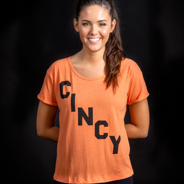
Great example of the Homage aesthetic: super simple, clean, and easy-to-wear, but a little bit weird and unsettling at the same time.
One of the big challenges for any designer is balancing your own personal tastes with what sells. You tend to like really weird design-- which is what makes you such a good designer-- but Homage product needs to be accessible. How do you balance scratching your own creative itch for weird stuff with making sellable product? I think of myself as both sides of the brain, as corny as that may sound. Working at Abercrombie, I was always paying attention to sales as well as design. Even though I was a graphic designer, I was always interested in what was selling and why, because at the end of the day we have to sell shit. So I kind of approach it as if I was working at an agency, where you have things that you personally like, but you also have to please the client, but in this case the client is our customers. I think part of the reason I’m good at thinking that way is because I’m not a trained designer and I wasn't an “art kid” growing up- I went to college for earth science. The fact that I came into design later on in life lets me view it in a different way, in particular that I didn’t have some aesthetic style that I believe was more important than selling.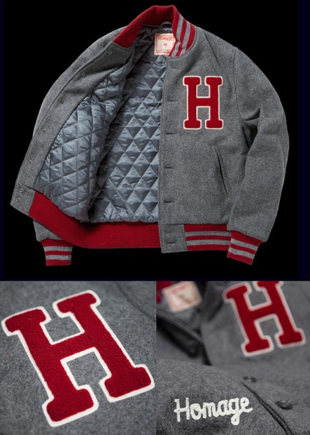
Homage's varsity jackets are as authentic as it gets, full of rich, vintage details like wool felt applique, chenille and chain stitch embroideries, and the classic cropped fit-- definitely a labor of love
You work is heavily inspired by vintage graphics, but it still has its own voice. How do you find that sweet spot of borrowing without stealing or copying? The key to borrowing without stealing is rather than actually taking a specific element from a vintage sample and using that verbatim, it’s more about understanding the handwriting of that vintage sample and using it to execute your idea own, original. For example, we do a lot of scanning of old alphabets. We’ll end up with an incomplete set of letters, then finish the alphabet on our own, and use them on completely different phrases. So you’re kind of mixing and matching, you’re never taking a complete idea. So you end up with something totally new, but that has that vintage vibe that we are all in love with. And now that we're bigger, we have even more tools. For example, we have a full-time illustrator, so I can get original art any time I need it instead of scanning something from a vintage sample-- like if I need a baseball player in a certain pose or whatever. Then we can take that art and remix it with some old font from a vintage sample so it’s grounded in authenticity and looks like a cool fan-made shirt from the '70s, but it’s 100% ours.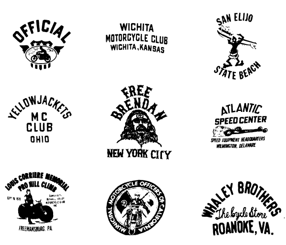
Various scanned vintage samples, vectorized for easy remixing
You've always been into digging through vintage samples. What are you looking for when you're digging, and how do you incorporate it into Homage product? Working at Abercrombie was probably the height of that for me, because we had access to a huge library of samples. I always took the time to pull a few samples, scan them, and turn them into vector assets that I’d compile into giant Illustrator files full of all this weird vintage stuff. When I get the chance to go dig through vintage now, I’m looking for a lot of stuff. In general, I’m always looking something I haven’t seen before. Specifically, I look for “#1” graphics because we work with a lot of sports teams and those are always useful. Alphabets are another big one, like I was talking about before— any kind of new alphabet I haven’t seen before that we can scan and rebuild. And now that I’m also responsible for the cut-and-sew design as well, I’m also looking for cool vintage silhouettes that we can take bits and pieces from. I think that stuff is really important to add flavor to our line, so that we’re not just doing 20 colors of t-shirts, we have some things in the assortment that are actually different types of garments, like the varsity jackets we did a while ago. I still love going out and digging through vintage and hopefully it’s something I’ll be doing forever.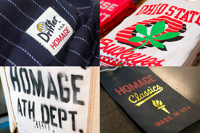
It's hard to do justice to Homage's relentless attention to detail in these photos, but literally no detail goes unconsidered, whether it's part of the product, the packaging, or their brick-and-mortar stores
Another big challenge of striking the balance of core stuff that you know will sell vs new stuff that will add flavor, but might not sell. How do you find that balance? Do you ever decide to do something for flavor even if you know it probably won't sell? I’m always looking for a “scientific” approach to it, maybe because I went to school for science. I’m always looking at the data to help make those decisions: what should be the balance of fleece vs t-shirts, how much OSU stuff should we be making vs bringing in a new school, and so forth. The numbers are super helpful, but at the end of the day a lot of it is going by what you feel is right, because in the fashion business things change so fast that what was right last season might not be right this season. Ultimately it comes down to trial and error in a way. We bring in a new style and either it sold super well, it bombed, or it did somewhere in the middle. Then we just have to learn as much as we can from it as far as what we did right and what we did wrong. Maybe we went too far with the graphic, or maybe we didn’t get the fit right, etc. But the key is that as long as you have your core business in good shape, which for us is t-shirts, that gives you the freedom to experiment and try new things. If they do well you expand on them, if they don’t, then you cut it loose and go in a different direction. You can’t get too attached to something— even if you like it, it might not be right for the business.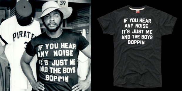
Other brands might just throw a badly-distressed Pirates logo on a t-shirt, but Homage digs deep into the heritage of every piece they do, like this one referencing Dave Parker of the '76 Pirates' homemade shirt
A big portion of Homage product is licensed-- anything from sports teams to pop culture properties like American Gladiators. How do you give each of the licenses their own identity while still tying it all together and making it feel like Homage? The great thing is that our customers are really cool, and they come to us because they want something different and unexpected— that’s why they are into Homage. So that frees us up to do things that are a little left of center, like if it’s a team, instead of just doing the logo it might be some really specific phrase that the really hardcore fans use. Exactly. You guys never underestimate your customer-- you always assume that they'll get the reference. If you phone it in and just slap the logo on a shirt, people can tell. They pick up on that. So for us it’s about really digging into the heritage and finding something else to work with because that’s what our customers want. We’re always asking ourselves things like “Is this too obscure? What’s the most recognizable thing from this film?,” or sometimes we’ll call up a hardcore fan of a team and run our ideas by them to see what they respond to. It’s really just going that extra mile to find that thing that really speaks to the fans of these properties. Licensed tees have been done to death, so what’s our take on it that’s different? https://www.youtube.com/watch?v=7mKNlAf6FIg A great example of that is what we’re doing with MLS (Major League Soccer). We started by doing stuff with Columbus Crew, and now we're doing a full line for MLS that has a t-shirt, scarf and socks for each team. MLS has this really young, energetic fanbase that’s right in our demographic. Those are are customers 100%: that want that cool t-shirt that's more than just a logo, it's something special that makes you feel like you're really part of the insider "fanclub." We wanted to deliver something that felt unique and special, so we really put the time in, hanging out with the supporter groups for every team and were like, “We wanna make something you guys are going to love— let’s build this together." And I think it shows, because each one of the shirts has its own point of view that's drawn from the team's heritage-- it's not just a logo. Sometimes what a brand DOESN'T do is just as important as what you DO do. You guys are always trying new things, how do you know when something ISN'T right for the brand? I keep saying this, but it all goes back to a great team who really understand the brand, and our review process for getting it front of them. We all try to push the boundaries because that’s what keeps us fresh and new, and sometimes we go to far. It’s pretty amazing but we present our ideas to the team, and without a lot of argument we all come to a pretty quick consensus as to whether it’s right or not. All of us are open to listening to other people’s ideas and criticisms, and we all want to keep it rooted in that vintage vibe. Like we were talking about before, it’s all about knowing when to stick to the core and when to move it on… that’s the challenge every day. Give a little, take a little.To learn more about designing apparel graphics, check out CreativeLive's "Designing Graphic T-Shirts" with Brandon Rike