Michael Bierut and Jessica Helfand are well versed in the art of the book cover. They’ve designed books, they’ve authored books (see covers, below), and as the founders and editors of Design Observer, they’ve written countless articles on book design. They even curated the content for the book Fifty Books/Fifty Covers.
[gallery columns="2" size="medium" ids="31330,31331"]
In advance of their class, Thinking Like a Book Designer, Bierut and Helfand have interviewed five prominent designers about what makes a great cover. Are people drawn to the image, the typography, the color? Is illustration better than photography? Or are purchasing decisions purely based on the content or author? In the case of magazines on the newsstand, you have literally less than a second to capture the consumer’s attention. With that kind of pressure, how do publication designers know what will work on the cover?
As you’ll learn in the interviews, much of it is gut instinct based on years of experience and really understanding the content as the author intended it. The creative part of the equation is probably the easiest for the designers, as they will tell you, but getting everyone on-board with the design is the tough part. The author, publisher, and marketing people all have a say, and this is where the process can get tricky. Learning how to instinctively navigate this terrain requires experience and patience.
Here, we asked each designer why they think certain covers they’ve designed work with the content.
Barbara Glauber, Principal, Heavy Meta
 Paper and printing can play a large role in the design of a book and for this exhibition catalogue on the subject of class in American society, I used materials that aspire to be fancy and stamped the title, set in lower case script, in gold foil onto purple leatherette paper.
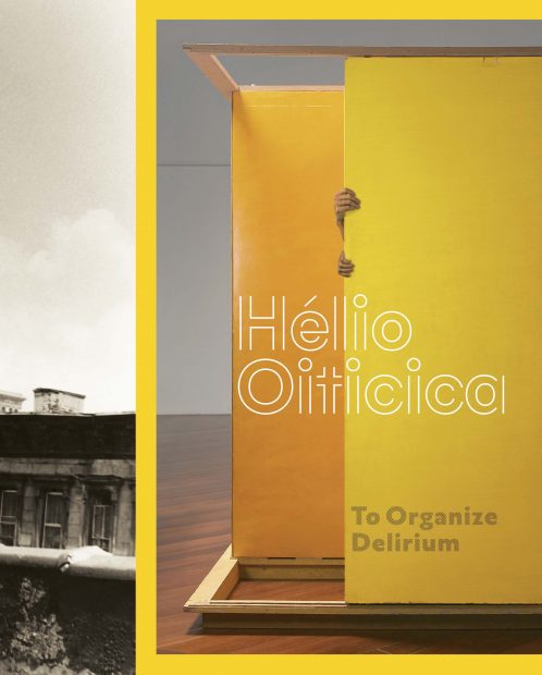 For this exhibition catalogue, this Brazilian artist's name is composed of circles and straight lines that resemble plans of his maze-like structures while provocative photographs of his work wrap around the sides of the book.
Oliver Munday, Associate Art Director, Knopf
 I like the way the dry, ironic tone of the illustration reflects the narrator’s acerbic wit in the novel.

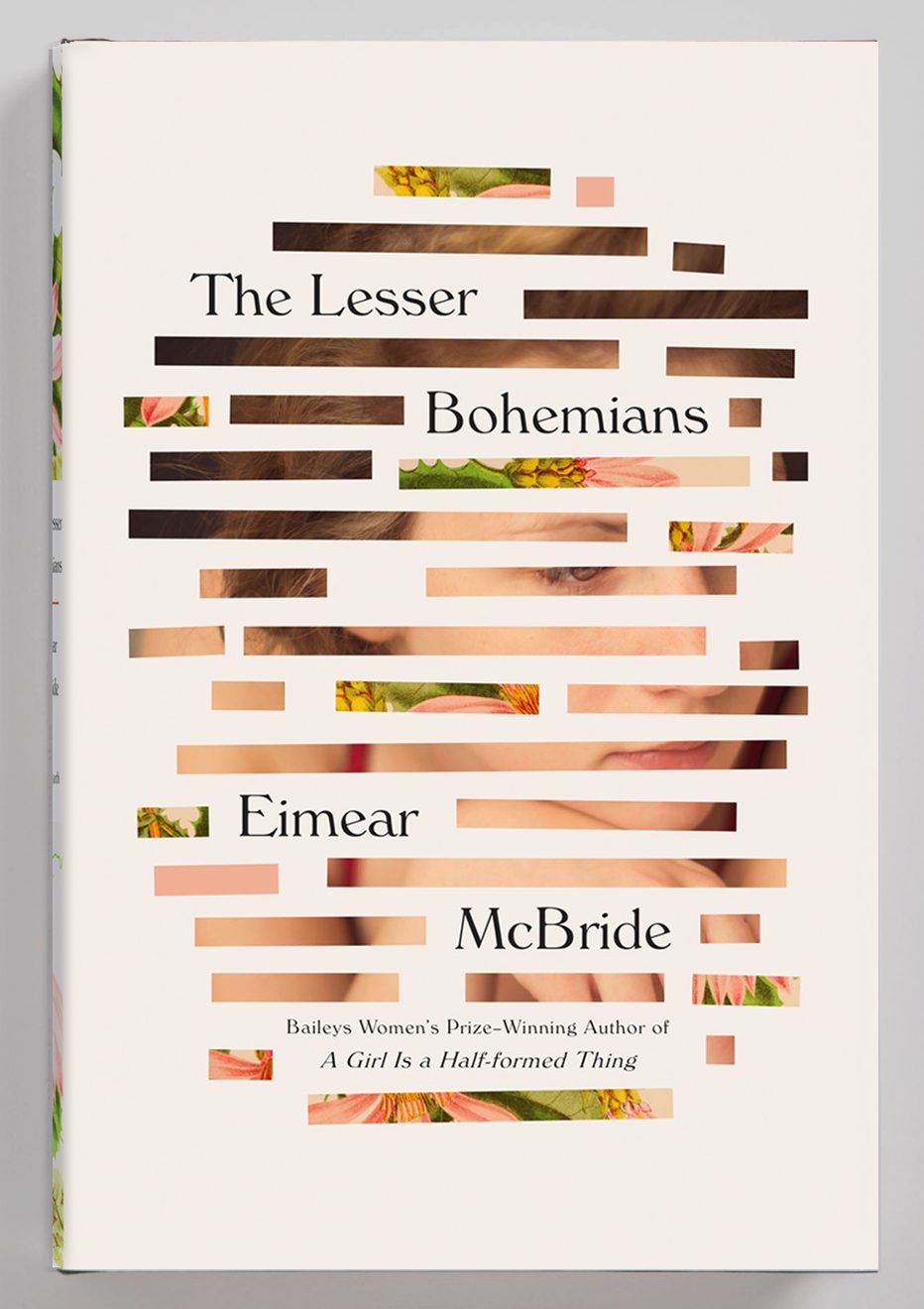 I enjoy how the expressive, impressionistic presentation of the image allows for varied emotional responses.
Peter Mendelsund, Associate Art Director, Knopf
[gallery size="large" columns="2" ids="31395,31394"]
In the case of both of these jackets I was happy to be allowed to employ some wit, especially in the case of David’s book, where it could be argued that the title is hard to read (though it is precisely in that extra second in which the viewer tries to parse the title that something interesting happens).
Kelly Blair, Associate Art Director, Knopf and Pantheon
 Keith Gessen's fantastic essays in Against Everything turn the word against on its head. Rather than being anti-everything, he is pressing up close and examining things. Therefore, the optical illusion of a space turning inside out over and over again felt apt. I couldn't resist also having the type press right up against the edges.
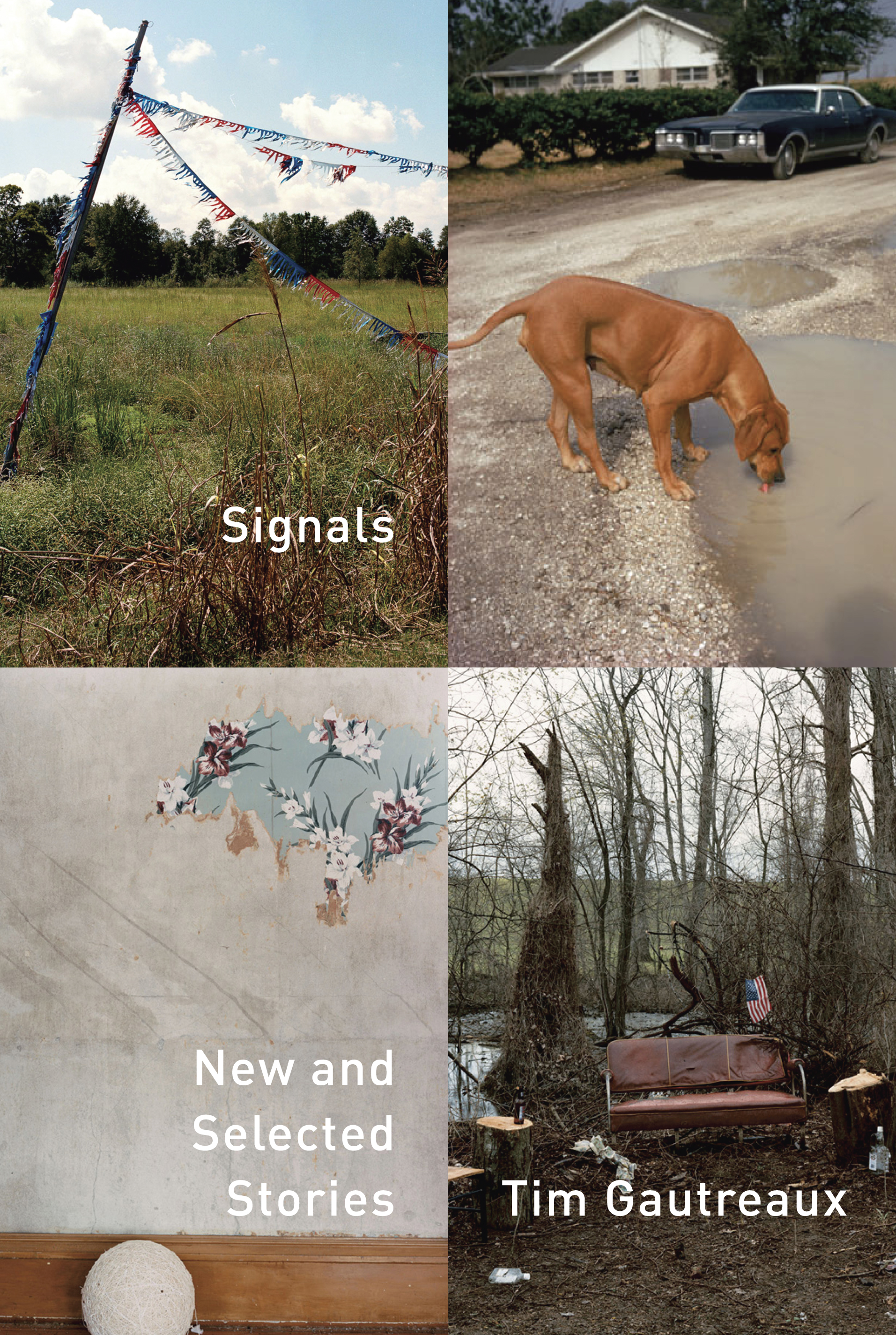 Signals is chock full of beautiful stories set mainly in the American South. There's such a rich tradition of photographers working in the south, including William Eggleston (not used on the cover), Eliot Dudik, Stacy Kranitz, Maude Schuyler Clay, and Alec Soth. At some point in my research, I started to realize it would be difficult to choose just one. Luckily for me, a book of stories is a perfect opportunity to use multiple images.
Luke Hayman, partner, Pentagram New York
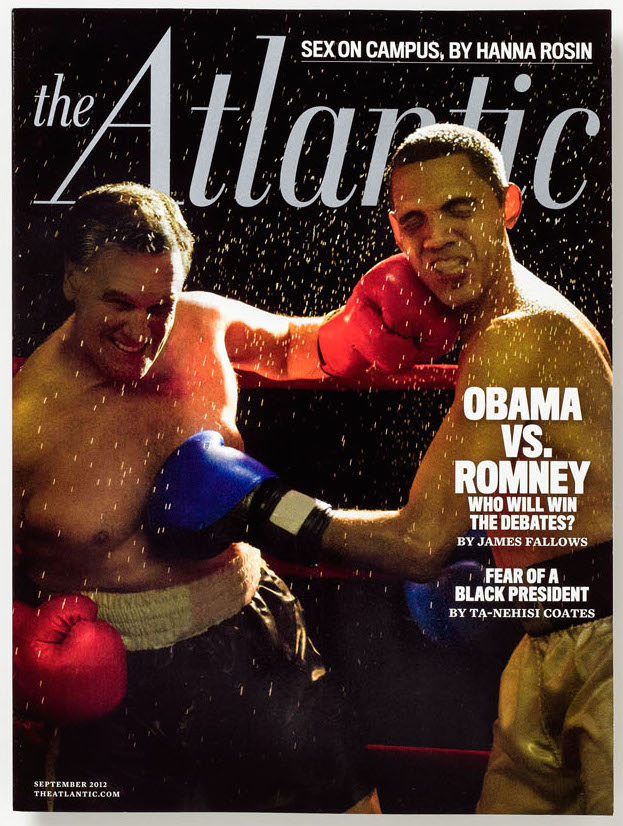 Four years ago, leading up to the U.S. presidential elections in 2012, we were guest art directing The Atlantic, and produced this cover as well as a series of ’secret’ photo shoots of an illicit boxing fight. The brutality of the fight was a metaphor for the vicious sparring that was predicted. (Four years later it all feels so tame!) The photographer, Alison Jackson shot look-alike actors in a Brooklyn gym to create a powerful series of images and videos.
[caption id="attachment_31353" align="alignnone" width="1600"]
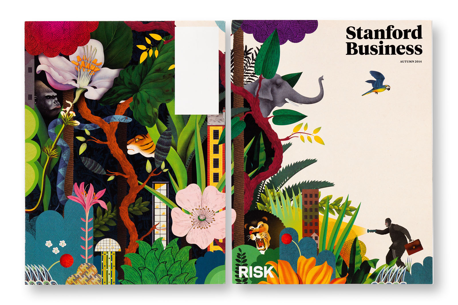 Illustration by Brett Ryder.[/caption]
This three times a year publication is sent to alumni and other business leaders connected to the prestigious Stanford Graduate School of Business. The design of the magazine is deliberately different from its East coast rivals with color palettes and commissioned imagery reflecting the spirit of the Silicon Valley powerhouse. Each issue is intended to be handsome enough to remain on the office desk of the reader for three at a stretch, so it deliberately looks less ephemeral with only the theme as text complementing the vivid illustration which wraps over the spine and back cover.
To learn more about the craft and concepts of book cover design, check out Thinking Like a Book Designer.
 Paper and printing can play a large role in the design of a book and for this exhibition catalogue on the subject of class in American society, I used materials that aspire to be fancy and stamped the title, set in lower case script, in gold foil onto purple leatherette paper.
 For this exhibition catalogue, this Brazilian artist's name is composed of circles and straight lines that resemble plans of his maze-like structures while provocative photographs of his work wrap around the sides of the book.
Oliver Munday, Associate Art Director, Knopf
 I like the way the dry, ironic tone of the illustration reflects the narrator’s acerbic wit in the novel.

 I enjoy how the expressive, impressionistic presentation of the image allows for varied emotional responses.
Peter Mendelsund, Associate Art Director, Knopf
[gallery size="large" columns="2" ids="31395,31394"]
In the case of both of these jackets I was happy to be allowed to employ some wit, especially in the case of David’s book, where it could be argued that the title is hard to read (though it is precisely in that extra second in which the viewer tries to parse the title that something interesting happens).
Kelly Blair, Associate Art Director, Knopf and Pantheon
 Keith Gessen's fantastic essays in Against Everything turn the word against on its head. Rather than being anti-everything, he is pressing up close and examining things. Therefore, the optical illusion of a space turning inside out over and over again felt apt. I couldn't resist also having the type press right up against the edges.
 Signals is chock full of beautiful stories set mainly in the American South. There's such a rich tradition of photographers working in the south, including William Eggleston (not used on the cover), Eliot Dudik, Stacy Kranitz, Maude Schuyler Clay, and Alec Soth. At some point in my research, I started to realize it would be difficult to choose just one. Luckily for me, a book of stories is a perfect opportunity to use multiple images.
Luke Hayman, partner, Pentagram New York
 Four years ago, leading up to the U.S. presidential elections in 2012, we were guest art directing The Atlantic, and produced this cover as well as a series of ’secret’ photo shoots of an illicit boxing fight. The brutality of the fight was a metaphor for the vicious sparring that was predicted. (Four years later it all feels so tame!) The photographer, Alison Jackson shot look-alike actors in a Brooklyn gym to create a powerful series of images and videos.
[caption id="attachment_31353" align="alignnone" width="1600"]
 Illustration by Brett Ryder.[/caption]
This three times a year publication is sent to alumni and other business leaders connected to the prestigious Stanford Graduate School of Business. The design of the magazine is deliberately different from its East coast rivals with color palettes and commissioned imagery reflecting the spirit of the Silicon Valley powerhouse. Each issue is intended to be handsome enough to remain on the office desk of the reader for three at a stretch, so it deliberately looks less ephemeral with only the theme as text complementing the vivid illustration which wraps over the spine and back cover.
To learn more about the craft and concepts of book cover design, check out Thinking Like a Book Designer.