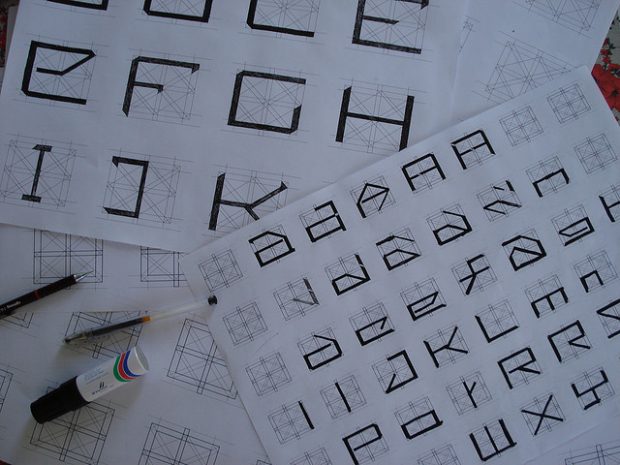
Confession: I am a font snob.
I agonize over font choices when others claim they can’t even really tell the difference. If you are reading this, you probably call on your inner font-snob from time to time. And if you’re like me, you rationalize the choice of one font over another in terms of legibility, overall impression, personality, color, etc. And, In terms of legibility in particular, here’s an interesting question ...
How different is one font-face from another?
Of the key typographic factors (face, kerning, line length, letting, size, contrast), research shows font face has the smallest impact on legibility (big caveat here: studies have looked at differences like serif vs. sans, and a host of basic font face comparisons, Palatino vs. Arial, Georgia vs. Helvetica, etc. but not extremely wacky fonts that are obviously less legible) (
Tinker, 1963, Chandler, 2001, Gasser et al., 2005, Pyke, 1926,
Rothlein, 1912).
The central argument for the insignificant role of font face is this: People read best with the font faces they are used to and getting used to a font face
happens so quick, the learning time is negligible.
I feel like something is missing from that assessment.
A few weeks back i started reading research papers and crafting exploratory experiments aiming to “score” font faces based on how legible they are. It’s easier said than done. I did,however, find some common assumptions about perception of font faces that don’t quite add up. For instance, learning any new letter form is assumed to be the same effort and process as learning some other new letter form. That’s a strange assumption for a couple reasons: a.) some letter forms are easier to identify than others, b.) some letters are more common than others, c.) some typeface letterforms deviate further from a canonical form than others. Besides, there are obvious cases where font face makes a difference in legibility. Consider the two example type treatments below. They differ only in font face. One is much harder to read than the other. The reason is simple: the script font capitals include stylistic distractors from the canonical letterform, are hard to identify, and destroy the familiar shape of the word.

I decided to make a simple experiment based on the following question: can a user tell the difference between letters and words if the only difference is the font face? I added two twists:
1. I varied the exposure time (duration the letters or words were shown on screen), and
2. Made sure that when presented, the letter or words appeared in the viewers parafoveal region.
Number one above is reasonable enough. As the exposure time decreases you expect people
to discern less of a difference between fonts. Number two requires a bit of explanation...
I read a 2005 article about discriminating letters in parafoveal vision (
Chung et. al 2005). The study showed how visual pattern learning in the foveal region (your area of sharp visual focus) is much better/faster than learning visual patterns just outside of the sharp focus region (i.e. the ‘parafoveal region’). This finding gave me an idea. If the learning time for fonts is thought to be negligible perhaps this “can you see a difference” test would prove much harder in parafoveal vision, and show nonnegligible effects of one font face over another. Before I push us into the weeds, it’s worth noting that this (air quotes) ‘experiment’ has many problems. For example I am:
● making the tacit assumption that users in the study are more familiar with helvetica
than the other fonts
● assuming that the learning time will be unaffected by the 100 trials users perform
● not controlling for computer and/or reading competency, or any environmental factors
● … I could go on, but you get the point
So here is what I did.
I coded a trial based experiment that randomly compares 5 fonts against a baseline (Helvetica. Groan. I know), at five different exposure times. Users are shown a “priming” mark in the center of the screen (to draw their focus and define the foveal region of sharp focus), then briefly presented with either two letters or two words (randomly placed along a circle just outside the focus range based on the priming mark). Users are then presented with two options: same, or different. If the two letters or words were not identical, the user is instructed to select “different.” Ten users completed 100 trials each. Go try the experiment yourself
here.
Here is what I found
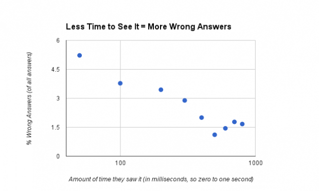
Even when you show somewhat small font differences to people (outside of where they are directly looking) for slivers of a second, 80% of the time they can tell the difference!! The plot below shows you that, say, a little less than 6% of all wrong answers came from seeing the font comparison for 50 milliseconds. From there, as you up the amount of time users see the font comparisons, wrong answers drop to around 1%.
What you are dying to know, I'm sure, is this: "Did similarity to Helvetica result in more wrong answers?”
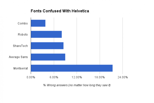
You tell me. First, look at this graph showing the percentage of wrong answers by font. The data says that users most often confused Montserrat with Helvetica, and the font Combo, less so.
Now, look at these fonts specimens put in the same order shown in the graph (with Helvetica at the bottom for comparison)...
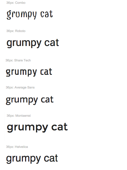
Many questions arise. Isn’t Roboto more like Helvetica than Montserrat, what gives? Average Sans and Share Tech are similar to each other, but are they really the same amount of
different form Helvetica? The questions could go into the night, through several bottles of whisky, you get the point.
But to conclude this (air quote) experiment, I’ll leave you with a very nerdy graph:
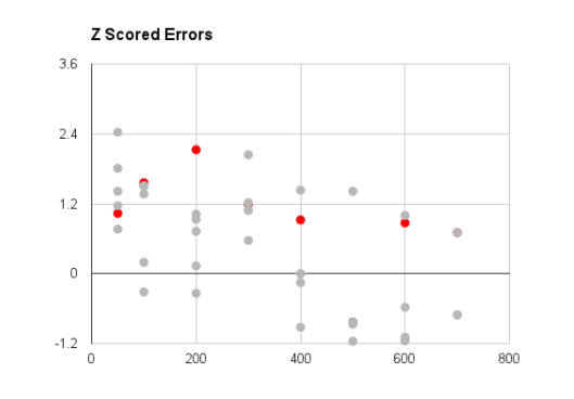
Z Scoring is basically taking data and fitting it to a bell curve. I did two things in the z score plot above: 1.) fit the percentage of wrong answers to bell curves by exposure time. 2.) highlighted the wrong answers where people saw the comparison Helvetica vs. Helvetica
But answered they were different.
Here is what i think this means. If the grey dots were really close to the red dots, we would say that people confuse helvetica with helvetica just as often as any of the other fonts meaning they actually can’t tell the difference between fonts. BUT, those grey dots are not only spread away from the red dots they also follow the trend of less errors with longer time to judge the comparison. So 80% of the time, people can tell a difference between Helvetica and other (kind of) similar fonts. However, looking at just the wrong answers, users can likely tell the difference between a lot of font comparisons not just how different they are from Helvetica.
Interested in the Experimental Research on Typography?
Objective research on the effect of typographic treatments (arguably) started in 1926. Miles Albert Tinker published great experimental research on typography from 1926 1966. Since
then more experimental researchers have questioned the principles of typography. There is,however, still no measure of how font face effects readability or even legibility. In fact, thereis disagreement over whether it has any effect at all. Soleimani & Mohammadi (2012) provides a good review of the opposing research.
Check My Work :)
--Soleimani H., & Mohammadi E. (2012).
The Effect of Text Typographical Features on Legibility, Comprehension, and Retrieval of EFL Learners. English Language Teaching; Vol.
5, No. 8.
--Tinker M. (1963).
Influence of simultaneous variation in size of type, width of line and leading
for newspaper type. Journal of Applied Psychology, Vol. 47.
--Gasser, B., Boeke, J., Haffernan, M., & Tan, R. (2005).
The influence of font type on
information recall. North American Journal of Psychology, 7(2), 181188.
--Chandler, S. B. (2001).
Running Head: Legibility and comprehension of onscreen type (Doctoral dissertation).
--Pyke, R. K. (1926). Report on the legibility of print. London: H. M. Stationery Office.
--Rothlein, B. E. (1912).
The relative legibility of different faces of printing types. American Journal of Psychology, 23, 136.
--Chung S., Levi D., Tjan B. (2005).
Learning letter identification in peripheral vision. Vision Res. 2005 May; 45(11):1399412.
--Tai Y., Yang S., & Hayes J., & Sheedy J. (2006).
Effect of Character Spacing on Text Legibility. Vision Performance Institute Technical Report.
 I decided to make a simple experiment based on the following question: can a user tell the difference between letters and words if the only difference is the font face? I added two twists:
1. I varied the exposure time (duration the letters or words were shown on screen), and
2. Made sure that when presented, the letter or words appeared in the viewers parafoveal region.
Number one above is reasonable enough. As the exposure time decreases you expect people
to discern less of a difference between fonts. Number two requires a bit of explanation...
I read a 2005 article about discriminating letters in parafoveal vision (Chung et. al 2005). The study showed how visual pattern learning in the foveal region (your area of sharp visual focus) is much better/faster than learning visual patterns just outside of the sharp focus region (i.e. the ‘parafoveal region’). This finding gave me an idea. If the learning time for fonts is thought to be negligible perhaps this “can you see a difference” test would prove much harder in parafoveal vision, and show nonnegligible effects of one font face over another. Before I push us into the weeds, it’s worth noting that this (air quotes) ‘experiment’ has many problems. For example I am:
● making the tacit assumption that users in the study are more familiar with helvetica
than the other fonts
● assuming that the learning time will be unaffected by the 100 trials users perform
● not controlling for computer and/or reading competency, or any environmental factors
● … I could go on, but you get the point
 What you are dying to know, I'm sure, is this: "Did similarity to Helvetica result in more wrong answers?”
You tell me. First, look at this graph showing the percentage of wrong answers by font. The data says that users most often confused Montserrat with Helvetica, and the font Combo, less so.
 Now, look at these fonts specimens put in the same order shown in the graph (with Helvetica at the bottom for comparison)...
 Many questions arise. Isn’t Roboto more like Helvetica than Montserrat, what gives? Average Sans and Share Tech are similar to each other, but are they really the same amount of
different form Helvetica? The questions could go into the night, through several bottles of whisky, you get the point.
But to conclude this (air quote) experiment, I’ll leave you with a very nerdy graph:
 Z Scoring is basically taking data and fitting it to a bell curve. I did two things in the z score plot above: 1.) fit the percentage of wrong answers to bell curves by exposure time. 2.) highlighted the wrong answers where people saw the comparison Helvetica vs. Helvetica
But answered they were different.
Here is what i think this means. If the grey dots were really close to the red dots, we would say that people confuse helvetica with helvetica just as often as any of the other fonts meaning they actually can’t tell the difference between fonts. BUT, those grey dots are not only spread away from the red dots they also follow the trend of less errors with longer time to judge the comparison. So 80% of the time, people can tell a difference between Helvetica and other (kind of) similar fonts. However, looking at just the wrong answers, users can likely tell the difference between a lot of font comparisons not just how different they are from Helvetica.
