
When it comes to choosing colors for your logo, you might be tempted to choose whatever Skittles-inspired rainbow hue you like best (blue for the win!) and call it a day.
But if you go that route, you’re missing out on a huge opportunity.
Color—and the way you use it—can be extremely powerful. People have strong associations with color—and when you understand those associations, you can choose colors to incorporate into your logo design that inspire the right emotions and behaviors in your audience.
[caption id="attachment_48587" align="alignnone" width="620"]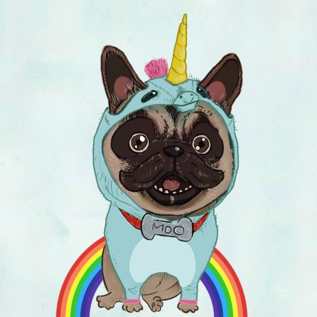 This guy knows how to do color. Illustration by 99designs designer kOuNy[/caption]
But how, exactly, does color psychology work? What kinds of emotions and behaviors can different colors inspire? And—most importantly—how can you use color psychology to choose the most impactful colors for your logo?
This guy knows how to do color. Illustration by 99designs designer kOuNy[/caption]
But how, exactly, does color psychology work? What kinds of emotions and behaviors can different colors inspire? And—most importantly—how can you use color psychology to choose the most impactful colors for your logo?
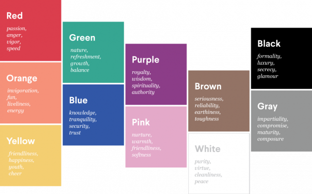 When you understand the psychology behind each color, you can use it to choose the right colors for your brand. Building a brand that targets children (and their parents)? Go for orange, which people associate with youth. Need to inspire trust? Go with blue, which people link to dependability and trustworthiness. Going after a female audience? Try pink, which people generally view as feminine.
The point is, when you understand the power of color, you can be strategic about the colors you incorporate in your logo design—and use color to your advantage.
When you understand the psychology behind each color, you can use it to choose the right colors for your brand. Building a brand that targets children (and their parents)? Go for orange, which people associate with youth. Need to inspire trust? Go with blue, which people link to dependability and trustworthiness. Going after a female audience? Try pink, which people generally view as feminine.
The point is, when you understand the power of color, you can be strategic about the colors you incorporate in your logo design—and use color to your advantage.
 Logo design by 99designs designer binaryrows[/caption]
[caption id="attachment_48590" align="alignnone" width="620"]
Logo design by 99designs designer binaryrows[/caption]
[caption id="attachment_48590" align="alignnone" width="620"]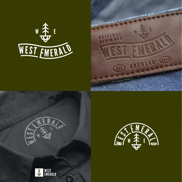 Logo design by 99designs designer simolio[/caption]
[caption id="attachment_48591" align="alignnone" width="502"]
Logo design by 99designs designer simolio[/caption]
[caption id="attachment_48591" align="alignnone" width="502"] Logo design by 99designs designer Daria V[/caption]
All these logo designs incorporate different colors—and they all have a completely different look, feel, and message. The first uses bright, primary colors—perfect for their family-oriented audience (nothing screams “for kids” like a Crayola-inspired color palette!). The second uses green (on their digital logo) and brown (on their denim labels)—both colors people associate with nature, making them solid choices for a rugged, outdoor apparel brand. The third uses a soft shade of pink—which definitely speaks to the female audience the organic product is targeted towards.
The point is, you want to choose colors that a) feel true to who you are as a brand, and b) as a result, are going to speak to the customers you’re targeting with your branding. Are you masculine or feminine? Playful or serious? Modern or classic? In-your-face or laid-back? Once you know who you are, you can choose the colors that best align with that personality—and will have a biggest impact on your target audience. If you need help figuring out the right color for your brand, plug your brand traits into our 99designs Logo Color Chooser to find a winning hue!
Logo design by 99designs designer Daria V[/caption]
All these logo designs incorporate different colors—and they all have a completely different look, feel, and message. The first uses bright, primary colors—perfect for their family-oriented audience (nothing screams “for kids” like a Crayola-inspired color palette!). The second uses green (on their digital logo) and brown (on their denim labels)—both colors people associate with nature, making them solid choices for a rugged, outdoor apparel brand. The third uses a soft shade of pink—which definitely speaks to the female audience the organic product is targeted towards.
The point is, you want to choose colors that a) feel true to who you are as a brand, and b) as a result, are going to speak to the customers you’re targeting with your branding. Are you masculine or feminine? Playful or serious? Modern or classic? In-your-face or laid-back? Once you know who you are, you can choose the colors that best align with that personality—and will have a biggest impact on your target audience. If you need help figuring out the right color for your brand, plug your brand traits into our 99designs Logo Color Chooser to find a winning hue!
 A recent 99designs analysis found that the color blue is used in a whopping 55% of logos across all industries.[/caption]
So, for example, if you’re in the world of healthcare, chances are pretty much all of your competitors are working with the color blue. Which makes sense—according to color psychology, blue inspires a sense of trust (and we can’t think of people you’d want to trust more than your healthcare team). On the flip side, if you’re running a retail business, you’ll see a lot more red with your competitors, since red can increase excitement—and the more excited people feel, the more they’re going to buy.
You don’t have to follow trends (sometimes, it’s better to go against the grain!), but keeping your finger on the pulse of what’s going on in your industry will give you key color insights that can help drive the logo design process.
A recent 99designs analysis found that the color blue is used in a whopping 55% of logos across all industries.[/caption]
So, for example, if you’re in the world of healthcare, chances are pretty much all of your competitors are working with the color blue. Which makes sense—according to color psychology, blue inspires a sense of trust (and we can’t think of people you’d want to trust more than your healthcare team). On the flip side, if you’re running a retail business, you’ll see a lot more red with your competitors, since red can increase excitement—and the more excited people feel, the more they’re going to buy.
You don’t have to follow trends (sometimes, it’s better to go against the grain!), but keeping your finger on the pulse of what’s going on in your industry will give you key color insights that can help drive the logo design process.
This guy knows how to do color. Illustration by 99designs designer kOuNy[/caption]
But how, exactly, does color psychology work? What kinds of emotions and behaviors can different colors inspire? And—most importantly—how can you use color psychology to choose the most impactful colors for your logo?
Understanding how different colors affect your audience
The colors you choose for your logo design—whether consciously or not—are going to make an impact on your audience. The right colors can create the kind of emotional response you need to take your business to the next level. And the wrong colors? Well, let’s just say they can push your potential customers straight to the competition. Every color tells a story—and if you want to harness the power of color to build your brand, you need to understand what stories your colors are telling your audience. Here are the most common associations people have with the colors of the rainbow:
When you understand the psychology behind each color, you can use it to choose the right colors for your brand. Building a brand that targets children (and their parents)? Go for orange, which people associate with youth. Need to inspire trust? Go with blue, which people link to dependability and trustworthiness. Going after a female audience? Try pink, which people generally view as feminine.
The point is, when you understand the power of color, you can be strategic about the colors you incorporate in your logo design—and use color to your advantage.
How to choose colors that fit you, your brand, and your audience
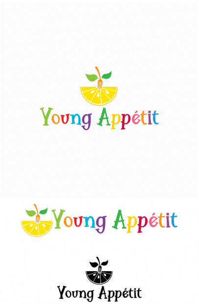
So, now you that you understand the meanings behind each color, let’s talk about how to actually choose the right colors for your logo. There’s no magic formula for choosing logo colors; the colors that are going to be right for you and your brand are going to depend on who you are, what you want to say, and who you’re targeting. Or, in other words, you want to choose colors that fit you, your brand, and your audience. Let’s see what that looks like in action. [caption id="attachment_48589" align="alignnone" width="406"] Logo design by 99designs designer binaryrows[/caption]
[caption id="attachment_48590" align="alignnone" width="620"] Logo design by 99designs designer simolio[/caption]
[caption id="attachment_48591" align="alignnone" width="502"] Logo design by 99designs designer Daria V[/caption]
All these logo designs incorporate different colors—and they all have a completely different look, feel, and message. The first uses bright, primary colors—perfect for their family-oriented audience (nothing screams “for kids” like a Crayola-inspired color palette!). The second uses green (on their digital logo) and brown (on their denim labels)—both colors people associate with nature, making them solid choices for a rugged, outdoor apparel brand. The third uses a soft shade of pink—which definitely speaks to the female audience the organic product is targeted towards.
The point is, you want to choose colors that a) feel true to who you are as a brand, and b) as a result, are going to speak to the customers you’re targeting with your branding. Are you masculine or feminine? Playful or serious? Modern or classic? In-your-face or laid-back? Once you know who you are, you can choose the colors that best align with that personality—and will have a biggest impact on your target audience. If you need help figuring out the right color for your brand, plug your brand traits into our 99designs Logo Color Chooser to find a winning hue!
For extra inspiration, check out the competition
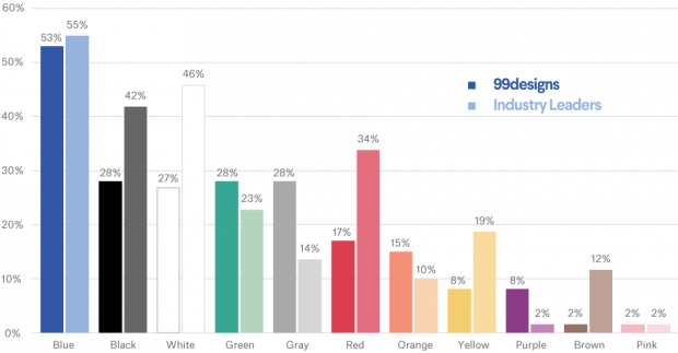
If you’re in need of a little extra inspiration in choosing the most impactful colors for your logo design, one of the best places to look? Your competition. Now, don’t get us wrong—we’re not saying you should rip the color palette straight from your competitor’s logo design. But checking out your competitors will give you a sense of what’s working, what’s not working, and any color trends that are happening in your industry—all of which you can use to help choose the best colors for your brand. [caption id="attachment_48592" align="alignnone" width="620"] A recent 99designs analysis found that the color blue is used in a whopping 55% of logos across all industries.[/caption]
So, for example, if you’re in the world of healthcare, chances are pretty much all of your competitors are working with the color blue. Which makes sense—according to color psychology, blue inspires a sense of trust (and we can’t think of people you’d want to trust more than your healthcare team). On the flip side, if you’re running a retail business, you’ll see a lot more red with your competitors, since red can increase excitement—and the more excited people feel, the more they’re going to buy.
You don’t have to follow trends (sometimes, it’s better to go against the grain!), but keeping your finger on the pulse of what’s going on in your industry will give you key color insights that can help drive the logo design process.