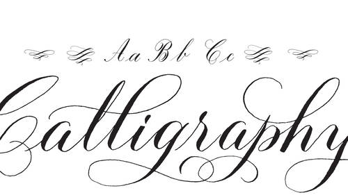
In recent years, lettering and calligraphy have experienced a resurgence in popularity. These two art forms have a strong kinship and are well worth exploring. By adding these skills to your toolkit you can bring an extra touch of originality to your projects. You’d be well advised to understand their differences before listing them in your portfolio, though.
Martina Flor and Giuseppe Salerno challenged each other a couple of years ago to a competition of sorts. They created a site called Lettering vs Calligraphy, and each day they would create a letter—Flor, a letterer and Salerno, a calligrapher— “to explore the capabilities of the two technical approaches.” Here, they discuss the finer points between the two practices and talk about the competition and recent projects.
What is hand lettering and how is it different from calligraphy and type design?
Martina: Lettering is essentially drawing letters. While type design focuses on creating a full alphabet that works in all its possible combinations, lettering often deals with just a word or phrase. These are drawn for a particular use and no fonts are involved.

Lettering and calligraphy have a doubtless relationship. However, the different nature of each (lettering is drawing, calligraphy is writing) has an impact on the artwork. While lettering often imitates the spontaneous movement of writing, it is the result of careful decision-making. It is the product of determined calculation on how that curve or shape should look. In this sense, lettering and type design are design-related disciplines, whereas calligraphy stands on the side of art.
What is calligraphy and how it is different from hand lettering?
Giuseppe: Calligraphy is the art of writing through infinitive tools and requires a development of some of your muscles. Strokes, lines, shapes are usually derived from experience—the more you do it, the better you’ll get. It requires practice and studying all the historical hand styles will make you stronger. Calligraphy is global. I practice Latin scripts, but sometimes I like to take on Arabic lettering with bamboo pens.
Do you feel these terms are interchanged a lot?
Giuseppe: Sure, a calligraphic piece can be transformed in hand lettering and your “drawing” skills can help you to adjust, manipulate, and improve your letterforms.
Martina: I do feel they are interchanged a lot. For example, if you look for the hashtag #lettering on Instagram or any other social network, half of the results are calligraphic pieces. There’s also a current trend to label a sort of naive-cute looking calligraphy as hand-lettering. Calligraphy and Lettering may look alike at times, but they are two completely different approaches to executing letter shapes.
Tell me about the Lettering vs. Calligraphy site.
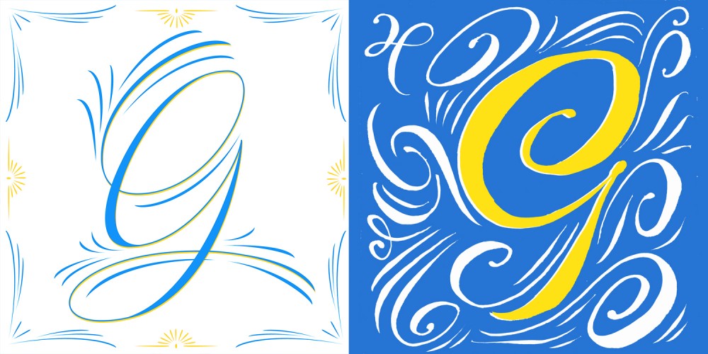
Martina: I met Giuseppe at Typostammtisch Berlin (a meet-up of Typographic Aficionados), and after sharing insights about our work we decided to collaborate and came up with an excuse to produce new work. We set up a simply structured website where we would upload a letter a day (I drew letters, and Giuseppe did calligraphy) according to a keyword. For instance, S for Sexy. The challenge was not only to create a pretty letter shape, but also communicate a mood or atmosphere.
Giuseppe: Our followers wanted to vote for their favorite letters, so we added a voting system. I did not expect that!
What was the best challenge in your opinion?
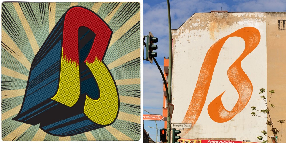
Giuseppe: I loved our “ß” battle.
Martina: I think that what Giuseppe did on this one—writing with his finger on a screen—is pretty out of the box. I’m happy about my postmodern-digital-stone-age letter shape, too. Unfortunately, Giuseppe beat me in all of them.
How did you pick the moderators and how did you advise them in regards to the assignments?
Giuseppe: Most of the moderators are professionals in the typographic field— teachers, designers, type foundry experts, or writers. We asked them to take part in the battle by assigning an attribute to the letter challenge.
Martina: We are still amazed with the fact that many specialists and “intellectuals” of the typographic scene decided to take part in this venture. We didn’t advise them much on what to do. They would tell us what to draw and announce the winner by the end of the day.

What was the outcome of the project? Do you feel like people had a better understanding of the two “design” forms after the challenge?
Giuseppe: I think the project interacted very well with the community, and other projects were born as a result of LvsC. What I liked the most, is that a lot of non-designers got involved too, may be cause of the voting system, but we made something for all the audiences.
Martina: True, even our moms were voting on the website, so the project reached audiences beyond those interested in lettering, calligraphy, and design. I believe that for those with a trained eye for typography, it was interesting to see how the two techniques perform. But at the end of the day, it was just about two people giving their best at every battle.
In some cases, lettering and calligraphy, look remarkably similar—even in your challenge. How do you explain this (if there is an explanation)?
Giuseppe: Every lettering piece had a tangible use of drawing skills and every calligraphic piece was based on handwritten letterforms done with some special tools. We manipulated some images with software, because we wanted to pimp up our images everyday.
Martina: And I think that the fact that the results look similar is rather interesting and intriguing. At times, they perform radically different, and other times it was hard to say how some letters were made.
Can you each tell me about a recent project you’ve done?
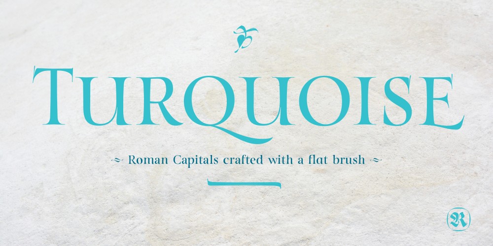
Giuseppe: I’m very proud to have released a font called Turquoise, based on Roman Capitals designed with Brush. My goal was to create Roman Capitals that were smoothly designed with a brush, not carved. The main concept was based on the fundamental strokes that are commonly studied when you practice Roman letters. That’s why many Serifs have these unfinished terminal serifs.
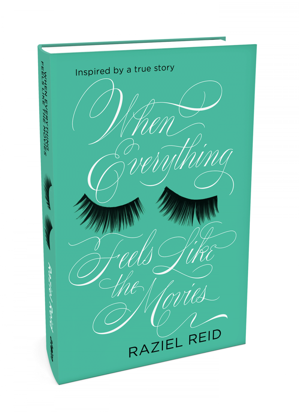
Martina: I did the lettering for this book cover for Little, Brown Book Publishing house in the UK. It stands right on the edge between lettering and calligraphy. I think it is pretty successful at being intriguing and dramatic, as well as fresh and young.