Stanley Hainsworth, Chief Creative Officer at Tether and Creative Director, Kari Strand, give us a behind-the-scenes take on the rebranding process for a well-known product.
 Celestial Seasonings has led the herbal tea brand category since its inception, 45 years ago. It boasts a legion of loyal brand fans who love everything about the brand from its many tea flavors to its iconic and lovable illustrations on the packaging. But, as with any beloved brand, change is inevitable, and Celestial Seasonings was no exception.
Tether was hired to reposition the brand without losing its core consumer base. Stanley Hainsworth, Tether’s Chief Creative Officer, acknowledges, “Our challenge was a tough one: Introducing and attracting a younger audience that didn’t have a previous experience to grow from, while still staying true to the existing brand, and its loyal fans. We believed at heart, the great tea flavors and the authentic story of Celestial could resonate with both given the chance.”
 They started by conducting qualitative consumer testing - an essential part of the rebranding process. Through this testing, they learned who Celestial Seasonings’ current consumer is, what appeals to her, and what was keeping potential consumers from purchasing their tea. It turns out the answer is one and the same: the colorful, illustrative packaging while appealing to CS’s core consumers, look dated and old fashioned to younger consumers.
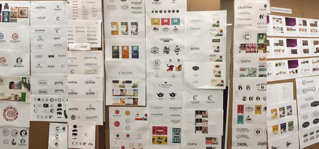 Tether created a series of positioning boards that helped to steer the visual language and brand story. “Some tough conversations came when we initially presented logo ideas. We knew going in that their team would be receptive to moving the needle, pushing the brand into new territory, but we didn’t know how far,” Kari Strand, Creative Director and lead for the project, explains.
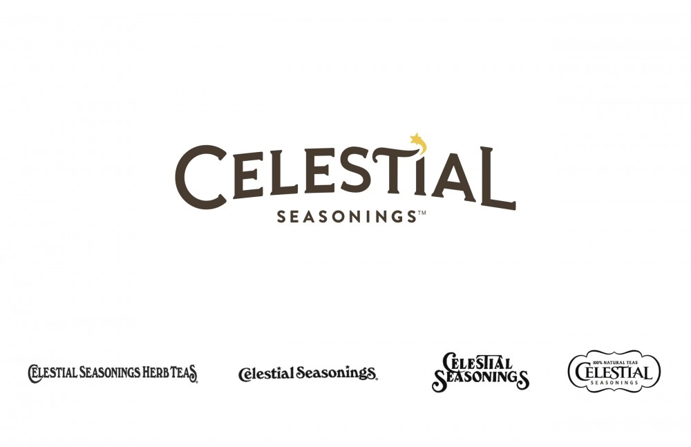 While it was important to maintain some of the traditional qualities of the brand’s heritage, the Tether design team recommended an evolution of the Celestial Seasonings’ logo, drawing inspiration from previous logos. The drop cap C and L were devices that had been used before, as well as the emphasis on the T. The star on the letter I was inspired by an older version of the logo, with a little star sitting atop a lowercase i. Strand says, “It represents that bit of fairytale magic that the brand has, as well as being a nice tie to the word celestial.”
The qualitative testing revealed that consumers had a hard time identifying the logo in the crest. “Part of that might have been the previous design of the boxes, which sandwiched the logo in between the colorful illustrations and a color bar at the top,” she notes. “It got lost.” Thankfully, the CS team wasn’t attached to the crest, per se, and with the development of new products, it was clear that the crest would only hinder the brand expansion.
[caption id="attachment_21244" align="alignnone" width="640"]
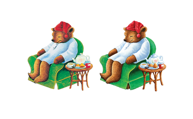 Years of Photoshopping had degraded the original illustrations, which Illustrator Michael Bast lovingly recreated.[/caption]
The illustrations were streamlined, giving much needed breathing room to the packaging creating a consistent look, and allowing flavor descriptors to emerge. Most of the original illustrations were retained, and those that had to be redrawn were done so by artists Celestial has worked with in the past. But, perhaps of the most challenging update was the Classic Sleepytime bear.
 “It is their most-recognizable, and most-loved character and tea—so taking it on was a big challenge,” Strand says. “The original piece of art had aged, and the years of Photoshopping had degraded the quality of the file. We tasked illustrator Michael Bast with recreating the art as close as possible, and he was able to capture the innocent charm of the original, down to the brush strokes.”
[caption id="attachment_21240" align="alignnone" width="1000"]
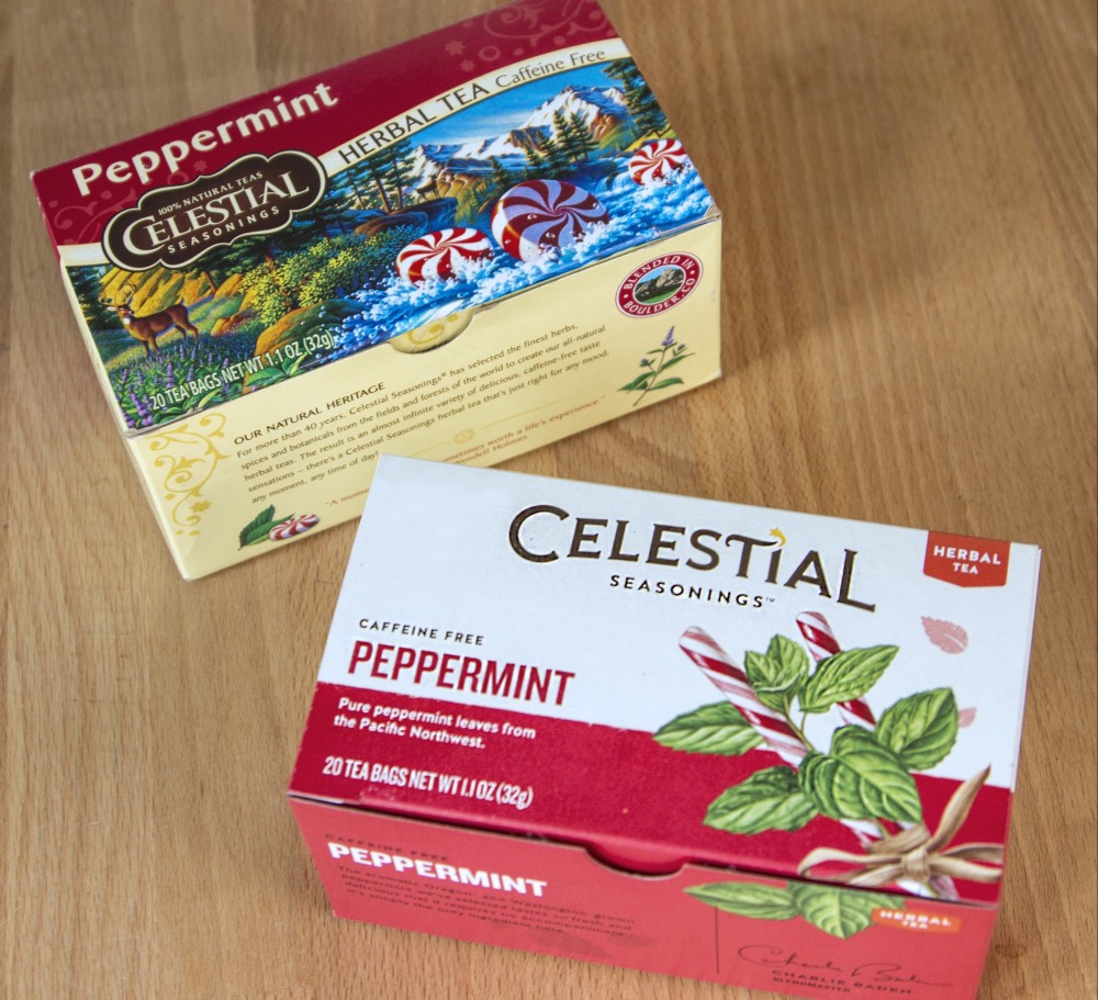 The logo got lost in the illustrative background of the old packaging, above, whereas the new packaging, was cleaner, revealing a new, crisp logo.[/caption]
The rebranding process has yielded a more modern, clean sensibility, yet maintains traditional elements near and dear to Celestial’s core audience. “From the start, our goal was to find the heart of the Celestial Seasonings brand, strip away the distractions and help the brand appeal to the broadest possible audience,” Hainsworth says.

 Celestial Seasonings has led the herbal tea brand category since its inception, 45 years ago. It boasts a legion of loyal brand fans who love everything about the brand from its many tea flavors to its iconic and lovable illustrations on the packaging. But, as with any beloved brand, change is inevitable, and Celestial Seasonings was no exception.
Tether was hired to reposition the brand without losing its core consumer base. Stanley Hainsworth, Tether’s Chief Creative Officer, acknowledges, “Our challenge was a tough one: Introducing and attracting a younger audience that didn’t have a previous experience to grow from, while still staying true to the existing brand, and its loyal fans. We believed at heart, the great tea flavors and the authentic story of Celestial could resonate with both given the chance.”
 They started by conducting qualitative consumer testing - an essential part of the rebranding process. Through this testing, they learned who Celestial Seasonings’ current consumer is, what appeals to her, and what was keeping potential consumers from purchasing their tea. It turns out the answer is one and the same: the colorful, illustrative packaging while appealing to CS’s core consumers, look dated and old fashioned to younger consumers.
 Tether created a series of positioning boards that helped to steer the visual language and brand story. “Some tough conversations came when we initially presented logo ideas. We knew going in that their team would be receptive to moving the needle, pushing the brand into new territory, but we didn’t know how far,” Kari Strand, Creative Director and lead for the project, explains.
 While it was important to maintain some of the traditional qualities of the brand’s heritage, the Tether design team recommended an evolution of the Celestial Seasonings’ logo, drawing inspiration from previous logos. The drop cap C and L were devices that had been used before, as well as the emphasis on the T. The star on the letter I was inspired by an older version of the logo, with a little star sitting atop a lowercase i. Strand says, “It represents that bit of fairytale magic that the brand has, as well as being a nice tie to the word celestial.”
The qualitative testing revealed that consumers had a hard time identifying the logo in the crest. “Part of that might have been the previous design of the boxes, which sandwiched the logo in between the colorful illustrations and a color bar at the top,” she notes. “It got lost.” Thankfully, the CS team wasn’t attached to the crest, per se, and with the development of new products, it was clear that the crest would only hinder the brand expansion.
[caption id="attachment_21244" align="alignnone" width="640"]
 Years of Photoshopping had degraded the original illustrations, which Illustrator Michael Bast lovingly recreated.[/caption]
The illustrations were streamlined, giving much needed breathing room to the packaging creating a consistent look, and allowing flavor descriptors to emerge. Most of the original illustrations were retained, and those that had to be redrawn were done so by artists Celestial has worked with in the past. But, perhaps of the most challenging update was the Classic Sleepytime bear.
 “It is their most-recognizable, and most-loved character and tea—so taking it on was a big challenge,” Strand says. “The original piece of art had aged, and the years of Photoshopping had degraded the quality of the file. We tasked illustrator Michael Bast with recreating the art as close as possible, and he was able to capture the innocent charm of the original, down to the brush strokes.”
[caption id="attachment_21240" align="alignnone" width="1000"]
 The logo got lost in the illustrative background of the old packaging, above, whereas the new packaging, was cleaner, revealing a new, crisp logo.[/caption]
The rebranding process has yielded a more modern, clean sensibility, yet maintains traditional elements near and dear to Celestial’s core audience. “From the start, our goal was to find the heart of the Celestial Seasonings brand, strip away the distractions and help the brand appeal to the broadest possible audience,” Hainsworth says.
