[caption id="attachment_13672" align="alignnone" width="620"]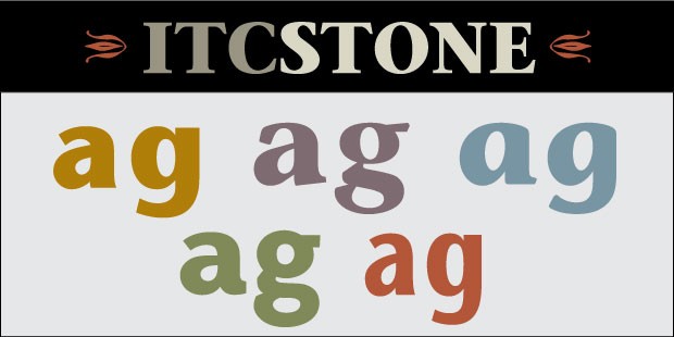 The ITC Stone family contains a Sans, Serif, Informal, Humanist, as well as a Sans Condensed.[/caption]
A type super family is a family of typestyles that are united in some way, usually sharing the same basic foundation and structure, but with different finishing details. Most commonly, a super family will offer related serif and sans designs in a range of weights.
[caption id="attachment_13673" align="alignnone" width="620"]
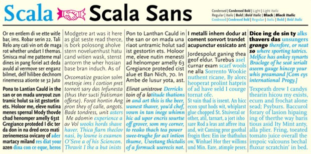 The FF Scala family contains a Serif, Sans and Jewel.[/caption]
Other stylistic variations can include informal, slab, humanist, script, decorative and display version, as well as width variations, such as condensed, compressed, and expanded. The advantage of using a type super family is that they offer a wide and varied selection of weights and styles that shine as individuals, but also combine harmoniously when used together.
[caption id="attachment_13674" align="alignnone" width="620"]
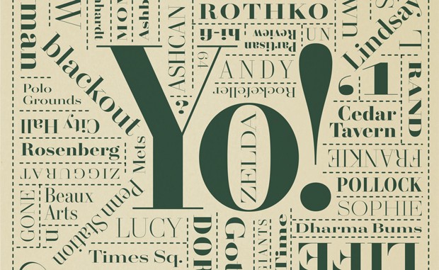 Terminal Design’s Yo series consists of five widths: Yo Andy, Yo Frankie, Yo Lucy, Sophie, and Zelda, each containing a whopping 20 weights.[/caption]
Some super families take an innovative approach. For instance, Linotype Compatil is a modular type system with four distinct styles, all having the same proportions and spacing: Compatil Exquisit is a Venetian serif, Fact is a humanist sans serif, Letter a slab serif, and Text a transitional serif.
[caption id="attachment_13683" align="alignnone" width="620"]
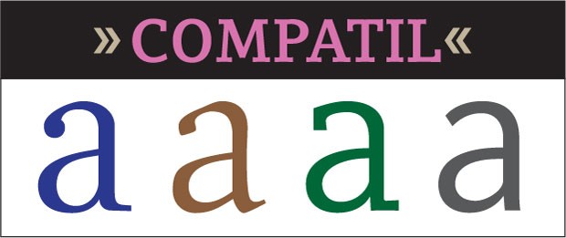 The Compatil modular type system consists of Text, Exquisit, Letter, and Fact.[/caption]
Laura Worthington’s Charcuterie is an unconventional type super family. What unites all of the versions of Charcuterie is a style – that of the French bistro and sign lettering of the early 1900s, where the mixing of different styles became in vogue. With its ten distinct styles as well as an assortment of ornaments, frames and catchwords, the possibilities are endless.
[caption id="attachment_13679" align="alignnone" width="620"]
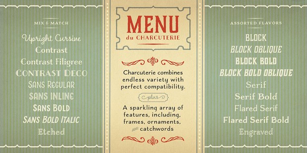 Charcuterie is a family of ten distinct yet related typefaces, many of which have their own font families, and three decorative/ornamental typefaces.[/caption]
Super families are hard to beat when it comes to versatility. If you want to mix typefaces effectively without risking an over-designed look, super families can be a great solution.
[caption id="attachment_13675" align="alignnone" width="620"]
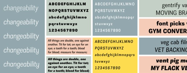 Trilon encompasses 80 fonts spread over four widths.[/caption]
[caption id="attachment_13682" align="alignnone" width="620"]
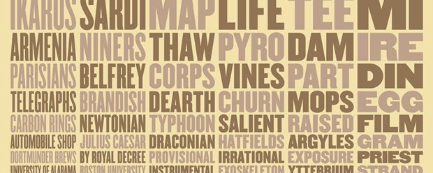 Champion Gothic is a stylish sans serif consisting of six different widths.[/caption]
Since they are usually based on the same skeletal structure with matching cap and x-heights, they work well together, creating contrast without discord.
[caption id="attachment_13677" align="alignnone" width="620"]
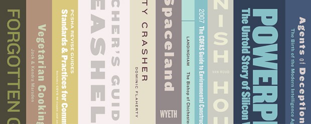 Knockout is a sweeping collection of 32 sans serifs encompassing nine widths.[/caption]
Staying within the same typeface family can create smart pairings that support an effective typographic hierarchy while maintaining a consistent tone and personality.
 The ITC Stone family contains a Sans, Serif, Informal, Humanist, as well as a Sans Condensed.[/caption]
A type super family is a family of typestyles that are united in some way, usually sharing the same basic foundation and structure, but with different finishing details. Most commonly, a super family will offer related serif and sans designs in a range of weights.
[caption id="attachment_13673" align="alignnone" width="620"]
 The FF Scala family contains a Serif, Sans and Jewel.[/caption]
Other stylistic variations can include informal, slab, humanist, script, decorative and display version, as well as width variations, such as condensed, compressed, and expanded. The advantage of using a type super family is that they offer a wide and varied selection of weights and styles that shine as individuals, but also combine harmoniously when used together.
[caption id="attachment_13674" align="alignnone" width="620"]
 Terminal Design’s Yo series consists of five widths: Yo Andy, Yo Frankie, Yo Lucy, Sophie, and Zelda, each containing a whopping 20 weights.[/caption]
Some super families take an innovative approach. For instance, Linotype Compatil is a modular type system with four distinct styles, all having the same proportions and spacing: Compatil Exquisit is a Venetian serif, Fact is a humanist sans serif, Letter a slab serif, and Text a transitional serif.
[caption id="attachment_13683" align="alignnone" width="620"]
 The Compatil modular type system consists of Text, Exquisit, Letter, and Fact.[/caption]
Laura Worthington’s Charcuterie is an unconventional type super family. What unites all of the versions of Charcuterie is a style – that of the French bistro and sign lettering of the early 1900s, where the mixing of different styles became in vogue. With its ten distinct styles as well as an assortment of ornaments, frames and catchwords, the possibilities are endless.
[caption id="attachment_13679" align="alignnone" width="620"]
 Charcuterie is a family of ten distinct yet related typefaces, many of which have their own font families, and three decorative/ornamental typefaces.[/caption]
Super families are hard to beat when it comes to versatility. If you want to mix typefaces effectively without risking an over-designed look, super families can be a great solution.
[caption id="attachment_13675" align="alignnone" width="620"]
 Trilon encompasses 80 fonts spread over four widths.[/caption]
[caption id="attachment_13682" align="alignnone" width="620"]
 Champion Gothic is a stylish sans serif consisting of six different widths.[/caption]
Since they are usually based on the same skeletal structure with matching cap and x-heights, they work well together, creating contrast without discord.
[caption id="attachment_13677" align="alignnone" width="620"]
 Knockout is a sweeping collection of 32 sans serifs encompassing nine widths.[/caption]
Staying within the same typeface family can create smart pairings that support an effective typographic hierarchy while maintaining a consistent tone and personality.