
 There is no denying that Apple has got it down. It - a magical combination of simplicity and beauty that even the most loyal Android user will admit. This is minimalist design, and we see it everywhere today, from the Pinterest homepage, to business cards, to our most-used apps. And we hear it: KonMari anyone?
Minimal design appears classic and simple, and intentionally so, but all design is design - it goes through the same problem-solving process as any other design style. Whether you want to build out your graphic design portfolio or redecorate your living room, there are specific minimalist design principles to follow. There is, after all, a science to every art.
There is no denying that Apple has got it down. It - a magical combination of simplicity and beauty that even the most loyal Android user will admit. This is minimalist design, and we see it everywhere today, from the Pinterest homepage, to business cards, to our most-used apps. And we hear it: KonMari anyone?
Minimal design appears classic and simple, and intentionally so, but all design is design - it goes through the same problem-solving process as any other design style. Whether you want to build out your graphic design portfolio or redecorate your living room, there are specific minimalist design principles to follow. There is, after all, a science to every art.
The Minimalist Style: What is it & Where is it From?
In its initial heyday, minimalism can be traced to the late 1960s to early 1970s American visual art, however, artistic and philosophical movements around the world laid the foundation for its growth even before the 20th century. If you’ve ever seen inside a traditional Japanese home, it’s clear that today’s minimalist home draws from the Zen aesthetic. Dating back to the 12th century, the Japanese Zen philosophy carries visual principles such as Ma and Wabi-sabi. Ma literally translates to “negative space”, but is better understood as a person’s consciousness of space created by intervals. Wabi-sabi emphasizes austerity and the integrity in using natural objects. Western interest in zen, however, didn’t generate until after World War II.Whether you're a minimalist or not -- learn how to position your brand to stand out from the crowd. Learn more.

Fast-forwarding to the 20th century, obvious European influences led to the birth of American minimalism. The De Stijl movement the Netherlands restricted artists to rigid rules (see Piet Mondrian), while German Bauhaus artists experimented with geometric abstraction, championing the motto “form follows function”. Dieter Rams, head designer for Braun, called for “less, but better” (don’t miss his 10 principles for good design). Pioneer of modern architecture and father of “less is more”, Ludwig Mies van der Rohe brought minimalist building to America in the 1930s. Moving far-west, the stage was set in 1960s New York: artists like Donald Judd, Don Flavin, Robert Morris and Anne Truitt balked at lavish and overly decorative art, stripping their work down to only the most essential elements. They believed this revealed true form - American minimalism was born.
6 Guidelines: How to Design Like a Minimalist
First, you should determine if minimalism works with your project - it’s a design choice, after all. In the case of web design for example, content-heavy websites like Amazon may incorporate some minimalist principles, but ultimately can’t be simplified enough. Similarly, a children’s product or app needs a lot of stimuli - minimalism probably isn’t the best choice. But if the style fits, then consider the following:Put function first
What your product is used for determines how it looks. Period. Minimalists prioritize content and accessibility, and products have a clear purpose. There shouldn’t be anything decorative that could confuse the user; in fact, you should conserve resources in construction. Try subtracting elements until you only have the bare minimum for your product to work.
Create visual hierarchy
Make it really clear for the user: what’s the focal point? Where should they start? What information is most important? Play with design elements like typography, composition, color, and contrast to create high contrast and simplify user experience.Leave room to breathe
Remember Japanese zen? Negative space (most often white space, but it can be another color) is the base of minimalist design. Lots of blank space ensures your design is simple and allows your audience to focus on only the necessary elements.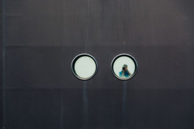
Be strict with proportions and composition
Using strong grid alignments eases navigation and keeps your design clean. Keep the rule of thirds in mind, but also explore other compositional options to create balance.Limit color
Be sparing and intentional in your use of color. Try a limited color palette or go monochrome. This doesn’t mean you can’t be bold though; stand-out splashes of color are used by many minimalist designers.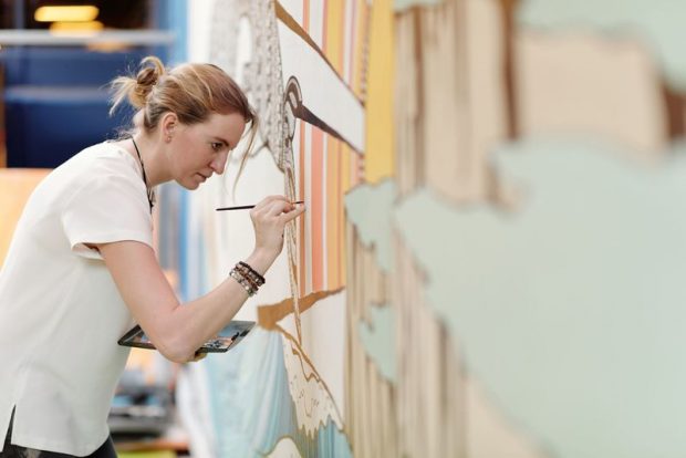
Use simple typefaces
Communicate with clean and straightforward fonts with a high level of readability. What minimalist design looks like in…- Web and app design You’ve witnessed the influence of minimalism on web and app design: just check out this fascinating visual timeline of how well-known websites have evolved throughout the years, and try not to cringe throughout the 90s. Flat design, or a 2D aesthetic in the user interface of websites and apps, means icons and buttons have been distilled down to their most basic units - the era of raised “you’ve got mail” buttons is long gone. Consider how you’re nestling information and arranging layout to ease navigability; for example, many web designers use the F-pattern for text-heavy content. For content-heavy sites; you may design a minimalist landing page only, or use a top-heavy model (negative space and high-level content first, followed by denser content after the scroll).
- Graphic design Minimalist graphic design is distilled down to pure visual elements, communicating a lot in simple forms. This doesn’t mean uniformity though - these examples demonstrate endless possibilities.
- Interior design A minimalist interior is clutter-free - everything has a home. Notice how color schemes have neutral or light color bases and added textures like rugs, pillows, and blankets stay within the same tone. A minimalist home isn’t void of color though - often standout pieces add pops of color to create a focal point. Open space is key, so prioritize quality over quantity of items.
- Architecture The works by Tadao Andao and Kazuyo Sejima reflect minimalist architecture philosophy: paring down materials and elements to arrive at the essence of a structure. Open-plan layouts emphasize space.
Whether you're a minimalist or not -- learn how to position your brand to stand out from the crowd. Learn more.