In the age of digital photography, the value of printing your images cannot be overstated.
For most photographers, their best work will get posted to Instagram and on their online portfolio, and then just sit on a hard drive forever. But having
a tangible, physical print of your work is a large part of what photography is all about. It translates a digital file into the true physical art form that photography is grounded in.
I am a huge fan of
printing my photos; as large as I possibly can while retaining sharpness and quality. I do it for myself, as well as for occasional print sales. I use a few different professional print-labs, and am usually fairly satisfied with the final result, however I have definitely gotten back a number of prints that are clearly off. It's hard to describe, but most people who have printed their own images can recall noticing that certain colors are simply different than what you had post-processed when it was on your computer.
I have wasted hundreds of dollars on prints that I do not display, because when they arrived I knew that they don't represent what I had intended. This sucks, and because I know it is my own fault I have just had to shrug it off.
I have always had a basic understanding that things like color profiles, monitor calibration, and paper/printer choice all make a difference in the final outcome. But to be honest, the idea of going down that rabbit hole of research just didn't appeal to me.
I wanted to focus on taking pictures.
My big mistake was not thinking that this stuff was as crucial as it actually is.
Some other key mistakes that I have made: sending TIFF files to print labs that prefer JPEGs. Shooting and then processing/exporting different color profiles. Post processing my images on a laptop and assuming that my monitor's display was exactly the same as how the printer would see it.
All of these various mistakes have led to sub-par prints, either for myself or (far more embarrassingly) for clients. While some of these mistakes have been glaringly obvious (like the time all the colors in a sunset photo were inverted), many of the issues that I am referring to are very subtle. However my goal is to position my work as high quality photographic art, and when a final print doesn't represent that, I am uncomfortable displaying it.
Some key things to pay attention to if you are
printing your photos:
- The color profile in your camera settings
- Your monitor's color calibration
- The color profile settings of your final exported image
- The settings and file type preferences of your print lab, or
- The settings of your home printer that you are printing on
- The type of paper you are printing on
- An LOTS more that I don't even know about yet
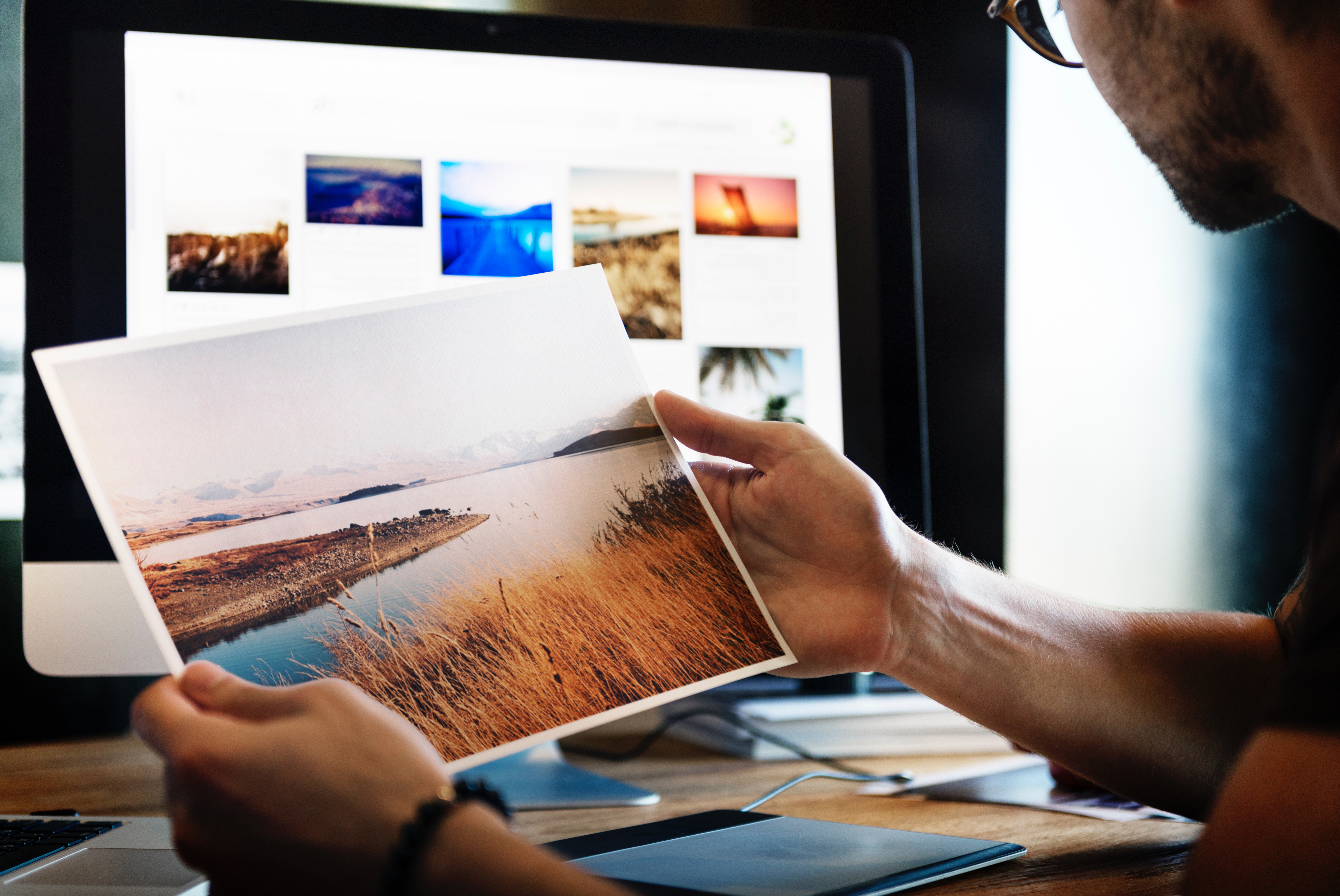
[caption id="attachment_34034" align="alignnone" width="3162"]
Printing photos gives you a deep sense of pride in your work[/caption]
The art of getting the print right is based on somewhat-technical, and usually overlooked information that most photographers don't want to bother themselves with. Even if you are so inclined and want to seek this information out on the internet, what you will find is severely lacking: a couple of blog articles that don't actually explain anything.
One of the biggest elements of my mistakes: I don't know what I don't know. This would be a much more simple article if I could just list out what the ideal printing settings are, but it's really not that simple, and I am 100% certain that there are factors that are contributing to the quality of the final print that I have yet to learn.
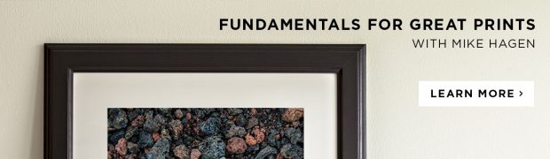
This is why I could not be more excited about the upcoming CreativeLive course,
Fundamentals for Great Prints with Mike Hagen. Watch it for FREE while it's live on Jan 14015, 2018, and learn how the professionals approach this topic.
You will learn how color translates from a digital file to a print. Mike will also cover the different sizes and aspect ratios to consider as well as how to sharpen for best quality.
Some of Mikes's most essential advice has to do with shooting. There is a long journey from the shoot to the printer, but the decisions you make up front really shape the potential of your print. Mike calls them "field techniques."
Field Techniques for Better Prints:
Set your camera for the lowest ISO you can get away with. A low ISO makes for less noise. An ISO setting of 100 is a great goal.
Depth of field control. You probably have a depth of field button on your camera. Use it to check your depth of field and verify the right subject are in focus.
Shoot RAW. A RAW photo will help you pull more details out of the shadows.A JPG can produce great prints, but you need perfect exposure. RAW gives you more flexibility.
Set it to Adobe RGB. If you are shooting JPG, set your camera for Adobe RGB in the color space setting in your camera. You’ll end up with a greater range of colors when you get those professional prints.
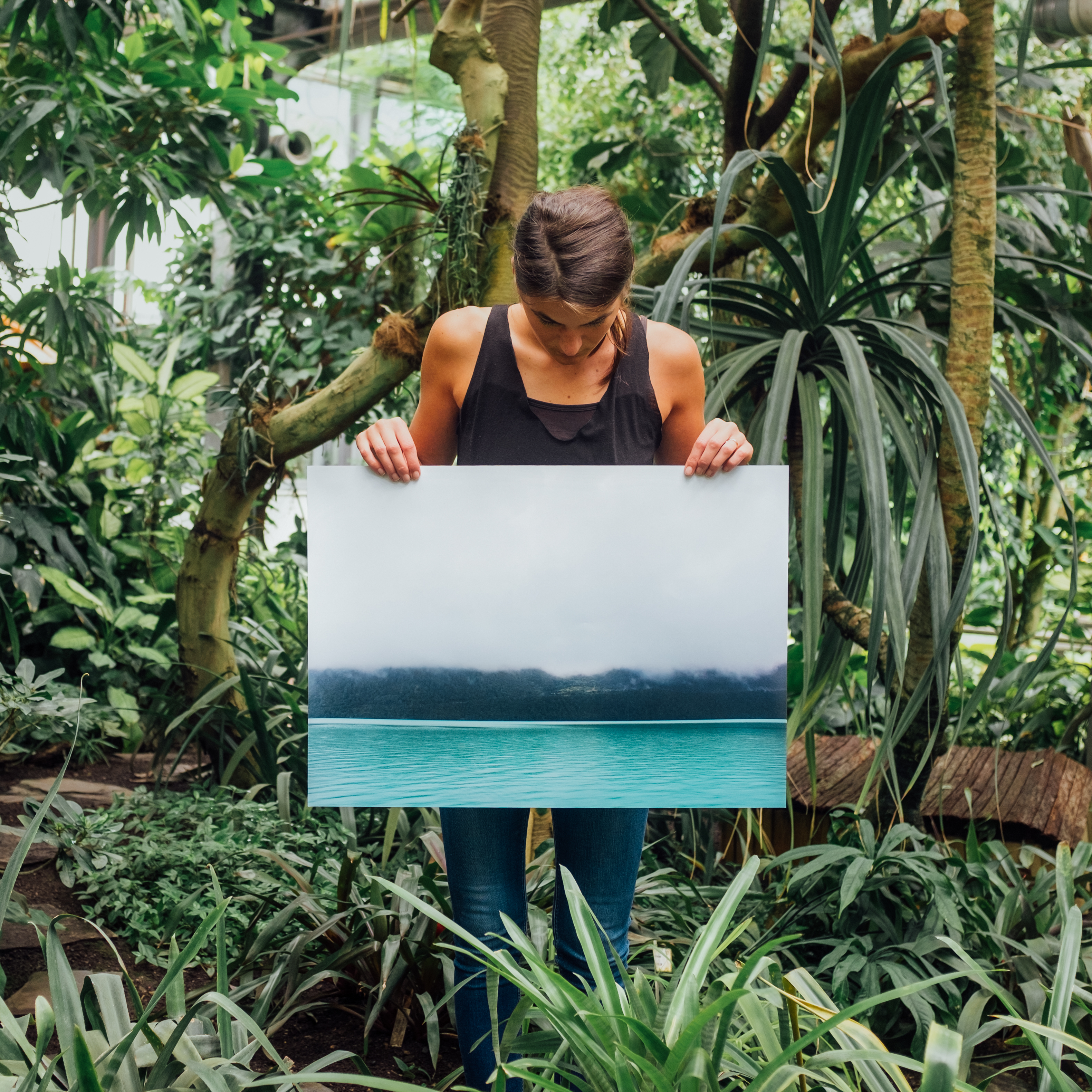
[caption id="attachment_34035" align="alignnone" width="3175"]
How great would it be to display your work publicly with total confidence?[/caption]
It's a hard truth, but photography is more than just taking pictures. The art of the print is really what can make the difference between hobbyist, and a successful photographer.
Whether you are selling your artwork, displaying your art in a gallery or venue with the hope of getting print sales, or selling wedding albums to your clients,
this stuff matters.
You spent a lot of time and hard work getting your photo to be as stunning as it possibly can be, so why would you not take the time and make sure you are
getting the print exactly right?
Join
Mike Hagen and CreativeLive to simplify your print workflow while enhancing your end product.
