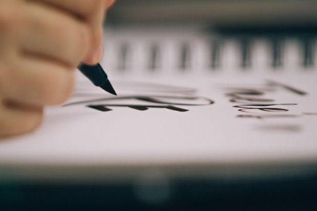
 Typography today is a distant cousin of the highly manual art it used to be. In a not-so-distant past, typesetting was a specialized skill practiced by dedicated typesetters and done in collaboration with both a graphic designer and a printer.
Today, nearly everyone is expected to use fonts and know the basics of typography. We select fonts for everything; email signatures, web fonts, newsletter headlines, Instagram stories, and on and on. Our typography choices are a reflection of our personal and professional brands – which means they are worth getting right. As Ilene Strizver put it in Typography Fundamentals, “you can have the best illustration or best photograph in the world but if you use some crappy type inappropriately styled and set, it is going to downgrade the level of what you are doing.”
Typography today is a distant cousin of the highly manual art it used to be. In a not-so-distant past, typesetting was a specialized skill practiced by dedicated typesetters and done in collaboration with both a graphic designer and a printer.
Today, nearly everyone is expected to use fonts and know the basics of typography. We select fonts for everything; email signatures, web fonts, newsletter headlines, Instagram stories, and on and on. Our typography choices are a reflection of our personal and professional brands – which means they are worth getting right. As Ilene Strizver put it in Typography Fundamentals, “you can have the best illustration or best photograph in the world but if you use some crappy type inappropriately styled and set, it is going to downgrade the level of what you are doing.”
So how do you get type right?
 Most people (besides professional type designers who know the difference between slab serifs and sans serif fonts) use the words “typeface” and “font” interchangeably but it can be helpful to know there is a difference between the two. The distinction is useful because it calls our attention to all of the little variables that are otherwise easy to miss while selecting a font from a drop-down menu. In the days of manual typesetting, Bodoni was a “typeface.” The “font” described the size and weight of the Bodoni blocks the printer used for the job. Today, designers tend to call the whole thing a “font” or “typeface” and there isn’t much practical utility in parsing words, but the history adds context and reminds us how much variability exists–even within familiar typefaces like Helvetica or Times New Roman.
All of that variability shows up in the shape and design of individual characters. Strizver published a handy visual guide to the anatomy of a character. The guide makes it easy to see how many little components are at work in a letter. Learning what a swash, stroke, and step are can be a good way to “educate your eye” to see the subtle (or significant) differences between fonts. With so many components it is easy to see why there is such a range of personalities among typefaces.
Most people (besides professional type designers who know the difference between slab serifs and sans serif fonts) use the words “typeface” and “font” interchangeably but it can be helpful to know there is a difference between the two. The distinction is useful because it calls our attention to all of the little variables that are otherwise easy to miss while selecting a font from a drop-down menu. In the days of manual typesetting, Bodoni was a “typeface.” The “font” described the size and weight of the Bodoni blocks the printer used for the job. Today, designers tend to call the whole thing a “font” or “typeface” and there isn’t much practical utility in parsing words, but the history adds context and reminds us how much variability exists–even within familiar typefaces like Helvetica or Times New Roman.
All of that variability shows up in the shape and design of individual characters. Strizver published a handy visual guide to the anatomy of a character. The guide makes it easy to see how many little components are at work in a letter. Learning what a swash, stroke, and step are can be a good way to “educate your eye” to see the subtle (or significant) differences between fonts. With so many components it is easy to see why there is such a range of personalities among typefaces.
 Mastering these fundamentals sets you up to feel more confident when it is time to buckle down and select a typeface or font that will be perfect for your project. For every typography project, there are three key questions you can ask that will help guide your type choices:
What are my goals? In client work, your job is to use your typography skills to help the client achieve their objectives. It is crucial you understand the exact outcome your client hopes to achieve with your work. In the words of Strizver, “every typeface has a distinct personality and conveys a different mood, message, or feeling.” When you understand the ultimate goal of a design it becomes possible to start thinking about the right typeface mood.
Where will this be displayed? The size and scale of the display font is going to have a big influence on what you do with any particular design. A banner displayed at a distance calls for much different type choices than a full-page flyer.
Who is the intended audience? While you, personally, might be keen to use a clean modern look you’ll have to consider your audience. If your client is a stalwart of tradition who aims to reach an older audience, make sure to use typography that reflects their tastes. Age and demographic information are helpful guideposts.
Mastering these fundamentals sets you up to feel more confident when it is time to buckle down and select a typeface or font that will be perfect for your project. For every typography project, there are three key questions you can ask that will help guide your type choices:
What are my goals? In client work, your job is to use your typography skills to help the client achieve their objectives. It is crucial you understand the exact outcome your client hopes to achieve with your work. In the words of Strizver, “every typeface has a distinct personality and conveys a different mood, message, or feeling.” When you understand the ultimate goal of a design it becomes possible to start thinking about the right typeface mood.
Where will this be displayed? The size and scale of the display font is going to have a big influence on what you do with any particular design. A banner displayed at a distance calls for much different type choices than a full-page flyer.
Who is the intended audience? While you, personally, might be keen to use a clean modern look you’ll have to consider your audience. If your client is a stalwart of tradition who aims to reach an older audience, make sure to use typography that reflects their tastes. Age and demographic information are helpful guideposts.
 Once you’ve answered those questions you can use these five typography tips perfect for better design, every time:
1. Use related fonts to create unity.
Too much contrast can create chaos on the page. Using different fonts from a font family or type family is a simple way to create visual harmony.2. Cultivate your personal list of workhorse fonts.
James Victore is a legendary poster designer and he encourages designers to keep things simple. It is easy to get bogged down in the process of selecting a typeface, but some projects need to be expedited. Keeping a list of personal faves will help you work quickly.3. Get your hierarchy ironed out.
Strizver thinks the process of establishing a hierarchy is one of the most important jobs a designer does. She explains that “clearly distinguished font sizes... establish a logical content order.” In essence, hierarchy shows the reader which information is most important and your type and font choices can make that easy to see.4. Serif or sans serif font?
While there is an entire universe of typefaces to choose from, most can be divided into one of two groups: serif and sans serif. A serif is the little extension that comes off a character or letter. Books and magazines are almost always set with serif typefaces based on the commonly held belief that serif type is more readable. The truth is that both serif and sans serif can be rendered unreadable by bad design, but, for long blocks of text, defaulting to serif is a safe choice.5. Design for readability.
Typography serves a unique purpose: it is there to be read. Don’t get carried away with eye-catching fonts simply because they are interesting to look at: remember to design for your reader and make sure they can actually read the text.Make a living doing what you love. Join Debbie Millman to build your brand and create a meaningful career.