Lesson Info
8. Editing Images in Lightroom
Lessons
Class Introduction
05:06 2Composition, Props & Angle
14:28 3Shoot: Cake with Flowers - Creating a Story
29:11 4Shoot: Waffle with Syrup - Capturing Movement
23:53 5Shoot: Granola - Simple to Complex
11:06 6Image Review - Crafting Your Story
25:16 7Culling Images
11:11 8Editing Images in Lightroom
18:37Lesson Info
Editing Images in Lightroom
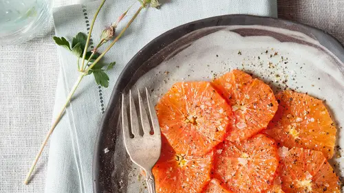
So let's edit these. Alright, we edited this image of the frosting, and now we have this image. We'll go into our develop, we'll go into our crop tool, there's no need to see the bottom of that, right there, and maybe we come in a bit 'cause the focus is really on the cake. And I think that's fine for cropping. I like that, I like the tight crop. And then I wanna work a little bit with the exposure. I wanna make the white of the background white. Oh, but then it blows out the flowers a little bit. So I want it to be very light and airy, so I kind of overly blew out everything by bringing up the exposure, but now I'm going to use the dodge and burn tool just a little bit, and bring some shadows back in, just with my exposure slide, just a tiny little bit. So I'll show you the difference. This is where we came in, and that's where we are now. So it's not a huge difference, but it just is enough to make it kind of pop and have a really light, white, airy feel, which I like. And if I wante...
d to bring out the pink more, I could come down here to the magenta slider, or try the red slider, ooh that's fun, or the orange slider, that gives a nice little. Okay, so we'll just go back down here though to the update the exposure adjustment. Okay, great. So I'm happy with that. I don't think it matches this image anymore, so what I wanna do with this image is bring up my exposure just a little bit. And you can still see the details, so that's okay. Alright. So next, we have our hostess with the mostest. Alright, so if I'm looking back at my grid in the library, I want our hostess to blend in with these two images. So she needs to be brightened. So let's go to our hostess, and let's develop, and let's go over to exposure and just see if we can bring in a little light and airiness. So we went from import, it was a little bit dark and shadowy, and then we just brought up our exposure of it, which really makes it have that similar, light, airy feel that's so popular right now. So we've got our nice cake, we've got our nice frosting, we have our hostess with her light and airy feel. Okay, so also I wanna do a little sharpening of her face, and maybe a little sharpening of everything else. And I think the contrast should be a lot, doing the punch is too much. So let's just see, we imported like that, and now we have it light, bright, and airy. Alright, so let's match this. So I'm gonna go bring up my exposure a little bit. It's really about the waffles. So there, what needs to be a color that you can really see. Right, her arm doesn't matter, the flowers don't really matter, they're subsequent items. But this I wanna bring in a little bit of a highlight here. So I just used my brush, I'm coming into my exposure. There, pop. Okay, so now what I want to do is go to my sharpening, and let's look and see what it was like before. Here's how it came in, which is pretty, and I like it, but for this story, it's really light and airy, so then this is where we are now. And then we do the same with this. We've got our beautiful hostess, we're bringing up the exposure a little bit. Maybe we crop a little bit, right? I don't think we need this. Well it's a little crooked, so straighten. You always want your lines to be straight, because that is what will make people crazy when they see squiggly walls that aren't quite, and if you have a wall that's, if your image is not straight, make it intentionally crooked. You can't have just a tiny bit of crooked in your image. So okay, I like that better, getting in there, that's nice but maybe we don't need so much of this napkin, it's not really telling us anything. Okay, we've got our hostess. There she is, airy, bright, and let's sharpen a little bit, and then let's see if it all matches. So we can kind of toggle back to that. It looks pretty nice together. But this waffle here, it's not that sharp, right, so I'm going into my handy dandy tool, and I'm gonna take the waffle is the important part of the image, that was our focal point, so I'm just gonna bring up the clarity, and I'm bringing up the sharpness, and then because I was doing that, I'm also bringing up the highlights. When you use clarity, remember it's bringing in black, and so I always match my clarity with my highlights. If I bring my clarity up 29 points, I bring my highlights up 29 points, and I see what that's like. So, I don't like the clarity on that, it's very muddy. So I'll show you the before and the after. Here's before, oops, before, before, there we go. I prefer that. So I've backtracked, and now I'm going back onto my waffles, and I just wanna sharpen them a little bit, and then I'll bring my highlights on them up just a little bit. There, I like that better. So we've gone from here, was our import, here we have our final image, and it's okay that our hostess is not in focus, because she's not the focal point of the story, she is there to tell us, there's a person, she's beautiful, she's made breakfast, she's smiling, she's welcoming you in. She doesn't have to look directly at the camera. You still get that whole story without her looking right at you. She's inviting, okay great. So now let's move on. We have this image, and I'm really not feeling like it fits the story, but I'm going to add other elements. Now I know what else to shoot. So I'm gonna keep it the same feel as the rest of them. So I brought up my exposure, and now I want these berries to be really sharp, so I'm bringing the sharpness up a little bit, and then also my highlights can come up on the berries. Let's see. Okay, so that-- And let's do just the regular sharpening. Okay, so we've got our import. That's okay, but then when we go to that, I think it fits in with the story, and to double check, I'm going back into my library, and I'm going to my grid, and now everything really to me, feels like it's part of one cohesive image group. So we could rearrange them a little bit. But anyway, the overall feel is consistent, and I know that I really wanna add some detailed shots in there of napkins, or of cutlery, I wanna tell the whole story, and for me that's elements. There's a hero shot, which is your main, overall shot that's finished, and then you have your wide shot, so maybe I'd show the room and the people in it, then I have my detailed shots, leading up to what then I have, I've got the process shots, I maybe have something of the hostess making it, which we kind of do, and then I have my plated, finished shots. And that's a story, right there, and it's also a color story. So I get two for the price of one. Yes, questions. So on all of your photography, do you ever do anything super wild? For example, put it in the Photoshop and just tweak the curves and make it look almost like inverted and just wild colors? I was watching a show the other day, and I think it was America Idol, or something like that, and the backgrounds, they were just all really wild and out of gamma colors. And I was just curious if you ever used those types of things. That's a great question. I do enjoy when other people do that, but in my work, particularly since I do so much for newspapers and magazines, and for catalogs, it's very important that my imagery really looks like what you'll get or eat. And particularly with food photography, you want people to know what they're eating. So maybe if you were doing a fashion portrait, that would be the right time to play with wild colors and really tweak the colors. But I want you to know that this waffle is edible, and in order to convey that to your subconscious, it's important that the waffle looks like what your brain expects a waffle to look like. That is how you trigger the salivation in your tongue. I think, if you look at this image right here, you're probably a little bit hungry, right? Something about that, you want to eat it, and the reason you want to eat that is because your subconscious and your eyes are working together, they're queuing each other, and so you're seeing an image and your brain is saying, mmm, that looks like waffles, yummy, and then I bet you can even smell the waffle while you're looking at it, and that's really, I think, the mark of a good food image, is to make your tongue salivate, and your nose start working, and your eyes to really lead the way for all of that. So even though in portrait photography or fashion photography, it's great to play with wild colors, in food photography, you really want your colors of your food to be true. So, great question. Yes. Do you ever storyboard your stories before you start? 'Cause I noticed you had, like the flowers, you had certain props that were ready for you, and I feel like, when you have to make choices, a storyboard would be handy. So I'm just wondering how you go about that. Storyboards are really useful, and if you're shooting for a cookbook, or you're shooting for social media, and you really are planning ahead, which I highly advise, storyboarding is a great way to do that. If I had storyboarded this, even in more detail, or had more time here, I would know that I wanted some images of cutlery, and that I wanted maybe an image of beautiful plates stacking. Absolutely. So in the storyboard, you can kind of plot out, I'll have three images that are prep shots, so I'll have two images that are detailed prop shots, I'll have plated images, I'll have three of those, and you can draw out a little bit of what you're doing, or make a vision board, a mood board. Absolutely, it's a great idea. Yeah. When you are creating your storyboard for your social media, do you have a guideline on how many images you think it would take to convey that story before you move onto the next? Would it be like six or, between six and 12, or kind of a guideline to post that story? Great question. So if you're talking about Instagram, for example, you look at Instagram in blocks, and those are blocks of squares, so I would do as many images as you could to fill that block os squares before you're scrolling. And you could maybe do double that, but when you're scrolling, it's very nice to be able to see an intact story when you just pick up your phone. Somebody might not go on and scroll through your imagery, but you at least know for sure that they're going to see that block of squares. Yeah, great question. I noticed when you were doing the cake earlier, and then when you were editing it, because you chose the-- This cake, or that cake? The wide one. Yes, oh the horizontal. Yeah, that the one. The line from your backdrop to your thing, I'm curious, do you ever do seamless rolls to get rid of it, or would that change the feel by making it too commercial and not tabletop? Great question. I do use seamless, and I usually use seamless if it is something that's for a catalog and it's a sillo. If I'm using something like this, I think it's really great to show a horizon line, even if it's faint, because in a natural environment, you're always having a horizon, and you wanna make sure it's straight, and if it's not straight in camera, you wanna do it in post. But if I were to do this shot and you didn't have that little bit of a horizon line, it might feel too studio. So how, if you were gonna post some of these on your social media stuff, what kind of text advice do you have, beyond just the image, how do you use text? That's a great question. So I use text very simply, and not on every image, and only in negative space. And I might have some text to introduce a series of images. On my social media, you can't really see that, but I do compilations of work, and then I send them around to editors, and reps, and ad execs, and also to, if I had one here I'd give you guys that. My most recent one was, I created my own magazine, we'll call it, just an issue of a bohemian lifestyle, and in that, I made a cover, and then a few of the interior images, I had some text around the images that said things like, bohemian style with an arrow in the negative space, and then a portrait of a woman over here. So I think if you're subtle with your text, it's a great way to let your reader know what you're doing. You tell people what you're doing, and they will believe you, most of the time. So if you wanna say, this is the new section of my Instagram feed, you could start with an image like this, and write birthday party, or hostessing, or celebrate, and that would convey an image, it would lead up to everything you're doing afterwards, and I would know what you were talking about, I would know what to expect, which is so helpful. So what kind of programs do you use when you're creating promos, or if you're doing your own magazine? So for promos and my own magazine, I use Photoshop. I also use some design programs that my assistant uses, and then she sends them to me, and I say, can you move this over, and can you do that. So I am not using Adobe Illustrator to do that because that's not my skillset, but I am art directing the process. I don't have a specific program to suggest to you other than Photoshop, and I always start in Lightroom. I always do my own post-production, because only I'll know the exact feel I want of something. And as you can see, it doesn't take that long for me. You can make it really simple and fast, and see a huge difference, a remarkable difference in your work. Yeah, tying in with the text question, how do you feel about watermarking, or do you watermark your images? Great question. I don't watermark my images, and you do always risk having an image being taken and used, but in professional circles, I find that my peers are also not watermarking. It seems to cheapen the image and it's very distracting, and so you have to just trust that your work is strong and that you have to trust people, and I've had a major, major magazine steal one of my images, and you have to just use your-- It's a hard question to answer, because it does happen, and it even happens to professionals. It's not avoidable, but there are great software programs that have come out where you can back-search imagery, and those are worth getting if you're concerned about that, for sure. Llana online asked, don't you always crop one by one, so square, or do you use longer, taller images now? I still use square format, but part of that is because I shot medium format in the film days, and I loved squares. Now they're a bit trendy, but my business cards used to be square, and I loved my medium format squares. So that's just something I'm drawn to. I know a lot of professional photographers are switching over and doing rectangular images in their Instagram feeds, and that looks beautiful too. I think the key is being consistent. So if you're choosing square, always do square. If you're choosing a full frame, always do the full frame. When you mix it together, that's when it doesn't really have a cohesive look. So whatever, it's personal choice, absolutely. What would you do different for online, using your photos online versus printing, just in post? Just in post, online versus print, I would sharpen in a different way. I find print, you need it to be tack sharp, and online, depending on the screen quality, it's not as important. It's important to always be sharp, but in print, you can see every little detail. And then in print, I also tend to make my images a little bit lighter and brighter, because the paper might take the black ink and really saturate, and so I want the image to come across the way I intended, so I'll tend to pre-brighten and lighten an image, I'll overly do that when I send it to a printer, so that I still am retaining the shadows, but it's not getting muddy. And it's important to find a printer you really like and can have a relationship with, because every printer will calibrate differently, and they'll print differently, and so it's very important to be able to work with someone and say, hey, this one was a little bit dark, can we go lighter? This one was a little bit bright, and once they get to know your style, they'll start printing for you automatically those ways. So it's great to develop a relationship if you're printing with your local print. And I support local, absolutely. So, yeah. And I use Bay Photo. I love them. They are really wonderful and have helped me so much with my imagery.
Ratings and Reviews
JennMercille
Liza Gershman is not only an amazing artist, she is an excellent educator. In this course, she goes beyond teaching the basics of interesting composition. She factors in the connection between food and culture, and the role that it plays in storytelling as a visual artist. She demonstrates how to draw upon the story of a dish, to showcase it with an authenticity that will set you apart and elevate your art. This was a wonderful class, and absolutely worth owning! Thank You Liza!
Florence Grunfelder
Liza gave a good overview of the steps involved in shooting food - from choosing the props, selecting the pictures to editing in Lightroom. This is a good course for someone getting started in food photography.