Landscape Printing Presets and Tips
Lesson 18 from: Photoshop and Lightroom for Landscape PhotographersMatt Kloskowski
Landscape Printing Presets and Tips
Lesson 18 from: Photoshop and Lightroom for Landscape PhotographersMatt Kloskowski
Lessons
Intro and The Basic Lightroom Formula
40:42 2Exposure Tips for Landscape Photographers
09:51 3HDR Demo for Landscape Photographers
16:09 4Things Landscape Photographers Stress Too Much Over
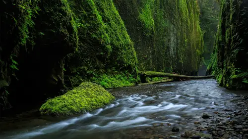
07:04 5Waterfall Landscapes in Lightroom and Photoshop
38:01 6Landscape Panoramas in Photoshop and Lightroom
19:30 7Mountain Landscapes in Lightroom and Photoshop
14:07 8Why I Don't Use Graduated ND Filters
03:37Making Your Skies Look Great
10:27 10Enhancing Clouds and Contrast
08:21 11Polarizers and the Sky
16:45 12Replacing the Sky in Landscape Photography
29:06 13iPhone Timelapse for Landscape Photography
08:07 14Organizing and Selecting Your Landscape Photos
15:43 15Editing the Selected Landscape Photos
12:30 16Editing the "Hero" Landscape Shots
08:17 17Lightroom Mobile and Landscape Photography
11:00 18Landscape Printing Presets and Tips
11:44 19Landscape Printing Q&A
10:39Lesson Info
Landscape Printing Presets and Tips
We got our photos imported, we got everything organized. We've kinda seen the editing throughout the day. If you got anything from that, which photos do you spend time on, which photos do you try to move through quickly, you know. I know it can kinda seem confusing. You've seen me use Lightroom presets sometimes and then you see me jumping into Perfect Effects and all that. The presets and those thing, that's when I'm not gonna leave Lightroom. The photo's not really an iconic photo for me, it's not gonna do much, it's gonna be part of a photo book, that's when I'll go through my presets. I want that work flow to be fast, 10, 15, or, 10, 15 seconds, not 10, 15 minutes. The other stuff, the other photos that I know are gonna be, these are gonna be print worthy, I'm gonna hang 'em on a wall, that's when I go through the more, the bigger process with it. Okay let's finish this up, talk a little bit about printing. So to me when it comes to landscapes, we've got a couple of different optio...
ns for printing. We'll talk about two things, one, we'll talk about layout and then we'll talk about the actual color process. What I'd like to do is just give you some recommendations for print material, not necessarily brands, but just what I find landscapes look better on. But let's talk a little bit about layout. Lightroom's got a lot of automatic layout options for you, so let's go find a folder. This is a good one, this has got a lot of photos in it. (mumbles) There's this brush, it's gonna bug me. Brighter foreground. (chuckles softly) Okay, a little brighter, a little warmer, okay. This is gonna bug me 'cause I love that photo and I forgot to pre-edit it. So I've got a folder full of a bunch of photos here so let's go ahead over to the print module and Lightroom's got a bunch of different layout styles, so it's got single image, contact sheet, picture package, which is basically Sears, and custom package which you layout yourself. The single image contact sheet ones, pretty good, I know it says single image, you can do a lot of multi-image presets with it, so I'm gonna run through my print templates and then I'll explain a few of them as we go through, it's easier to click on one and then explain what it did. I've got under my print templates here, so one large photo, landscape. So what did that do? You go under layout, sets the margins, one row, one column which means just one photo. And then the width and the height. So this is an 11 by 17ish, or, yeah. All right, so as you move things, see what happens? I can move the margins and I can change the way the whole thing looks. So that's one landscape print, one large photo portrait. You can click on different photos. Okay, we're gonna talk about this little watermark down here in just a second so just notice that it's there. I'll tell you how to get it in just a second, but that's landscape portrait which is pretty cool, and again, these are just some pretty common print sizes inside of here. One square photo. One tall photo edge to edge. Give yourselves a little bit more space, there we go. So one tall photo edge to edge. One photo wide. Panoramic, this is cool, so if you look at what I did with the margins over here is left and right are the same, top's a little bit and then the bottom, a little bit more. And you can tweak these, and then, the photo that goes inside of here you just move up and down. You can change what gets seen inside of it. So that's a fun one. Vertical landscape. So two vertical. As again, you just click through, get a bunch of different photos, two by two square. Two by three landscape. There's a background option down here under page, you can choose your background color. Let's see here, so three wide, three tall. Again, click inside here, you can change what you see. I'm not gonna go through, you kinda get the idea I think. Five photos. This one's kinda cool, especially with that scene where you've got similar photos. It almost looks like, if you've ever seen those canvas wraps where you print sections of them, it looks very similar, in fact, you could make it very similar and just use the same photo over and over again and just show different parts of it. But these are all ways that I think landscape photos can print well, different ways to print them rather than just printing one photo per page, which obviously, you could do that. 20 photos tall, I want white. Full bleed. It's a nice one too. All right, so, you saw how they were all, how I made all of them. Just play with the layout settings. All the margins, the rows in the columns, it's just how many photos do you want on the page? One and one is just one, you can obviously figure out the rows and columns go up, that changes. I did package all those up into, they're a part of that, you can buy them for nine bucks, the whole deal on Matt K photos, so they're packaged all into a zip file so you can just grab them, but, what I did down here is an identity plate, okay, so as you create these, you'd also have to create an identity plate. It's down here under the page section. A whole section for it. And what you do is you click on it to edit, and just type in, so you can see I did Helvetica, Futura, Helvetica, bold, so kinda just change the font a little bit but you save that as a custom identity plate and that way you can use it anywhere, you don't have to recreate it over and over again. The other one that I did, let's go back. Here, this is good, see that? So that I actually created inside of Photoshop. All right, what I did is, I created a new document. 2000 pixels wide by about 800 tall. And so I just took the type tool. Matt Kloskowski, let's leave that at that. Matt Kloskowski. A little bit bigger, and this will, I don't even think that's, we used a different font. But then what I did is I took the type tool again, I put MK and I just found a script font. It seemed like I had so many. There we go, there's one, there's one, there we go. I found a script font. Free transform, did a little bit larger, and then reduced the opacity. Save that image, save it as a JPEG. Go over to Lightroom, see the identity plate, remember when we went to edit it before? Remember how we put text in it earlier, I typed in text. There's an option to use a graphic, so you can create a graphic somewhere and import that and that's your identity plate. So it shows off things really well, it's a nice way to just add a finishing touch to things. So that's how we created all that and don't forget, you do have a page background color so you can change it from black to white or any color that you desire. So that takes care of the layout portion. I'm just about done, if I left you with anything, it'd be, when it comes to printing landscapes, so what do they look best on? Give you my personal opinion which is, I love metal. A, the metal prints. Most of the labs have them. They've all gotten really good now. Four or five years ago it was hit and miss, like only certain labs had 'em but they're all pretty much using a lot of the same technology now. So Nations Photo Lab, Made Photo, Mpix, they all have really, really good, good metal prints, so you really can't go wrong anywhere. Metal is different from metallic, okay? Metallic is a metallic-y paper. It looks metallic, like you know when you have a metallic paint that's got that, it's different, it sounds silly, there's metal and metallic. Metallic looks metallic, where metal, metal looks like a high gloss print. For me personally, I like my landscapes on a high gloss. I want them very, very glossy, I want lots of color and I want lots of detail. So I don't typically print them on canvas because I lose a little bit of that color and detail on there. I definitely don't typically print them on fine art paper because you'd lose even more of that color and detail on fine art paper, if I did it, I don't personally do a lot of black and white but when I do, that'll put on more of a fine art textured paper. But my big colorful landscapes, glossy, metal, luster paper if I'm gonna frame it. Those are really the two, the two key. But there's a big, big difference between metallic and metal. I personally am not a huge fan of metallics, sometimes it looks cool. Waterfall photos, photos with a lot of darker tones in them, I find metallic looks kinda cool, but it's got a metallic feel to it, I don't know, something that's, I don't know, something about it, I'm not crazy about it, but just kinda, if you want my two cents on what landscape photography looks good on, the glossier, the better for me. More colors, more detail, holds all those colors. The more fine art stuff looks better on more of that textured paper.
Class Materials
Bonus Materials with Purchase
Ratings and Reviews
Barry Walsh
Great class Matt! I am about two-thirds the way through the class and have learned a lot about Lightroom and the objective of this course. I must admit I was over-whelmed by the amount of material covered and that was probably due to not having prior knowledge about Lightroom. I have since signed up for the 7 day trial of Adobe Creative Cloud Photography plan and then went through their "beginner's" tutorial. If you are contemplating taking this course, I would highly recommend taking the Adobe Lightroom tutorials first. They cleared up a lot of confusion on my part and I now have a better understanding of the concepts Matt covered. I'm actually going to go back and retake what I viewed to help reinforce both what Matt initially covered and the basic concepts tutorials offered by Adobe. Again, great job Matt and thanks for all the useful information!
a Creativelive Student
Matt is the best and he his the same in person. I had the fortunate opportunity to run into Matt on the side of the road at Dallas Divide in Colorado a couple of years ago.... he is the real deal. I have learned almost all my LR post processing from him when he was with Kelby and have continued to follow him over to On1 as he is the best teacher out there when it comes to Post. Great class and bring him back again. Another great CL class ....... bravo!........ Johnny Boyd @ natureimaging.com