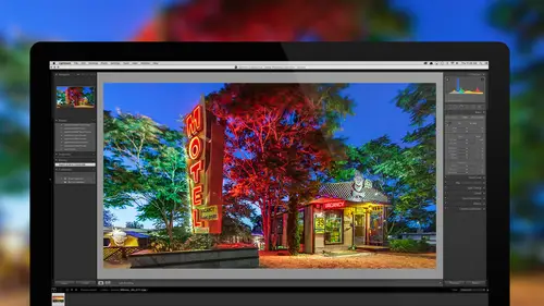
Lesson Info
9. Image Adjustment Techniques
Lessons
Bootcamp Introduction and Overview
1:22:40 2Import Images and Customizing Lightroom
1:41:15 3Understanding Catalogs and File Management
1:08:26 4Baseline Raw Image Adjustments
1:29:20 5Creating Finalized Files and Printing
1:28:55 6Organizing Your Images And Managing Projects
1:19:03 7Making Your Images Searchable With Keywords
50:35 8Fixing Isolated Problems
1:39:09Image Adjustment Techniques
1:17:56 10Fine Tuning Your Image
1:14:01 11Facial Recognition And Map Viewing
38:45 12Adjustment Workflow: BW, HDR, & Panoramas
1:16:49 13Organizing Your Keywords
49:24 14How To Find Any Image Quickly
55:41 15Showcasing Your Work: Slideshows and Books
1:26:38 16Image Adjustments: Start To Finish Workflow
1:07:18 17Lightroom To Photoshop And Back
1:02:26 18Basic Troubleshooting
55:48 19Advanced Tips and Tricks
1:03:21 20Workflow Refinement And Final Summary
1:01:45Lesson Info
Image Adjustment Techniques
We're back with Lightroom Classic: The Complete Guide. Let's take a look back at what we've covered thus far in class 'cause we've made it a quite a bit. On week one, we tried to create a firm foundation of knowledge so you really started to feel comfortable with the Lightroom before you got into to many of the advanced features. Therefore, we talked about catalogs, file management, getting your images into Lightroom, printing them and getting them back out, so you can deliver them to other people. Then on week two, the first day we talk about organizing your images and working with projects. And therefore, we talked about things like flags, ratings, labels, collections. On day two of the second week, we started to get our images to be searchable. Ultimately, our goal is to be able to find any memorable image in five seconds or less and that was the first step towards that goal. Then on the third day of the second week, we talked about isolated adjustments, so that now we know how if w...
e only need to adjust somebody's face or only the little corner of an image or something like that we can do so. Well that means now we are two-fifths done with the class. We still got quite a bit left. We have 12 days to go. And today, we're gonna get into reducing noise in your images, sharpening them and correcting for distortion. Let's start by talking about how to work with multiple images because a lot of the things we're gonna need to do in this session is such a common problem. It's something you might wanna do to an entire folder of images at once for some of it. So here I have a series of images that are very similar. If I click on the first image I can then hold the shift key, scroll down and click in the last image. And if I have all those images selected then if you look one of the images will be known as being most selected. That's the one that has the brightest area surrounding it. I can change which one is the most selected by just clicking within the picture on the others. Before when you click within the image though. If instead of clicking within the picture you click within this kind of border area around it then you'll get only one picture selected. So when you see me clicking I'm not clicking in the area beyond the picture. I'm clicking on the picture itself. I'm holding on the shift key to get down to the last one and then if I wanna change which one is most selected then I'm clicking within the picture itself. Now the one that's most selected this one I'm gonna see if I head over to the develop module. And now let's talk about how can I adjust multiple images and what are our options related to that. Well it all depends on the setting that is found near the lower right of my screen. Down there if you look closely you're gonna find the word Auto Sync. On your version of Lightroom though it's either gonna say this or it's just gonna say Sync and it all depends on what this little switch's status is. If that is in the up position then you're in auto sync mode and if on the other hand, you click on that light switch and it turns off now you would manually sync things by clicking the sync button. I'm gonna turn that on to begin with because whenever auto sync is turned on anything I do to this photograph which is the most selected one will also affect all the other images that are currently selected. So, since they looked all similar I could come in here and maybe pump up the vibrance on the image. You get it really colorful. Maybe I could adjust the white balance to control exactly what we have as far as the overall look of the image. And I can come in and adjust my contrast and just fine-tune this until I really like where we're getting, maybe like that sun blow out of have less with that. All right, let's say that's what I like. Well now if I go back and I look at these images in a library module, I'll do that by typing the letter G to go back to the grid view, it might take it a moment to update but it is trying to do it as fast as it can and it will apply the same settings to all the other images that were selected. Well after doing so I noticed that this one particular image here is a little bit brighter than the others so that's when I'm gonna click on that image to make it the only one selected. And to do that I don't click within the image itself I click in the surrounding area here and therefore it deselects all the others and now I can go back to the develop module, and just for that particular image I might end up bringing my highlights down or bringing the overall exposure down to make it look a little bit more like the others. I'll type G to go back to the grid and now you can see that only that particular images just got updated because there was only one image selected. Well, let's look at the other options, we'd have to get it to effect all those pictures. Let's say that I didn't think about all these other pictures at the time I was adjusting. Maybe I take all of these images except for one of them. I go to the develop module by typing the letter D and I'm gonna hit the reset button in lower right. That's gonna get rid of all adjustments applied to the images as if they've just been freshly opened or loaded from my camera. I'll go back to the grid by typing G and so you can see that we only have one image adjusted because that image was not currently selected at the time I reset things. All right, so now let's say I just adjusted this picture. In fact, I can go in and adjust it some more if I'd like. Maybe I come in here and make it even more colorful to make it ridiculous looking and I adjust my tint here to control the overall color. Now what if I wanna get those settings on to the other pictures? Well, we have a couple options. First, if that's the very last image that I adjusted and I switch to another one and I type D to go to develop module, you're gonna find a button at the bottom called previous. And previous means take whatever I did to the previous image, the last image I adjusted and apply it here. So now this image looks just like the last one I had opened. But that's only if the very last image I had opened in the develop module's one that I adjusted. So that's one way I could do it. The other way I could is I could keep that image selected and add the others. I'll hold shift and I'll get the last one and I'll make sure that the image that has the adjustments that I want is the most selected image. And that means the one with the lightest background surrounding it and if it's not I click within the picture itself to switch which one is the most selected. Now I head to the develop module, the letter D, and down here at the bottom we have auto sync on but auto sync is only going to work for the sliders that I move while that's turned on. And so right now it's not gonna automatically grab every single adjustments that's been applied to this but if I adjusted one slider in here like exposure to adjust it just a little bit, that slider itself is applying to all the other images. So I could fine-tune every single one of these sliders and it would transfer them over to the other picture but instead I can do the following. If auto sync was turned off then we have a sync button and that means let's manually sync and sync just means copy. We're gonna manually copy the settings that are applied to this image and we're gonna apply them to all the other pictures that are currently selected. So I end up hitting sync, this comes up and it wants to know exactly which setting should I apply. Because if you manually crop this image and you have another image that this one's a vertical, the other one's a horizontal, the cropping probably shouldn't go along with it. Or if you ended up doing some, I don't know, maybe spot removal in these two images or five images or whatever was shot in completely different days where you probably had different amounts of sensor dust on your sensor, you probably shouldn't copy that over. There's all sorts of reasons why you might not wanna copy everything. But in this case these images are so similar they were shot just a few minutes apart. I'm gonna go down here to the lower left and choose check all. And all that does is turn on all these check boxes. I'll click synchronize and it just copied the settings from the image I was viewing and it applied it to all other images that were selected. So, if we go back and type letter G to go to the grid it'll take it a moment to actually update the previews but you'll see that all of them have the same adjustments now applied. So, auto sync is useful if you have yet to start moving the adjustment sliders then it works fine. But if you forgot to select multiple images you only had one image like this one selected at the time you went to develop, maybe in this case you went to black and white, and go back to the grid and you realized, oh man, I didn't have all the other images. Well, that's when I can turn auto sync off and then it becomes a button called sync, and that button called sync means let's after the fact, copy these settings and apply it to all the others. But you don't have to go to the develop module to do this stuff. Let's say I took all of these other images and just to make it obvious that they don't have adjustments because I wanna remove them, I'm gonna right click after selecting all those and there's a choice in here, it should be called develop settings. It takes me a moment to find it, here it is. If I choose reset that's the same thing as going to the develop module and clicking the button on the lower right that says reset. And that means remove all adjustments from these images. All right, so now they don't have any adjustments. Only these two images, I didn't have selected have adjustments and let's see other methods we can get those same adjustments transferred over to the other pictures. Well, in order to not go to the develop module what I would do is I would right click on this image and when I right click I go to that area called develop settings because that means changes being made in the develop module. And I'm not gonna reset it because that would end up throwing away all the settings that then applied, instead I'm gonna copy those settings. Now when I choose copy I'm gonna see the same options that we saw when we used the sync button. The sync button is how we usually do this when we're in the develop module. When you're not you just right click on an image and we ended up saying copy settings. So in here I could come in here and turn off as many of these check boxes as I wanted. For instance maybe I don't want cropping to transfer even though this image hasn't been cropped. Or if I've corrected for distortion and like a building where I tilted up and the top of the building looked smaller than the bottom. Well, maybe that was only one of the shots so I don't need it to be applied to all the others. We could turn off these check boxes. I choose copy and now it's remembering the settings that I told it to copy from this image and I can select all these others. And right click on any one of them and now choose paste settings. And if I choose paste settings it's now gonna transfer all those settings to all those pictures. Another settings that I had in there was I think it was paste from previous and that is the same as the previous button that we had in the develop module. And what that means is just apply the exact same settings as the very last image that I brought in to the develop module and I adjusted. So that would be the cool one there. But now I want to apply the settings to this but I don't want it to take away the black and white effect. I think we might already have those settings applied in there but if I right click though and I told it I wanted to copy settings for something, that's when I might wanna go to this picture, choose copy settings and that's another time when down here I would choose check all, and then I'd look at what particular choice within here if I can figure it out would be the one that would affect the black and white settings because that's the setting that I don't want to wipe away from this picture. And I'd actually have to look because I don't feel like spending the time looking at every one but it's most likely under color that's here or might be a different one, but whatever it is you could copy and just figure out what one wouldn't reset it. Then I could come over here and paste and if I chose the right check box and I did not because the black and white went away, you could say don't override that particular part. Those are some of the ways that we can get images to have the exact same adjustment settings and oftentimes you need to do that because you shot a large number of images and it's just not worth spending the time to adjust them individually, or you just want the consistency that you would get for having identical settings. Here's another example of the series of images that I captured. They're so similar that I think they should all at least start with similar settings and then I might deviate afterwards to fine-tune each individual image. All right, then let's talk about how we can save settings for a particular image where we're not gonna apply it to a different picture. We just wanna be able to get back to it at any point in the future or past. Or in the future because that's the only place we can go. Let's take a look. I'm going to take this picture, I'm gonna hit the letter D to go to the develop module. And what I might wanna do here is have more than one version of the picture when it comes to cropping, just different cropping options. Maybe I commonly get people that want an image for Instagram and they like it to be square. And then I get others that need it to be able to fill an eight and a half by 11 sheet of paper and still I have a third person that always needs it to be used for HDTV which has that wide format look, and I wanna have it set up here. Well, you can go to the crop tool and you can crop it for all of those uses but it's only gonna remember the last version you ended up with. So, let's say that I got this set up, this is the exact cropping that I like because I got rid of some telephone lines that are up here, I got this nicely little car out of the way there and umbrella out of the way there, and you can't see the curb down here on the corner so I think that is my ideal cropping. So here's how I'm gonna get it to remember these settings. I'll go to the left side of my screen and over here there's an area called Snapshots. And I'm gonna click the little plus sign. Now I already have two snapshots because I worked on this image in the past but in this case I'm gonna add a snapshot and I'm just gonna call it Ideal Crop because that's the version of the cropping that I would personally prefer to use if at all practical. Then if they wanna have a different version I go back to my crop tool, maybe I change the aspect ratio and here I'm gonna go to 16 by nine. That's the proportions of an HDTV. So I choose 16 by nine but in this case it's getting me a vertical crop so there's a couple different ways I could do this. I could sit here and try to drag the image but that's not gonna allow me to get it to be horizontal. Instead I type the letter X, X means exchange their proportions there so I can get from horizontal to vertical. So with that I end up getting the bus in here, I end up adjusting each corner here, maybe get rid of that little white car that's there, get rid of the umbrella that is on the left side and then move this around, it's gonna be a pretty tight crop but let's say that's what I think is best for HDTV. Well, I go to the left side of my screen and even while I'm still in the crop tool, I could hit the little plus sign here and just call that 16 by nine crop. Oops I get a one in there instead of an exclamation point. All right, then I could do yet another one, maybe change this to one to one which would be a square crop and then I'd have much more versatility here with how far out I can bring that. Maybe include a little bit more of the image and I still don't think I get the top of the palm trees in there though. I'll keep them just a little bit out of the frame. Go to the left side of my screen and again I'm going to hit the plus sign and I'm just gonna call it square. Now it's not just for remembering the cropping settings, it's remembering every single setting that is in the develop module. So if when I made it a square image, I also clicked over here on the letters B&W where it turns it black and white and that's what I had when I created the snapshot. Then when I switched between these various snapshots it would not only crop it square but it would also make it black and white. But in this case I'm not gonna save a snapshot that has black and white built in. Let's just go over here now to my list of snapshots and see what we have. If I hover over to them without clicking then in this area above in an area called the Navigator I'll see a preview of what I'd get. So when I hover over the 16 by nine I can see that crop. Here's what I consider to be my ideal crop. Here's a square one, here's a tight and here's a vertical. Looks like the vertical and my ideal are probably identical. Since the ideal and the vertical are identical, I might only keep one of them and all I can have to do here is right click on it, and I can either rename this if I'd like to or I can delete it. You'll see there is also the choice of update with current settings and I might use that. Let me first delete this. Let's say I did the square crop. I click on it to actually apply it to my picture and I realize I don't really like it, I wish it was tighter. So I go to my crop tool, I bring it in a little bit tighter. That and then I go to the left side of my screen to the choice called square crop and I right click on it, and I say update it with the current settings. And that just means make it look like this one. All right, now we can both rename them, delete them and update them but all they are are remembering the settings that we applied in the develop module and if we hover over them we get previews and only if we click on them is it actually going to apply it and make the image look that way. So, when somebody request an image that is 16 by nine proportions I'll probably come over here, hit 16 by nine then I'll use an export preset to actually export an image that is, in this case, the right size for HDTV. 1920 is the horizontal dimensions of that and I could export it that way. But that's not the way I like the picture so when I'm done I go back to snapshots and I say let's go to that vertical crop because that's my favorite one. Since it's my favorite I might right click on it and rename it and have vertical crop slash my choice or something like that or my favorite. But snapshots aren't just used for cropping. This is where we can have a black and white version of the image as well as a color or when you're just experimenting with the image you think the image is really done at this point but you're gonna just experiment a little bit further. You might create a snapshot just so you could easily get back to this stage before you go back to your develop module and you start pushing the sliders even further to see if you can get away with it. As long as you have a snapshot before hand then you can experiment to your heart's content because you know you can always get back with that snapshot. And so, I use snapshots a lot for our different cropping. So here's another example of my bus and this one if I go there's my normal crop, I have a tight crop and similar settings. I also do this when I'm teaching, so here's an image that I taught with and I wanted to show the progression of this image. And so, if I go to my snapshots here you can just see them, they're just numbered and it shows me what I do at the very beginning, that's the one called negative one and it just progresses. And if you look at the little preview in here in the navigator, you'll see it. As I hover over these you'll see the image slowly change and I can get to the final one. So I can click on any one of these and progress through exactly what was done to this picture to build it up to my final version, and I could end up describing all those steps as I go through, and it looks like actually negative 10 is the first step. So, all sorts of uses for snapshots. It's a pleasant thing to do where oftentimes what I'll end up doing is whenever I think an image is done I'll make a snapshot and that just means that if I ever continue playing with it or I accidentally reset the settings on or anything like that, I can always get back to that stage. Another thing to use snapshots for would be if you just made a print of an image and you wanna keep track of what was the first version of that print, you can make a snapshot and name it initial print test. Then you make some changes to the image and to fine-tune it for that particular print make another snapshot and call it first revisions, then continuing to refine it, making more prints. You could kind of stack up the different versions and if you ever wanted to get back to a particular version of it you could do so through the snapshots. All right, now let's starting looking at some other adjustment features we have available. We're gonna look at sharpening images and dealing with noise. So, if I come in to an image and I just press the letter D for develop, one of the sections that I have on the right side of my screen is one called detail. And within the detail section I have both sharpening and noise reduction. You're gonna need to do noise reduction if you end up shooting with your camera set to a high ISO setting, if you ever do really long exposures or you ever adjust your images and you end up brightening up the dark areas. That's when usually you're gonna start seeing noise in your image. In this particular image it'll take it a moment to load when I zoom up but I can see a good amount of noise up in here. Now I'm not sure how well that noise is showing up on your screen because this is on video and there's compression so often times you don't see quite as well. I'm gonna zoom up to one to four, actually no, not one to four, the other way around, four to one. Four to one, it'll take it a moment to load I believe but you might be able to see in here that we have some noise. And right now there's actually been some noise reduction applied to this image, let's undo that so you can really see how much noise was in the original. Anytime you wanna reset settings to get them to their default settings you can double click on the heading. In this case I'll double click on the heading called noise reduction and I'll double click on this heading up here called sharpening just to make sure we're default settings for both. Then up here I can see quite a bit of noise. We probably don't need to be zoomed up quite that far, maybe we'll go out to two to one so you can see a little better. The first thing that I usually do when thinking about noise reduction is to first make sure that we're not exaggerating the noise that's in the image through sharpening because the default setting for sharpening is not zero. If you look at it, the default is 25% or just and that means it's taking all the detail in your image and exaggerating it. That detail could just as easily be that noise. So the first thing that I do is I come down here to sharpening and I find a setting called masking. When masking is set to zero it sharpens everything in your entire picture. That means it's even sharpening this yellow portion of the sun even though I can't see any detail in that at all. Well, to limit what we're going to sharpen we can bring this up and the higher we get it the less and less of our image is sharpened. What happens is things that are very similar to each other start being ignored and only where you see an abrupt change in the image. A big jump in brightness wouldn't still be sharpened. There's a hidden feature built into this and that is if I hold on the option key, I have it held on right now that's alt and windows. I can click it and watch what happens. My screen turns white but then if I start bringing this in you'll start seeing it looking different and now whatever turns black on my screen will not be sharpened. So if I bring this up far enough to right about there, now the yellow part of the sun that had no real visible detail won't be exaggerated but the areas surrounding the sun will. Well, if you look at those areas out here do you see any useful detail where you recognize the texture fabric or a mountain or something else? I don't think there really is any useful detail there. If you look at it there's useful detail right here on the edge of this, right here on that tiny little edge. I can see a little bit of useful detail down here. But in the area up where the sky is maybe only where the transition is between this color and the next, otherwise this should look perfectly smooth. So let's go to the masking setting, I'll hold on the option key and I'll start to pull it in and tell those areas that don't really have recognizable detail until they turn black. And if I wanna back off on it sometimes I do because look at the bottom portion of the image. If I still wanted to sharpen some of this stuff I don't wanna push it too high then, I might end up with about there because we're still sharpening the stuff at the bottom. Or if that stuff is not all that important when it comes to sharpening then I'll keep going to try to get the sky to really get black. So now only the areas that have those little white lines on them will be sharpened. It all depends on how important it would be to get this areas to be sharp. I don't think that's an important portion of the picture because I really think this is the focus. So that's a first thing I do is make sure we're not sharpening smooth areas that don't have any recognizable or useful detail. And so, I do that by bringing up masking. Then the next thing I do is I need to zoom up on my picture because you can't see noise when you're viewing it where you can see the entire picture. Most of the time I go to one to one view but I find with some of the newer higher resolution displays it's even hard to see the noise at one to one so on occasion I'll go up even closer, and you can change what setting is loaded into this far right area by going to these little arrows, and right now I'm using two to one. So now I can more easily see the noise that's in the image and here's where I can do my noise reduction. There are two kinds of noise in the image. If you see that the noise just looks like the brightness of the image varying then you have luminance noise. If on the other hand where you see the image varying its different colors, it looks almost like Christmas tree lights where you see green and yellow and orange and pink, then you have color noise instead. So, here I only see it varying in how bright the image is so I'll bring up luminance noise. When you bring this up it can take a little bit of time for it to apply. If you have a slower computer then you might have to wait before you actually see the image update. You can find out if it's done updating or not by looking at the bottom edge of your screen right here if you look in that spot right there. Watch what happens in that spot, I'll try to get it where I can see them both. Okay, watch that spot right there when I come up here and I adjust luminance. Do you see the little whirly that showed up for a second? On some computers you might find that that sits there for two to three seconds. And so, if you're moving this slider around wildly and not giving it time to update, you might think that noise reduction is really ineffective but in reality it just never updated your screen. So I'll bring this up until my noise is no longer objectionable. I don't expect to completely get rid of it because when you do oftentimes your image will look too soft. Then next there is a slider here called detail and as I bring up detail it's gonna try to maintain detail in other portions of the image. If you get it too high though it will often make the sharpening go away. So you're looking for the highest setting where it doesn't make the sharp, not sharpening, the noise reduction ineffective. And this image you're not gonna notice a huge amount of difference, there's not a fine detail in the picture. So let's try a different picture. Here's an image where I really wish I could see what's in the dark portion of the picture. And so, to be able to do that I'm gonna come in here and bring up my shadow slider to see if I can get more of that detail to appear. I could bring up my exposure slider if I wanna go even further because my shadows is maxed out. After doing so I think my highlights in here are a little too bright so I'll back it off. I'm just fine-tuning this image. All right, now at this stage anytime I have taken something that was really dark to begin with and I brightened it up, that's when I think about noise reduction. So I'll go to the left side of my screen, I'll go to either one to one if that's easy enough to see it or sometimes two to one, it all depends on how high resolution my screen is. In this case I easily see it at one to one. And I will come over then to this area called detail and a lot of these images will already have settings applied so I'm just gonna double click on noise reduction and double click on sharpening to be sure that we're at default settings. Now in here I see a tremendous amount of noise and hopefully it comes across in the video. It's luminance noise meaning that it's just varying in brightness. I'm not seeing all sorts of different colors in there so it's going to be the luminance slider that I need to use. But before I do that I wanna make sure we're not sharpening these areas. If I look at this area here I can't see the texture of stucco or whatever material this is so there's really no useful detail there, there's no reason to sharpen that. I can see detail right there where there's a transition, same with this edge so it wouldn't be a bad thing to sharpen these edges but there's no usable detail here. So I'm gonna go to masking, I'll hold on option and I'll drag it up until those areas, you see all that white stuff in there, that would be sharpened. That's the noise. It'll bring it up to right there. Now those areas are no longer being sharpened but if you see what's still white on my screen, those areas are being sharpened and those are the transitions where I said we had a little bit of useful detail. So now I know we're not exaggerating the noise that's within this image. Then I'll come down here to luminance and one thing you can do with luminance is you'll notice the two sliders below it are grayed out when luminance is set to zero, and it's only if you bring luminance up at all, doesn't matter what setting that they become available. Well, sometimes what I end up doing is I'll bring up luminance just a tiny amount just to get these other two sliders available and then I'll do the following. If I bring detail all the way down it's the equivalent to turning off this setting. And so, it's like this isn't doing anything at all. Now we're just doing purely noise reduction and I can bring this up and see at what point does the noise become where it's not objectionable. And I'm only thinking about the noise, I'm not thinking about any detail that would be left over. So let's say right about there it's no longer objectionable. Well, the problem is if you have detail turned all the way down when you do noise reduction everything in your image gets soft and it's detailed, it's gonna bring back detail in those areas that are not smooth. So now I'm gonna max out detail as high as I can go and if the noise reduction got lessened where it's no longer effective then I'll lower it and I'm trying to find what is the highest setting where noise reduction is still effective. And sometimes I need to go back and forth, bring it back up to see did the noise come back. Bring it down a bit until I figure out what's about the highest setting where noise reduction is still effective. Now the third slider that's here called contrast, there's only a select number of images where you're gonna see anything at all change with that. Most of the time you're gonna just wale this around all the way to one side and the other to look at your image and you won't be able to see anything at all. But if there was any areas that had just subtle changes in them you might start seeing it change with this, you can move it up and down. But on this image it's not something we're gonna see a dramatic difference. Most of the time it's the top two sliders that really do the bulk of the work. Now, if you go down here to the bottom there is this area for color. And the default setting on that is not zero and that's because most images have color noise. Let's just see if we can see the color noise in this image if we happen to turn this off. If I bring color noise all the way down now if I glance at the image I start being able to see areas that look a little bit magenta, a little bit yellow, a little bit green and that's color noise. And that's why this default to 25 instead of zero because most images have that kind of a look. In this particular image it wasn't all that bad though. All right, let's switch to a different image. With this image if I show you the original version of it, I'll do that by hitting the reset button on the right side of my screen, you'll see that it was originally much darker especially where this gentleman is seated, his outfit looks almost solid black, so does this area over in here. Noise is usually concentrated in the dark areas of your photograph. So if you ever make an adjustment that brightens up those dark areas, I would inspect them because I would expect to see noise. You don't usually see noise in the bright portion of your picture so I'm going to just choose undo because that'll undo the resetting of my settings. And I'm gonna go to the area called noise reduction and I'm gonna make sure we're at default setting, so I'll double click on the word sharpening, I'll double click on noise reduction and actually that's not default because masking would be at zero. Let's see here. All right and now let's zoom up on the image and let's look at these areas. Remember this area looked almost black in the original, same with his shirt. So if I click on that area to zoom up on it, and I end up turning off, I'll turn off color noise reduction, turn off a few others, let's see what we have. That looks really nice and clean to me but right over, oh, it looks like it wasn't completely loaded or something, I don't know why it suddenly abruptly stops there. But if you look at this look at that crazy noise. Well, first off I turned color noise reduction off by bringing it all the way down just to show you what the camera actually captured. This is what I called color noise. Do you see how it's not just varying in brightness like it is kind of over here. That's more luminance noise on her skin that's a little bit more luminance noise. But here this is color noise so is that where it looks like what I call Christmas tree lights. Well, I'm gonna double click on the color slider to reset it to its default which is and it usually handles most of the color noise. But it's important to know that the default is relatively high. If you ever take pictures of things that have really small colored areas like certain kinds of jewelry where there might be tiny little specs of various colors or certain kinds of fabric where you might have tiny little specs of color, the default setting with color noise might make those little specs blend in with the surroundings, and if it does you might need to lower it. But in this case let's take a look at the luminance noise. I'll bring up first masking to make sure we're not sharpening those areas. If I look here I can't see the weave of the fabric, I do see a little bit of a fold right here and there so that's usable, useful detail. Over on her outfit I can see the various wrinkles, I can't see the texture, the actual weave of the fabric though so it's only where those wrinkles are that's useful. So I'll go to my masking, I'll hold down option and I'll bring it up. I'm trying to maintain some white on those wrinkled areas but trying to get a good amount of black where there wasn't useful detail. So maybe about there. So now we know we're not exaggerating that, if you wanna see the difference, I'll turn masking off and just stare at that noise. And if masking goes all the way down you see the noise is being exaggerated. If I choose undo, now it's just a little bit less. We'll bring up our luminance slider. And I have to, on this one it's taking more time because I see a little whirly at the bottom, so you got to make sure you wait for that before you judge the image. And by the time I get it out there I start noticing her face and the other areas of skin are looking really soft. That means either reduce the amount of noise reduction to get those areas to have detail again or bring this setting called detail higher. When detail is turned all the way down it can soften the entire picture. As you bring detail higher and higher it's only areas that looked pretty darn smooth to begin with to get noise reduction applied. As it gets even higher things that had more variation in brightness don't get the noise reduction. And so, I look for the highest setting, this still makes the noise reduction effective when it comes to detail. Now at this point I'm noticing in this area some color variation. I see where it's brighter, kind of reddish color in here. I see almost like a purplish magenta-ish over here where it feels almost blotchy in there. And that's where down here in this area called color there's something called smoothness. And that's where I might need to increase the smoothness. If I bring the smoothness all the way down you'll see a lot more than blockiness. Bringing smoothness down is disabling that setting and now as I bring it up, it's gonna blend those areas together a lot more, and I do that mainly when I see larger areas of blockiness instead of little bitty specs. If it's little bitty specs it's the color slider I increase, if it's big, kind of masses of color I bring up the smoothness setting instead. In this particular image I just had the thought could be an HDR image, I'm gonna go look to see what the file format is. Yes, it is. And that's why when I first got into this image I was surprised that there wasn't a lot of noise in this area of the picture and it suddenly came in down here. Well, this image was actually created by merging three exposures together. A bright one, a medium one and a dark and what tells me is the darkest picture was used down here where the picture are because it had the most noise in it. And it happened to use one of the lighter exposures to blend in up here and that's why there was a sudden transition there. Just thought of that. So then the other thing we can do with these settings is if we find that an image is not quite sharp, so if I take this picture and I click on it, it's just got a little bit of a feeling of softness to this where otherwise I expect to see a lot better detail. The first thing I would do with sharpening though is the background doesn't have any useful detail, I can't see the texture of whatever's out there, the leaves. Can't see the veins in the leaves or anything else. Instead all I see is noise so I'll go to masking, hold down the option, bring it up and get that area in the background to not be sharpened. Then if I still see noise out there I bring up my luminance slider if it's objectionable noise, sometimes I don't mind noise in certain images but there I've got the noise to go in nicely. If I found the process of doing that made this even softer and you can find out because there's this little light switch right next to the word detail. Just turn it off and see that your image feel a lot sharper before or not. If it did you could bring up the slider called detail to see if it could bring in further detail. But in this case when I turned it off and on, I didn't see a lot of sharpness returned to the image so this isn't gonna be effective. So this is a kind of image now where I can apply additional sharpening. The default settings for sharpening are not zero because most images need to be sharpened. But this is an image where I might need to come up here and boost it even higher. You got to be careful though, if you push it too hard the detail within the image will start looking artificial as it does here when I bring it up that high. So we're looking for the highest that is not making the image look artificial. We do have a setting down here called radius and radius means how much space can it use. So, what happens is it goes around every little piece of detail and it puts a little halo around each one and radius controls how wide the halo is. So as you bring this up higher and higher it blends the sharpening in to the surrounding image. As you keep it lower, you're gonna get just more of a refined small halo. There's a hidden feature built into this. If you hold down the option key, when you grab this it'll make your image black and white and oftentimes it's easier to evaluate the sharpness of the image when you're not distracted by the color. So I turned it all the way down, that is actually how sharp the image was out of camera. And now I'm gonna bring it up and try to get the sharpness in without getting artificial. So I would say in this particular image, probably somewhere around there. Then I can do the same thing with radius and here I can see how big of an area is it adding contrast. Do you see that kind of, if you look right about here. You see there it's a wide line that it's darkening just beyond the neck. If I bring it down you see it's a skinnier, skinnier line. And so you got to decide if those little halos that it adds become a little bit too obvious, you'll need to lower this. So maybe right around, I'd say right in there. And sometimes after adjusting your radius if you ever lowered it you might need to adjust the amount. You'll probably have to boost it up a little bit. But ultimately it's best to do this when you are looking at the image and just occasionally switch to that other view to get a sense for what it's doing. We can then adjust our detail and the higher this is the more it's going to try bring the detail into the image. That. And so we could not only reduce noise but we can also try to boost the sharpening. But with both the sharpening and the noise reduction we need to make sure we're viewing the image at least one to one view, otherwise you're not truly seeing a good amount of sharpening. The only time I would think about viewing the image smaller than that is if you're thinking about a particular kind of output like printing when you're sharpening for that. Oftentimes in the printed version you won't see as much detail as you do on screen, so sometimes I view it at half size if I'm previewing that. All right, now let's talk about a different kind of improvement with our picture and that is lens corrections. The lenses we shoot with can easily introduce distortion. When you get certain lenses you'll find that vertical lines that are near the edges of the frame either bow out or they bow in, so you can get either barrel or pincushion distortion. And if you ever have perfectly straight lines like what I think I have in this image that's when you'll probably notice it the most. Here we have the perfectly straight edge of my picture at the very top of the image and I notice at this line which is part of a building, it looks lower in the center than it does on the edges. It looks like it's bowing downward. And so, if I wanna be able to crack for that I go to this area called lens corrections and in there there is a check box called enable profile corrections. I'm gonna turn that check box on and when I do if you watch that top line, I'll turn it back off, you see it bow downwards. Turn it back on and it's more straight. It's straightening the entire picture and what it does is Adobe got a hold of the lens that this was captured with and it tells me the lens right here. 24 to 70 and it was on a Canon camera. And what they did is they tested that lens. They pointed the lens at a grid. They took a picture of the grid and then they measured how much was the grid distorted. Did the edges bow in or bow out and by exactly how much. And they created what is known as a profile, just a description of how that particular lens distorts a picture. When we turn on this check box it automatically compensates for it as long as it's a lens that Adobe has tested. But when we do that it cracks not only for lens distortion, it also compensates for vignetting. Vignetting is when the corners of your image are darker than the center because the lens just can't deliver as much light to the corners and it starts to fall off there. So, when I turn this check box off and back on again you might notice the corners of the image getting brighter as I do so. And that's it compensating for the difference in brightness with that lens. Sometimes you only wanna correct for one of those two. Sometimes you like the fact that the corners of your image are darker because it helps keep people's attention towards the middle of the picture and if that's the case we can control it right down here. When I turn on enable profile corrections these two sliders are available and now if I bring vignetting down to zero it is not going to brighten the corners of the image. Or if the lens that I have, the copy of the lens I have seems to be different than the one Adobe tested, I could overcompensate it and brighten the corners even more if my lens seems to be different than theirs. Maybe it's that you have a screw on filter and from your lens like a UV filter or something similar in the little mount for it, the little metal that surround the edge is just cutting a little bit of the light that can fall into that lens so your corners are a little darker than the one Adobe uses, so you might need to boost that up a little higher to really get your corners the same as the middle. On this image I don't think you'd notice but if you had a picture with just a straight up blue sky you probably notice the corners being a little darker. Now when I talk about it distorting, your lenses distorting one extreme example of that would be a fisheye lens and I believe that this image was shot with a fish lens because I can visibly see that distortion quite pronounced here where it's bowing outward would otherwise be perfectly straight lines. So I'm gonna turn on enable profile corrections and when I do it should figure out which lens this was captured with and it should compensate for it. So that curvature that we had on the image has now been fixed. It tells me down here which lens that it knows the image was shot with, it gets that from the metadata that the camera attached to the image and it's able to correct for it. Well, when it comes to fisheye lenses, sometimes I like that effect, that's why I own that lens and I want that curved look. So when I turn on enable profile corrections that's when I might choose to turn the distortion slider all the way down and that means do not compensate for the bending of the image for that lens. Only compensate for the fact that the corners might be darker than the center. Or in this case I kind of like it when it straightens them out. We can do some further corrections to actually make these lines perfectly vertical. Right now they're straight but we'd have to do more to get them perfectly vertical. See if I can find another image that was originally a fisheye. This image I think has already been corrected for. I'm just gonna turn off the correction that's here and we'll see that this image to me looks somewhat normal the way it is now but if I turn this off you can see it used to be a fisheye and I'm not sure if I cropped into it. Let me go to the crop tool, no. So there's the fisheye where you can see the curvature of the fence and the curvature of this which was an actual straight piece of wood. I say enable profile corrections and it straightens it right out. The reason why I had to use a fisheye here is there was a telephone pole that my back is pushed up against. That if I didn't use a fisheye it would be included in the frame. Now there's something else that can happen to your images, if you zoom up really close to your images you might find that you have different colors on the edges of things. Here wherever you have a high contrast line you see this kind of magenta color and kind of a greenish color in the opposite side. That's also caused by the lens. That's known as chromatic aberrations and we have a check box to compensate for that as well. It's right here, remove chromatic aberration and if I turn it on it should attempt to fix it. In this particular image it was rather extreme so it's not absolutely perfect but it's a heck of a lot better than without. You usually find that on high contrast lines and oftentimes as you move towards the edges of the frame, it might become a little bit more pronounced. Here I have another image and let's zoom up on these and first make sure that we don't already have that turned on. Right here I can see a green edge and up here I just see hints of purple but don't look like they belong. And right down here I can see a very pronounced green line, right here I see magenta and it just doesn't look right. Now just in case that doesn't come over in video all that well let's zoom up to a little bit further then you should be able to easily see it. I turn on remove chromatic aberration and now you can see that those things have either been eliminated or at least improved. On occasion though that won't be enough and if it's not enough then when you're in this area called lens corrections, there's an area here called profile and there's another area called manual. Profile means base it on Adobe's testing where Adobe again took the lens, they pointed at a grid and that grid had black lines in it and they looked at the edges of the lines, and said doesn't have any fringing on the edge. And if so by how much? Well, there are some times when it just can't quite compensate all that we need to. Let's go to the other side of this image because I think there are more pronounced issues over there. I'll zoom out first and then I'll zoom up over here. Do you see purple fringing right there that doesn't look like it belongs in the image. Well, if you end up with purple or green fringing in your picture you might need to come over here and choose the setting called manual. When you're in the setting called manual you're gonna find an eyedropper, turkey baster over here. Click on it. Move this into your image and click on the area where that color that's fringing on the edge is most prominent and all that Lightroom's gonna do is measure what color it is. When I click watch what happens to the picture. You see how it tried to reduce or eliminate it. But what did it do? Well, if you look on the right side of my screen at these sliders I'm gonna choose undo by just typing Command + Z, and you see that this part called amount got moved up and this part here called purple hue ended up being pulled together like that. What this does is this defines the range of color that it found when I clicked. And so it tried to isolate purple so it knew it wasn't bluish or more of a magenta-ish. It was pure purple. It measured exactly how strong it was and it brought this up enough to neutralize it. If I had found an area that had a green hue instead it would have done the same with these two instead. So that can work with purple and green that is left over after you're already applied the profile correction to your image. And so, that ended up making this image much more usable even though I don't think it's the best picture. It's just one that I knew had that issue. This is also where you can manually correct for vignetting if you find that Adobe doesn't have a profile for the lens that you shoot with most commonly. And then here you could choose exactly how much it should brighten the edges. Here if I move it towards the right we'd brighten and there's a choice called midpoint which controls how far does it encroach in towards the middle of the image. And so by experimenting with that you could attempt to compensate for a lens that there was no profile for or a lens that just seems to not conform to profile all that well. We also here have a choice for distortion and that would again be if they didn't have a profile for your lens or it wasn't accurate then you could move this and if I move it one direction it will distort it in pushing things out. If I move it the other one it'll pull it in. And so it could try to compensate for barrel or pincushion distortion if you didn't have a profile or the profile wasn't accurate. So that's lens corrections. When I turn them on, this is a fisheye image so it tried to straighten it out. It's just looking up the metadata for your picture and if it can find that Adobe actually tested your lens, it dials in right here, which profile it's using and that automatically compensate for things. Down here at the bottom you can choose if you didn't want to compensate for distortion, you could say no or maybe you only wanted to partially compensate for it. Same with vignetting. And if they didn't have a profile for your lens that's when you head over to manual and you play with this stuff. In general, you just hope you never need to play with the manual part. And so, I usually have both of these check boxes turned on for 98% of all the images that I work with. The one exception would be fisheye images because if I want that fisheye effect then I might want to turn down that distortion slider to keep it. So now let's take a look at a different kind of correction and this is not necessarily due to the lens you're shooting with. It's due to how you're shooting with the lens. If you take a lens and you tilt it up at a tall building then the top of the building is further away from you than the bottom of the building. And so, the top of the building ends up looking smaller than the bottom and it tilts in like that. Or if you're shooting a picture on the wall and you don't perfectly align yourself with that picture, instead you shoot it from an off angle then you're gonna get distortion. And let's figure out how to correct for it. First, let's look at some images that have already been corrected for. So in this case here's what I like images to look like with architecture. Do you see those vertical line right here in the left side is perfectly vertical. Same with that one and that one. Even though to include this entire area at the top, I believe I needed to tilt my camera up and in doing so the top of this would usually look distorted, it would look smaller. Here look at how perfectly straight both the horizontal and the vertical lines are but I know I was not able to get up high enough to shoot this straight on. Instead I'm one story below this I think tilting up to get this in the frame but we don't have distortion. Same with here, do you see this line across the top and how it just is perfectly parallel with the top of the frame and the chairs at the bottom. Do you see how the spacing between the leg of the chair and the edge of the frame is really, really consistent all the way across. Well, that did not happen in camera. Here if you look at this container ship, the vertical line that makes up the containers absolutely perfectly straight all the way up there. Well, that wouldn't be the case if I just grab my camera and took the picture. Let's take those same images and let's turn off the setting that is correcting for that and then let's learn how we can get our images to have that kind of a feeling. So I'm gonna go to an area within Lightroom that's called transform. If I expand that area, we have a few different settings and one of them here is just called off, and that means don't compensate for this. When I set this to off you get a better feeling for what this image look like when it was first capture, although you should be aware there's probably a little bit of cropping applied here too. If I go to the crop tool, yeah, you can see it cropped in. I'll reset my cropping so you can just see the original image here. So I had to tilt my camera up in order to get the top here and I wasn't all that careful when it came to was I straight on from this or not because I can see the curb it's not perfectly straight. So, in this area called transform I'm gonna experiment with these six buttons. First, I'm gonna choose auto because it's quick and easy and oftentimes it's good enough. So if I click on auto let's see what it does. That's not bad. Look at the bottom of the image. Do you see here how this looks to perfectly align with the edge of the frame and that's pretty darn close to aligning as well. The verticals on this look pretty darn good so I think auto could be enough. But we have other choices, let's see what they are. We have a choice called level and level is going to only look at horizontal lines and it's gonna try to make them straight and it won't care about vertical lines so much. So when I click level if you look near the bottom of the photo where the edge of the curb was and you look at the top of the photograph where this little kind of trim or accent line is, you see that originally this didn't line up with the top and at the bottom it didn't line up either. But afterwards at least at the top of the frame it's lining up just right. At the bottom it's off a little bit, the left sides a little high but it tried in for just clicking once that's not too bad. I'll turn that off again, now we have a choice called vertical. Vertical is only gonna think about vertical lines so now it's not gonna care about that horizontal going across the top, it's gonna probably find this vertical line here, that vertical line there and it's gonna try to make them straight. It's not always great at knowing what a vertical line should be though and in this case it looks a little artificial to my view but that's what it attempts to do. Then we finally have one last choice which is called full and it thinks about both vertical and horizontal lines. Therefore, hopefully it'll get this top accent line to be straight and it'll get this verticals. Let's try it out, it's called full. It seems to mess up on the top here, it doesn't look evenly spaced. It's messed up down here at the bottom too, I don't think full did all that great of a job. So, what do we have so far? We had auto which just means let Lightroom figure it out and see what it comes up with. Then we can work only on horizontal lines, only work on vertical lines or work on both. But if you want ultimately control you want to use a setting called guided. And so, let's talk about how to do that. I'm gonna switch to a different image and we'll use it on this picture. First, let me get rid of any correction that's already been applied to this picture. In here I'm gonna come here and just make sure everything is zeroed out. Also wanna make sure any cropping that's applied to the image is reset so you can just see what it looked like coming out of the camera. Then if I choose the choice called guided now I move my mouse on top of my picture and I see a crosshair. And it gives me a zoomed up version of where the crosshair is so I can see exactly where I am. And I'm gonna try to put that on the edge of one of these windows. Right there I'm right on the edge, I'm gonna click and I'm gonna drag way up here, and I'm defining a line. I'm gonna try to get it again on the edge of a window right here. When I let go it doesn't do anything with just one line to find. I need to put down a total of two vertical lines. So I'll go near the opposite of the image, I'll try to find the edge of a window right about there. Click and then I'll drag way up and I'll try to find the edge of the same general window up here, trying to get it to align about there. The moment I let go where I've defined two vertical lines it's gonna try to straighten them and make them perfectly vertical. All it did was say what angles were those two lines at, let's transform it to make it perfectly straight. Now, I can't add more than two vertical lines. I mean, sure I can but it'll ignore any additional ones but I can add up to two horizontal lines to do further correction. So now I'm gonna go near the bottom of my image where I see this edge of the concrete that's there. I'm gonna try to get right on that edge, I'm looking at the zoomed in portion. It can sometimes hard, right there I'm on edge. Sometimes hard to get it to be absolutely precise and I'll come up here and try to get right on that edge again. Come on. Now I might not be able to get it exact, I'll be one pixel off. When I let go though it's gonna straighten that area so it's perfectly horizontal now. If I do that one more time, maybe I go up here. This time I can go to this yellow railing that's there, I'm gonna get right on the edge of it if I can right there. Drag over here and try to get again right on the edge of the railing. The more precise you are the more precise Lightroom will be. Let go and it made that part straight as well. After doing so you notice it had to distort the image, bringing that down like it did so I might go to my crop tool and this is where the crop tool, there is a check box called constrain to image, and it's turned off at the moment. That's what's allowing me to see this area that is empty. If I turn on constrain to image it's gonna pull in the crop in rectangle to try to give me what it thinks is the largest area that doesn't contain white. Now in here though I might wanna grab these corners and decide, no, I'm gonna bring them a little bit further just so I can go further down. I don't wanna throw away that bottom part and I'm just gonna concentrate on this little section of windows but I really actually wanna keep this white vertical line on the right side just like I have it on the left. And so, in this case I don't wanna constrain it to the image because it won't let me bring it out any further. I'll turn off constrain to image and I'll just pull that further out like that, and then I'll get on to my crop tool. Now I have a nice straight building, I do realize that that little corner piece is missing but I could bring this image into Photoshop. And in Photoshop I can retouch that, in fact, I think I have a version if I switch to the next image where it has been fixed in the corner. Now, you'll also notice if you compare this version of the image to the other one that it feels a little different and that's just because I used fewer windows, three windows tall and four windows wide. Whereas here I think we have four and four so it's more of a square so it's two different versions of the picture. But one was simply showing you a version that was brought into Photoshop where the corner was retouched. So let's look at a few other images and see how that was used. On this image all I'm gonna do is go to this area called transform and I'm gonna see what the setting is. And I see that on this particular image all I did was click the full button and that was enough. Let's see what it looks like without the correction. I'll go to off and I can see here on the edge of the image how that doesn't quite line up, and at the bottom it's not too bad but if I went to auto it didn't quite fix the top enough. I go to level, that didn't do it but when I go to full it seemed to have handled it so I didn't need to do any manual dragging on this particular image. Let's go to another one and on this one I noticed that the part that's turned on is called guided which means I did click and drag within the picture. If I set it to off, you'll see what it actually look like and in this case I see a good amount of curvature here which tells me I also did some settings down here which we haven't talked about yet. One of which is called scale. Let's get rid of our cropping and let's see if we can see what this original was closer to looking like. Taking just a few minutes to get a few other settings turned off, some lens correction settings. But in here I had to tilt up a little bit so it's not a huge difference but the top of these containers is a little bit smaller than the bottom's. And so, in this particular case I'm just gonna get back to our end result here so I can show it to you. Here it is. You can see the compensation that was done by the edges of the image here and it was done with guided upright which means I click on this choice called guided and I drew vertical lines within the image. If you wanna see where those lines were drawn once you're already in the setting called guided, if you wanna see them I think you can click on this little icon here. And then you can come out here and draw new ones. You can see I made one line right there, other line right there and that's it. I didn't want to to do any horizontal lines because it should have been at an angle. If I want to I can see if I could get this, let's say I was gonna crop in just to the containers. I won't be precise about it because I just wanna go quickly but I could attempt to completely straighten it. It looks a little absurd in the rest of the image but that might just be because I was gonna grab the crop tool and I'm just gonna crop up to only that area. And if that was the case I might have been able to get away with some of that but in this case I would need to retouch the corner of the sky. Go to my history and get back to my actual end result that I have. Here we have a nice straight line there, we have nice straight lines here, we have nice vertical lines here on the columns and so, that is an instance where either you have to be really careful shooting it or you need to use this feature. In this case though if you look it's set to off so this is more careful shooting on my part. One last example would be this image. Here I had to tilt up because I thought I wanted to get these in it but in the end there was a little too much distortion when I tilted up. And so let's see what we can do about it. First, I can try auto and I see here that the door seem to get vertical which is nice but you see how the bottom of the photo is cut off. If I go to my crop tool it won't let me get that area back. Whereas if I sent this to off do you see how much space was at the bottom? Well, there are sometimes when you need to manually intervene and that's when you use the various sliders that are found down here. One of those sliders is called offset, well there's actually two of them which will simply move your image left to right or it will move your image up and down. So if I want the cropping to allow me to get to that bottom I can do that. I also have a choice called scale which will simply make the image smaller or larger and therefore if I need to see the entire part after the distortion correction I could get to it. So if I wanna precisely crop I could do so. So it's a combination of either offset or scale that would allow me to get in there and crop this. The other choices that we have in here is sometimes after you correct for distortion you'll find that things feel stretched like a building look too tall. Well, if that's the case we have a slider here called aspect and if I move it you'll see that door looking wider or looking taller. And so, sometimes a building might look like this where it feels just way too tall when you're done and that's where you can tweak the aspect ratio of your image, and fine-tune it until it doesn't feel distorted. The other choices we have in here is rotate which is literally rotates the picture, so if it's a little bit crooked you could attempt to fix it. And then we have both vertical and horizontal. Vertical is going to tilt your image one direction. So if you have the top of the building looking too big or too small, usually too small you could compensate. And the other one will do it left to right tilting. And so, if you find that the other choices that we had up above using either guided or the others just doesn't quite do it for you, you could just come in here and use this and try to figure out exactly what would be needed to make that perfectly vertical, to make that horizontal distortion be looking at the bottom of the curb like the step. Get your aspect ratio just in case. And then if it's cutting off the edges use offset. You say okay, let me get to that stuff. When you're finally done usually I grab the crop tool and I fine-tune my cropping and that might be our end result. Now here I think I could have done a little better, I think I have another version of the image, it's actually been processed and there was my final version of the image but it was if you look at this particular image you'll see that my upright setting is set to off. This whole area, the area at least at the top where you have the six buttons, so it's called upright, is set to off and here you can see vertically I adjusted it a tiny amount to compensate for that. All right, so we've been looking at how we can improve our images by getting rid of noise, by sharpening and by correcting for distortion. And those are things that a lot of people don't appreciate in the end result but I really can see a difference in it where when I see an image that hasn't had those things done to me personally it feels kind of sloppy and can be distracting to enjoying the picture. But when I see an architectural image and the verticals are perfectly vertical, I'm kind of at ease and I can just enjoy the picture. And that's how I go about getting all the verticals on my picture's architecture to be nice and perfectly vertical. Oftentimes when shooting though I need to shoot just a little bit looser where I add a little bit extra space around the edges because I know when it corrects for the distortion I'm gonna have to crop in just a little bit. So if I realize I'm tilting my camera up I'm not gonna frame tightly in camera, I'm gonna zoom out just a little bit so I have a little bit more to work with once I get here to Lightroom. For those of you that purchased the class, remember, you get homework each day and the homework for today is a special catalog of images for you to correct. So go through all the techniques we talked about today, work on those challenge images to really get good and practice them. It's really nice to be able to use images that I supply so that you can be familiar with it and good at it before you actually run into your own images that have the challenge, you'll already be practiced, you'll already be ready for them. Now we still have 11 days left. In those 11 days we're still gonna cover things like converting your image to black and white, we'll talk about maps. How we can see our images on a map. We'll talk about high dynamic range imaging, we'll talk about panoramas, troubleshooting, we got a whole bunch left, 11 days is a lot. So I hope you're gonna stick around for the other days. Now tomorrow we're gonna talk about fine-tuning the tone and color of your image and we're gonna talk about reducing haze and adding vignetting. Vignetting would be darkening the edge so that we could get some where you get to concentrate on the center portion of your picture. Now don't forget your homework because the more you practice on those images the better you're gonna get and I'm really trying to get it so you can get good at this before you end up having to work on your images. Because when you're working on your own you can be frustrated if it's your first time trying something out. So be sure to look at that. But before tomorrow rolls around, go to the Facebook group and that's where I'd love to hear your questions. Now I know when you purchase the class you get a lot of extra things. First off, you can pause me, rewind me, play me back anytime you want and you also get a workbook. It's a PDF file that describes exactly what we covered in each lesson and therefore, you can refer back to the PDF instead of having to always play the video again. There's also a bunch of other extras like adjustment, presets, keywording starting set and homework assignments. So it's really worth purchasing the class if you wanna get the most out of Lightroom. If you wanna find me on the web you can visit my main website at DigitalMastery.com or find me on social media. Here's where you go to visit. This is Lightroom Classic: The Complete Guide. I hope to see you tomorrow.
Class Materials
Bonus Materials with Purchase
Ratings and Reviews
fbuser 199e5619
Just wow! Ben is such an amazing instructor - he is able to explain everything very succinctly and in just enough detail that your eyes don't start glazing over. I've used Photoshop for over 20 years and have been afraid (and didn't really want to learn yet another program) of using Lightroom, until I've heard how awesome it is from my fellow photographer friends. This course is extremely comprehensive and if you're a more experienced user, you can skip some of the lessons and just watch the ones you want - but even experienced users might get at least a few nuggets of information that they didn't know in every lesson. Highly recommend! And thank you, Ben. P.S. You're wife and her yoga poses are amazing. I just got into yoga a few months ago and can only hope to be half as good as she is! :o)
user-3a4b8a
I was taking a lightroom course from another provider and decided to give Creative live a shot as I wasn't happy with the other class. This class blows that one out of the water! I love the detailed instructions, he goes at a good pace and I love the transcription (I didn't even know that was there until I scrolled down). I would definitely recommend this class to anyone wanting to learn lightroom. Thank you Ben for giving this great class!
user-9d5e9f
I have been searching for something to help me with my images. I am fairly confident with my ability to take nice photos but sometimes they need help. I might actually enjoy editing now!