Image Adjustments: Start To Finish Workflow
Lesson 16 from: Adobe Lightroom Classic: The Complete GuideBen Willmore
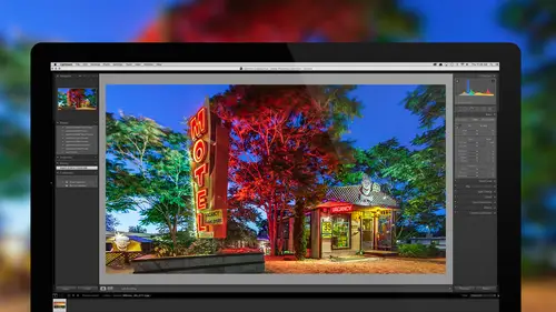
Image Adjustments: Start To Finish Workflow
Lesson 16 from: Adobe Lightroom Classic: The Complete GuideBen Willmore
Lesson Info
16. Image Adjustments: Start To Finish Workflow
Lessons
Bootcamp Introduction and Overview
1:22:40 2Import Images and Customizing Lightroom
1:41:15 3Understanding Catalogs and File Management
1:08:26 4Baseline Raw Image Adjustments
1:29:20 5Creating Finalized Files and Printing
1:28:55 6Organizing Your Images And Managing Projects
1:19:03 7Making Your Images Searchable With Keywords
50:35 8Fixing Isolated Problems
1:39:09Image Adjustment Techniques
1:17:56 10Fine Tuning Your Image
1:14:01 11Facial Recognition And Map Viewing
38:45 12Adjustment Workflow: BW, HDR, & Panoramas
1:16:49 13Organizing Your Keywords
49:24 14How To Find Any Image Quickly
55:41 15Showcasing Your Work: Slideshows and Books
1:26:38 16Image Adjustments: Start To Finish Workflow
1:07:18 17Lightroom To Photoshop And Back
1:02:26 18Basic Troubleshooting
55:48 19Advanced Tips and Tricks
1:03:21 20Workflow Refinement And Final Summary
1:01:45Lesson Info
Image Adjustments: Start To Finish Workflow
Let's talk about what we've done thus far. We're getting quite a ways through it, but not everybody has been with us for the whole journey. On the first week, we pretty much tried to create a firm foundation on how to think about Lightroom. What is a catalog file, how many of them do you need, and how should you really think about Lightroom? Once we got that foundation, we moved on to the second week. And in week two, we concentrated on organizing and adjusting your pictures, so that you can start tagging them with keywords so they're searchable, and you can start really refining them so you get through quite a bit of the adjustments that are available. On week three, we concentrated on specialized features, like HDR, panoramas, black and white, and viewing our images on a map, that kind of stuff. Well, now, we only have five days left. We've been going for 15 days already. But that doesn't mean we're done yet, we still got a lot to do. So today, we're going to start doing some start t...
o finish images. That means that in the past, as we looked at the features in Light Room, we pretty much limited ourself to whatever the topic was of the day, but I didn't use all that much of what we covered on previous days. But in this session, I can use all the adjustment stuff because we've talked about it all, so now you can see how I actually combine all these features together to create an image that I really like the end result of, even though the starting point might've been somewhat mediocre. So, let's jump right into Lightroom, so we can spend as much time in there as possible. Let's start with this image. I'll go to the develop module. And if you look at it, it's just a picture of some flower petals on stairs. But I wanna reinterpret the entire look of the image to create something that I like, which I don't think this is giving me yet. So, in the develop module, the first thing I'm gonna do is darken the image overall. What I'd like to do, is make it so your eye is drawn just to the flower petals and the stairs, and nothing else. So if I bring my exposure down, I will do that until the stairs are about as dark as I'd like them to be. Then, I'd like to get the areas in between the stairs to be even darker. I have a bunch of ways of doing that, but I think in this case, I could just work on the shadow slider, bring it down, and see if we can darken that up. Now, if you consider what's actually in there, if I bring those up a little bit, it is a color that's not found in too much more of the image, so I could instead of bringing shadows down, I could've gone down here to HSL, and maybe worked with the oranges or yellows and darken those. But I also see some yellowish areas on the stairs, so I might not do that. To get even more contrast between this dark area and the bright, I might tweak the contrast, increasing it. Now we're starting to get to the point where I can't really see what's in between the stairs. Then, next, I wanna start adjusting the color. I wanna see the overall warmth of the image and what it might be shifted to. So I'm gonna go to my temperature and tint sliders, and I'll just move it around to see what happens if I make the image a little cooler, or a little warmer. I like it when we've had a little bit extra warmth. I try the same thing with tint, to see where I wanna be. Where it's not too green. Just about right. At this point, I wanna see if I'd like to pull out some of the detail that is in this area, and I do that with clarity, so let's just see how clarity affects the texture that's in the wood, and the flowers. Don't wanna get it too hot. And then, we have to think about vibrance and saturation, and in this case, I think I want the mellow colors to be a little bit more prominent, so some of the yellows and other color in the stairs might come out, so I might end up bringing my vibrance up to make those mellow colors prominent, then, I'll adjust saturation, to control the image as a whole, making sure that the flower petals don't become too colorful. 'Cause when you get something to be too colorful, it can blot the detail. And I notice it on this one little flower petal, right up here, if I bring the saturation up too high, right there, I can start seeing it turn into almost a solid color, and that's saturation clipping, so I wanna back off on that to make sure I avoid losing the detail. Somewhere around there. Next, I might come in and start thinking about cropping, to just kind of concentrate this a little bit. I wanna get rid of this little bright area on the side, so I might bring this in. And I might concentrate a little bit at the bottom, getting rid of the bottom edge, and this kind of distracting area up here. Then, at this stage, if I wanna fine tune the colors more, what I would most likely do, is head down to the area called HSL, and with that, I can grab the little donut that's there, and if I wanna control the color of different areas, I can click right on the flower itself, to control what's gonna happen with the magentas. And I'm dragging up and down to see what it would look like, if it's a little bit less colorful or more so, but again, if I go too far, it's going to clip the colors where it's going to look artificial, and one thing that I frequently do, is in this case, if there's one color I wanted to concentrate on, I'll take other colors like greens, blues, and aquas, and lower them way down in saturation, 'cause there's usually just a hint of them in the surrounding areas, and therefore, there won't be any hint of those colors in the wood that's there. At this point, I wanna fine tune the edging a little bit, I see some distracting detail around the edge, so I'll crop in a little bit more on the right side. To get it concentrated. Then, oftentimes, I want somebody's attention to be more in the center of the picture, less on the outer edge, and so I might come down here to my effects, and end up working with vignetting. Most of the time, I set this to color overlay, unless there are really bright areas near the edge of my photograph, because that's gonna give me the best color rendering. I'll move down the amount just a tiny bit, and then when I adjust the other sliders, I hold down the option key, that previews it as if the amount was at 100, so in here, I'm gonna first bring up my feathering, so I have a really soft edge. And I'm gonna adjust my roundness, to see, I'd like kind of a vertical, might be about, like ... There. And mid-point, we'll control how far in towards the edge, I only want the outer edges. Alright, so we're getting this refined. At this point, if I really wanna start thinking about the end result, I'll usually head to the detail area, and under detail, I wanna make sure we're not sharpening these areas here that don't really have any useful detail, and so I'll usually come in to the masking setting. I'll hold down the option key, and I'll bring it up, until anything that looks like it didn't really have useful detail, turns black. About there, in this particular case. And we're getting close to done with this one. Now, with these images, here, I have actually a snapshot of what I ended up with, the original time that I adjusted this image, and let's just compare what my end result looks like here to what I actually did when I was processing this image for the first time. If I wanna do that, sometimes I'll have a snapshot I wanna compare to something else, and you can do it in a few ways, but what I would do, is go to the lower left of my screen, where I see two Ys, and I'm gonna tell it to show me before and after left to right. So we see the side by side. Here, it's showing the original version, before it had been adjusted, with my end result. I wanna preview over here, a different version of my picture, so I'll go over here to a snapshot that I've created in the past, and if I right click on it, I believe I can choose right here, copy snapshot settings to before. That means, look at what this version of the picture was, and compare it. So now, let's see the before and after. And I actually think I prefer the one on the left, the one I originally processed has got a little bit more richness to it on the steps, and the color rendering of the leaves as well, so you can get a sense for, what did I do originally, what did I do this time around, the only thing I really don't like about this one is this one little bright area over here, and I could probably either crop in to right there, or I can grab my adjustment brush and adjust that to get it darker. But that shows you one, quick before and after. Now, that one was pretty simple, let's move on to something just a little bit more complex. Here, I have an image when it was kind of hazy and foggy. And so let's see what we can do with this. So, when I glance at this to start with, the first thing I think about is the haze, and any time I have that look, it usually means that the darkest portion of the picture will be nowhere near solid black. And if that's the case and I wanna change it, de-haze is where I'm gonna head to. As I bring de-haze up, the darkest part of the picture gets even darker. Once it gets really close to being black, it stops concentrating on that darkest area and goes for more of a mid-tone area, and it pushes it towards black. Let's see how much of that haze I can break through. I like the kind of smokiness that's in there, I just don't like that the darkest portion of the image wasn't very dark. Now, at this stage, I wanna see if I can get the detail that's in here to pop out a little, and I'll do that with clarity. So, we'll bring our clarity up. See if that helps to get it to pop out. Helps a little bit, but when I do clarity, and oftentimes, this is true, after doing de-haze, the darkest part of the image is a bit on the dark side. Well, we have a slider called shadows, so I can bring it up to fine tune what's happening to the dark portion of the image. And get it exactly the brightness I might like. Alright, at this stage, I'm thinking about white balance, and I'm thinking, do I want this area to look as blue as it does, I don't mind that blue look, but I just wanna see, do I want it a little warmer or not? So, I'll grab my temperature setting, and move it around, see do I want even more blue? I actually don't mind that. Or, do I want a warmer look. The warmer look seems to take away the personality of the blue though, but I like the way the buildings are rendered, so it's kind of a toss up. Well, let's figure out a different way we could affect the colors that are in here. We'll get this to look okay in general, but I'm thinking differently about what I want to have happen in these smokey areas, and in the rest of the image. Those smokey areas are bright, and the rest of the image is much darker. And in this particular panel, there aren't really any options to separate the bright and dark, when it comes to adjusting color. So, that's when I'm gonna head down to this area, called split toning. Split toning is gonna allow me to push a color in to the brightest portions of the image, and push a different color into the darkest portions. I'm thinking I want blue in the brightest portions, 'cause I kind of like when we had that blue smokiness in there, so I'm gonna go to the slider called hue, that chooses the basic color that we're gonna push into the bright portion of the picture, but just moving the slider doesn't do anything, because saturation controls how strong it is, so I need to hold down the option key, Alt in Windows, when I move this. That's gonna act as if saturation was turned all the way up, and I'm gonna go over here to the blues and find the blue that I like for that smoky area. Gotta decide, is it a greenish blue or is it more of a purplish blue, or something in between? Maybe right about there. Then, I'm not sure what color, if any color, I wanna put in the dark portion of the image, but I wanna see what would it look like, if I did? So, I'll hold down the option key, and I click on the hue slider for the shadows. And I definitely don't like red. I don't mind some of the green. Gotta decide, is there any color that would be helpful? Knowing that it doesn't have to be this strong. I'm thinking I might push a little bit of green in there. Or maybe it's kind of yellowish orange, I think yellowish orange. Alright, so I've chosen the two colors, one for my highlights, one for my shadows, but now, I need to make sure that it considers only the smoky parts in things that are in that brightness range as being highlights, and I need to make sure it thinks of these dark areas as truly being shadows. And I do that with a setting called balance. I'm gonna hold down my option key, when I click on it, that's gonna apply things at full strength, so it's easier to see, and I'll move this around, if I move it one direction, I now have too much orange in the smoky areas. I move it the other direction, and if I keep going, I have too much blue everywhere, I need to get the blue only in the smoke. So I'm gonna move it this way, a little too much. Let's see, right about there, I'm getting blue in the smoke, and not so much in the rest of the image. Now, I simply have to choose how strong it's going to be, so here, I go to saturation for my highlights, and I'm gonna just slowly bring it up, and as I do, you can see the blue color being added. And I just need to decide ... How strong. Maybe around there. And then I wasn't sure about adding color to the shadows, so I'm gonna bring up the saturation to see if it would be helpful or not. I'm not really liking what it's heading to, so I'm gonna leave that on a pretty low setting. I think I like it when I have just a little hint of it in the image. At this point, I'm mainly interested in where the blue smokiness is coming through the image, and my interest kind of stops, right about here, because this area just doesn't have much going on. So, I'm gonna grab my crop tool. And I'll pull up the bottom, and get rid of the non-exciting parts. I might also pull down the bottom, or, the top. To give it much more panoramic feeling, a little more dramatic, when it's wide view like that. Alright. Getting there, now, at this point, I might fine tune the details we have left over, and I do that in the area called HSL, because here, I can adjust the hue, which is a basic color, the saturation, which is how colorful, or the brightness, or luminance of various colors, and I do that with this little donut guy. So, what I might do in this particular case, is see what would happen if I get the color of the temples, I click right on it, and I drag up, to see what would happen if I make it more or less colorful. And I'm just watching the image as I bring this up, to see how high can I go, I think around there, looks pretty good. And I could take the color of the forest that's here, and see what happens when I make it less colorful or more. And try to fine tune that. Unfortunately, though, it overlaps the color that's in there with the temples, I notice that it's orange and yellow that are changing. Sometimes, I manually come in here and work on greens, because there'll be enough of that surrounding area that would be considered that color. Might be that I go in here to the other choices, like hue and luminance as well, it might be that I wanna tweak the overall color that is found in the temples. In case you can't tell, those little things sticking up are actually temples. You're in Burma, here, and you're floating in a hot air balloon over the area. I think I'm liking it just a little bit towards red, and my luminance I can also control, so the overall brightness of those areas. Okay. Now at this point, it's this area up here by the sky that I'd like to work with, if you look at the blues, the kind of smokiness coming through here, and how bright it is, and you compare that to what's up here where the mountains are, I'd like this to be a little bit brighter, where that kind of haziness would be, and I'd also like the area above here to be a little darker, so it has more contrast, it doesn't look as hazy in that area. Couple different ways I can do that, one of them would be to use the adjustment brush, but in this case, since it's a area that's pretty straight across that horizon, I'm gonna instead, use this tool right here, which is the graduated filter. What I'll do, is I'll click on the place where I want the effect to end, so I want it to start at the very top of the image, and I want it to start fading out, right about here. So I'll click, and I'll drag to where I want it to end. Now, what you're seeing in the image right now is whatever settings I had pre-loaded into this tool, and that means whatever settings were dialed in before somebody clicked and dragged on a picture, like I'm doing right now, I don't have to care about what that looks like 'cause I can always change them, the main thing I'm gonna do here is hold shift, to see if I can get that line to be straight. Now, I get a relatively abrupt transition. Then, up here, for my effects, so you can see that de-haze has been turned way up, that's what's causing the image to look the way it does. I'll double click on it to turn that down, and now, I'll decide exactly what I like here. I think what I would like is, I sure, I could bring up de-haze to get the mountains to be dark, but I think it's gonna be a little bit extreme, if I, look kind of fun to make it actually hazy. But I think instead, what I'm gonna do is bring up clarity a bit, clarity's gonna bring out the detail that's there. And I might bring up my highlights just a little bit, 'cause I wanna brighten up those bright areas. And if I want more blue in that area, up here, I can shift my temperature, it's a little bit towards blue. Get a coolness in there, so it feels like a cool morning. And oftentimes, I tweak a whole bunch of sliders in here, just until I like the look of it. So, here, I'll adjust my contrast to see what would it end up doing for us? And I might bring down saturation, or maybe even up, we're gonna see here. Just gotta experiment to see what I really like. Alright, so now, if I hover over this little dot, it shows me the area covered with green, is where it's applying, and that's what we have overall, I don't mind that. I'll switch out of our tool. Now, if I think I'm getting anywhere close to done, I really need to start looking at the settings that would fine-tune the image a bit more, and one of the main areas I'll go to, is this area called detail. When I'm in detail, usually, the default setting for masking is down here at zero, and that controls how much of the image will be sharpened. When I have an image like this, the sky really contains no useful detail. It's not like you can see the texture of anything in there, there's no clouds or anything else, so I don't want that to be sharpened. Because the only thing that's usually found up in there is noise. So, I'll go to my masking slider, I'll hold down the option key, click, and I'll drag it over until the sky turns black. Now, while I'm doing that, I notice some detail in the sky, I see a circle, near the center of the image, up where the sky is, and I also see two dots near the left third of the image. And so, I'm gonna bring this up first, till the sky turns black, about like that. So we don't sharpen much of the sky. But then, I can see right there, a sensor dust spot. So, I'll go to my spot ... Removal tool. And I'm gonna make sure it's set to the choice called heal, and on the bottom of my screen is a choice called visualize spots. I'll turn that on, it give me the same general view we saw when we were sharpening. Or, yeah, masking our sharpening. And I'll just turn that down until I can easily see this little circular area. I usually use the bracket keys on my keyboard. To change my brush size. And I'll click to get rid of that spot. I might get a smaller brush, because I don't think this is useful detail over here, it could be other sensor dust spots, or birds, but not ones that contribute to the image. So I'll go there. And there. Then we'll get out of that tool. So, I'm starting to like the image, I think the main thing I could do is work a little bit with how colorful it is, in this case, I might choose to bring up vibrance, or, vibrance is gonna control what happens to the mellow colors. It might be that I mellow them out, and instead, I bring up the color overall. So those temples come out. A little more. I have to experiment. Most of the time, when I do this with vibrance and saturation, where I use them both together, I end up actually using presets. Because I can have presets that would be pushed in two different directions, and easily preview it. We'll include some of those presets if you purchase class, in our preset sampler. Alright, I'm gonna call that good for now. Let's move on to another image. Now, from now on, I'm gonna work with images that have already been processed. And I'm gonna more or less take apart the processing that has already been applied, to show you how the image was built up. And so, all I need to do is get to this next image. Hit the letter D for develop, and the way I ended up doing it, so I can show you the various steps that were used to construct an image, is I use snapshots. So, if you go to the left side of your screen, when you're in the develop module, one of the choices that you'll find in here are snapshots. Snapshots are just saving the current state of your image, so you can get back to it in the future. And because most images include a full history of what was done to the image, I can just scroll down to the very bottom, and if I click right here on the word import, that's what my image looked like when I first imported it. And I could make a snapshot. And I can move up here, to a different point of my image, click and make a snapshot, to save those various states. Sometimes though, with an image like this one, you get a very long history, because there are some things I had to do afterwards to actually get this snapshot list to be the way I want, so it's not quite a clean history on this image. So anyway, let's take a look. Here is first, the unprocessed, original picture. Looked like this. And let's see ... Just so you know, we're in Phuket, Thailand. Wanted to look at where we were. Alright, so the first thing that we ended up doing in this case, is lens corrections. So if I click on this choice called lens corrections, you'll see what it looked like afterwards, and you can see, it just corrected for some of the distortion of the lens where it was curving the image, and all that is, is in here, going to this section here called lens corrections, and turning on two check boxes. So that was pretty simple. The next thing was to concentrate our attention into the central area through cropping, so you're gonna get rid of this area on the right where you can see some green, and get rid of a good portion of this, so this is what it looked like after cropping. Starting to concentrate on that one area. Next, we end up going to the basic panel, where right now, you can see all the sliders are zeroed out, 'cause they haven't been applied yet. Let's see what it looked like after applying our basic adjustments. Now if you look at that, if you go back and forth, you'll find the image is quite a bit more colorful on the gold areas, and that was done through the vibrant slider, because if we'd used saturation to do so, the gold color would've ended up getting some saturation clipping, where it would've lost detail, but by bringing up vibrance, I was able to crank it up quite a bit, without losing detail. Other things that were done in here, the shadows were darkened up quite a bit, and the whites were adjusted to actually brighten them up, to get kind of little brighter highlights in here. The brighter you get the highlights on metallical objects, the shinier and the more it's gonna stand out. Also, clarity was turned up a bit, to bring out the detail. So again, here's before the basic, here's after. The next thing was to try to make it so you concentrate here on the center portion of the image, and to do that, we ended up using vignetting, called post-crop vignetting, and that's gonna end up darkening these corners of the image, so we'll go in there and apply our vignette. Then, at this point, we ended up starting to give up on the general sliders that are here, and instead, use the adjustment brush, and let's see what kind of changes were applied to the image. Before, after. I'm gonna go to my adjustment brush, and I'll hover over the image so I can see the various pins that cover the image, and if I go to one pin, I can hover, and if I do, I can see what area it would affect, that's affecting the majority of that statue. If I click on it, I can see the settings that are being applied, and you can see that the shadow slider was turned up to its maximum, and then the contrast and clarity were adjusted, and so that's what, that I ended up correcting, then down here, there was an area just in the corners of the image, and in that case, it's ended up bringing down the contrast a little, and bringing down the clarity, so there's not quite as much detail, and showing off some shadow detail. In general, that's compensating for what's called the post-crop vignetting, so it doesn't darken these corners quite as much. These days, this is a slightly older image, these days, oftentimes, I replace the feature known as post-crop vignetting with instead, this up here, that is known as the radial filter. With the radial filter, I can still darken the edges of the picture, but you can use a brush to remove the results, and so, I could just paint on those knees, to remove the radial filter, and so that might be a better option. Finally, here on the sides, there was probably some darkening done, the highlights were brought way down, clarity was brought down to make it harder to see detail. And the exposure was brought down a full stop as well, and that was simply to make it harder to see any details that were left over in the outer area. So that created our final image. If we end up going just from the cropping stage, to the final image, you can see how much that that image got transformed. And I think it really helped to get your attention, to go just where I wanted it to be, which was where the statue is, and then this little kind of accessory above, and if you compare it to the unprocessed original, then in this case, sure, I look at this, but my eye also is distracted and goes over here, there, and explores other spots, in the end result, though, it's pretty darn concentrated just where I want you to be looking. Here's another example, let's take a look at what was done in various stages. First, let's look at the unprocessed original picture. That looks pretty bad, I think the color looks terrible, and the brightness, especially in the shadows, like in this area going across, or where the car's front grill is. Look pretty terrible. Let's see what was done in the basic panel. I'll go to right here, and one thing that's relatively common, you'll find, when I'm out shooting mid-day and even at sunset, is shadows and highlights are sometimes put at their extremes. You gotta be careful when you do that, though, because that can create glows in your image, and I can see one right now, it's right along here, there's just the littlest hint of a glow, and that's being caused by bringing the shadows and highlight sliders to their extremes. Sometimes, I need to bring images like this into Photoshop, and touch up those little glowy areas just a little bit, because it'd be something that's difficult to do here. But if you look at it, this is mainly the highlights and shadows being moved in opposite directions. Other than that, we fine tune how colorful the image was, added a little bit of clarity, that's another one you have to be careful with, it's clarities, highlights, and shadows, those are the three that can add glows to your image. Anyway, that's what was done, and then really fine-tuning the white balance to get the colors to separate just right. Now, at this point, when I have my highlights and my shadows maxed out, sometimes I find I need more fine control over things, and I just can't get it with these sliders, especially when they're maxed. So that's when I might come down here to an area called the tone curve. And in the tone curve, I'll apply the setting that was there, you see how it just brightened the image overall? Here's before, here's after. All I did in that case, was, there's a little donut icon up here, near the top of the tone curve. I clicked on it, and I moved my mouse on top of the image, until I found the area that I think really needed to be brightened the most. And it was kind of like the front of the car, and I simply move my mouse on top of the front of the car, I clicked, and I dragged up. And that ended up brightening the image, based on that particular area. And you can see, when I mouse over to the car, that the little circle that shows up and curves is really close to where that little dot is. That ended up being moved. But if you were to just click on the image and drag up, you're gonna add light to that area that you're dragging on, so that was the tone curve. Next, went over to HSL, and this is where we're gonna fine tune all the colors within the image, and if I show you what was applied there, here's before HSL. Here's after, you see what's going on with our sky? And what's happening where the purple in the neon sign is. Well, let's see what that is. Mainly, here, the saturation of the blues was turned up to really make that sky pop, and then here, the blue in the, not blue, the purple and the magenta was turned up to get the color right around the neon, or the word, Motel, to jump. Now, I can look to see if I ended up adjusting the luminance, and I did, I ended up darkening the blue sky a little bit, by bringing my blue down under luminance, and on occasion, I'm not sure if I did it in this case, I go to hue, and I'll fine tune things here as well. It could be, that in this case, I come in here and say, I don't like the pink that's in the word Motel, and so, I see what happens, if I start moving this around, in this case, it affects too much of the building that's over there. But it might be that I tweak the gold that's at the horizon, or other things. But the problem here, is these sliders will affect the entire picture, and so oftentimes, I instead need to use the adjustment brush, and only paint it into an area. So here's before HSL. Here's after. At that point, started needing to adjust individual areas that the sliders themselves would not be able to isolate, so we went to the adjustment brush. And let's see what it looks like after adjustment brush. There's after. Here's before. If you look at the front of the car, got a lot brighter. The neon word, says TV, got brighter, so did the Motel, so let's take a look at those adjustments. I'll grab my adjustment brush, I'll hover over the image, and you can see that there are a total of, looks like one, two, three, four, five, six, seven, eight different regions that were changed. So I can hover over each one, and you can see that this affected the top portion of the building, and if I click, it was mainly making it less colorful, after amping up the color everywhere else, it was a little distracting in that area. If I hover over near the windows, this is getting just the windows. Most of the time, when I see that, it usually means the color of light inside a building was different than the color of light outside. Like they add fluorescent lights on the inside and natural light outside, I'm not certain if that's the case here, but most of the time, when I see that, if I click, what I would end up seeing is a white balance change, but in this case, it just made that area less colorful. Then, we have some changes to the sign, if I hover over, the word Blue Swallow, I would just make the assumption, maybe I brought up clarity to get the detail to come out, or brought the highlights up to brighten. Let's see what it is in this case. It's actually a tweak of both the highlights and the contrast. To get that to come out. Another adjustment real close by, I'm not sure if I'll be able to actually click on it, there it is. And this gets all the neon, and remember when I mentioned clarity would make the detail pop out, well there, I did it to all the pieces at once, and that's clarity all the way up to really get it to pop. Get down here, we have just the inner parts of the word Motel. I wanted it to be darker in there, so, I painted only on the insides, and I brought the highlights down. Also, boosted the saturation a bit. Here, we have the word vacancy, if I click on that, it's just a general tweak, try to get it to be a little brighter with my highlights, and a little more detail coming out with clarity. If I was gonna further work this image, I might stay in that adjustment brush tool, I might turn on auto-mask, and I might decide that I want this sign to have less color. So, I come in here, and I would guestimate at the settings I'd like to use, maybe bring the saturation down a bit. Maybe moving this a little bit away from yellow. And then I can come into here to the sign, and see if it would help, to get the amount of color. Now, I have auto-mask turned on, which is why I'm able to click here and not be quite as precise, I might wanna turn on a checkbox at the bottom to show my mask overlay, to see how precisely is it actually doing things, and if it gets a lot of over spray, like this did, I would have to choose erase, and then try to get it off of the surrounding area. In my case, I'm not gonna spend the time to get that precise, but one of the tips I might give you, is I could get a relatively hard-edged brush, and since that is a rectangular sign, I can click on one edge, hold shift, and click near the others, and that's gonna give me straight lines, and so I can quickly delete things away. Right now, my brush is too soft-edged to really be effective with that, but that is often what I need to do around things like signs, is I'll paint over the sign, and then I will tell it to erase, and I'll click in one spot, hold the shift key, and click another, and it just draws straight lines between the areas where I'm clicking, and therefore, it's much easier to clean it up. Once I've gotten paint on the side, I'd turn off that check box at the bottom, and now I can decide, do I really want that to be less colorful? Do I really want it to be, you know, away from blue? Or towards blue, or some other color? So that's how I might fine tune it. And here is the actual final version I ended up with, so if you look at the unprocessed original, and then you come to the final version of it, you can see that it's been transformed considerably. And I'm sure in the process, I also went to the detail tab and I brought up masking. I can see it's not at zero. I would've usually brought it up to make sure that the sky is masked to black, and you can see that when I option click. The other thing I do when I think I'm done, is I zoom up to 100% view of my picture, and I scroll around the whole thing, just to see if there's any oddities in it, and also look for sensor dust spots. Now, I'm gonna show just a few pieces of these, go through them relatively quickly. Here's my unprocessed original, and let's just look here, we cropped out mainly this bottom portion, you see a little bit of shadowing there to get rid of that. Did some lens corrections to make the horizon line a little straighter, instead of bent. And in the basic panel, you know, brightened up the dark portion of the image, maybe made it a little bit more colorful. Under HSL, tweaking the blues and the sky to whatever we wanted. And now, at this point, we did some other ideas. When I look at this image, I compare the right side of the sky, I see a much deeper blue that's there, and over here, it looks a little, almost washed out, where it's getting closer to being white. So, if I wanted to change to darken this particular area, maybe made it more blue, and had it fade out across this direction, I could use the graduated filter and that's what we have done right here. Do you see how that darkened up the left side, so it doesn't feel quite as kind of washed out over there? Just try to compensate for the fact that the sun is making it so bright over there. You wanna see what that was, it was the graduated filter, and if I hover over here, there's one dot. Click there. So it's applying it full strength across here from the left edge of the picture, until right here, then it ends up starting to fade out, it keeps fading out until it gets all the way over here, to this side, and if you look at what was done, it looks like the shadows, mainly the dark part of the image, was darkened, exposure was brought down overall, and a little boost in contrast. And that was enough to get that to go where we needed it. After that, the adjustment brush was used to transform the image. The top portion of the image was darkened quite a bit. But we also worked on trying to get rid of some issues that were in the picture, there were a couple of them. One of them I didn't fix perfectly, but I ended up lessening it enough where it wasn't as distracting, but let's take a look at it. I'll go to my adjustment brush, I'll hover over my picture, and you'll see, there's quite a few regions that have been changed, even though it might not have been very obvious. Two regions would be obvious, one would be where Karen is, I most likely brightened her up, and you can see, it's masked to just where she is, if I click on that, I told it to bring the whites up. What happens, is oftentimes, I end up bringing the whites, or not the whites, oftentimes it's the highlights, I end up bringing down overall on the image, to get detail in a sky, but anytime you do that, anything else that's bright in your picture will look dull. So if you have something like a waterfall for instance. In order to get the sky to show up, you needed to bring the highlights down, darken it quite a bit to get the sky to be rendered the way you want, that's also gonna darken up the waterfall, so, you go to the adjustment brush, you paint just over the waterfall, and you bring the highlights back up, to say, let this area be nice and bright. And so, that was one thing I thought I might've done there. Then, there was a large adjustment up here at the top, we'll see if we can figure out which one it is, it's not that one. I thought there was. Oh, it's probably the entire sky, is my guess. Yes. Right there is the entire sky, if I click on it, you can see I'm bringing the shadows down to darken that sky quite a bit. And that's what affected those leaves. But let's look for some issues in here. I'm gonna zoom up, in the upper left of our picture, in this area where the sun is, oftentimes, if you have the sun going directly into your camera, you're gonna run into some issues. I'm gonna come in here, and with my adjustment brush, I'm gonna turn off the little light switch that's here, which'll disable all the adjustments done with the adjustment brush. Therefore, we might be able to see some of the issues. Here, I see some lens flare where it's green in very blobby kind of areas, and right here is almost a rainbow of color, in same width around this area. So one of the things that I did with the adjustment brush, if I turn this back on, is now, you see that those areas are less distracting, I don't see as much of a rainbow of colors and such there. So let's figure out which one of those, probably this one, affected it ... A click on that one. Lightroom on occasion gets distracted, where if the last thing I did was zoom, then it likes to think I'm continuously zooming, so I'll just go out of this tool and right back into it, and that usually fixes it. Alright, and what we ended up doing there, is there's a special setting here, I don't know that we had a chance to talk about. There's a chance we did. It's called moire, and a moire pattern is usually what you find in fabric, if you use certain cameras, you'll find that you get, any time there's a relatively ... Obvious pattern in a fabric, like just the weave of the fabric, even, you'll find a weird wavy pattern in there, and it can vary in color. Well, there's a setting here that can help compensate for that, and that is moire, and in this case, it was really cranked up, and painted right over where the sun was, and it got rid of that color variation that was in there, almost a rainbow look that was there, also, the clarity was brought down just a little bit, to soften the area where the sun is. That's the main thing that I wanted to show you here, there other adjustments made, over here on the right side, that's because there was another issue over there. If I zoom up on that portion of the picture, you can see a little hazy area here, it's not perfectly fixed, but if I turn off my adjustment, you'll see that it was more prominent before, and that's a sun flare right there, it's kind of the same issue, where it's almost a rainbow of color, and I ended up trying to lessen it by painting with my brush. Could've spent a little bit more time to get it to completely disappear, but you can see how it was addressed. Now, let's get into a complex image. We show you the end result. Here it is. This is a buddy of mine's photo studio, actually, his name's Dan Winters, and I do a series of images on gas stations. Well, he's the only guy I know that actually owns one of them, and so I went out and captured this particular image. Well, if you happen to drive to an area called Driftwood, Texas, you'll find that there's only about three or four buildings there, one of which will be this one. And if you go there and you point your camera at that and hit the shutter, you're gonna capture something more like this, and you could, if you wanted to, adjust your exposure, and if you did, you could get a darker shot, and if you wanted to see even more around where that gas pump is, especially at the top, where the name of the gas pump would be, you can go even darker. But regardless, by the time you get to the point where you can start to see the detail in those bright areas that are important, the areas in the dark are gonna be pretty much black, if you shoot this at twilight, like I did. Well, I wanted a nice shot of his station with a nice blue sky. And in case you're not aware of it, to get a nice blue sky, wait for the sun to go down, and you have about, well, you have at least 30 minutes of great time where there's still good light around, and then you have another 30 minutes where it'll look generally dark, almost like this dark, with still a blue sky, it's a total, about an hour. That you can capture some of this. So, let's see what we did. What I ended up doing, is captured a sequence of exposures to capture an HDR of the scene. So usually when I capture HDR, the first thing I do when I'm actually in the field capturing it, is I'll look at the darkest exposure. And when I'm looking at the darkest exposure, I'm looking at the brightest areas of it. Asking myself, do I have enough detail there? And if I don't, if it's blown out, where there's no detail whatsoever, I need an even darker exposure. Now in this case, I didn't think that the areas where these little lights are hanging from the building are anything where you should be able to see the bulb at night, so I didn't mind that those are blown out, and I went just enough where that light at the top of the gas pump, you could see the name in there, even though I might wanna darken it somewhat, it wasn't blown out to solid white. Then, after that, I ended up creating a brighter shot. And another brighter shot, and I would keep going until I can easily see detail in whatever's important in the dark portions. So here, it's too dark in here, I can't even tell what's there, so I needed another image, and at this stage, I can tell that that's a fence, I can tell these are trees, but I didn't need to be able to see very branch that was in here, so I believe that that's where I stopped. So I had one, two, three, four shots. Well then, what I did, is I took those four pictures, I went up here to the photo menu, I chose photo merge, and I merged into HDR. Now, that's something we covered in a different session. So I'm not gonna do it here, simply because you'd be staring at a progress bar for a while. Instead, I'm gonna take the end result that I got from that, and show it to you. So after merging those images together, this is as far as I was able to get the image. And let's bring that over to the develop module, and see what was done. This is what it looked like, immediately after I was done merging those exposures into an HDR image. What you're gonna get as an end result after that, really depends on if you had a checkbox turned on when you merged the images. Can't remember the actual name, it's either auto-adjust, or just adjust. If you turn that on, the end result might look slightly better than this, because it would've moved the adjustment sliders here, under the basic tab, and right now, mine are zeroed out, so it would be as if you didn't have the check box called auto-adjust turned on. Then, whenever I have an HDR image like this, I usually start by bringing my highlights all the way down, and bringing my shadows all the way up, just to see what I have in the picture. After doing so, I adjust the exposure to get the overall brightness. And only when I get that, do I fine tune the settings. That doesn't mean I end up with my highlights and my exposures at their extremes, I just start there. And I might decide I want the highlights a little brighter, I might decide I don't want the shadows quite as bright. Whatever, but that's how I start. Let's see what I ended up doing, with the basic panel here, I have a snapshot that will bring us to what it looked like. So as going for a kind of a night moody picture, and this is what we ended up with, if you look at the sliders that are over here, you can see what I've done to the picture. And that's how much I progressed. At this point, I started applying a lens corrections to get rid of any distortion applied by my lens, therefore, this straight line, a little white line on the road, would be nice and straight, instead of bent. Then, I ended up using this section called transform. That's the section down here that a lot of people use, when they have architecture to make sure the vertical parts of a building are perfectly straight, and same with the horizontals. Let's see what it looked like, after doing my transformation. Now, if you wanna actually see it, I used what's called a guided transformation, or guided upright. If I click this little icon here, you can see it when I mark over the image. What did I do? I found two vertical parts within the picture, those were two columns that I perfectly aligned something with, then I ended up choosing something else on the building, and in this case, it either was the sign that was there, I don't really have to zoom up to be sure, but I got this line to line up with the horizontal on the picture. Down here at the bottom, there was a white line going across the roadway, and I aligned a line with it to make sure it was perfectly straight, so if I ended up cropping up really close to that line, then it would be nice and straight. Compared to my crop. At this point, I wanted your attention more towards the middle of the picture, less towards the edge, so we did some vignetting. You gotta be careful with vignetting. If you use the choice called post-crop vignetting, if you ever decide to change your cropping later, it's gonna recalculate the vignetting, it's gonna move it, based on the new cropping, and in this image, I'm assuming I'm gonna crop up really close to that white line, so this wouldn't be a good preview of the vignetting. So, not always ideal. Then, I ended up doing some spot removal, and spot removal was actually to remove just little distracting elements, like there was a gap in between the two doors, where you could see just the tiniest little dot of white light coming out, so I removed it. Over here on the right side, there was the tiniest area of peeled paint that I retouched out, that's what this is. And it was really slight changes to the image with the spot removal. And at this point, I started using the adjustment brush, and with the adjustment brush, let's look at the end result we got with that. There, now I got the color a lot more how I wanted it, and so here's before the adjustment brush, here's after. Before, I think I was thinking about the image as a whole, where I was trying to get the majority of the image to look appropriate, knowing that the color of light coming off the lamps that are on the building would be a different color than the light hitting the scene as a whole, and so I decided to paint that in to get the adjustment a change. Let me go back and forth again, watch where the road ends in the distance here. Before, it was way too colorful there, because when I brought my highlight slider down to retain the detail in the building, this got a little too dark. This is a little distracting as far as how colorful it is, so that was adjusted to brighten it and make it less colorful. And let's just grab our adjustment brush and see how many areas were changed. If you want, I can hover over them. Down here at the bottom, I probably made the road less colorful, because any time you bring up a setting called vibrance, it is aggressive about blues, and there was probably blue in that road, that I wanted to reduce. Right here, this is most likely adjusting the white balance of the image to correct for the color of light that was there. It also brought up clarity a bit, to bring out the detail that was there, and brought whites down to bring out, to show more density there. There was areas here, where the pump that was there didn't match the rest. Of the area, and this fixed that. Up here, I probably darkened this little area or shifted the color to get the, get it rendered properly. And here's another for the whole top, so if you look at all these areas that are changed, here's the bottom of the sign, which had a different kind of color hitting it, because that is where this light at the top is not affecting it quite as much, whereas this area at the top of the sign had some color issues due to light, and this is controlling the overall rendering that's there. So, you get the idea of the kind of areas that I worked with, I'll just turn off the check box here to show you overall before. And then the refinements. Alright, so at that point, I just thought about cropping, and ended up cropping out the bottom portion of the image, oftentimes, that's done a bit earlier in the process. But this is as far as I was able to get in Lightroom. Now, I wish I could finish this image in Lightroom, but I can't really do complex retouching in Lightroom, and those telephone lines bug the heck out of me, so those were things that I needed to remove using Photoshop. Now, if I know I'm gonna send an image to Photoshop, before I send it to Photoshop, I almost always uncrop it. That means I'll go to the crop tool, and there's a reset button. I'll hit reset. So that we're at the normal full frame of that image. Because if I crop the image here, and then I open it in Photoshop, only the cropped area would be sent to Photoshop, and therefore, I'd be stuck with that end result. And so ... I like to uncrop it here, send it to Photoshop, and only when it's done being in Photoshop, and I see the image return here to Lightroom, would I finally crop it, because then, it's not permanent. It's anything you do before it gets sent to Photoshop that's permanent, after it gets to Photoshop, so I would kind of uncrop it, that's what this bottom choice is, is uncrop for Photoshop. So, let's take a look. Here's what it looked like after merging HDR. Before any processing. And then, it progressed. The basic settings, lens corrections, transforming, vignette, spot removal, adjustment brush, crop, and then, thinking, we're gonna head to Photoshop, so we uncropped it. Now, let's take a look at what was done in Photoshop. Here's the final image. Notice, there are no telephone lines. Good luck doing that in Lightroom.. Lightroom just isn't sophisticated enough to handle a task like that, but let's take a look at what other kinds of things might have been done in Photoshop. I'm gonna take this image, I'm gonna choose photo, edit in, and I'm gonna say open, in Photoshop. It'll ask me a question, and I'll say, let's edit the original picture. By edit original, that means if I made any changes after working in Photoshop, after the image got back here in Lightroom, like cropping, that it's gonna ignore those changes, and I could reapply them later. It's not gonna incorporate them when I open it in Photoshop. It's a big file, so it'll take a moment to open. And this class, it's not about Photoshop, it's about Lightroom, so I'm not gonna really do much here in Photoshop, other than show you what the results were. If you truly wanna learn how to think about and get good at Photoshop, I have a class on CreativeLive, which is the Photoshop complete guide, it would show you how I think about doing these kinds of changes in Photoshop. So, first, here, I have a top layer called the crop. And oftentimes, what I'll do, is I'll put a overlay on top of the image, that indicates where I plan to crop the image. Why? Because then, I won't spend time doing retouching, way out here, where, let's say it would take me an hour to do a precise retouch of a certain element over here. Well, if it's gonna be cropped out at the end, why waste your time? I do want that information to still be in the photo, just in case some magazine comes by and says, we wanna do a center two page fold, we need something to fill this, and that's when it might be appropriate for me to spend the time to finish the retouch that would be out there, so it could be used in a wider format. But anyway, oftentimes, that's just a layer that I can turn on and off, to remind me of the approximate crop I plan to do, but the actual cropping's done in Lightroom. Then, down here, we have the image itself, it's a little bit weird set up in that it's something called a smart object, the only reason it's that way, is I wanted to apply something called shadow highlight. That was an overall brightening effect, if I turn it off, there's before. And turn it back on, there's after, just brighten things up a little bit. To show you the actual meat of this image, what was really done in Photoshop, I have to double click on the little thumbnail picture for this layer, and that will open the smart object and show me what was inside of it. But you can learn about smart objects in my Photoshop complete guide. Alright, here we go. Now, let's take a look at what we have. I'm gonna turn off all these layers except for the bottom one. This would be what was delivered from Lightroom originally. First thing I ended up doing, is I put in another version of the picture, and it was just used over here. I noticed that when I merged the image into an HDR picture, there was a car streak over here, where a car had driven by and because I turned on the ghost reduction feature, ghost reduction gets rid of anything that's moving in your picture between frames. Well, in that spot right there is where the car had driven by, and it decided to use one of the darker pictures there, and as an end result, that was extremely noisy. And so, I actually took one of the individual exposures that I had in Lightroom, and I imported it right here to Photoshop, put it on top, and I masked it in, so there's a different picture being used in those spots, just to avoid it being overly noisy. Then, I did retouching. Let's turn on the retouching, and see what it looked like, and I shouldn't say I did retouching. Sometimes I talk my wife into doing retouching when I'm busy, I know you wish you had the same kind of setup, but here, I'll turn these on and Karen did a lot of this retouch. So, first, here's just a little patch on the right side, you'll see it right over here, it barely moves, but we extended out a tree. Here, weeds be gone, this is me doing basic retouching, to get rid of some of the telephone lines in other objects. This, let me just view this single layer, is something tiny near the left side of the picture. Then, here's the one that Karen did. She spent the time to get rid of all that. But actually, it's the other way around, I think she spent the time doing this one, 'cause that's the difficult part. And these are just various layers where I use them as separate layers, 'cause I might wanna turn them off later, and decide that I did too much, but the retouching as a whole is this. All that being gone. Then, since we're in Photoshop anyway, we might as well enhance the image a little bit further, and so various color adjustments were made, and I'll just show you where they were made, tiny areas over there were probably made less colorful. One tiny spot up there is probably that top lamp, might've been brightened or contrast tweaked, I'm assuming these other ones were the other individual lamps, to fine tune their appearance. Some little color tweaks here, and then tweaking the color of the grass that was at the bottom. So, you don't notice it very much when you're zoomed out like this, because that was near when I was done with the image and I was just zooming up and being picky about various areas. So, I ended up doing that. Saving the image. And when I saved the image, since it was opened originally from Lightroom, it got put right back into Lightroom, and was right here. If you have an image that started in Lightroom and when you open it in Photoshop, it ended up removing any features like cropping, usually, I have to go to the history panel over here in the develop module, and right here is where it will say it was exported or sent to Photoshop, and you'd just have to click up here on the topmost setting, which would reapply the cropping. So, when I was done with Photoshop, it probably looked like one of these, and I had to go to my history to reapply the cropping. But, that gives you an idea of how a complex image really makes it through Lightroom. So, let's take a look again, at the original picture. This is what it would look like, if you just pointed your camera there and captured it. And I don't like that anywhere. And then here is our refined end result. We had to merge multiple exposures, in order to get the full brightness range of the scene. We needed to do basic adjustments on that, to get the overall feeling right. We had to do some transforming to make sure these vertical lines were nice and straight. Same with the horizontal, so it's a really nice, clean shot there. Then, starting to use the adjustment brush to really fine tune things, but I'd pretty much try to take the picture as far as I could using Lightroom. The reason why I go as far as I can using Lightroom, is because it's only in Lightroom, if you're working on a raw file, where it can look all the way back to the original raw data that your camera captured, and get the most out of it. The moment you open this image in Photoshop and you start using adjustments like curves, levels, hue and saturation, it doesn't have anywhere near as much information as Lightroom had, because it can't look all the way back to the original raw data that's contained in the original picture. And so, it's not that I don't want to do things in Photoshop, it's just I wanna do as much as is practical in Lightroom. 'Cause the end result will usually look cleaner than what I could get out of Photoshop. So, I use Photoshop when I have to. But I try to do as much as I can right here. So you've looked at how I've taken some images from their raw starting point, what the camera delivered, and I've transformed them into an end result, starting with something simple, and progressing to something much more advanced. Well now, if you wanna get good at this, then you really should do some homework. I have a special Lightroom catalog ready for you that has a bunch of kind of challenge images, where you can end up looking at images that I've shot, and I've put snapshots in them so you can see what does my end result look like when I'm done processing them, and then you can hit the reset button on the lower right of the develop module, and you can try yourself. See if you can do something better than what I accomplished, or see if you can get close to what I accomplished. And if you can't figure out exactly what you'd need to do, then go back to that snapshot that's attached to the image, click on it, and you can get to my end result and you can inspect every setting that was used to pretty much create that image. What I'd like you to do, and by the way, that catalog you only get if you purchase the class. It's one of the downloads. But another piece of homework, is I'd like you guys to transform your own images using everything we've talked about in Lightroom, but limit yourself to only Lightroom, don't send things over to Photoshop, and post some of your before and afters on the Facebook group, so everybody can see them and be inspired by them, and possibly ask questions, how the heck did you do that? 'Cause then, I think we can all learn from each other. Now we got four days to go. We're getting pretty close to the end here, but we still have a lot to cover. We're gonna talk about Photoshop roundtripping. That's like when I wanted to send this image to Photoshop, make some changes, and get it back into Lightroom, and maybe I need to do that more than once. How can I do that effectively, what settings are involved, and how can I retain things like cropping or other changes that I've made afterwards in Lightroom? We're also gonna talk about troubleshooting, tips and tricks, and other things. We still got a lot of good stuff. Tomorrow, that's what I talked about, getting to Photoshop and back into Lightroom again, that's roundtripping to Photoshop and back. Before then though, head to the Facebook group. Do you see that address at the bottom of the screen, type that in. Ask to be added to the Facebook group and that's where you can comment about this or any other lesson, keep in mind, if you purchase the class, you get a lot more, it's really the best way of learning Lightroom. Because here, you're only watching me, but you can't pause me. When you purchase the class, you can pause me, rewind me, play me back as many times as you want, and you have the handbook as a reference that reminds you of everything that was done, you get homework that talks you into doing things you wouldn't otherwise be doing, to actually learn and get used to these features before you actually run into an instance where you need them on your images, to be ready for it, by the time that comes around. So this has been another installment of Lightroom Classic, the complete guide. See you next time.
Class Materials
Bonus Materials with Purchase
Ratings and Reviews
fbuser 199e5619
Just wow! Ben is such an amazing instructor - he is able to explain everything very succinctly and in just enough detail that your eyes don't start glazing over. I've used Photoshop for over 20 years and have been afraid (and didn't really want to learn yet another program) of using Lightroom, until I've heard how awesome it is from my fellow photographer friends. This course is extremely comprehensive and if you're a more experienced user, you can skip some of the lessons and just watch the ones you want - but even experienced users might get at least a few nuggets of information that they didn't know in every lesson. Highly recommend! And thank you, Ben. P.S. You're wife and her yoga poses are amazing. I just got into yoga a few months ago and can only hope to be half as good as she is! :o)
user-3a4b8a
I was taking a lightroom course from another provider and decided to give Creative live a shot as I wasn't happy with the other class. This class blows that one out of the water! I love the detailed instructions, he goes at a good pace and I love the transcription (I didn't even know that was there until I scrolled down). I would definitely recommend this class to anyone wanting to learn lightroom. Thank you Ben for giving this great class!
user-9d5e9f
I have been searching for something to help me with my images. I am fairly confident with my ability to take nice photos but sometimes they need help. I might actually enjoy editing now!