Lessons
Lesson Info
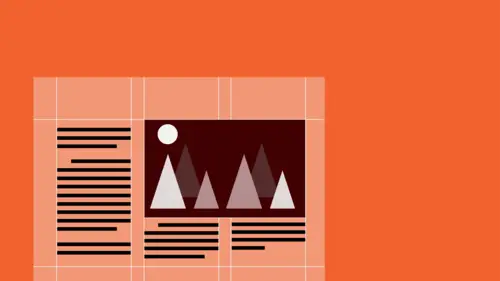
Working with Grids (or Not)
And then, just last, a little quick tour through one very very powerful method of organization, and that is using a grid, also known as the typographic grid. Which can be very very again very useful for creating organization. The grid is one concept or one approach to bringing type together with imagery, and type with type, in an integrated way in a space. It grows directly out of the quality of Western, out of the Western alphabet, and of Western language. So even thought it appears to be this very kind of architectural or mathematical, sort of structure, which is is, it is sort of intrinsically evolved, from the fact that our letter forms are essentially a system of vertical strokes. And that when those letter forms line up next to each other to create words, they become a horizontal line. And when that horizontal line extends and becomes even longer and when you stack sentences that are horizontals, on top of each other, they become a vertical line. What's called a column. And when ...
you place vertical columns next to each other, they create, now, a horizontal line. So from the very drawing, the atomic nuggets, that build our letter forms, up through how we expect to read words and sentences, in a kind of an organized manner. The vertical and horizontal orthogonal relationship seems very organic. And naturally derived, very authentic to the language. And so this organizational structure makes a lot of sense. These are the parts of a grid showing you one page. All grids are made up of these kinds of parts, but there are different kinds of grids. I'm not gonna dig into the individual bits so much, other than to say that this is a column, which is a vertical structure, and that this is a row which is a horizontal structure. And that they create, a kind of a building block in between which is called a module. The rows and columns together create a kind of the live area, or the place where content is. And it's separated from the exterior of the format by another space, which is called the margins. There are a lot of different kinds of grids. These are column grids, in which essentially there's no real division of the columns except on occasion, for, to create a potential moment for contrast. As an antidote to the up and down sort of rhythm of text or images sliding along in the columns, and being proportioned by them, sometimes you want to be able to align things left to right in a particular way or for a particular purpose. Like at the beginning of a chapter, for example, sometimes it's true that the title of that chapter and the introductory text for that chapter on the opening spread of a book will be dropped low to a certain kind of a flow line, to a point much lower, and then when you turn the page, the text returns to the top of the page, to the margin, and that becomes a kind of a cue, as to how a chapter opener is different in quality from the inside of a chapter. So, it can, structure can act in a kind of an informational way. And so, you know, you can have two columns, you can have two columns, sort of symmetrically placed, left to right on the pages, or the column structure can be asymmetrically placed, that is, literally lifted up and put down, in the same location. You can have a lot of columns and a lot of flow lines, or not so many columns and not so many flow lines. You determine the use of that grid, and the kind of structure, based on the content, and how complex it is. As well as, to a certain degree, you know, what you're trying to achieve in terms of energy. These are modular grids, or modular column grids, and these are column grids that now also have row structures, and you can see that there's a lot of potential variation in the kind of structure that exists. There are grid hybrids, that is grids that are made up of grids on top of each other, for example, a two column structure on top of a, or superimposed on a three column structure which creates some interesting possibilities. More flexibility, more variation possible. Because everything has to line up with the grid in one direction or the other. And you can also have conflicting grids on different sides. Or you can have grids, as well as overlapping, and you can have different kinds of grids on different pages, or even on the same page. As here, for example, a single column with a modular structure, and then a single column with a two column structure. This might be very very useful for some kind of complex publication in which you have running text, images with captions, infographics, and some kind of commentary or sidebar, all on the same spread. So the grid becomes more complex, when the informational needs are more complex, and the grid becomes simpler when the information is simple. You can see right here, just a couple of examples of sort of how much variation in layout qualities exists, in this publication, where you get text of different kinds of width, with different kinds of spatial break. You can see clustering of images, as well as full bleed images. You can see very very narrow kind of captions, running as a kind of vertical against this kind of gallery of contoured elements. And you can see the row structure all the way down, repeating itself. Sometimes in combination. This is three rows high, this is two rows high, this is one row high, and a row of negative space, and then a row below that before you get to the folios. Two columns here, three columns there. One, two, three, four, five. So you make the appearance of wider things, by combining narrower things. And even in the case of the full bleed, you know, images have to relate to the grid. So, you don't just sort of plop this in there and go okay it's a full bleed image, so I have no grid there. Your grid is still there. If you look at, this particular page, you'll see that this axis, which is defined by the left edge of the third column, is actually the point at which the tall, bright vertical element in the photograph appears. And if you look at the depth of this interval, where this row starts from the top of the page, and you'll pull it down here, you'll see that this also happens to be where the first major horizontal break in the image happens to be, and it gets better. If you look, if you look at all the little bright spots, bing bing bing bing bing bing you basically see that they're more or less arrayed around the diagonal axis of the page. So, a lot of thinking has to go into how this image is sized and cropped, so that it does actually relate to the structure that's underpinning it. And that even happens with silhouetted, or free floating images, that are not inset into other shapes. So this is a five column grid. One, two, three, four, five. And you'll see these alignments, between the tops of things and like, the boundary line between shadow and light, light and shadow, the dotlike elements of the shoulders and there's kind of a focal point, you can feel the row here. And you find it again across the page, at the point at the top of this boundary, between dark and light. If you look at the kind of primary axis, the sort of emphasis point in the photograph, where all the tension is, is here it rides right up the lefthand side of this empty column. If you also start to look at where, you know, sort of, where clusters of things, other focal points of this image is that this is also, directly related to some row over here. And if you look at the proportion of two columns together, it also, that happens to correspond, to where the beginning of the third column is, on the left page as well. So when you're positioning images, I mean the reason that you use silhouetted images with typography, is to kind of counteract the geometry of the typography. So that you have, opportunities to play with contrasts of organic contour against geometric contour. And, but even though, so there's a tremendous difference between those. Very light, linear, textural, geometric, very organic, tonal, strong value contrast, massive, as different from the type as it can possibly be. And that's a good thing. Contrast is very interesting. But still, the things that are contrasting each other have to share something. If they don't share some underlying relationship, whether it's compositional, or syntactical, some other kind of idea. Then, they don't really contrast each other anymore. They're just different. So, in positioning the silhouette, in sizing and positioning and cropping the silhouetted images, by creating these interconnections between the irregularity of the orfanic form, and the structural architecture of the geometric grid underneath, that you bring those two things into a very tense and very dynamic relationship.
Ratings and Reviews
Shereen Atef
he is every thing in design and more,,,,i needed this since i was 12 lool and i will follow his steps in every thing i do as an artist ,,i can't thank him enough or thank you enough, God bless you
Gary Harding
Timothy Samara is a prolific genius. He's also an academic who's written numerous required graphic design books. This is abstract, high-level graphic design theory, and is not practical in a do this/not that/ make your layouts look like this sense, but it is still important. This is advanced thinking and it may not be for everyone.
Brenda
Great information- very helpful for a beginner trying to grasp the basics.
Student Work
Related Classes
Design Projects