Lesson Info
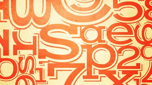
2. Beginning of Typography
Lessons
Bonus Video with Purchase: 'Custom Letterforms - Gerard Huerta'
1:05:31 2Beginning of Typography
14:15 3Selecting the Right Type for the Job
40:00 4Text vs. Display
23:10 5Type Hierarchy
21:13 6OpenType Demystified
29:56 7Taking the Plunge with Type
15:28 8Think Like a Type Designer
23:10Lesson Info
Beginning of Typography
Welcome to typography the fundamentals we've got a lot of ground to cover today but before we start in the actual content I wanted to give you an idea why a session like this is important, especially in today's digital world um not too long ago in my life would probably perhaps not existent in some of yours twenty thirty years ago um graphic designers had a very different job than they have now and everything was done very very differently when I started in this business there were no computers you didn't have to do your own type setting things were done in such a way that when I explained to you and show you some of the images they're actually going to see our seemed very archaic to you the graphic designer really just had to come up with the concept ahn do these cops with markers and tracing paper and what not get approval and once that happened you actually took the type the type written set type which well it didn't look like this yet but it just looked like typewritten type and yo...
u had to actually spec the type and send it to a type shop which was populated by type setters or typographer sze that had ten twenty sometimes thirty years experience setting type okay the way we had to do it was crazy you actually had to know really math because if you had a manuscript if you had let's say thirty pages of information plus a headline you had to do such crazy things as count the characters in a line count the lines on a page estimate the number of characters on each page multiply that times the number of pages of text then you had to decide what type face you were using what point size what leading how much space that was going to take in each line how many lines it was going to take and spec it out and sent to a type shop and hope you came pretty close because every time you sent this back and forth it was really expensive and if you sent it back and forth more than three times you might get a pink slip at the end of the week okay? Because it was that critical what would happen then you would get back paper proofs and they would look something like this. This is actually a marked up typeset proof that was marked up by the great her blue balan okay, who is a name if you're not familiar with definitely look him up because he was absolutely huge in the world of typography and typographic design in the sixties and the seventies and still has a last thing influenced today so that's her blue balance so because I started working in the studio working on some of his layouts this was a um a proof that he would mark up I know you can't see it very well the details but basically he was changing line breaks he was changing hyphenation sze in some cases he was editing outwards to make for a bit better brakes and he was doing this on proof after proof after proof okay and sending it back so what happened after that what happened after that is that people like me who starting in this business we did what was called mechanicals or paste ups and this was something that was done with paper proofs with a new illustration board in the back exacto blades if I go ahead you'll see we used t squares we use triangles it was really fun it was like oh this is on I'm going to do arts and crafts for a living so it was really kind of cool this is really it must not of funny ad but it's a dated at because when we first started this we'd use rubber cement to paint the proofs to pace the proofs to the boards then we went to wax and so this is a waxing machine it was hot wax you would slide the proof under you would get a layer of wax on it and then going back to that um mccann because this is really the most telling page that shows what you had to dio you had to take all the elements the type the dummy illustrations cut them up on a board and paste them with the t square exactly the way you wanted him. So this that says placement on lee, so that was not real art. That was a photo stat. So I mean, this is not specifically about typography, but the point is things were done so differently that graphic designers did not have to set your own type. You did have to figure out what the right you know, we still haven't decided a typeface and the layout, and you still had to decide on the important things, but you didn't have to decide a lot of the details. Here's if you had a set type on a curve, these things were done manually, which in a lot of ways is better than on the computer because the computer has such a low resolution it's hard to really see what you're doing on the computer unless you print it out. So these things were done manually when we had rules. We had a usurp it a graph we had actually do the rules, unless you set them had the typesetter set them. A lot of times I have usurp it a graph and done box rules over and over more than I can even tell you so you really it was a very hands on kind of thing if you had color separations you set them, sent them out to be separated to the color separator. Then they went to the printer where a stripper would take care of them, and it wasn't the kind of stripper that took their clothes off. It was the kind of stripper that stripped in the film separations into the film of the rest of the piece. So basically in those days and oh, this was a tool I won't even you'll get a headache if I tell you what this is. This was used to measure the lines of type, depending upon how much the leading was I mean, this was something we lived by every single day it was called behavior rules, so you missed out on that. But the thing is, these days, in the digital world, you are expected to have a thousand gears in your head to remember to how to do everything you are required to. Not on ly be responsible for the design, you have to set the type, you have to do your own color separations. Do you remember? You're not separating your retouching? I mean, you're responsible for just about everything, okay? The problem is, for most designers, most designers don't have the adequate training to feel confident and comfortable working with typography the way they might. Just doing overall design so whether you're a student, whether you're a professional, whether you're in advanced creative director, whatever it is I can tell you I've taught thousands of people and in my classes I get people from students, two creative directors who admit and to me and to everyone you know, I'm very successful at what I do, but I'm not confident with my typography um a lot of graphic designers are self taught, which means you really have to learn it on the fly you have to learn it from people you working with, but then there was awful lot of designers who have degrees in design that in itself doesn't prepare you for typography and the way we're going to be approaching it today, okay? Because even if you've taken type classes, type classes or very often in universities and colleges taught by designers who like type who designers who were told okay, you have to teach the type class okay, I have a little bit different background on the typography specialists who also does design so I know type from the inside and out as a type user in a tight maker okay, so I also know enough about today's current software and technology to be able to show you how you khun best use your technology to achieve extremely professional results with your type now the professional results are not a result of knowing the technology the professional results are knowing the aesthetics and the skill to make the decisions and have very acute observations and then knowing how to use the software to achieve that okay so something like this what we're doing today what we're doing right now and what we're going to be doing in the next session is not just for graphic designers these days it's for anyone who has the need or opportunity to be using type and what they're doing okay so that's not on ly graphic designers it could be illustrators who know they have to know how to use type a little bit for some of their their pieces it could be photographers that every once in a while I need to put or use type and really don't have any of the training and don't have the confidence you can have the best illustration or the best photograph in the world and if you used some crappy type inappropriately styled and set its going to downgrade the level of what you're doing it's also today's world not many people left in the print world there's so many people who are web designers who are motion graphics designers who were doing e books who were doing any other media other than print all of those require an understanding of good typography and many of those people have tremendous skills in web design some are programmers but I have very little background in design and typography the other person that this would be good for is even an admin or somebody in a company where all of a sudden they're not they don't have an in house art department, they might have a poster have an invitation, and they say here, why don't you put this together, you know? And they whether they're in word or whether they learn in design, they still don't have any skills or understanding, and sometimes you see the actual worst pieces coming out from that, and nobody wants that, okay, so the advantage, you know, what we're going to be learning and discussing today is it can make everyone's work better whether you're a student where they were professional, whether you're thinking of changing careers, whether you just want to finance your portfolio because here's, the other thing these days, employers will very many prospective employers will say in a job offer typography skills required. Okay, you could have a kick ass portfolio, and if you don't, if you have dumb quotes, if you have something that shouldn't be in there and there's somebody else with an equally good portfolio, but their type is better, you're going to lose that opportunity so it's really critical, and I'm very, very passionately dedicated to helping to educate anyone who fits under any of those categories and others. Tohave a better understanding of typography to give you more confidence and basically what I like to say is what I'm trying to teach you is to learn how to see to learn how to see differently than you do right now, okay, so before we begin, I would like to know let's let's talk to the audience a little bit and find out just tell us your name and what you do or why you're interested in typography and why don't we start with you? I'm ariana I'm a biomedical engineer, a fashion designer and a writer, so I'm here partly for writing I want to be able to design my own print books um but also, I think it's relevant for like marketing and internet materials as well, all of this so I'm really excited great sounds good. I'm in amos sierra and I designed pretty uh web and mobile in photography I mean, to photography is something that I feel like I'm improving so that's why I'm here that's one of my challenges, I think you're in the right place sounds good. My name is sam and I'm an early stage on turner just in the business planning phase and hoping to get something off the ground in the next few months, but I just have a personal interest in typography and design, and I think it'll also be really useful for everything from marketing materials and web design for money business you know you you bring up something that I think is also important I don't know if you're planning on doing your own marketing materials or not but as an entrepreneur even if you're hiring other people you need to have an understanding ofthe how to present the typography with the overall design so even if you never set type yourself just learning about typography and learning how to evaluate what other designers are doing is equally important if you want success for your own business so I'm glad you're here is well uh melvin I'm a graphic designer an animator and I think type goes along with what I do so I just I just started and I think it's a good opportunity to refresh my type uh knowledge I guess and I applaud you for knowing that as a motion designer so thanks okay this ever shell and like sam I'm an entrepreneur I have three businesses and I love font ology as I call it and I am I have about three thousand funds on my computer and I know them all you d'oh d'oh and I do a lot of design and I am what I call a crazed creator and so this is absolutely fabulous for me I'm so passionate about fons I've created some and I do a lot of hand lettering and so this is very very exciting for me and I and it would be a graphic designer. So this is just so exciting for me to be here. Well, I'm so happy to have you. I'm happy to have all of you.
Class Materials
bonus material with purchase
bonus material with enrollment
Ratings and Reviews
a Creativelive Student
Ilene's courses on Typography are jam-packed with excellent information that will elevate the quality of your work in print. She knows what's current, but also what's important in long-time standards, and why. Just an incredible amount of information! you will enjoy watching, but you will want to purchase because of the sheer amount of useful content.
a Creativelive Student
This course is packed full of the answers to questions I've had at the back of my mind for a long time. Ilene teaches with great clarity, her material is well organised, and she teaches at a good pace - with a bit of humor to lighten it up. I found it really useful.
shiran
This course taught me very well about Typography. I knew almost nothing before taking it (I barely understood then the difference between Serif and Sans-Serif...). And now, I feel that I really understand a lot. It is a very good starter to learn when, how and why to use type. Plus, Ilene is a great teacher with a big sense of humor and a lot of experience in Typography. A must have for everyone who want to understand something about types and fonts.