Color Correcting: Travel Photography
Lesson 5 from: Advanced Color Correction in Capture OneDavid Grover
Color Correcting: Travel Photography
Lesson 5 from: Advanced Color Correction in Capture OneDavid Grover
Lesson Info
5. Color Correcting: Travel Photography
Lessons
Class Introduction
03:10 2Advanced Color Selections
26:44 3Color Correcting: Product Photography
06:34 4Color Correcting: Architecture Photography
06:09 5Color Correcting: Travel Photography
07:07 6Color Balance Tool and How to Save Styles
14:13 7Dive into the Color Editor's Skin Tone Tab
14:04 8Color Manipulation for Portraits: Headshots
07:36Lesson Info
Color Correcting: Travel Photography
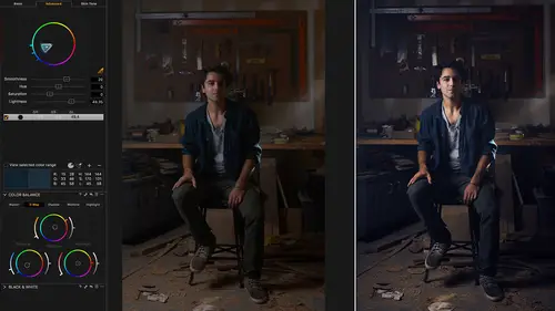
So let's have a look at this image as it came out of camera and after it's had some processing. So that's sort of before and after of what's possible. Even though we're not looking at the color tools and such that we can influence color to quite a heavy extent with the levels tool. This is in relation to when we say auto levels as such. So we've got two images here. I'd just say two variants, like so. So the same image. Let's do a different thing to each one. So first of all, I'm just gonna say auto levels on this. Let's go to the next image and look in our Capture One preferences and then to the exposure tab. 'Cause what you'll see here is levels tool channel mode. We have two options here: RGB channel or red, green and blue channels. So this only influences how the auto adjust works. So if you change this and manually adjust the levels, it makes no difference. But when you're using auto adjust, it does make a difference. So you'll see in this image here, we've got some kind of blue h...
aze sneaking in and so in. I shot this at totally the wrong time of day so it's not ideal situations for landscape photography and such, which is why we've got this hazing in the sky. It was right in the middle of the day, not in the golden hours as such. What we can do is changing this to red, green and blue. If I now say auto, as such, what Capture One does is specific auto adjustments for the red, green and blue channels. So if we go back to the first image where we did auto, you see in the red, green and blue channels, everything is still at zero and 255. If we look on this image, you see when we did the auto correction, it's been adjusted individually for those different channels. So in the blue channel, if I grab my highlight point, you can see how it influences the blue in the image, like so. So if I just do that and then we look between those image, then you can very easily see the haze in that one with the color cast, if you like, and then it's looking pretty nice and neutral in this one, as such. So if you ever get any instances, might not only be in landscape photography, but anytime where you shot architecture, landscape or such, anything outside where you've got a tricky color balance like that, then using the auto levels in its channel mode red, green and blue can actually make a big difference to the image and save it, of course. Then with further adjustment, then really if we look at how the raw file looked, again it's amazing what you can pull out of it as such. If we look at some other shots. Let's grab this one. This is a simple example. Then we look at a more complex example. Again, an image like this. Let's reset the color edits here as such. Quite often, blue skies can be a little bit kind of flat, milky and so on, so that's when it's good to tweak the hue a little bit. So if we grab our picker, choose a blue sky and then bump up the saturation and then take the hue in this direction, you'll see if I move it dramatically how it changes the view of the skies. How we can go a little bit this way and then darken down a bit and it just gives us that original sky that we might have remembered it as, like so. Once again, if I pick the foreground, not even thinking about changing the color, just making it brighter, then we can do so as well. So the color edits can be a really good tool for changing exposure just of a particular color range. This is an interesting image here, as such. I'm gonna reset this. 'Cause what's been done to this image so far, if we just do an option click. So just some basic changes you see to exposure, contrast, brightness, saturation and so on. It has a really nice color tone to it all over except if we zoom into the shirt, you see it's got a bit of a blue tint from somewhere to it, which kind of doesn't really match the rest of the feel of the image. So if we go to the color editor, really easy fix. Pick on the blue tone, drop down saturation, then it takes that out straight away and gives us a nice color match for the rest of the image, like so. So a really simple little tweak just to take out that offending color tone, which is correcting from the rest of the adjustments. Again, if we look at our gentlemen here. Let's take away... Let's go for this unedited one. Let's take this one away. So let's just do a few other quick edits. So I just bump up the contrast. That's, and lift our shadows a bit more and brighten it. In this case, we've got a bit of a distraction, I feel. Sometimes our eye naturally goes to, if you like, the lightest part of the image or the most color saturated part of the image and sometimes that's a bit of a distraction. So I quite often personally use the color editor to get rid of these distractions. So if I grab the color picker and pick over here, then take the saturation out, then we do that but then again we also lose the kind of nice warm tone which isn't a distraction on our subject himself. So again, what we could do with this one to make it even quicker is we could probably grab a gradient mask, which is just like a gradient filter that you would place in front of the camera lens, except we now physically draw it. So if I start drawing over here on the right hand side and finish about here, that gives me a mask that looks like so. Then the same trick as we did before. We can grab our color picker, pick on our distracting tone and then take the saturation out of it but not affect our main subject as such. That's a really quick operation. So it's not like we spent ages playing with the color editor. We just did a quick mask over on the right hand side, did a quick pick. Let's do it again. Quick pick inside the mask itself and then we can just play around with that adjustment. So you can take the saturation out. If we need to edit our mask to be a bit bigger, I can just redraw our gradient on it like so just to creep a bit further across. Let's turn that layer on and off. It's just taking that color saturation out on the right hand side, which could be seen as a distraction or such.
Class Materials
Bonus Materials with RSVP
Ratings and Reviews
Dan
Can you get all this stuff online? Probably, but it's great to have it all in one place and it's pretty comprehensive. David doesnt waffle it's pretty much pure content so it gets a thumbs up from me.
Jakob Lehner
I use CP1 for about two years now being pretty happy with it and my color editing skills. So I thought, nahhh not for me I know it all... After some time I bought it on sale and I couldn't be more wrong. I learned much more in the first 40mins than in the last 2 years from YouTube tutorials. This one is really great, highly recommend it!
user-940746
David's knowledge of the color correction process in CaptureOne is amazing! This class has not only adde to my knowledge of color correction, it has shown me how to do it with a quicker and easier process.