Lesson Info
3. Intro to Matching Color by Numbers
Lessons
Lesson Info
Intro to Matching Color by Numbers
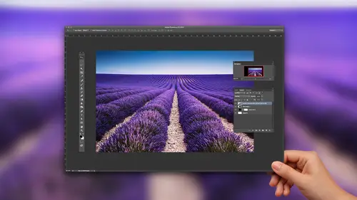
So what I want to do now is I want to be able to go in, and I want to take these colors and apply them to other images. And I've got my orange right here, and I can do one of two things I could actually go in and take this orange and bring it into my other document. But because I've gone in and I've done a fairly nice average sampling here and my color picker, this is the orange that's readily available. And I can bring this into another file and be able to adjust my file to that color orange, which is what we're gonna do. You gonna jump over to my ball of yarn here and on a new layer and create a new layer, and I'm going to create a selection, and I'm going to fill this election with my foreground color, which is my average orange that I picked. So I created a new layer, put a selection. Their option delete is going to fill it with my foreground or my sampled color, and I'll just be select that that's the color that I would like to go in and match to now. I want to do this non destruc...
tively, because when I do this, I want to be able to go back and tweak this color. I don't want to do it right on the image. So we're gonna use adjustment layers in order to get this ball of yarn to be adjusted. Exactly. Like we want to keep in mind that this ball of yarn has a hot a lot of highlights and shadows. The predominant color is kind of this orangey red right there. So what do we go in and we actually match? We can know what we hatch from, but at what point of the ball of yarn is gonna match that color orange? Okay, is that the highlights? Is that the shadows? But we'll worry about that when we get to that. So what I want to do is I want to start off with doing some color adjusting. And so I want my color adjustment to be above my ball of yarn and not adjusting my orange. So one of the things that people do is they go into their color adjustment and they start working with levels or curves and they start sliding things back and forth. Try Teoh, Make this work. Take out the red and they're just kind of shooting in the dark. OK, don't. None of this stuff is going to get you there by feel, All right? No amount of touchy feely moving stuff around is ever going to get you there. You'd be surprised how far it will go south before it actually looks good. And what's crazy about what I'm gonna show you is it actually will look worse before it looks better. And of course, once it looks worse, people stop immediately. But you'll see how we're gonna do this. So I'm not going to go in and just randomly adjust to do everything by the numbers. So what going to start off with is I'm going to start off with a hue and saturation layer above the object that I would like to change the color. And what I'm gonna do is I'm first going todo my hue and saturation and I'm gonna slide my hue and saturation by huge liar specifically, and I'm going to get it into the zone of the hue that I'm trying to match. Okay, so I want to match my orange I'm just taking my hue. Slider. If you've never used this before one of my absolute favorite color adjustments here you can make anything change color. What's great about this is it literally is just swapping out one color for another. So your highlights, your shadows, all of your intensities remain exactly the same. All you're doing is you're just changing the hue. So that's gonna be your first step. Get it close, Okay? Because no amount of adjusting other way will get you to some of these things. So there it is. Okay, so there's my human saturation right there. It used to be this reddish and now it's kind of close to the orange. Okay, what do we do next? Well, now I need to know the actual physical makeup off my orange. So I'm gonna go into my window menu under my info panel, and this is going to become super helpful right here. Now I work in RGB mode because any time you take a photograph, it's always done an RGB. I adjust everything in rgb. Every once in a while you will get a file that's been converted to see m y que but rgb is going to give you a much broader spectrum of color and a lot more editing capability. So in the info palette, we've got lots of information here. Now, info palates can be adjusted to whatever you want to go ahead and show in your info panel right now, it shows my RGB makeup here. So if I were to hover over my object, I could see what the RGB makeup is. I also have my c m y que make up here. If I click on this whole cheese grater and yes, that's what I call it that's a cheese grater. I'm gonna go to my panel options. And this is where I can set different information in my info panel so I don't have to have it read. RGB and C M y que. Um, my mode here is reading actual color. Since this image is an RGB mode, then it's reading the RGB color. Okay, my second color readout Aiken set to anything that I want. Maybe I want you know, Total Inc. Or want to read opacity of an image or a mask or something like that. So the info panel can be set up in many different ways so that when you sample you get all these different color about showing up. Okay, so in this case, I'm just gonna leave it in RGB the second color mode, See em like a I'm not going to use. But we can use that anyway. So with that, I need to find out what might orange actually is. So all I have to do is hover over my color, and I need to be on that layer because if you're not on that layer, it won't read correctly. Okay, If I click on my color adjustment layer and I hover over my orange here, you'll see that my RGB is 2 54 Well, that can't be okay, So I need to be on the layer. I'm sampling, and the little cursor that I get is just the cursor that's there when you are using your info panel. And so it doesn't matter what tool you have selected. Okay, so I hover over this, and I'm actually going to write this down because my red is going to be if I can actually read the screen and right at the same time, my green is gonna be 1 60 My blue was going to be 63. This is what the Orange is actually made up of. So if I go and I hover over my red here, I get all these readings on my actual read right there. And of course, this red is being adjusted by an adjustment layer. So I hover over this. It's like 1 75 108 If I turn off my adjustment layer, I see that my RGB values are different. Okay, so this adjustment layer is actually adjusting it. And the values of my ball of yarn are being reflected because I've got it that adjustment layer on there. So I've got this and here it is. So now I look at this and I'm hovering over this ball of yarn and I'm moving all over this and kind of seeing what's happening here to go to my eyedropper tool here. And I go on here and I see that my numbers are all over the place. Well, I have to decide at what part of this ball of yarn is going to give me that accurate reading. Clearly, by having the lightest portion of the yarn here. That's not gonna be accurate to adjust my orange to, because then everything else is going to be significantly darker from that point. If I go to the darkest point of my ball of yarn, then it's going to overcompensate. So I want to find kind of a neutral place that's in between my highlights and my shadows to go ahead and sample as my color. And what I'm talking about here is that when I put my cursor kind of in here, I want to get a neutral color. So it's not kind of midtown, so it's not. The darkest is not the lightest, and that's kind of the average color. So in this case, when I look at this, I'm just gonna take an average here. My read is about 1 70 My green is about by blue is about 40 okay, and I'm taking an average average because you can see as we go move all around here. Things change constantly. So based on what I've got now, I now know that my red of my in my orange right here should be to is to 33. But the red in my ball of yarn is only 1 70 So clearly the red has to change. And same with the green in the blue. Well, I've got it much closer with my hue and saturation. And now I'm going to do an adjustment layer on top of this to get the red, the green in the blue of my ball of yarn to match the red, green and blue makeup off my orange swatch. So I'm gonna go in and I want to make sure that I put my adjustment layer on top of my other adjustment layer. This is very important because if I put the adjustment layer in between here, it's going to change the values. OK, and I love to use curves for several reasons. One, it really makes it look complicated. And people are like, Wow, that's amazing. I don't know. A lot of people don't like curves because it's like, Oh, yeah, you know, there's a lot of stuff that you can dio curves. We're gonna be what we need to use. I want to put my curves on top here because my curves are going to affect my hue and saturation layer and it's going to affect my ball of yarn. If I put my curves in between here, I'm going to get a totally different reading. Okay, so I want everything to be put on the top. So any new adjustment layers always go on top of all the other adjustment layers. Very important. So I need to take my info panel off here and we'll put that there so we can see what's going on. And now we need to go in and specifically target the red to green and the blue channels. So in my curves I go in, I've got my composite here my rgb I can select my read my green and my blue channels to go when and specifically at it. So I go into my red channel here and now what do I dio? You know, I've got this thing. So I just start sliding around, poking at things, moving stuff around until something happens. And the answer is of course, sure, why not? So here's what I want to dio. I want to specifically target the same area that I measured my ball of yarn or that section to get my numbers here which was kind of in this area, and I want to be able to go in and target that area so that I adjust my read my green in my blue in that target area so that I can sample from the same position every time. So what I'm gonna do is I'm gonna go in here and I want to be able to adjust my red here. And it was someplace in the one send 61 70 range. It needs to be 2 33 was my original measurement of my orange swatch. So instead of going in here and trying to figure out where I click and pull on the ramp here, not gonna bother. I'm going to use my little scrubby tool in my curves adjustment that little hand there with the up and down arrow. And I'm not going to go on to my ramp and simply click on my ramp and guess where I'm going to be adjusting here. I'm gonna go right to my ball of yarn in that area that I want to adjust and you'll see the corresponding middle circle moving up and down my curves ramp right there because that's the point in which I'm going to adjust. That's going to create the most difference so that when I and read or take red away from my image, it's going to do it in the area that I want to now because this is a ramp here. By not specifically adjusting one area, I'm creating a curve where it's going to go. Win is gonna just that area significantly in that area. And then it's gonna taper off the adjustment on everything else. So with my little scrubby tool active and I position my tool over here, take a look at my info panel. You see how we now have two readings in the info panel? We've got the first number slash a second number. Well, that second number is going to be the adjusted number, and the first number is my original. Okay, so now that I've got my hand my little scrubby tool here I put my cursor over by ball of yarn here, and I click on here and I can literally drag up or down directly on my image. Now, if I pay attention to buy RGB here, I know that my RGB needs to be significantly higher. So I'm gonna go in. And I know my red needed to be, like 2 33 so I'm gonna drag that up way, way, way up to kind of like the to 30 range, and it's like, Wow. Okay, that's a lot of orange. Okay, now, again, this may look worse before it gets better. Don't freak out and be like, Oh, my gosh, that's too much. Okay, well, is it because we still have the green and blue to adjust? Now, keep in mind that we picked a flat color. Okay? This ball of yarn has a lot of complication to it. It's not just a simple flat color. We've got highlights and shadows, and we've got different colors working on this. So my original orange right here was to 33. My green was 1 60 my blue with 63. I'm gonna jump over to my green section. And right now, my green is, you know, reading 85 80 s right there. And my green needs to come up substantially so I can go ahead and up my green. Here. It seems like these colors sure hope these ratings air correct. Looks kind of Weird, doesn't it? And then my blue comes up substantially there, OK? And that looks nothing like it's supposed to have that. So my colors to 33 1 60 right there. So that was my original. That's what I've got adjusted right there on that doesn't seem right at all. Even though I do this all the time. I know it's just observing that in the mid tones it looks correct, Yes, but there's that image. Seems like, has a lot of highlights and shadows. It certainly does. And that's the That's the tricky part right there. So and it is 2 32 33 1 60 Yet that whole thing works. And then when I go to this one here with that adjustment on it, when I go through here, that's 70 right there. Okay, so this is the reason why we go in and we do adjustment layers because we did pick a section in here that was probably a little bit dark. And because we do this on an adjustment layer, I have the ability to go back and cut back the opacity of this adjustment layer so that I can cut back the amount of intensity in which I adjusted that color. Okay, So instead of trying to go back in and dial back each and every one of the colors here by adjusted them based on the numbers And now when I go back in and I adjust the opacity here, you can see that I can go in and I can cut back the amount of intensity in that particular area.
Class Materials
Bonus Materials with Purchase
Ratings and Reviews
Janaina de Assis
For me it was easy and simple to understand, easy for an online training. His formula to teach is amazingly fun and energising.
Vivian
This is a concise course which teaches the concepts of color matching "by the numbers" in a clear and easy-to-follow manner. It was fun to try the techniques I learned in this class on one of my own photographs and the results were not only accurate but quick to achieve.
Emily Bristor
I learned a lot from this course, and Jason Hoppe gives clear instructions and explanations. I'll be looking for more of his courses.