Lessons
Lesson Info
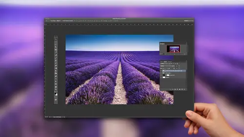
Simple Matching Techniques
I want to show you how this actually works when we use the built in color matching feature in Photoshop under the image menu, we have our adjustment section and at the bottom of adjustments, we have the match color dialog box. And when we call this up, there's two things that you have to have. You have to have both the images open, the image that you want to draw the color from your source image, and then you want to have the image that you're applying it to. And what I want to do is I'm gonna call up saying my ball of yarn, and I would like to take this reddish ball of yarn, and I would like to make it orange. Thank goodness I have my orange. So I'm gonna call up my image that's going to have the color applied to it under the image menu. But you have my adjustment and go to match color, and then I'm going to go and I'm going to choose my source image from the list of images that I have open. You have to have those images open in order to do that, but I'm gonna drop down to my orange a...
nd it shows me in the picture that there is my orange right there. Now, what's interesting about this is that I have the orange and then I also have the green leaves. What does it know to pay attention to? Who knows? Okay, so I'm just gonna click, OK? And we're going to see what happens on. Oh, my gosh. The ball of yarn is orange. That was awesome. Okay, so what did it do with the green leaves in there? I didn't pay any attention to that. Or did it? Just know that, you know, the ball of yarn is round and so is the orange, and it picks that up. How does that work? I'm gonna undo this, and I'm going to go to another image here, and I'm gonna grab this bottle of water here, and I'm gonna do the exact same thing. I'm gonna match the color to my orange because if it works so well on my yarn, of course it's gonna work awesome. On this bottle of water, this bottle of water is gonna turn completely orange and the class is over just like that. So image adjustments match color on. I'm going to choose my source file, which is going to be my orange and I click, OK, And it didn't work out the way I planned. It looks like I'm That's quite interesting. Well, a couple things were going on here. When we do this, when we go in and we choose the match color, we do have a little bit of control over what color we are actually sourcing from. And when I apply it to another object there, it all depends on the hue and saturation of the object that I'm applying it to. Okay, so while match color is really great, we don't have tons of control over what's actually going to happen. I'm gonna undo this. So one of the things that I can dio is I can go back to my orange here, and I would like to specifically say I want to just target the color in this picture. Now, when I choose my source file, it is actually sourcing all of the colors in that file. If I want to target a specific color, which I wouldn't want the green leaves to be picked up, I would want to just source the origin there. I'm going to go and I'm gonna choose a selection. And with that selection, I'm going to put a selection around the area in which I want to sample. So anything inside this election is what I'm gonna pay attention to. Now I'm going to bounce back over to something else. Here, let's grab the coin. Are Let's dio my maple leaf here, see how this works. I'm gonna go into the image adjustments match color, and I'm gonna choose my orange as my source file. But when I go in, I can use my selection as the source to calculate the colors. Now pay attention over here to my layers panel right there because I put a selection around my orange. It basically is taking all of the other information out of my source file. So it's only paying attention to what's in the orange. When I use the selection in the source, it's on Lee going to calculate what's orange there, and you can see that it gives me a totally orange image. If I don't use that, I get just the color being replaced there. So what's interesting here is that I can get different results based on having it, just do it automatically or I can actually target something and say OK, just pay attention to the specific color. Now you're probably wondering, OK, so you're getting a lot of different methods. A lot of different results from this. How good is this really? And the answer is absolutely. It's not that great. Okay, when it works, it works great. But when it doesn't, what do you do? Well, the issue is we don't have that much control over what we're doing. So I want to be able to specifically target a color and understand that collar and be able to apply that color in a very specific way. Now, you do have some controls here when you're using your match color, and I can go ahead and control the luminous which people would think of his lightness and darkness. Could the color intensity so I could make it very vibrant or kind of de saturated overall, and then they can fade the effect so I can go back to my original color and then slide back down. Teoh the color that's been added and it's like, okay, and that's fine. But with the result that I'm getting. I'm not totally convinced, but this is gonna work. So while it's interesting and fun to go ahead and see that it works some of the time, but it doesn't work all of the time. So I'm gonna jump back to my orange here, and one of the things that I want to show you and talk to you about is understanding the perception of color, what we see and what Photoshopped actually reads. So if I were to zoom in on my orange here, I could see that there's lots and lots of pixels of color that make up this orange thousands of colors of orange. Now we see it and are. I averages all these colors together and we see orange. Sure, we see varying shades of orange, but it's orange, it's not purple. And what color orange is that? While the reality of it is, we don't really know exactly what color orange that is. Our eyes are actually averaging that color over a large area, so we see orange. But there's no specific orange that are ICI's because we're seeing everything together years ago what we would have to do if we wanted to sample that specific color. We go in with the eyedropper tool and you see, if I hover over the eyedropper with the eyedropper tool and I clicked and I sample, I'm getting all of these flashing different color orange here and my color picker ring, and I can see all these different oranges flashing. None of these actually truly represent the orange on. Getting every single pixel is I'm going through. So somebody's like, Oh, just pick up the color orange of the orange there and you choose that, okay? Or you choose that and it's completely different. And then you try to apply it another method to some other application, and the orange doesn't look the same. So really, what we want to dio it was we would want to go in and we would want to you take our file and take a section of color and do what are I does and literally average that color out. So it's gonna blend all of this color together to give us an average. So if I were to put a selection here and go under my blur menu and blur this out substantially, that's pretty much what I'm looking at all one continuous color orange, and that's what our I kind of perceives and that if I were to go in and select with my eyedropper tool, that's pretty much the orange color that I'm looking at. But this is a real hassle. Every time you want a sample color to go in, select something, blur the whole thing to get the average well, we're not going to do that because Photoshopped has that built in with the eyedropper tool. Now with the eyedropper tool. When I go in to my eyedropper tool in the control bar, we have several different methods of going in and controlling color. And if we go into the sample size here by default, it's on the point sample, which means any place that I click, I'm specifically getting that pixel of color and just that pixel of color. Well, that's not what our ICI's. That's not how we perceive color. So we have several different averages here where we can have nine pixels that it samples averages all nine together 25 and so on, so that when I actually click on this, it does what I just did on screen. It takes that number of pixels and it averages all the colors together. So if I were to pick a 11 by 11 average, that's pixels by 11 pixels, and I were to click on this orange and I were to drag over it. You'll see. There's much less change in my eyedropper tool when you hover over it. Yes, I get lighter and darker portions when I go to a very large average here, and I click on this. You see almost no change in that orange there because it's sampling and averaging a very large color. So if you truly want to pick up a color and you want to get a more realistic color, make sure when you go in you actually said on average, that is going to take a very large average sampling. That's going to be the color that you perceive. And then we can use that color in order to if we want to take that color and put it in another Photoshopped file to match. Don't go in and just use the actual point sample because when I go in and I use that point sample, I will literally get that pixel or that pixel or that pixel of color, none of which accurately represent the color. I want the whole average. So when I used the average here on, I click on a color, it doesn't really pay much attention to the specific pixels you see is I drag over this. My little color picker ring is just giving me a very large average. That's what we see. That's what I want to use. Years ago, before we had this, we would have to blur the images to sample that color. So if you've ever gone into photo shop and sample the color and then try to use it another application or another Photoshopped file, you're like, Why doesn't it work? Well, that's why so this average is absolutely awesome, fantastic to use. And when you're doing color matching, you gotta use that in order to make that work
Class Materials
Bonus Materials with Purchase
Ratings and Reviews
Janaina de Assis
For me it was easy and simple to understand, easy for an online training. His formula to teach is amazingly fun and energising.
Vivian
This is a concise course which teaches the concepts of color matching "by the numbers" in a clear and easy-to-follow manner. It was fun to try the techniques I learned in this class on one of my own photographs and the results were not only accurate but quick to achieve.
Emily Bristor
I learned a lot from this course, and Jason Hoppe gives clear instructions and explanations. I'll be looking for more of his courses.