Project 1: Create Grounding
Lesson 11 from: Compositing for Digital ScrapbookersTiffany Tillman-Emanuel
Project 1: Create Grounding
Lesson 11 from: Compositing for Digital ScrapbookersTiffany Tillman-Emanuel
Lesson Info
11. Project 1: Create Grounding
Lessons
Class Introduction
17:03 2Conceptualize & Narrow Down a Theme
11:21 3Build Your Compositing Studio
05:24 4What is Blending?
09:38 5Most Common Blend Modes & Groups
08:07 6Self Blend a Photo Two Ways
12:31 7Drop & Go Blending
07:39 8Blend Two Photos Together
21:36Project 1: Introduction
05:49 10Project 1: Build Background & Focal Point
31:45 11Project 1: Create Grounding
13:57 12Project 1: Add Personalization & Lighting Effects
28:58 13Project 1: Fine Tune & Finalize
10:57 14Project 2: Deconstruct Layer-by-Layer
04:41 15Project 2: Start With a Focal Point
18:13 16Project 2: Add Background & Build a Scene
09:25 17Project 2: Create Grounding
04:07 18Project 2: Add Lighting Effects
14:15 19Project 2: Add Personalization
11:56 20Project 2: Fine Tune & Finalize
18:39Lesson Info
Project 1: Create Grounding
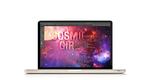
Conceptualizing your theme here, you need grounding. What's grounding? Grounding means that things aren't floating. Things look like they're where they're supposed to be. That includes some types of the lighting effect sometimes, if you have a face in there. You don't want your face just floating off in space, it needs a shadow. So grounding shadows are part of grounding. Sometimes they're not grounding, sometimes they are. But that is what grounding is. It creates a backdrop for your landscape, okay, in this essence. Or it's grounding things to make it seem like it's supposed to be there. I don't know any other better way to explain it. That's just, it's just grounding and we like it. But think about it, I'm sitting here and what's keeping me grounded here is that I literally have my feet on a table and I'm sitting on a chair and I'm grounded. And then there's a shadow behind. I'm sure there's lots of shadows cast from all the lights coming in here that's making me look like, okay, sh...
e's here. If we did not have those illusions, if that was not real, your brain would go, "That looks weird." So we have to build those same kind of thematic scenes in our compositing pieces and that's part of having a realistic base. When we're doing scrapbooking, we don't think so much of grounding, we're thinking of foundation. But when we think of building a realistic kind of dimensional space, we have to think in terms of, okay, we need something to exist on this layer, on this place. So my forest is the way that I chose to use grounding. So that's where we are at right now on page 16. We're going to go into step six called Create Grounding. So, first step, go to File and then Open. Alright, we're making good time. File, Open, and navigate to the dark trees, okay, that we have here. And click Okay, click Open. And this is a picture that I took behind my backyard, way back in the day, and I just love that dusk kind of effect where you have a little bit of glow in the background with the sun setting, you know, down. My sensor was working way hard on this one, on my camera (laughing). But I wanted to get the silhouette of the trees. This is again one of those kind of photo fillers that I was talking about when you look through your photos. And it doesn't always have to be some great picture that you took. This just happened to be a picture that I said, "Hey, look at the sun going down. "I wonder how my sensor is going to play around "with this particular photo even though it's going dusk." That's not a photo we're typically going to print or keep and use in a scrapbook layout, but it makes for perfect extra piece and fodder for this kind of style of compositing. These are the kind of photos that you're looking for because they make for extra stuff to add in, but not for technically scrapbooking. That makes sense, right? So with our Move tool, we're going to select our Move tool in the Tools panel and click and drag it into our layout. And it looks pretty good, you know, we've got to find some way to make it work though. So again, when was the last time I talked about this? This was yesterday, so I need to talk about it again. When you have to enlarge a photo-- we're going to enlarge this photo to fit the full frame of the layout, however the thing is that it gets a little squirmish when you're enlarging your photos. You don't want them to start looking pixelated and raster, you don't want to lose all of the fine detail that you have. When I open a photo, my general rule of thumb, so I open it and it takes up a good 60 to 70% of whatever size layout I have, I know I can full-frame it. If, for example though, you open up a photo and it's like that, do not increase that. That's just going to look horrible by the time you go to print that. It might look good on your screen, but when you go to print it on a nice size paper, you're gonna go, "Well, that was just not working." But if it's this big, I can go a little bit further up. So I need to use my shortcut keys, Command-T or Control-T on the Mac or PC, and then hold down the Shift key to proportionately enlarge that photo. If you're working in Photoshop Elements, then you do not have to hold down the Shift key because it's going to be proportionate automatically. So we're going to fill the full frame with this and so now we have our forest, okay? Let's see, when do we do, do, do ... Okay, alright, well, we'll move it down when we get ready. So next I need to fix this photo a little bit. It's a little dark. Now I'm going to go ahead-- I don't say when to drag it down so I'm just going to go ahead and just do this anyway. Let's drag it beneath our moon at least, layer, so that we can see the moon over the trees. I don't say that in my steps, but yeah, the moon's definitely going to go over the trees in this layout, so no big deal. That already creates a really fantastic effect. Do you guys like that? When I first did that, I was like, "Whoa! "Should I just leave it like that?" But then I went, "No, no, let's put the galaxy "back in there, come on ..." So that's cool. The thing is that I need to play around with it. First of all, it's too high. I need to drag it down because the moon doesn't technically touch trees, so we do want it to make a little realistic, even though, you know, it kind of reminds me ... Oh what was that movie? I thought I heard somebody say it. Huh? Well, ET? That's awesome. I was thinking of that one with Jim Carrey, where he plays God for a day or a couple of days. And he brings the moon in. What was it? Bruce Almighty. Bruce Almighty. And he has that moon shining, he's like, "Ohhhh." And I'm like, oh the things I could do with this. So this in my mind is bringing up another kind of layout but ET would be the closest one I was thinking of, the trees, moon, boom, right? Okay, so, what we're going to do is play around with some levels to create ... I believe, let's see, what are we doing here? Highlight, okay. So we want to add a little bit of extra light to the photo. It's kind of dark. It'll work as a silhouette but it's still a little dark. So we're going to use a levels layer to add light to it. So click on the Create New-- first target your tree layer in your layers panel. Click on the Create New Filler adjustment layer icon and select Levels. And then we're going to create a clippy mask from our levels layer to our forest layer. Ba da boom. And then, what we've seen before is, we want to play with our highlights, okay? Now the highlights are going to, if you move them to the left, it's going to make things lighter on our photo. Do you guys remember when I was talking about jumping the background layer and all that stuff? That you use adjustment layers and what not to help you out with that? That's one of the ways that you can do it. You can fix your photos in Photoshop. Photoshop was made to fix photos. So even though we have Lightroom and all those great things, you don't always have to have those extra photo editors to work in the photo editor. It's a photo editor first so do not be afraid of your adjustment layers. So you see how when I go to enlarge it, it creates that kind of green, you see a little bit more of that green coming out in the trees? That's, you know, trees are green. You see a little bit of that dusk, you see some of the, maybe that's a star, maybe. It's probably part of a lens flare actually. But I'm adding more light to my piece. The highlight that I ended up going to, and you can actually also type those in, I think I just did 136. And that's where I left it at. So it's a pretty strong highlight, it's a pretty strong levels adding light there, okay? The other thing is the more you add to your photo as far as levels or brightness or contrast, whenever you lighten it up, you're adding more noise. So just keep that in mind. I don't know if you guys saw that, but as soon as I added that levels layer and you see all of that extra pixelation and stuff going on in there, that's not really a big deal if you're going to work with blend modes. I'm going to get ride of the sky anyway in a second, so not a big deal. But just kind of remember, the more noise you're adding, the more pixel information, the more gray tones you're adding, so your layout's going to change, okay? That's very important, like I said, when you start blending and doing stuff with adjustment layers, you're going to notice, "Hey, it's starting "to get a little gray, it's starting to get a little hazy, "a little fuzzy," you're adding noise, you're reducing some things down. Okay, so next we're going to change the forest layers level to blending-- uh, to overlay. Again, we do not work with our jumping to background layers or dummy layers. This is a dummy layer pretty much now, right? So what we're going to do is add it to the base and we're going to select overlay and boom ba da binga. How did that work? It made all of our darker tones stronger, all of our highlights stronger, and it got rid of the mid-tone grays. Remember, I pushed my mid-tone grays up with my levels so it goes, "Oh, let's get rid of that background," okay? It makes those dark tones look-- there are no real highlights in that picture, so we're all dark tones. But it took those really dark, black tones and pumped them up and made them really strong. And it took everything that wasn't so dark or wasn't so light and it just said, "Uh, get that color information out of there." So you don't have to guess, okay? Why did that happen? Because we knew that this was a contrast mode and contrast takes your highlights and bumps them up. It takes your shadows and bumps them up, and it takes those mid-level tones and says, "Nah, maybe, maybe not, probably not." And that's how we get that forest to blend into the background, okay? Now, also what I did, is the last final step, and this again is still step six, adding the forest, is I used the Brush tool and changed the foreground color picker to conceal some of the top of the sky. And you may be able to see it, you may not, but you kinda can see it. You see how when I turn on the visibility and turn off, that some of this area up here is blending too because that was the darker portion of my picture? That's where you want to come in and fix that, okay? So we're going to add a layers mask. We're going to click on the layers mask icon, creates a layers mask. I'm going to select the brush tool, you've seen me do that before. We're going to choose a soft, round brush. I already have one. And I'm going to increase the size of my brackets so that I can start to conceal parts of that sky that I don't want to interact with my moon or interact with everything outside of my forest area. Now again, because my mask was white, I'm using black as my foreground color. And I'm going to get kind of closer in there. And you may find that you like how it changes the mood or the dramatic affect of your piece or how your paper looks, you may find that that works for you. But it doesn't work for me, okay? So, any questions about that process? Yeah, Lauren? Will it work similarly if we add the mask in the top layer in the levels layer? So if the mask was right here? Yeah. Like this? If you did an inverse mask? Like instead of erasing from the, like concealing from the picture, you conceal from the layers effect. From the levels? Levels, yeah, I'm sorry. Okay, from the dummy layer? Mm-hmm. Uh, let me think about that. Let me put it back and reset it here. Um, actually I'm going to go back into my history panel and do it that way, so I still have my levels history. Here's the thing, okay? The levels mask, if we were to disable this layer mask, and then do it up here on the dummy layer, okay? Here's the problem, it's not concealing this part of my photo, it's concealing the levels layer. So whatever's happening on that layer is what's going to be concealed with your layer mask. It's not going to say, "Okay, well, I think you want it from the photo," it's just going to conceal the levels. The problem with that is my levels layer is making things lighter, so it's not doing really anything, it's just kinda confused at this point what I want to do. So for it to work the way that you want it to, is if you have to ask yourself basically this, do you want to conceal the levels that's lightening it? Or do you want to conceal the sky on that photo? That's the question you want to get yourself to. Do I want to conceal this part on the moon or do I want to conceal the texture that's still applied to the moon? Then I would add my mask here. Do I want to conceal the lightening part that's screening, the double screen, the self blend of this layer, do I want to conceal-- that's what a layer mask is doing. It's only applying to that specific layer. So for right here, this gradient fill, do I want to apply this to my gradient? Now when that can come into effect is if you're jumping the background layer and I hadn't applied the levels, but still it's not going to do anything for my sky. It's going to do it for the blend mode that I apply through jumping the background. So I hope that's not confusing, but that's where-- Yeah, yeah, that helps. That helps, okay cool. So I'm going to enable this back again and I'm just going to get rid of that levels part. Don't show, I mean it. And that should reset it. Great question. Now that we've created some grounding, and I hope that makes sense, whereas now the moon no longer looks like he's floating, he exists for a reason. He's just not out in the universe chilling or something with no relationship to earth. Now we see, oh the moon is above some forest and your mind goes, "Okay, Earth." Somebody is around somewhere with a satellite which is the moon, okay?
Class Materials
Bonus Materials with Purchase
Ratings and Reviews
Phyllis
I was in Tiffany's Mixed Media class and was also lucky enough to be in this class. Tiffany is an AWESOME instructor and well organized. Her Mixed Media class was a great building block for this class. The class is well worth the money--well organized workbook and other great bonuses. If you want to take your scrapbooking to the next artistic level, I highly recommend Tiffany's two classes at CreativeLivel.
a Creativelive Student
Great course with easy to understand ways of blending more than one photo together for a great composite layout. Excellent materials and workbooks.. Thanks Tiffany for a wonderful class! - Christa (cfile)
E.L. Bl/Du
I think Tiffany is good at explaining it so those who arent pro photgraphers can start at the basics to learn photoshop. I really liked watching this even tho my vision is in another direction, I like how she explains how to get there in photoshop. She makes it not so scary to jump in. She is clever mom too, every parent wants their own kids to be a star and she surely did that. What a neat thing to "scrapbook" the photos. I liked learning adjustment layers, would like more in curves too. But great place to start out in ps. I recommend if your lost in PS.