Lessons
Lesson Info
Basic Principles
All right, so we're gonna start with basic principles, and the very 1st 1 we want to talk about is a big one filling the frame. This is This is huge. And it's something that doesn't often come naturally to everyone. So here's an example. This was taken with my phone while I was on the sofa crow saying something, and I looked up and I saw my cat over there, and she was just so sweet on the chair and I thought, Oh, let's get a picture now This is just a snapshot. This is what happens when you're engrossed in something else and not really willing to put in the effort to get up and get the shot that I think I really should have gotten. So when we look at this photo, I look at it and I'm like, What's the subject? Is that my cat? Is it the piece of Croce that I'm working on? If it my regaled pants and the in the bottom quarter, I don't really know. It's what kind of a mess, so clearly that's not the best composition choice there. If you're leaving your viewers wondering what they're really s...
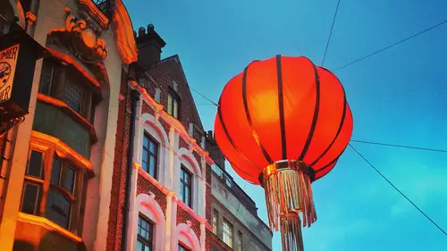
upposed to be looking at, then that's a sign that you probably missed the mark a little bit. So I realized that. And then I thought, OK, I'll get up, put micro shakes I So I did. And then I was able to get a much better, more interesting photo by giving much closer and filling the frame with Onley the things that I wanted to have. So instead of just shooting from where I was, I got up and actually actively composed. The shot on git turned out much, much more powerful. E So another example. Here's another shot of ah, friend of mine's daughter and she they were making cupcakes one morning, and the 1st 1 here is just what I would consider a snapshot. We think about the difference sometimes between the snapshot and a photograph. I really just think the difference is mindfulness and being aware of what you're doing. A snapshot to me. Is something done, really without without a lot of thought. It's just a quick Oh, that looks fun and you just grab it. You're not thinking about the story you're telling, or, um, you know how to make that photo the most interesting? It's just a grab. So this picture is a grab. She centered in the frame, which is not really interesting. There's also we can see one of her parents off to the side. We see a trash can in the background. We see the oven open. I mean, just kind of a lot of random stuff around the seam. If I just bring a little bit of mindfulness and fill the frame with my subject in the story I want to tell, I can get a much more compelling shot like this one. So that's feeling the frame, the next principal we're going to talk about. It's called the Rule of Thirds, and you can't really study photography for more than probably five minutes without running into the rule of thirds somewhere. So basically, the rule of thirds just says that it's much more interesting if you can put your subjects instead of always putting them in the center of the frame. The idea is you want to put them in one of the thirds, so if you've ever looked through your viewfinder and seen this, it looked like a grid. And if it's not appearing through your viewfinder by default, you could play around with your camera and check your display settings because it's usually an option that you can turn on if you want it. So the idea is that if you divide the frame into thirds both horizontally and vertically, then the points of interest are where the lines intersect. So we can see in this image that I put little circles in all those corners, and the idea is that if you put your subject somewhere where those lines intersect, your photo will be more interesting. So here's an example of not using the rule of thirds. So here this this subject is just centered in the middle of the frame, and it's not terrible. I mean, it's filling the frame. There's not a lot of distracting background elements, so that's knife. But it's just it doesn't have a lot of balance. It's just centered right in what we would sometimes called the dead center of the frame. And it gets that name because it's just pretty, pretty boring. It doesn't add a lot of dynamic interest or movement to the scene. So, um, here is the scene recomposed with our subject over on the right third and I think it's just a lot more interesting. It also creates some negative space, which we'll talk about in a minute. Here's another example. Beautiful picture, beautiful subject matter. Beautiful colors. Everything was great, but again the subjects just dead center, and it's just not terribly interesting. Here's the same scene. Recomposed. Now It's vertical, so it was horizontal. But here's a vertical composition with that flower in the upper right third, and suddenly it's just a lot cleaner. One break people of my son here again. Dead center Kids are hard, man. They move a lot, so it's really hard to have your composition set with them. One trick that I use it often as I can with him, is to put him in care. Can't get away here he is eating lunch and I've got him in the center of the frame. But that's obviously not the most interesting photo here. I've recomposed the scene, and he was playing around and laughing, and I caught this great moment where he's just throwing his head back and laughter, and it's more interesting for a lot of rhythm, but also because he in the right third here's another image of just a still life eucalyptus leave and again in the center of the frame. And we have the beautiful wall color. Our house is really colorful at home. So you that a lot for back backgrounds when I'm shooting things. But in this example here I have centered in the frame and we see the patio door to the left, which lets in a lot of excellent light. So that's really nice, but it's just kind of random that it's on the side there like that. So here's the same scene shot from a slightly different position and moving the plant over to the left. So adds more interest. We can see the mirror on the right, and it's a nicer composition. Just a couple more examples with the overlays he conceived vertical or horizontal. Another portrait. Now, when you use the rule third, that's not to say that you can never put your subject in the center. I mean, rules are meant to be broken, obviously, but it helps to understand the rules. He could break them with knowledge and break them purposefully and you know, intentionally with a reason. So here is an image where the subjects are in the center of the frame. But there's some other compositional things that we haven't talked about yet that are happening in this image that that help really support it, even though I put the the subjects in the center. So one thing is that this image has leading lines, which we'll talk about in a moment. But also the horizon is down close to the lower third, so that also helps. So even though the people themselves there in the center, the horizon is in the lower third. Here's another example. Again, the subjects are centered. But another compositional element that's in this photo that we haven't talked about yet is some natural framing that's happening so there in the center. But then they have these trees circling around them that that helps to frame them. And that adds to the competition as well. Another image with the subject in the center that can also be done really well, I think if it's very symmetrical, so in this case we have these bold blue shoes and then the geometric pattern of the sofa. So it works in this case to hold that in the center because it is so symmetrical. A fireworks image again there in the center. Um, but it works out. It works out nicely in this case again, Done intentionally. And my cat, What would be what would example be without the cat? But here she use entered as well. But again, the images very symmetrical. Same here and here is, well again with leading lines. So the rule of thirds tells you to put your subject in one of those points where the lions intersect in the top or bottom or left or right third of the frame. But remember, you can always break those rules. Just make sure you know why you're doing it all right. Next up, as a basic principle, we have repetition. So would you repeat things in photos, you can repeat lots of different things. You can repeat shapes. So here I have a picture of that. Eucalyptus plants and leave create a repeating pattern. In this image. It's some Roman columns that form a line, so that's interesting. And they repeat also, so repeating patterns can be interesting shapes. Here we have repeating circles and the colors. Although they're not the same, they're sort of along the same in the same vein, repeating lines confined a lot in nature. Nature provides ample opportunity to capture patterns as well as architecture. This is, um, shot upwards, looking upwards from a stairwell basically in a hotel building in Santa Fe. This is just the pattern upholstery pattern on a chair. Somewhere I forget where that was. Some hotel someplace. One thing that can be interesting when you're photographing patterns is that you can also interrupt and break the pattern. So here's an example of my son. I fell in love with this rug when I was putting his room together. I I like geometric imagery. And so I found this rug with all these stripes, and I couldn't wait for him to be born and get here because I couldn't wait to photograph him on the cool rug. And it makes really great patterns with the repeating lines and the stripes, of course. And then I broke the pattern by having him in the scene and, of course, with his bright orange diaper that as a lot of fun contrast, which will be talking about coming up as well. So, ah, lot of times when you're composing your images very rarely are you gonna have just one of these principles and play. Most of the time, you're going to be having multiple principles all being used at the same time. So that was repetition. Next up is what we call leading lines. The leading lines help guide your viewers. I threw your image, moves it along. Here is an example of my husband on a bike, and we are using the road I'm using. The road is a leading line. That's a very common thing that you would see in a photo like this. Roads make great leading lines. Footprints and walking path make great leading lines. Those were both pretty literal leading lines. Here is an example of a more abstract. So I have a triangle here between these guys flying this little airplane remote control airplane. And then there's a kayak or something in the bottom right corner, and those three items together form a triangle. It sort of just keeps the viewers eyes looping around this shape. And I shot that on my phone, which I often keep in the square format because I'm always on Instagram, so I always have it ready, shooting squares and so here we have a triangle in a square, and I think that adds a lot of interest. Another principle you can use to improve your composition is contrast. So contrast is something is the difference between things, and it could be difference between colors. So here we have this gold colored Buddha sculpture, and then behind behind him is the Blue wall, so blue and yellow slash gold contrast. So I think that's very appealing, and there's a touch of red in the upper right corner. I'm not sure what that was something else nearby, but they add some interest. Here is another photo shot with my phone. There's the rug again in my son's room, and I love the contrast in this because we have the contrast of the stripes themselves. We have the contrast with his bedding and the blankets and everything, but we also have the contrast of lines and the direction that the stripes are running. And then we have that that diagonal line of his crib. So that's actually the wooden edge of his crib. And it's this 90 degree, perpendicular intersection, and I just I love how the geometry works out there. So you can contrast all kinds of things. Color objects, directions, line size, um, even shape. If you want to learn more about colors and the whole color theory of how that all works, there's a really great tool from adobe at color dot adobe dot com. And you can create color schemes and play with color and just really get to know how that works better. I'm really drawn to color, so I use it in my images a lot. Here's another example, um from London. I think I shot this and again with my cell phone. I was just really drawn to the color in the scene. The dramatic blue sky, the red ornamental object, their lantern that's hanging and then the just the nighttime light of the building. Here's an image I did for clients was an engagement session, and we have the contrast of their black and white clothing and the red balloons. So I kept the background for that photo. Very neutral. It's just a gray wall. Basically. I think that really makes those balloons pop. Sometimes a photo that looks kind of black when you are looking at it. The scene here, This is the one of London airports, and I was drawn to it because the lines in the ceiling and when I shot it, I was like, Oh, this is kind of just boring, nothing really too exciting about it. But then, when I converted it to black and white, those lines became much more pronounced. And then it was a much stronger composition compositional elements. So you may find that actually removing the color can sometimes improve the image. Here's another example. This is a subway stop in the D. C area we see leading line. So the curve of that feeling structure leading down to the train and also the leaving line of the escalator on the left, the repeating patterns in the ceiling. I don't know. I would call that like a ceiling tile, but it's not tile, but those that sort of rectangular fell pattern in the feeling is a repeating element. And of course, we have really high contrast between the silhouette and the bright areas. Here's another example of ah black and white street scene, and this was shot after some rain so the streets are nice and wet, which adds a really great reflective element. Black and white can also increase um, texture in an image, which is really a function of contrast. So even though the color is gone, we still have a lot of contrast in this image. That's my cat on the staircase of our old house, and it's lit from direct sun from a skylight coming from above. And then it really brings out the texture in her for and I don't know that it It looked quite so textured in the color virgin. When you're working in light room, you can actually cook up your own black and white conversions, so you have a lot of power to really fine tune your black and whites. These are two. It's the same image and two different settings. Um, for a black and white in light rooms, you can really adjust and tweak with it. Play with it to get exactly the conversion you want. It's not that you're just dif ach aerating the image, which would mean to just sort of suck the color out of it. It's not just a D saturation, and you can actually go in and adjust. How did the red look when they're black and white? How did the green look, the yellows, the blues, each individual color. You can really a just and have total control over. So it it's pretty often all right. Another basic principle is negative. Space and balance. This is one of my favorites. So the idea is that you leave just empty space in your frame. So when I'm shooting with my DSLR, it's a nice big rectangle, and I like to leave like half of it up D A lot of times. So in this image here, I'm still following the rule of thirds. So I have the little gal. She was the flower girl in a wedding. I was shooting and she's getting giving all ready to walk down the aisle. And I shot this through an open doorway and I just left the whole left side of that frame just dark. That was just the door in the wall. And I love it, and it also communicated sort of ah, hidden moment. You know, they're clearly not posing for the camera, so I really like that a lot. Here's another example with more negative space. So my subjects were there on the left, in just a bunch of open space to the right, another vertical example. So wedding rings in the bottom third and empty space above. They are centered in the bottom third, but, um, they're centered, but it's still the bottom third, not the center of the frame. Here we have a macro shot of a flower on the left. The right hand side is again empty. Another cell phone grab taking my phone for a walk, leaving line of the sidewalk, the contrast of the silhouette and the sidewalk and the color of the grass. And then just that empty upper right corner, another fell phone grab at the playground. Sometimes the things that you leave out in a photo can also just be as as compelling as what you put in it. So in this photo, it's just the top of his little hat. Another bridal portrait. This is also utilizing another a technique that will talk about frame in a frame and again more open space on the left. Now, if you're really thinking through this, you might think, OK, carry. You told me to fill the frame so I get it. But now you're telling me to leave empty negative space, which isn't that. Isn't that a paradox? I mean, how can I fill the frame but also have negative space? To which I would say you are really paying attention. So good job. That's very, very good question. Yeah, it does sound like a bit of a paradox. And the thing is that when you're filling the frame with negative space, in some cases you are, um, doing it very carefully. You're not feeling it with anything that happens to be around. You are you're choosing. Remember, composition is all about choice. So, for example, here are those two lips again. So the frame is full of a lot of unnecessary stuff. I can see a chain link fence in the top left corner, some random. We There are other random plants in the back. We have some just dirt in the bottom, right corner and some daffodils. I mean, it's just kind of a random mess of of stuff, so the frame is filled, but, um, not very intentionally, it's not very well curated, So here would be one of those same tulip captured, still filling the frame. But I'm controlling what I'm filling it with, and I'm I'm feeling it with sort of nothing. So it's just green, sort of plain background. It's more. It's empty but full. So if you can wrap your mind around that what we're talking about, we're filling the frame. But sometimes that means filling it with emptiness on that emptiness still has weight, so it's also about balance, and we'll see that as we keep moving through all of these. But you're still balancing your subject against an emptiness, an empty area of the frame. But that emptiness still still has some weight. So the more that you play with us, you'll get a feel for what creates a good balance. And, um, it just takes practice. So don't be afraid to get out there and really give it a try.
Ratings and Reviews
bobbi
Khara does a great job! She is thorough, has a great teaching style, uses fantastic examples of the "snapshot" version and the good version. She is enthusiastic, has wonderful explanations. I'm not a beginner and knew everything she said, but still found the way she put it together interesting. I referred several beginners to her courses. I hope she comes out with more advanced courses.
a Creativelive Student
Too often, I hear budding photographers lament, “My pictures aren’t that great because I don’t have a good camera.” Khara dispels this myth with clear examples taken with her cell phone! Of course, good gear helps; but it’s the skill behind the lens that separates a snapshot from a photograph–not the hardware. One caution, however, with Khara’s explanation of the rule of thirds. It is true that the intersection of the horizontal and vertical third is very powerful. Indeed, it is so powerful that it has a name–a bullseye; and you want to avoid it! Seldom will you see a point of interest on a bullseye in any major work. Near it–maybe; but not on it. When an area of interest, like the eye in a portrait, is on the intersection of the thirds, the viewer’s eye is drawn there and it locks into place. Without anywhere to go, the bored eye moves on to something else. Fledgling photographers (and seasoned professionals!) fall into this trap and it would have been prudent of Khara to warn of this danger. Khara does a great job describing tilt and her bird on a wire photograph is an excellent example of dynamic symmetry. While not exactly in the realm of basic composition, dynamic symmetry a powerful concept to explore once the principles outlined in this course are mastered.