Making a Mobile Friendly Site
Lesson 4 from: Creating a Responsive Website with WordpressBrian Wood
Making a Mobile Friendly Site
Lesson 4 from: Creating a Responsive Website with WordpressBrian Wood
Lessons
What is WordPress?
20:56 2Choosing a Host for Your Site
25:20 3Basic Setup of WordPress
34:25 4Making a Mobile Friendly Site
28:48 5How to Find Good Themes
43:47 6Creating Menus & Pages
32:17 7Adding Widgets to Your Theme
30:06 8Post vs. Pages
19:39Lesson Info
Making a Mobile Friendly Site
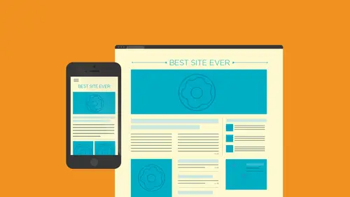
I want to talk about what? What makes a sight responsive I'm not going to go too crazy with this stuff because we need to get toward press obviously but I just want to spend a little time talking about responsive design because it will color what you choose to put in your sight okay and plug ins wise a different different things and functionality okay um you know what? This site right here is responsive like I said and the reason why it's responsive we can already talked about that is that we all the information essentially is kind of separated from the design all right? So we've kind all learned that when we when we start to build websites content is separated from presentation a lot of times they say if you look you going to see like I said before we can kind of drag and we kind of see things happening here and you're going to see that some some key key features like let me ask you you got like what you look it at a site on desktop versus a sight on a mobile device what kind of thing...
s do you see that are different a lot of times not always right but navigation right because what why would that be key why would that be uh something we we see that's different on mobile versus on desktop what do you think? Because it's spread all the way across the page when you're on the website, but obviously on a mobile phone it's not going to go that far over to the right? Exactly. So we as faras a mobile device, is concerned. When we look over here, we're going to see that, you know, you only have so much room to work with. Okay? What if I liked the design as faras the mobile site? Typically what? How many columns do you see and different things like that? Usually one right that's kind of simple? Yeah, it's simpler, it gets kind of pared down, right? These are all things that we need to consider we need to think about and when we design our sights and we start creating our sights, the theme of the template we pick is going to be super dead important, ok, the reason why I say that is because when we go in and we say, you know what, my desktop site, this is what I have, I've got the navigation up top here, and I could see that, you know, it's doing its thing when I get smaller, you're going to find that it's going to kind of convert to something else and as I know, I'm going to say tap. Because on a mobile device we tap right? So as I tap ok it's going it's going to drop down typically and you're going to see the menu system now there are a lot of other kinds that, like, slide in and do different things like that, right? If if you want to you're goingto pick the theme that's gonna have this functionality built in so you need to pick the theme that works the way you want it toe work because a lot of themes are going to get that a lot but some things are gonna get tied to the navigation and how it acts. Okay, so that's so super important actually, it really, really is, um also the content itself you're going to find it. How many of you have ever heard of the term retina like retina display? Okay or something like that, right? Um what does anyone know what we mean by retina in a website like, well, how it relates, okay, they called retina designed written already. Is it the way that your eye sees the page or the way that you take in the information? Usually yeah, so it is essentially like this retina is I guess you could say kind of an apple term, all right and it's for some of the devices that came out that have ah, super well, what they call it clear and crisp display so you're looking at a picture and you look at the images and you're like, wow, you know, I look like it's like hd people say you don't mean that type of thing, it looks a lot clearer, like crisper with a retina displayed there's actually more pixels generically it's more pixels packed into an area so we can have a picture looks a lot better, so for, like, photographers there want a show case imagery something like a retina, you know, image would help. Okay, you're going to see that with this site right here and you noticed this banner right here. We can add these really simply and really easily, but as they start to go across here, you're going to see and it's not really going to do it right now, you guys can't see the flash it's already loaded, but as a ghost smaller what we actually do a lot of times with responsive designs, we actually load different images. I think I think about this with response to design, I want to talk a little bit more about it with responsive design. A lot of times we have the same content it's, just like the same pictures and same tax, the same fonts were just kind of styling it differently depending on the size of whatever you're inside up right but if I have something over to the white board for a second here and kind of show you this if I have for instance a a picture like here's my desktop site and I've got a picture for the banner right up here okay there's a big old picture and it's let's say like you know, two hundred crazy k or something like that well so big picture got it in there and we realised that you know what for responsive design we take a lot of our imagery in a lot of content and it just kind of scales and gets bigger and smaller you see that a lot right when you make things bigger and smaller so but if you watch the side you're going to see the picture of her getting bigger and smaller one of the issues that we face and this is going to be something that's probably maybe built into the theme is if we go down to a mobile device for instance and that's the world's tallest phone whatever it's not it's not on not on my phone okay, we're going onto to something like this a lot of us are a lot of times what happened was it would take that image and essentially just shrink it and essentially it would get shorter because you know the landscape with in height had you know, scale dimension proportionately so we would actually have an image that was more like that ok forget that stuff so you just take the image that's two hundred k and shrink it down when we first started doing responsive design we're like killer it looks great okay but what's one of the potential issues here if you have if you have a mother and her baby and the mother is looking down at the baby the baby's gone then the picture completely changes content there's there's something called art direction which we deal with which if we have an image in there ah lot of times we can take pictures and they kind of put him in the background of things and if things get too small they couldn't crop things and cut things off ok so we need to ensure that that's done properly and we have settings for that lot of themes will let you do that a lot of templates think about this I have an image that's two hundred k in size I guess you have decent internet at your work or home or whatever it's probably pretty good looks pretty fast ok go on your mobile device is gonna load us fast is on your desk top usually mine doesn't okay I'm on sometimes I'm a forty network of three g network whatever you're trying to take a two hundred k image, download the same image to your phone your mobile device but just make it smaller think about that that's crazy okay, but that's something that when we first started doing responsive design, this is what we did and we still have a lot of people still d'oh, okay? We just said let's, just shrink so we're coming up with solutions and a lot of themes will actually have ways too if we have a desktop, let me call this the desktop version of the picture it can or we can actually make different versions of the picture for mobile, for tablet, for desktop, and depending on what size device you're looking at, it can put the right image ing okay, so that's one of the things to that we care about with responsive design, all right, and that's actually what's happening with this site. So it's it's kind of swapping out the pictures as I scale, which is pretty cool because you can have a big picture looks great in a small picks that looks great still okay, okay, and it doesn't like instantaneous because I don't see it flicker, I don't see it yeah that's amazing to me, you're going to find that sometimes and some solutions, if you will, you'll see if you do this, it'll like like a flash or something, well, you'll see it happen, okay? And this is the thing you have to consider like once again somebody on the phone is not taking their phone and saying let's stretch this thing out make it smaller you don't seem like they just load what they load and what they get is what they get so it comes down to right so okay so when we talk about responsive design, I also want to prep you for getting your theme here getting your your template if you will because like I said it's a big important part and I want to show you this this is a website that once again is is in that pdf of links that you can get it's called liquid apse of dot com and it is the most disgustingly hideous website you'll ever see but it's not meant for looking at ok it's meant for just kind of a quick here's what happens all right when you pick yourself a theme when you going to start dealing with a lot of this, we're dealing with responsive design and we kind of talked about was spot responsive means it means it's responding as faras size to the device it's honor the view port okay that's the browser if you want you're going to see that this this site actually just kind of does its thing it's like a look I squeeze it, it gets smaller and, you know does the thing that's called responsive okay, no the reason why I'm actually doing this is because I want to tell you why something is responsible makes it responsive okay, does that kind of makes sense? All right is we're going it's just a little bit of information on the back here that you may or may not use within your sight but it's going to effect the team you get okay uh if we talk about working with responsive design let me actually I'm gonna set out like a desktop here and I've got a picture and I got some texts from different content okay, maybe that's a picture and that's a picture if you look out here you'll see that a couple things make a page responsive first of all, as I go smaller what's happening to the sizes of the columns here there's drinking yeah, they're doing like the stretchy thing, right? Okay, we'll stretch what we do a lot of times is we actually will style will make the look and the feel like the colors the size ings and where things are located using what's called css how many of you are familiar at least with the idea of css? Anybody coated it before you ever code teo style sheets? You got it okay, so css style it's kind of like if you've ever been in like like in designer illustrator and create a paragraph style a similar kind of concept what you're doing is you're saving styling like I want the color for something to be read and you'll never just write out the word red that's done um we're gonna get a code I want a color for the read on all the text to be that all of our styling actually lives in a separate little text file called the css file. Okay, all websites do this, so we actually have a little css file in every site we create. Wordpress has one as well. Ok, whenever we changed stuff, change colors, changed sizes change things like that it's happening here, usually in the css in the styling. Now, when we have content, we have a picture we have tax to me of this and we go in and we make let's say this smaller or narrower or it's on a smaller device in the styling, this is the coolest thing in the world. How many of you have ever heard of a media query? Okay, just think of it this way. I'm not gonna go into this. We don't need to know this, but we can actually in our styling say, hey, if you are seven hundred sixty eight pixels wide, I want the color to be blue, and I'm really messing this up I'm sorry I could write straight so just on this topic right here, so in particular thing, I noticed the most we're talking about is the menu, right? The menu goes from from across to the pull down, and sometimes the text on the background doesn't look as good on what they choose versus this and that's something that we can change in that area. This is where we can change a lot of that stuff. A lot of that visual cues, visual things that we're looking at in this style sheet is called in this text file. Okay, now different different themes or template to buy are going to have different ones in different places, so somebody could be a little rough toe, like figure out where it is, but it's usually on the same place. Okay, so when we have a site that is what's called responsive, we have the same content. We just kind of tell it, and this is really simple. We tell it at certain sizes I want you to change. Maybe instead of two columns, I want youto drop a column down here and it's just it's so fast and you don't even know it's happening. So for instance, if I come back over here to the site and I drive good, you see its initially three columns, you're going to see it at some point it's going to do that right it's just gonna kind of drop and if you take a look they don't really care what it looks like so they just stuck it down there we wouldn't do that but anyway if I put it in line with the other column and this c s s is what tells it where to go like which columns going to go down correct okay yes so the css is kind of is giving accused in most cases this is what's happening okay okay so so it's saying ok at this side now do you see can you see down here I have a little little plugin thing for my chrome browser you see that little yellow thing down okay and it's just giving me a size telling me as a designer I want to see what size something's changing at so you can see oh that's around a tablet size it's kind of making it to two columns okay so it's in in the styling a lot of times not always but a lot of times it's saying at that size were going if you meet this condition this thing let's let's take that column and move it down okay styling does that just pretty pretty amazing so we're using what's called responsive design so the responsive design has a couple things going on it's got stretching columns which means that we're actually setting the width on everything that was called a percent it's kind of just doing this kind of doing that we also have the css doing it's switching whenever it comes to a certain size these they're called media queries. Okay it's enough background information. Alright. That's media query that's just something that's there. Okay? And this is what makes a responsive design so we can based on the theme theme, a lot of themes templates we get forward press are goingto either let you guys just kind of decide do you want three columns or two? How do you want to work? You know, if you get a good thing, okay, now something else that we have and this is something important we're going to kind of step mohr into working with themes and talking about themes. There are certain kinds of responsive you can get, okay? And you got it. This is something that watch out for, all right? Just to keep in mind, I expect over here we have what's called fully responsive and a lot of sites. A lot of themes will say we are responsive and we do this responsive means that it I'm gonna be laying here. I'm going to say it stretches and squishes okay, does that thing and it changes depending on certain sizes, okay, that's usually a lot what responsive means adaptive design is another kind okay, so let me let me choose adaptive. You've all seen sites that look like this on this site. If I choose adaptive, let me zoom out again. It's going to switch over and just show us what adaptive means. Now watch this back in the day when we were doing sites we thought were so cools anybody ever coated the table before? I'm sorry, it's. Brutal. Anyway, um, this's, why were press could be so awesome. So this is what an adaptive design notice what's happening there. Columns here. Are they changing size? No, but watch. Oh, I see what's happening here. So the white space changes so essentially what's happening is here. We don't a lot of times with what's called an adaptive design. You have the columns and the different features across here are set at a size and that's it. They're not set to be stretchy. Ok, at percent. So but they do have with this kind of design. They do have it. Whereas you go smaller or bigger. Whatever device you're looking at it's gonna add a certain size it's going to do this style thing? They're still css. They're still styling it's gonna change depending on what size you're looking at. Okay that's a big deal because if you pick a site a theme you start get going and you you pick one it's not quite what you want you're gonna have to back up and pick another one if you don't like it okay so this is this is pretty key and pretty important and that's that's what responsive design is okay it's just generically okay simply we're going to go in and we're going to pick a theme and kind of decide how we want to start and this is a conversation that I want to start having because it's it's crucial it's huge uh I'm goingto switch over here to a pdf I've got and this is a simple and this is actually in the bonus files uh that we can get and if you take a look you'll see whatever this is a slide I don't need this that's me whatever okay uh so you're gonna see I love this quote check this out why use responsive design? Why we make her sights responsive it's basically because you're layout you don't want it to look like crap on different sides screens okay? I mean it's the honest truth you forever and a day we had to just kind of suck it up and do it okay my sister in law and I were just talking about this yesterday there's certain sites that we won't even go to on her phone will wait till we get home toe look at whatever we want to look at because it's just not even worth having to scroll over on the website so consumers are making this decision if we don't it's true and I've been on sites like that on dh they drive me crazy, you know? And if you're designing this especially and you don't look at mobile and desktop let's say those two things as the same but different then you're not really doing it right you know what I mean? There's certain things that need to be the same certain that need to be different so you're tilly right? That's exactly what we kind of talked about how we can work I'm not going to get over that again, but I I want to skip to this because this is this is actually good. This is what wordpress says what a theme is and we're gonna start to talk about themes in general how they work and what they are um it's a collection of files that work together to create to produce a graphical interface when under flowing underlying unified design for a weblog these files are called template files how's that sit with you that's it's one of those things where it's like okay, I think I get it but we need to see it okay so that's that's the definition of a theme when we talk about working with wordpress, we are going to be dealing with themes a lot, okay? It's gonna be our bread and butter is going to be their starting point for our entire design how we think and act and work ok? And one of the things to think about is do we want to rebuild the wheel? So we want to just start from scratch or do we want to just pick something that's already out there and kind of work off of that? And to be perfectly frank, a lot of us that are just starting out well, probably not rebuild the real you don't mean you're gonna go in and say, all right, I'm gonna open up my text editor and start jamming it's not worth what we're presses for when we first started, you know what I mean? Later you get comfortable code whatever you could do that but there's a lot of places that we can go to find these these themes. Okay, now what I want to do is this I want to I want to show you where they are in the admin, but I also want to tell you what the theme is like, what it actually does and where it lives. It helped me to understand that ok, when we start working so we're going to get back to this, I promise but I'm going to go back out here and I'm going to go to my site just take a second to kind of switch back over and get back over to my admin here, okay? So this is the site where obviously work on in our admin and if you look down here, we kind of talked a little bit about this just briefly, but you're going to see what's called appearance and we're going to see themes now all the things that we have in here between customize and widgets and menus and all this kind of content is tied to the theme, so I'm gonna click on themes here we already saw this but it's going to show us the different themes that are basically provided by wordpress they give us these thieves are installed in every wordpress install you don't need to keep these in here if you don't want to but this is where we start now the theme is is a collection of files that sits remember that wordpress folder I was talking about the whole sites in there basically ok it's in that folder. All right, I want to show you where it is in the folder just so you get an idea of how this happens each one of these these themes out here the first second, third each one of these is a separate little folder full of stuff right so I was going to go out to my desktop for a second here, and I'm not I'm not trying to go to crazy deep here, I just want to show you, but in the word press folder here, this is the actual folder that will be up on or the content right here that will be up on your server on go daddy or blue most you can go look at if you want, you'll see in what's called w p content. This is your home. This is your realm whenever you upload images all different kinds of content, whenever you create, you know your themes are add your themes, they're going to go in this folder you'll see in here that we actually have a folder called plug ins and all the extra stuff we're going to talk a lot more about plug ins later, but all the extra content in extra functionality that you can add will be put in this plug ins folder. Usually okay, this here is called the themes folder. Now, if you look in there, ignore the index thing where you're going to see three folders in here twenty, fourteen, twenty, thirteen and twenty twelve if I go back over to the admin and just take a quick look. Twenty fourteen, twenty, thirteen, twenty twelve so each team has a folder in there. Okay, now what's great about word prices we almost you may never go to that folder in your life because it it kind of does a lot of that for us. Okay, but like I said, it just kind of wanted to show you where that wasn't and how it's set up. Now if we decide that we want to add a new theme for instance we could go in and you're going to see how do you guys think you do that? Click on that plus, but the joy enormous plus down here, this is add new theme, right? Or we also have add new town. Yep. So we also have search installed themes and what I'm gonna do is I just wanted kind of take you through this and show you this a little bit, but I'm gonna click on add new here and this is if you if you realize you want to start with a different design human okay, different functionality, different design. When we worked in wordpress wordpress there are so many wordpress developers out there that are, well, some of them are trying to make money off a wordpress like actually do it for a living. Some people are just trying to use it as a tool to create site somewhere, doing both so a lot of people will create these themes and either sell it to you or let you have it for free okay and there's a reason why we get one or the other we'll talk about that, but if I go in here and say ok, let's, take a look you're going to see that this is actually going to a word the word press site and just filing all those in here and sticking him in here you're going to see that there are they're categorized by featured popular and latest um now featured it's just you know, whatever we're press decides to feature, you know, depending on it and what's interesting about about themes is that you really only get to see like a thumbnail and I usedto way back in the day used to be a little difficult to kind of tell what it actually looked like an acted like I'd look at the thumbnail like let's say this pink one right here and yes, I focused on the pink like the pink one right here and I'd be like, I think that like that that might work it might be pretty good, you know? I mean but you don't need to know you know me these days it's so much easier if you go to one of the themes here you can see right here, it says details and preview or preview it's awesome so I'm looking around I'm like hey let's preview I'm going to see what this looks like what it's actually going to do is it's going to take me out this this customizer area this is what we typically called customizer it looks like that anyway it's going to take your basic content that you have already and kind of put it in here if you want okay it's going to show you what the theme looks like and what's really great about this is if you take a look I can go out and actually start to navigate and although the linking works I could if I really want to come off to the side here and kind of take a look and see what it's gonna look like which is really cool okay that's pretty neat and that you're just getting an idea okay, now you can tell is let me ask you a question here are getting a second is this theme responsive now remember there's two two main things that makes something responsive stretchy, squishy and it changes its certain sizes right take a look that's respond yes okay you're going to see responsive, right? Yep said as responsive okay, did you ever question I was just gonna ask what the bar on the left is, but I can't sort of say it's the description of yeah let's take it let's take a look at that that's a good question over here on the left you're going to see this kind of giving us more information about the things getting so look thumbnail I'm going to skip the ratings for a second we'll get back to that and you're going to see down here that any anybody worth their weight in, you know, gold or whatever you want to call it will actually give what's called a theme description and let me zoom in down here so you can see this this is actually really important because you can see it and visualize it but you can't see every feature in the theme you know, they a lot of teams will have once you install it and put it in they'll have like you can slap a video in there that just sizes easily you khun do three columns or two columns but when you're grieving but you can't see some of that so the description a lot of times will give you that some of that detail a little bit further okay that this is the thing about themes I love you can activate it hate it and it's tear it out you say I don't want to do that, you know I mean that's the best part about this you're not destroying anything you're just trying it now I want teo we're gonna talk about the rating thing it's key okay you need us when we talk about a lot of things plug ins themes you have to there's certain things you have to look at to see if it's going to be worth it for you to go forward okay and the reviews to be bit perfectly honest can really sometimes be a good tail tail like any review we see for books for this for that okay take each review you know with green assault kind of thing but look at the overall so we're going to talk a little bit more about that if you look you're going to see weaken just now if we decide here we could do it's called install this means take the folder with all the themes stuff copy it into that teams folder I showed you guys and say let's activate it let's make it the one we're working with a guy so I'm gonna do I'm gonna be like okay let's install this thing it's gonna go through now depending on your internet connection sometimes it could be slower in the green faster okay you're going to see okay what we did was we just took the package is just a zip file of that stuff basically care or the folder and it went in and it said let's go ahead and unzip it let's do our thing and let's install it now installed doesn't mean it's showing right now it's just in your folder it's not what's called active so what I can do is I can preview it I can activate it or I can just go back to the theme installer if I want and what I'm gonna do is this I'm gonna go I'm not gonna jump here I'm just gonna go back to the themes if you look over here, click back on themes and take a look and you're going to see suddenly that one shows up right there. So td macro right here that one I'm not you that's just a theme I just picked randomly okay, I'm not telling you to use this theme, but you're going to see that now the theme that you're working with the theme that actually shows and his editing and basically controlling the look and feel of your sight is active and that's usually the first one you see over here okay, so you're going to see that this one is active and it says active right down there this one is not yet so if we decide we want to check it out we could either live preview it and that's usually what I kind of just quickly suggest just take a look at it it's going to kind of go take a look, put your content in you're gonna actually you guys this is huge it's going to show you built in customers customization that the team has what have you always important to use the colors of the colors that I want you want to change the color the text in the header don't you do background color you go right here and goes eh let's pick that and let's do it which is kind of need all right so you're this is something key to look for anything we're going to talk more about this but so we can change like different information things like that if we decide and this is actually and there's the description again but if we decide that for instance you look over here and you're like well there's not a lot of customers h a I could d'oh you might want to use the thing because there's a lot of things out there that have a lot you can do but I also know that some themes don't have all the customization here sometimes it's outside you'll see I'll show you in a little bit so if we want to hear you say all right you know what? I like this one I'm gonna go ahead and save an activated if I don't like it I'll just not activated but I'll save an activated and that's saving means I just maybe change the color or something okay and if you look you're going to see ok, this theme is now active I got it right there and what I'm gonna do right now this is he just the most awesome part of world press, the party, love, I'm going to come out here, and I'm on my, my my website, right now. I'm just going to refresh and you're gonna see, hello, world, there we go, this is this is the awesome part. So the thing I love about themes is the fact that if we don't like it, we just what's called de activated. Okay, we don't like it. We just we leave, you can leave it there. We just don't use it.
Class Materials
bonus material with purchase
bonus material with enrollment
Ratings and Reviews
fleebers
Learned less than I expected. I came into the class with WP knowledge having a created my own functional site. I could have learned everything he covered by reading online, in less time and for free. The instructor was all over the place and never really answered all "really good questions" "you know what I mean?" I believe more could have been covered if the instructor was a better speaker and better organized. He was really difficult to listen to. I don't feel this course was worth what I paid but as I bought in a bundle I'm hoping the other sessions will be better. I recommend catching this course on a free preview before making the purchase. I wish I had.
a Creativelive Student
I thought that Brian did a great job explaining how to set up a word press site. I am a novice and felt that I could handle it after watching this. I am a very linear learning and didn't feel like he was jumping around. I felt that he was explaining the process of using a very detailed and multiple optional program well and I didn't have any problems following him. I think you have to have an attention spam and be focused because it is a lot of info and can seem rather detailed. For a beginning class on Wordpress, I am very satisfied with what I just learned and feel comfortable creating websites. I am planning to take the more advanced class based on this. As far as the title, I guess I took the time to read the description of the class before I purchased it so I felt like it was money well spent and knew what I was signing up to receive. I will agree with other comments, the one female student made it difficult to watch due to her need to add something to prove her knowledge. I could have done without that, maybe they could ask the students to limit their comments or questions.
LafnSuzi
In the process of upgrading our church's website responsive and this definitely was the course to watch. Have had a wordpress site for years, but got a great refresher and learned much I didn't know. Thanks a ton, and can't wait to get into the other courses as well to continue my journey.