James Victore's Workhorse Fonts
Lesson 5 from: Digitizing Hand-Drawn ArtLaura Victore, James Victore
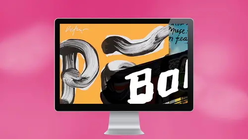
James Victore's Workhorse Fonts
Lesson 5 from: Digitizing Hand-Drawn ArtLaura Victore, James Victore
Lesson Info
5. James Victore's Workhorse Fonts
Lessons
Planning Your Strategy
06:34 2Digitizing with Photoshop: Step 1 - Scan
03:57 3Digitizing with Photoshop: Step 2 - Adjust/Edit
07:57 4Digitizing with Photoshop: Step 3 - Layer
17:24 5James Victore's Workhorse Fonts
22:22 6Digitizing with Illustrator: Step 1 - iPhone Capture
07:29 7Digitizing with Illustrator: Step 2 - Live Trace
08:58 8Digitizing with Illustrator: Step 3 - Overlay Vector
12:10Lesson Info
James Victore's Workhorse Fonts
I learned a long time ago that, um, there is just too many type faces out there. And what what I found is, and here's what. Here's what. Here's have a started for me is like when I was a young designer before everybody was using the computer before anybody was using the computer. When I was really 1920 years old and I was working in New York and there were these big, big books like Telephone style Old doesn't mean when the telephone book is the Yellow Pages anymore. Back in 19 huge books from a number of different sources, photo shop was one. Um, no photo lettering was one, and they were different sources. Some of them were in New York massive books, and they were like they were style books. He would flip through them, and each page had 30 to 50 different fonts. And it went you would you flip through it like this and would slowly take you from San serif all the way through to Sarah of two decorative to Hebrew to like, just like you could basically search for your font. And then you wou...
ld take a your your brief and you would mark your brief all up and say this one is going to be this size, and it's gonna be turned tight, not touching. And it's gonna be this. And then this body text is gonna you gonna market all up And you had a haber rule a special ruler toe figure out how to order type. And that was this. That was a skill that we had then. And then you send it off to photo lettering, and depending on how busy they were, it would might come back that afternoon. It might come back the next day, which was really cool, cause because there wasn't this immediacy, you could kind of go have a beer. I said out the type. Um, I wanna go have a beer. Wait for to come back. Right? Um, what I learned there is I found all these designers that I was hanging out with were spending hours poring through these type books looking for the right bond. And what I mean by the right front was fonts that had they came. They came with a backpack full of their own information. I need a font that says World War Two, right or I need a fund that says, Like, says romance and style like it should say it's like fashion, right? We're looking for a font to bring in its own meaning. If I flip through this book and I learned of the sponsor, I knew where they were and I had, like, my own little dog eared pages and stuff. And then I One day I realized we're wasting so much time looking for the right font. One thing I'm going to start do is using the wrong ist font. It will be the worst fund, which is kind of an interesting idea to put it. And the other one is like, You know what? I'm using so many fonts put up and especially now in the computer, I see this everywhere were using so many fonts that we're not getting good with any of them. We're not practice. We're not getting to know one type phase personally and get good with it. So we'll do a job and will Will will set a full page well designed, this whole thing and people go, Wow, that's really beautiful. What is that? Unlike I'm not sure, I think it might be Castle on because I have picked maybe five fonts, and I just use them for everything, because I don't think it really matters. Because I know the end reader. Here's why. It doesn't matter because I've stopped designing for designers. The idea. I've stopped designing for my friends to impress them, and I literally will have friends. I put things out in Cooper Black, and I get friends who write me. You're like Cooper black and kidding me. Why, you know, Or or I could pick, um, Gary Monde and someone say, Dude, what is it? 1990? You know what I mean? Like, I don't care about that. That's not important to me. One. I want that. I want to make sure that the words I'm using are quality. Our poetry are moving, you know? Don't design crap, right? Um and to I have made my life easier by choosing a few fonts and getting good with them. You know? I love Helvetica. It just, uh it works. It's a workhouse font. Now, James. Now James, which Helvetica? Right. There's a lot of Helvetica is out there. You have to look and see which one. I think the one we use in this one was There's a number they come with numbers like like 49 or 59. Boulder. Yeah, probably 69 because it's hilarious. Um, like I said, I mentioned the Cooper black and we use Cooper Black because it's not about what it looks like for only for situations where I would never use Cooper Black on a magazine cover. Or rarely do I use it on on a poster. It's kind of an ironic fight. Won't I love it personally, I think it's aesthetically pleasing. Um, I don't really believe in the There are some fonts that are just for text and some that are for display. I like to mix those up. I think that's fine, because don't tell me what the rules are, you know, Um, so I like Helvetica like the Cooper black, um, the Cooper black, um uh, for text fonts. Sometimes it's I've actually trying to learn how to love times because it's so ubiquitous and so boring. And but they're I think they're, uh sometimes it's kind of beautiful, so I'm using times practicing these days with I haven't let it loose on anybody yet. I'm just practicing with it right now with times. Uh, love, Castellan. Love say bon love Anything that looks like Cazalot and save on because they're kind of similar care Monde. Yeah. Um, what else do we use? Anything else? Baby? Hand lettering. Obviously. We tryto we try Teoh employ. I sometimes get tired of seeing that. That mark. I get tired of seeing my left hand all the time. Although I know that people kind of like to see it. So it's kind of weird that I'm not just doing everything like that becoming famous for that. So that's where what else do we use? We used in, But we used in for that one job. Was it made sense? Yeah. Yeah, So So so And he asked about din, and yes, we used in. But just for that GOP, the department probation job. Um, and, uh, yes, it was on the posters, and it is on the walls. Um, and that's again. That's just like a working stiff font. It just does. It does. It doesn't carry that much baggage, and it works. Um, um, yeah, I Every once in a while I see a really beautiful font that somebody has drawn and somebody is a color font color. I don't know. I don't care for this. Lettering with letter forms. Whatever. Um, um and I get jealous of, like, cool. I'd really like to use that and maybe someday might creep into my work, but, um, right now, we just kind of try to make our work, make our work. You know, we want to get good at a few things. And it took forever to me. I didn't I didn't. My my my genius friend Paul Sayer, designed the interior of my book because we wanted it. I wanted it. It's difficult for me, toe Look at my own work. And I wanted something really powerful. Um, let me see if I can find one of these crazy pages. You know, like, who was brave enough besides Pulse Air to do that. But we've been practicing with Helvetica for the last couple years, and we've gotten We've done pretty good with it. We use. We've just introduced italic brightened up our world. And the other thing is like especially about fonts is used. The font first used the regular version of the font. First, if you have a heads and be heads and see heads and disclaimers and then you might have to start looking at the bold or the a Talic or the but just go in with baby steps. First, there are type rules that we have that that we've made available through Creativelive Andi also, uh, 11 of one of the thing about Oh, um, things that tricks that people do with type like drop shadows. If you have to use a drop shadow on a Thanh on type, your type is in the wrong place. It just doesn't don't it's forcing it. Don't do it, you know. Don't ever. There's There's windows available on the computer that pull down, pull down windows that have all these options. You could make a bold You make a talic. You can you can. You can do all the Don't touch those. Those are that's for boobs. Don't ever do that stuff, right? Leave your leave. You have some respect for your typography. Okay? Are there questions about our use of fonts and typography in general? Have you Have you ever thought off doing your own phone and putting it out there as a as a phone using my hand lettering. Lettering as a font. Uh uh. I have not. The idea has come up from other people, but not for me. I that would make my skin crawl. Having people typing in my hand, writing coming out. Um, no, I don't like that idea. Um, but one of the things that I do with with hand is I have a, um you know, there is that thing that I like doing. Um, there's also I have a couple of different fonts that we draw in. And you see, actually, this is probably a better a better pen. And one of them is this kind of square square font that I draw with with just a, you know, a flat sharpie. I draw this box typography and I also have a very nice, um, fake serif that I generally draw. I'm drawn upside down for you guys is awesome. It's probably better than I can if I So this is a fake serif. So there's, like, a couple of different things that we, you know, that we that we try to do in the work. Yeah. So and I think what's interesting is that, like, for these kind of things you or for your question, like you might find, um, some sort of a hand drawn style that's a font, and you'll see it out there in the world. And, um, what is interesting is once you start paying attention and you're learning about art and design and fonts is that you'll see Oh, the O's air exactly the same, like all of those, And it kind of detracts from the from the peace. At least that's what James always gets upset about it. He's like, I can't believe they didn't based dry it can't believe it. Yeah, how lazy. You know, it was funny. There was a piece. Uh, we we had a a crit earlier. There were some online pieces, and there was one piece that would had a signature on it, but it wasn't a signature. It was a typeface that they used to put their name on it when it was like some fake kind of brush script from the computer. And somebody remarks and said that that that looks terrible. And I had to say, Wait a minute. We ever seen the original? Um, what's the album with with with the banana on it Andy Warhol, one with the Velvet Underground, Original Velvet Underground. Any Warhol signature and it is in it in brush script and it font that was his. He had a rubber stamp signature that was in brush script, and it was great. So don't ever laugh at anything you know, even dare I say Comic sans, which is the punch line for Typographer is right. I just think there hasn't been somebody qualified to make great work with it yet. There are no ugly typefaces. There are only ugly designers. Remember that, Yes, Michael Watson using more than one typeface in a piece of work. Oh, great, great. Can I answer this? Yeah, Go for Thanks. Maybe go. So 12 years ago, I worked as an assistant for a book jacket designer named Paul Bacon, and Paul was a fount of information. He's an amazing guy. He designed Joseph Heller's Catch 22 when it first came out, and then he 50 years later, designed Joseph Heller's last book called Closing Time. Amazing Did Raymond Carver did Robert Ludlum designed up books for everybody. Go into an antique bookstore and you start pulling stuff out, and you're like, Oh, my looking at the credit and it's Paul Bacon. He's amazing. I had a question for him. I had that question from because somebody commented when I was just designing book jackets when I just started because I was. I was trying. I was trying a bunch of stuff and I had like, three or four funds and somebody said, Well, you know, After and I went back to Bacon, I said, Paul, what's what's the rule? How maney fonds can you? And he said, He said, Do you mean my boy? Hey, said someone once asked. Duke Ellington, What good music? Waas and Duke said. It sounds good. It is good. I was like, Thank you. If it works, who cares? That's the end result. If it works and it looks good, who cares? Because the only people who are going to get sniping about our designers who are locked inside this little type prison and there are multitudes of those. So thank you, Michael, for the question. Any other questions? You get worked up, you have something expirations for? We were talking about yesterday about the trips that you have, like, uh and I know like the types of Farias. Well, like so example, you tried to grab some. You see some for music, opera. We can reproduce it in myself. So you do that it's often or are you always only like a your inspiration like a yes drying. How it goes? Do do what often grim inspiration For another thing. Never. It's on the US walking, going like going on a surf trip to Costa Rica and getting inspired by the typography there. This goes actually to my inspiration question across the board. Where do we get where do I get inspiration from, like, where do we get inference for inspiration from? And when I look at that typography native Costa Rican, beautiful, handmade by my coconuts signs. It's the same as going to the Matisse show for me. And when I see these works, both of them, they just remind me Relax, do what do what you make. I don't try to look, I'm like, oh, Matisse. I gotta start making I'm gonna start making more cutouts and now it just reminds me to like Matisse doesn't want you to be Matisse. He's, like, totally my shit alone, right? So I'm not inspired to make particular fonts or typefaces or letters Because I've seen something abroad or locally. I just It just always reminds me that I gotta play so cool. What are we doing now, darling? Rates? Um, do we want Teoh just for practice? Just for fun? Put a little type on this poster that we've just created. I want to do that new stuff. No, like type typography. Just pick a bond jurors. Well, let's see what they're gonna come back to the computer and and just to this lovely poster here, what do you got on there? Well, I don't know. Let's check it out. We're gonna come over to the type of tool Amber is gonna click on here, and it's in some huge. That's not that huge 55. But it's big for this poster. It's a small page. What size of that page? It's pretty small. It's pretty All right now. But here is that this is here. We get into, like, the real basics. Like you open a box, you type in something, you make it this big. You may get that big. You know, you change the typeface like the What do we say? The pleasant arrangement of shapes on a page, Really? But that's what Matisse was into. Twos old. So Okay, wait one second. Because never blue right. But it's one thing about type that I do is it's gotta be. It's black or white. I never or when really pushed and it needs a color than it's warm red Pantone. Warm, red Pretty true, right before my other co two colors Fluorescent orange, fluorescent pink but never blue. I just don't. There's something about typing in arbitrary colors. Is kind of nuts yellow. I don't believe it. So So let's change that to Black and you're gonna go over this color, make it like that. We make it in Rainbow Rainbow, but probably could I mean, we could and let's just make it really small. So it's kind of like it big. You dio or bigger beer. Yeah, yeah, let's do that monster. That's three point That can't be three handy cuts alone. Tell me what's tell 55 points? Oh, thank you. I'm doing the I'm doing the wrong thing. It was three point that that stuff What is it? The latest science. So you want to lead in, Write it down again. You want a bigger? Yeah. Like how big like that? Big. Bigger. Okay. Is that good? Yeah, but now I know you come out of this election to remove Jewel. Hello. What would you like to do with it, James? I would. Where would you like to place that? Move it? Yeah. Are you okay with Helvetica? Bold. Yeah, but the leading is necessary. Okay. Or what is it? No, the space between the current ing. Can I move it? We're professionals. As you can tell, I would put it. My stomach is growling. Nice. Where's my son? And you want it. And what do you want, Teoh? You want to tighten up the current ing a little bit? Yeah. So this little button here's for the current ing space between letters. Right? Tracking, tracking, backing. That has its negative 50. Tracking Carney. Carney. Yea, see? I don't see. I use it for everything. Tracking. I just select the two little letters and I wonder if you're doing it just to letters. It's Kerney. If it's all selected texts and letters tracking. That's cool. So we're all learning something here. Oh, learning something here today and there you go. and people sit there and do that all day. That's true. You can get really into that. Ok, Alright, then. All right. That's your thing. That's your thing. Okay. Are we good? Good, good. Here. What are the funds? Do you have what may see? We don't have that many do. Oh, what's what's girl Muecke? Yeah, I don't know. That's really bad. That's not bad. That's grew Muecke Bold regular now. Now that you know the elder crappy. That's terrible. Okay. Oh, my. See? You drive yourself crazy. Yeah, and these are all just like, straight up from, you know, came with the computer Really times times the previous accidents they used to. Yeah, but it was by accident. Um, yeah, it's a nice bold. I mean, it's a nice what? Sand Sarah, right? Yeah. Um, actually, I like this and I'm looking at the relationship between these things and, you know, you you we had in Helvetica and Helvetica has, quite frankly, has this kind of standoffish thing. And this has a much of a much more kind of warm relationship thing. Yeah, yeah, yeah. So it depends on you know, if you really means you want to really mean hello or not. You got Cooper Black in there? I don't know. Uh, I got Cooper Cooper's. It's not a beautiful cooper, though. It's OK. Funny, okay.
Ratings and Reviews
Melville McLean
It is a mixed report. There should be a thumb neither up or down rating. James Victore is a talented, with a big, as in New York metropolitan area big, bold, self-promoting personality who presents a persona that defies conventions and hates rules. That is all fine although I have never worked with or met a designer who has his attitude towards fonts before. Let me warn others studying design that you might not like that attitude. But everything in his world sounds passionate, impulsive and experimental. I think it is a good thing to be introduced to someone who seeks out working outside the box and embracing the counter intuitive. In short he is an artist who relies on the exciting and chaotic flux of inspiration to happens to design for a living. His left, hand-drawn letters are an expression of that, making words into art. He says he primarily wants emotional responses and people to react like they would to poetry. If you are a little more familiar with New Yorkers and the business you will also recognize all of this as his pitch. It is entertaining. And this course is a performance. His wife Laura is his muse. But this approach will not suit a lot of students here. We are not potential customers hearing a pitch. We are here for educational reasons, mostly practical reasons although he is definitely an inspirational force. And IMO, there are limits to teaching when the instructor is incapable of taking a step back and being objective too. Moreover, he and his wife offer the least of any teachers on CreativeLive that I have seen in terms of sharing in-depth skills and knowledge. In fact, some members of this class knew more than they did and it was the class that answered many questions that the instructors did not know. Laura in particular who was using the software shared with us that she "is not a Photoshop professional." That is an understatement. It can be tedious watching their trial and error approach. Moreover, neither one could explain the difference or use between JPEG, PDF and PSD files. Yikes and double yikes! They send them out to clients in what sounded like an arbitrarily arrived decision. The class was surprised to also discover that neither knew the distinction between kerning and tracking. Worse is that questions like this, the most simple, fundamental ones seemed to catch them both off guard so they were not prepared with an answer--which astonished me. Furthermore, any discussion of resolution was incoherent. They knew bigger was better so they let others decide for them later. Right. Well maybe they can take a few classes here to learn all of these simple fundamentals before teaching their next class because this was unfair to those who turned in as well as those who bought the class. Incredibly, they were ill prepared to teach this course. The class was very loosely organized, often somewhat chaotic and disappointing a lot of the time. I read that James has taught for 30 years. It makes little sense to me. And not everyone will appreciate his novel approach which apparently has not been sufficient to give his wife what she needs to use, let alone teach Photoshop. If you are here to learn specifics to augment your skills and knowledge, this is probably not the best choice you can make. You might prefer Erica Gamet and Jason Hoppe for Illustrator and anyone else you can find on CreativeLive for Photoshop If you want to see two folks make numerous errors, rely upon heuristics, demonstrate they do not understand or seem to even have any curiosity about what is behind their technical decisions and yet still manage to pul off a a fine looking finished product in the end, then this is for you. You also might be inspired by their passion, enthusiasm and maverick approach seen here. What they share is their process, warts and all but they are creative dynamic duo. I liked them but accept that this is a different kind of course than you usually se here. It all depends upon what you are looking for.
Mary Thomas
I too am glad I can watch this for free before purchasing. It is unfortunate that the teachers do not have the skills to teach. They have great talent in what they are doing artfully, but teaching what you know is an art in itself. The time of the students is valuable and in my opinion this is totally a time waster. Sorry, but this gets a thumbs down here.