Post-Processing Conceptual Shoots
Lesson 36 from: The Art and Business of Conceptual PortraitureJennifer Thoreson
Post-Processing Conceptual Shoots
Lesson 36 from: The Art and Business of Conceptual PortraitureJennifer Thoreson
Lesson Info
36. Post-Processing Conceptual Shoots
Lessons
Day 1
1Conceptual Meaning and Inspiration
20:56 2How to Get Started
10:18 3Breaking Down Your Own Experiences
15:00 4Experimenting with Homemade Materials and Spaces
15:03 5Testament Series
16:35 6Conceptualizing a Body of Work
11:30 7Concept Origin
31:42Thinking in Layers
13:31 9Writing an Artist Statement
09:41 10Commissioned Work vs. Fine Art
06:48 11Creating a Visual Vocabulary
10:40 12Preparing a Conceptual Beauty Shoot
08:23 13Preparing the Model
18:23 14Shooting a Conceptual Beauty Shoot
16:15 15Shooting a Conceptual Beauty Shoot Part 2
17:04 16Conceptual Beauty Shoot Questions
06:19 17Conceptual Domestic Shoot Prep
07:13 18Conceptual Domestic Shoot Part 1
25:51 19Conceptual Domestic Shoot Part 2
08:40 20Conceptual Domestic Shoot Part 3
30:19Day 2
21Submitting Work to Galleries
15:34 22Submitting Work to Publications
21:52 23How to Submit Work
06:51 24Writing a CV or a Bio
08:35 25Writing a Grant Proposal
12:57 26Artist Residencies
09:33 27Portfolio Reviews
20:49 28Pricing, Edition and Signing your Work
14:50 29Printing Your Editions
06:46 30Working with Galleries
14:16 31Building an Audience
04:56 32Preparing for an Exhibition and Final Thoughts
04:30 33Making a Living
06:38 34Conceptual Shoot with Family
1:27:00 35Conceptual Shoot with Male Model
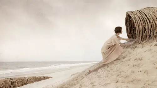
58:17 36Post-Processing Conceptual Shoots
25:00Lesson Info
Post-Processing Conceptual Shoots
I finished kind of almost finished as much as I could four of them so you could kind of see, especially since we just came from the shoot what they ended up looking like and so on this one I emerged three images together one that was over exposed with shadow areas here one that was under exposed the curtain here and one that was spot on for him. So I'll show you how I did that in a minute but you can see you know, we've got texture even in these shoes and in a print that's gonna be so pretty and I want I want that information absolutely everywhere texture in the leather of that binder even dodged the cord there I dodged this so you can read it if you wanted teo I had a little more saturation to the yellows and greens. I dodged all of these things, so they come up a little bit more in the print. Um added a little bit of dodging and burning toe add highlight and shadow ranges in here uh and also the same to the blanket. And then I burned this now on, basically by adding exposure that was...
under so we have texture, beautiful information in that curtain that will print beautifully so that's a pretty good, pretty good representation of what something might look like when I run it through for a first print and I would look at the print then and then make some more decisions on what else might need to be done to it here's mom and daughter from yesterday well look at the whole thing first but I extended the curtain and I'll show you how in just a moment uh burned this in so there's texture in there I mean you can see the linen in it that's good delicious stuff dodge some of the highlights in here so you can really see the texture of the clay also on the sheets that you can see the ashes on the bed I burned in the footprints so you could get more impact from that dodge this area so in the print you'll have detail even under the bed and this area to sew on all you have something like that all I'm doing is cropping really filling in a few gaps, dodging and burning they don't need much here's one of anesthesia from yesterday I did pretty much the same thing I didn't emerge any exposure because I didn't need it, but I dodged and burned a little bit let some of the highlights you know, live a little bit more and on this one, I add a when I call my recipes for the black and white, which I'm going to demonstrate in just a couple minutes and lastly this guy so this one I emerge three exposures together again so one for them one for the bits under the couch and under the bed over here that was over exposed so I get detail in there and then one that was under exposed to get information back in this window and things like that I dodge these little spots on the wall because how awesome are those right the bed in the back this so we get more information out of it all into the county and you can even see detail in the wood floor back there from that other exposure in a print that's going to be any good her face great um now dodge this area too and added detail back here I also straightened up some of the lines so that all the verticals and horizontal were perfect and I'll show you that too. Okay let's pull one of them up so if I go into light room let's do we're going to start the anesthesia? Um I think let's do this one because why not this one? These really don't need much at all. All I did to the first one was crop it so twenty by twenty maybe so it's square and I rotated so that vertical line is perfect uh horizontal teo I kind of like the edge of the fabric in there so I'm gonna let it do its thing crop crop okay, I would then take my healing brush or patch tool and get rid of the scenes increases, which would just won't take the time to do it all but it would take a minute, but and of course normally I would just the background wouldn't have the creases in it, so I wouldn't we haven't to deal with that. The next step is I would turn into a black and white with just an adjustment layer and photoshopped where's all my stuff here we go black and white where are you? There you are on I'll play with reds because she's on a light background I can pull this down a little, you know, give her a little bit more darkness to the skin tone and now watching the trunk I'm pointing at my screen like that's going to help everybody see it but I get more texture in here if I pull that up a little bit so easy peasy uh that's about it for her and then I would where's my huh? Sorry, I've got a little less square footage here on my screen than I usually do, so I make what I call these recipes and what it is is a psd file that has several layers in it and I save it in layers the top layer is usually the toning layer, so if you look at it this is just a layer that I've added that has this color that then I blend in color blending mode and that on top will make the entire thing toned whatever color that thing is and this is my magic yeah, I put this on everything I made black and white and it makes this gorgeous warm tone s o that's on top and then I've got just a little bit of texture in there. Um this is from a wet plate tin type that I made that was just a blank tintype didn't have an image it was just the plate and this is another one of those just a different one so I blend those two together very subtle. You can hardly see that there isn't a texture but it does add some interest so I take that whole kit and caboodle where'd she go missed asia? Where are you that I minimize you? Where'd she go help up there? You okay? So I take this whole kitten caboodle all use my move to a ll hold down the shift key and drop it on her punk that's it I'd put that on every women's portrait I've ever done pretty much and there I have a bunch I have in fact I sell them if if you want any of them on my web sites called my secret recipes so you could buy him but there's no, no twenty or something on there and they all do different things see pia tones and sometimes I'll do a same type look or something but it's the same idea so easy so you can kind of imagine that um, you know, without the creases and stuff like that and really that's all I would do to it, I might might take a brush in screen blend mode at ten percent in white coming here and soft, soft brush on her yeah, make a duplicate layer probably, but we don't have time for that and just dodge some of these areas maybe get in really, really with a tiny brush and dodge some of those little creases in the fabric that's about it though it's pretty much straight forward. I think it looks beautiful the way it is so that's black and white. And then I would print that on the honda meal bamboo paper which is also a warm tone and would come up all set with her. We don't love you anymore. Okay, next let's, uh let's look at mom and daughter for a moment. I think it was let's do this one because it's a different image so I've got two exposures here open. The first thing I would do is stand which the exposure's together because if I cropped them then they won't match up anymore so I've got to do this part first so that's that's my base exposure here's the over exposed one esso I take my base exposure and put that on the bottom here's my other guy I'm pull from the layers palate hold down shift so I drop it in the center of the new one and just drop it on and I can get rid of that one so when ill then do is is hold down my option key come down here to the mask tool and at a black mask so that allows me to paint back in any detail that I need. So here I'm painting with white on a black mask in normal mode let's just kind of amp it up so you can see it happened quickly, but now I can paint back in any detail and I love that little bit of blue. I mean, that killer most awesome thing ever all right, and then and this is very messy for now, but I want you just kind of see what what's up. Um I would also come in here, use that same layer smaller brush and this I would spend a lot of time with groups. Are you okay on dh very carefully, dodge these creases so they get this beautiful highlight to shadow range and print like magically I would do this on clothing, I do it on skin looking especially areas like this where there's a little bit of loss of detail back in there. I want that to show it's another little trick. I'll show you on color in a minute don't let me forget because it's a good one increases things like that, so I'm just adding a little bit more, almost what looks like a like I'm adding light that's really messy, but you guys get the idea so I would do that to the whole thing. Um, let's say, I've got all my highlights and shadows perfect um then I would merge these two layers or flatten them before I make the crop, and I might if it was really a lot of work, save a version that I had done that two in layers in case I wanted to go back hoops so here we go, we're going to crop this mother baby somewhere in there, I think square was asking to be square don't think, um, this makes me itch, so I'm going to duplicate the layer, grab my marquee tool come over here, grab my curtain area comand see command v command tea, so I copied pasted and then I'm free transforming this is a stretch, but just kind of showing the method probably be better if I mark it a little further over, so, um, I can get rid of some of that window area, in fact, and now I think I could get away with doing that and it's just it's good there and now, right? Ok, so I can mask that out, just adding a mask to the later layer that I just expanded normal mode one hundred percent and I get my bed back under here and I would be a little more careful with that edge, but all I wanted was to expand the curtain. So also I which I realize that we'll have in light room, but I would have another exposure of this that had that was underexposed for this little bit. So then I would have another layer that I drop on top. I have a black mask on that, just like I did with the highlight area and burn that in basic, so I get detailed in the curtain up there, so right now that's it's just strong way to much attention. I don't mind it being light, but not that. Okay? Um, I just I don't have that other layer, but I'm going to show you something that happens when you burn in, so I'm gonna grab my brush and multiply mode and I don't know something like that ah, and I'm going to sample this color for the curtain so let's say I'm trying to burn this in and I don't have the other file which I don't right now um I'm going to sample the color that the curtain is again I've got a regular brush and multiply mode at thirteen percent and I can paint that back in soft brush okay, but you might notice and this is gonna happen if you use the other underexposed file too there's a color shift right? Because color shift when an exposure is is darker it looks greater than the curtain does already. So if I layer flattened for a moment um on myself people kit in case I make it really ugly um then I grabbed my brush again sample this color this kind of rich version this is a good spot right here the rich version of the color then have my brush blended to color mode I can then that maybe thirteen percent warm that up a little bit and just kind of go over until I get what I need. It works pretty well now it just looks like, well, it looks like it belongs there. It just looks like a burn down version of the same curtain without it having a color shift so that works pretty well sometimes I'll play with things like that and let's say I wanted the bed skirt to be this color just pull that pick up that color again I do this a lot with clothing and bed sheets and stew a little more so you can really see it it's like painting in color I'd like to do that when I don't have the exact color harmony that I wanted I could make it blue I wanted teo so yeah it's kind of a fun trick and I use it a lot to get things to kind of come together I like the blue actually so that we go this one didn't need much I think you know I've been like a mention that burned in the footprints and stuff but that's about that ok we're moving on what's looking like room again find some another baby let's go to the full ones I think we'll do this one since we didn't talk about it okay um that's my underexposed one that's my over exposed one and there's my bass player so I grabbed these two just gonna again grab move tool come from the layers palate pulled down shift and dragon drop saying idea okay, now I've got my bass player with my lighter one and my darker one on top so I'll just option clicked on the mask here to get a black oops wrong layer to get a black mask on each of those extra layers so maybe let's work on the shadow area first now I know I'm going to crop this out, so I'm not gonna worry too much about it, but I want to paint on the black mask with white to reveal what's on that mask. Normal mode will try something around that range the soft brush and slowly it'll start coming in very fast. I'm paying on the layer. Somebody yell at me. What are you doing? Okay here. It's. Like what? Its not working what was happening, it's? Just not that strong. Is it there? Okay, I'm being messy, but you get the idea. No. You can see what's happening again as you get that grayness this again. It's not gonna be in the shot. You see that there, that it's kind of gray and I was really messing up there, but I will use I would use that color trick again. Get that warmer so it looked like it actually is part of the curtain it's not something that would then draw your attention. So there is actually texture in there, and I could pull it down even more if I wanted to. Maybe just by using curves on that layer or going back and finding an exposure that was even a little bit darker, so there I would do that with the highlight areas moved to my shadow areas you come down in here with a white brush on a black mask again, and then just start revealing a little more texture and detail in some of these areas that I know won't print very well, just as I know. Probably people mostly know this, but, um, if I come down here to this, have this cookie thing. Looks like a cookie x. Everything will take food to me. I can pull up thresholds, andi. I know. On my range of paper. Where is it? Is this it? Yes. I can print and see shadow detail, uh, to about fifteen or twenty ten. So if I go to ten, I know that those things are gonna have a hard time printing that I'm not going to see a lot of detail in there. And that's on a map paper. I could do the same thing from my highlights. Go up here about two. Forty something two forty four to forty five and know that those air started going to start to look brassy on my paper that I print on and that's, just something you have to experiment with butt or they're going to be blown out. That means that that's not gonna print, so in that case, I would actually need to go back and get an exposure that was even more under exposed to get texture in there because it's not going to print even if I can see it on the screen it's not going to print okay, so that helps me a lot to not waste prince when I know what's going to print and I'll just leave that on there so I can just turn it back on and look at it as I work, okay? So same thing with here I would dodge thiss even though it's not do that again it's not showing up, you know, not giving an enough detail a print but I want more texture out of places like that that are really going to print beautifully so I would dodge her a little carefully course um and then you know I'm a highlight one I'm probably come back in here and make sure it looks like I've got texture but just make sure it's perfect this guy I think I'd pull about a sixteen by twenty crop sixteen okay, I'm particular about cropping sometimes I look at something for twenty minutes before I can crop it can't learn new things okay, here we go. I like this little corner back here for sure that needs to be in there um the last thing I might do in an image uh is this one's not bad, but I like to pull gods down you see how the ceiling slopes down because it's of the distortion of the lens not sol pole vertical ones too and this is really cheating but I do it duplicate my layer and command tea and when you command tea for transform, you get this magic little windowpane thing up here which I love and they used all the time so I click on that and then I can see it's hard to see the ceiling line but it can grab this guy and pull that up so it's now square perfectly square and that it looks pretty vertical if I look at it that way but pair that looks pretty good so then I would cross that little sliver off but now it's perfectly square and it doesn't look like there's any distortion from the lens this one's a little bit to warm some of the lastly I think I would probably come in with color balance I like the color balance adjustment layer add some blue and touch of sayin that looks a lot more neutral yeah so that's about it mostly what I'm doing is controlling highlight and shadow arranged where they're beautiful and perfect and have detail in texture everywhere for a print because I also care about the print I mean that's what I'm selling to people and that's what people have done experience the most that's the most important thing yes they're going to see it online but if they're going to buy and purchase something our connect with something it's going to be a fiscal print um and then just little little details like street maybe straightening up lines and stuff like that, maybe we're removing anything. I find this distracting, but I try as you could see, the painstaking process of going through this to make sure nothing is distracting while I'm in camera, so I'm not doing it a lot of digitally adjust to it as much as I can in person. So that's pretty much my process. It's retouch, you know, add detail print look at the print I take a mark around my prints circle areas that I want to seymour of and go back and print again retouch prince again. I'll probably make four or five prints before I'm happy with the last version. No, I'm gonna come up thank you so much, jennifer it's been a phenomenal this is ah, the conclusion of our eight segment yes, of conceptual portraiture. I just feel like you've given so much of your experience and your expertise has been really amazing to get teo toe learn right along side everybody at home, so I hope that you enjoyed it, what would be one as we're as we're closing this out? What would be one main concept that you would want to leave somebody with I think if you don't learn anything else, or take anything else from away from the class it's to trust your instincts and trust your process, I actually was reading a little post on facebook if you're watching out there that somebody felt discouraged from watching the first section of this, because my process is so different than hers and that's, the last thing I want, what I want you to get is that you should trust your process and believe that, whatever it is that you do, you do. You, you know you're different than me, that's. What makes us so special, you know, that's, what makes people engaged in your work, and if you make photographs in two days there one day, so be that there's, nothing wrong with it, it's, all just a different things, so trust your process, dig into it and and make work that's important to you.
Class Materials
Bonus Materials with RSVP
Bonus Materials with Purchase
Ratings and Reviews
a Creativelive Student
"Thinking about art is not making art." In this inspiring and informative workshop, Jennifer helps you put thought into action - through meaningful self-reflection, exploration and by taking her through her own processes. Through exercises and examples, she explains how to pull out a thread of an idea and develop it into a conceptual project that is informed and invigorated by personal experience, preference, interests, and so much more. Her workshop not only feeds the creative soul, but offers earnest information on taking first steps toward publishing and showing fine-art. Jen so beautifully shares her talent and her love of teaching - I first "met" her on Creative Live and have had the joy of being mentored by her in-person as well. This workshop is a very close second to spending time with her one-on-one. Thank you, CL, for bringing her back!
kalei harmon
I love Jennifer, she's one of my cL favorites! She is such a soulful photographer and her art just resonates with me in so many ways. While she was creating her conceptual piece with the mother and child, my eyes welled up because it was such a profound experience to witness. I appreciate that she has a graduate degree in art and is able to refer to others in the field who are leading the way. She is so genuine and I'm grateful for her willingness to bare her soul to us through her art and process. I've learned so much by watching how she interacts with models and communicates efficiently and gently to get AMAZING poses. Definitely worth the buy if you're looking for inspiration from an artist who creates images which evoke emotion and communicate a message, not just trying to make "great photos." I can't wait to learn about the business side of it all!
Majda
I am so grateful for this class; it is just what I have been looking for to help me go beyond my "photographic potty training". By leading us through her own creative process, Jennifer Thoreson invites us to think about why we do what we do and to make our work more meaningful and authentic, creating our unique visual vocabulary. Moreover, she provides detailed info on submitting work to galleries and publications, contests, printing editions, preparing an exhibition and pricing. In her calm, unpretentious manner, Jennifer demystified art without trivializing it and I finally saw light at the end of a rather long tunnel.
Student Work
Related Classes
Portrait Photography