Lessons
Lesson Info
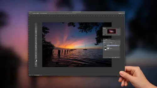
The Basics - Toning Your Photos
we're here today. If you haven't heard Teoh to talk about, you know, kind of landscape photography editing the way that I work this, for the most part, is I kind of just give you my workflow. So most of the photos you'll see the raw photo untouched. I have nothing to hide. I have. You know, I don't care if you know that I did. You know that I get I get that question a lot sometimes. And you guys probably know if you ever post a photo online and and somebody sees says, Oh, that's pretty Did you photo shop it? You know, it's like Of course, I did my answers. Of course I did. That's, you know, that's that's kind of par for the course, and especially as I think what you'll find is is for landscape stuff, it's almost needed. It's It's a necessary step to kind of get the vision of what we saw out there. So with no further ado, let's let's go ahead and get started. We kind of walked through that kind of give you a quick, quick run of what I'll go through here. I usually start in light room, t...
he One thing to know is is that every photo that I opened in light room in the develop module in light room would be exactly the same as if I opened up that raw photo photo shop. Because camera raw opens up and the controls and camera raw are exactly the same work exactly the same look exactly the same as they are in light room. The only difference is, is late room has a dark grey interface. Camera has a light gray, but they are the same controls underneath the hood. So just anybody based on your work, flow out there. Whatever you're using, the controls are exactly the same. So but we'll go over, you know, the basic stuff here. The basic toning, toning, contrast highlight shadows, color adjustments cropping on. And then, most importantly, I think it's also about like what to do, where what did you wear and what to do? Went so hopefully I can help you out with that stuff. All right, we're going toe will start out pretty simple here and take a look at a photo. This one was taken in Ah, actually taken in Washington. So this is the pollutes region in Washington state and what's probably 56 hours from here for hours. So it's It's kind of close to Seattle very, very far if you don't live in Washington State at all. But it's one of those places. It it really, you know, it's all about contours, shadows and highlights and contours. So this is one of those places where a lot of times you really be out there at sunrise or sunset. Sometimes you get away without, but this is one of those places where you'll want to, because you can see how it picks up all the different lighting shades here. So one of the problems that were first gonna have is, I think it's exposed well, but we we need more contrast. So if if you've never been to this area, it's on top of it, you're on top of a hill and you're looking out over these the's huge field, and you actually have a zoom lands on. And so because you're zoomed in so far, often this insists probably 400 400 millimeter lens. Could your zoomed off so far in the distance, you get all that atmosphere perspective. That kind of tends to dull things a little bit. So do we notice it will more stand in their know when we're standing there and we're experiencing it? We It looks great, but we gotta we have to account for that. So exposure wise, there's not too much I really would want to do to this photo because I think it gets pretty well exposed. But as I look at it here, it's really team or of a contrast thing. Where I go for contrast is going to be down here under the whites and the blacks. So what I'll do here is, if you opened up your hissed a gram, you can actually see right at the top. You see all those little gaps between the end of the hissed. A gram here. And by the way, this is the only Tommy's that history. I'm actually don't use it when I'm shooting. I don't care what it looks like, what I'm shooting. But when I get back are kinda uses as a base to edit from, so I try to be, as untech AEA's possible. But you could see that there's there's some gaps inside of there, so what we want to do is close those gaps. That's going to get us a good amount of contrast. For the photo, I could leave the hissed a gram open and I can adjust the whites and try to move. You know, Teoh, where there's closes the gap, the easy way to do with those. I just closed the history, Graham, and I'm gonna hold down the option key on Mac or the all key on the PC. I'm gonna move the whites slider over here to the right, And when I hold down, option or all, you'll start to see some little specks appear. So those little specks are, that means have a white point. So when I let go, you know, we could argue. Okay, I've got away point in the photo. This is where it becomes not quite a formula, and and your your taste at some point has to become involved because you need to look at the photo like, Okay, Is there something that's totally white in this photo is not really so what I would do here is hold down option are off again and kind of back off a little bit less, even though I know that if I looked at the history, Graham, they're still going to be a little gap that will do the same thing over on the blacks. So option are all click click on blacks and then just drag it over to the left. And then you start to see a couple little specks appear. That means we've got a black point in this photo. I think I'd want a pure black point. So if I hold on the hit the Baksaas key before after a pretty big change, so that's that's just too little sliders. We haven't really done anything else. Those were the two main sliders that all used to get the overall contrast to the photo. The other thing that that helps with is, you know, imagine this. So my screen right now is got lights shining down on it. Okay, um, your screen could be in a dark room. Your screen could be narrow window. Your screen could be, you know, have another light shining down on it. So all of our screens air in these different places. If I just eyeball it, what happens is is I'm gonna develop my photo differently than you're going to see it, then you're gonna see, Then you're going to see it, To be honest with you, there's no way to prevent that from happening because of where nobody is always gonna have their computer screen in the same computer screen calibrated the same way all in the same place. So it's always gonna happen. But what I can do by doing this is at least I create a baseline for myself. I know I can't control what it looks like on your screens, but at least now I've got a baseline for my photos so that when you see my overall my breath of work, at least there's a consistency there. OK, because I've edited everything fairly the same. So that's what this is. This does for me is kind of gives me that baseline, and hopefully other people are as close as possible. And we know that we generally don't want bright lights shining down on our computer screen and all that. Okay, next up we got highlights and shadows. That's another big landscaped paradise is in like room and photo shop. It's highlights and shadows, and those two are pretty simple highlights. You'll see pulls back on some of the bright spots. All right, Shadows opens up some of the shadowy areas. I don't really have any shadowy areas in this photo, so I'm not really gonna worry too much about shadows Highlights. We can kind of play with a little bit, all right, Because if you look at it, there are some brighter spots up here, some brighter spots down there so I can pull back just a little bit on those highlights just to kind of even everything out next up. If you like a top here, we got temperature temperature, tents overall, white balance. I usually shoot on like the cloudy or shady options from my landscape photos. Generally don't change it by shooting raw, so I can change it basically for free by going to any one of those settings. I'm not degrading the photo, but I generally don't change, so it's gonna be cloudy, shady. I like a warmer style photo personally, if you want to, you can come over here and you can kind of enhance it a little bit by Dragon that over to the warmer side next that we got clarity. So clarity is really good at adding details. All right. And as we look at this photo here, all zoom in. And if I start to crank up the clarity, you'll see it just kind of add a little bit of edge. Two things. The best way to think of what clarity does is we have that hissed a gram. We talked about the white spot, the white point, and we talked about the black point, right? Everything in the middle is kind of gray, so whites and blacks doesn't get to it. Contrast doesn't get to it, but clarity does. Clarity goes into those middle areas not so much a factor in this photo, but think of photos with with clouds and rocks. A lot of those types of areas you'll see clarity, will really pull out. Looks almost like a sharpening slider. Pulls out a lot of detail inside those areas so I can crank it up a little bit in this photo. But it's not going to do a whole lot to it. All right. Vibrance and saturation vibrance. I usually leave alone unless it has people in it could tends to protect skin. So if I needed to what I really think I need two guys, But if I needed to boost the saturation in this photo, I could I could increase my saturation. One of the reasons I don't have to is because that black slider did it right. That black slider has the effect of saturating the photo, so I don't really like Feist. If I saturate this anymore, it's gonna start. It's it's a little hard because you guys, we're seeing it with the light on the screen here, but I start to saturated anymore. Starts public, almost radioactive. Okay, so let's go down here. So that's going to be really the basis that's got what I call toning. Okay, the overall tone of the photo, but the backslash key that's before that's after school. Let's scroll down here. Next stop is going to be ever want to work on specific colors? You have your hue, saturation and luminant or lightness, and sometimes I'll come in here again. Saturation. I think we're good. Not really gonna mess with it too much. I'll play around with some of the yellows, the oranges a little bit, but it's not really not really affecting the photo. The greens, I concur, probably boost the greens. A little bit and I might do it because when I'm moved the saturation slider to me, the yellows got very radioactive, but I'm okay, boosting the green just a little bit. Here. I'll crank it way up and you can kind of see what it's doing to the photo. OK, so boost the saturation. If you go to a luminous, that's the brightness and darkness of those greens, and I kind of like toning it down a little bit to me. To me, the darker I make the greens, the Mawr accented, those highlighted undulations in the ground become on. I like those contours, so I kind of want to draw that out a little bit.
Class Materials
Bonus Materials with Purchase
Ratings and Reviews
Alex
One thing which does not quite work for me - final edits in last lesson look a bit oversaturated. But still good course for beginners.