Lessons
Day 1
1Why Function in Design is Important
28:16 2Examples of Strong Functional Spaces
32:56 3Web & Student Questions
20:25 4What do YOU Need for YOUR Home?
21:47 5Functional Space For Your Lifestyle
24:09 6Make Your Layout Work For You
23:41 7Assess Your Space
45:55How to Measure & Photograph Your Space
38:05 9Laying Out Your Space
32:06 10Space Planning: Kitchen
30:59 11Designing Your Home With Apps
14:14Day 2
12Industry Design Terms
50:45 13More Design Terms & Student Questions
35:11 14Biggest Layout Challenges: 1-5
45:30 15Biggest Layout Challenges: 6 - 10
18:44 16The Healthy House Approach
31:21 17Age Related Design
26:18 18Student Problem Space Submissions
24:34 19Multipurpose Spaces
30:36 20Getting Organized
08:57Day 3
21Useful Home: Working From Home
46:01 22Useful Home: Wired & Inspired
16:17 23Family Spaces, Small Spaces & Large Spaces
21:22 24Rethink Your Space
09:50 25Formal Dining Room Cross-Overs
21:04 26Viewer Room Challenges
15:00 27Framework for Creating a Budget
49:42 28Where to Splurge & Save
12:10 29DIY vs. Experts
31:25 30Pinterest Examples & Student Questions
22:50 31Maintenance Binder
16:49Lesson Info
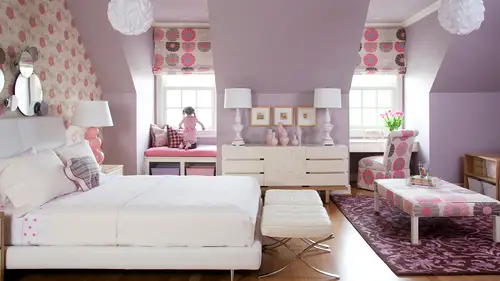
Biggest Layout Challenges: 1-5
We're getting into the nitty gritty now the challenges and solutions the reason that many of you came here the reason most people are watching and now we get to actually take cem some viewer problems and submissions in this section too but first we're gonna look at um the biggest layout challenges that most of you many of you are facing. So and what would you all say as far as your layout? I know we've talked about this sum you may have already mentioned it but just let's go let each of you reiterate what your biggest layout spaces are with regard to your your own home right now lisa mine is an open floor plan and it's a long rectangle and so my two challenges in that are how to delineate the tran the space allotted to the dining room and a living room and in a way that works with a built in counter and how to have it all look harmonious because I khun see everything from everywhere. Okay, great melissa uh my design challenge would probably be, uh balancing the functionality and the fl...
ow of the living room that I currently have with its corner fireplace that we just loving to talk about um and then making it comfortable and functional for my husband myself and my two dogs. Okay, good thanks. So my challenge is I live in a very large open loft space that's one really big room and likely says it's long and rectangular on dh theirs different things that need to happen in that space so living space a dining space work space space for the two kids I have a five and a three year old and my cats so how do we use the space in a different time for different activities and how do we make the space look more lived in because right now we've got everything against the walls and just a big swath of open floor where toys end up then get put away at the end of that bowling alley effect we were talking about yesterday or you could literally dance to cart will's anything you wanted to in that space right how big is your is your space so we're actually on three different levels so the total square footage is about fifteen hundred square height with two and a half bathrooms s o the area that I most concerned about is the main space with the living and dining space we have a similar space on the lower level that's one big space where we all sleep it's enclosed but it's the same thing when long rectangle okay okay how big is your space melissa not very big even if you're talking square feet like is it a ten by ten it's probably twelve by ten okay so he's not counting the really meant mantle that jets from the wall. Okay, how about you have because your spam mine from the point where the kitchen, the open kitchen ends and, um, is I'd say twenty by twelve and that's to accommodate the living room and the dining area. Okay, so so you have about ten by twelve for each of your space is pretty much if you were going divide them equally. Okay, good. Well, let's, look at some of the typical challenges some of these may apply to use some of these may not, of course, were your city dwellers, and we're talking about projects all over the the world, and so we're thinking about some of the most difficult ones that we encounter on a regular pipe basis from people in all different geographic areas of the country. One of the things that people deal with a lot is the idea of tall ceilings and most of the time when this is a problem, we're talking like two storey ceiling, so I don't know if you have any of that. Here you do. The area is open to the upper floors, so I have one really high, really tall walling soon you're like, what do you do with that he decorated there can get really awkward, right, because nothing's. Maybe when you're upstairs, there is an eye level, at least in your space, if there's a loft, sometimes in the places that we're dealing with there's not even like a breezeway or a stairwell or anything above to look over. So trying to decide what to do with those spaces? Eso not that I'm suggesting that you go back to the picture that we love to talk about online, that was my show house, but just embracing the idea, so maybe thinking visual interest, it could be a painting technique, but for sure, thinking of otherwise architectural detail ing or sometimes I love we've talked about this and other courses to use something like a wallpaper, even if it's, atonal and tone with a pattern. So if you can imagine the idea not necessarily even on the ceiling, but possibly on the wall that's so tall, because sally's giggling because we've had such feedback from this space that we love it's so provocative, but you know just the idea of not having to decorate with hanging things and up in that higher plains. Sometimes that looks awkward. Um, there's, a project that comes to mind of one of my clients, that when I first started working with them, they had this idea of a two story entry way, and they had hung portrait's their daughter's wedding portrait ce unlike a second level because I didn't know what to do with them they were just had these big pieces of art there are cool hang them there. It really felt awkward, though, because when you walked into the space you're like what's that way up there and you can't really see it it's not at eye level, it doesn't make a lot of sense, so I try to make things logical, practical, functional and beautiful all at the same time, and so adding interest visually with a painting technique or a wallpaper technique. Even if it's very subtle tone on tone, it can give you the option of often out of hanging things on the wall. Also, if you can imagine that you could even have large strives or some other sort of pattern, even if it was beige on beige or wide on white. Sometimes we do these kinds of stripes on the wall and we'll make them all the same color, but one is flat and one is a glossy so sometimes just something to give some visual interest there. So you're not feeling the need to decorate um can be a great a great source of a great resource or great idea to just sort of make it a little more exciting but not make it a focal point in the space I love the idea of adding architectural detail ng so there's two kinds of architectural detailing going on in this project of my friend denise mcgee hey she's, a designer in dallas, and we see architectural detail ng on the ceiling with the beams that are just painted out the same color as the ceiling, but she's also applied a reclaimed wood to an entire wall that goes taller. So this maybe this isn't quite a two storey ceiling, but the idea it's still there that you could do something interesting again, not as much decorative with like, furnishings here, but these air spaces where you can really adds some kind of material. So maybe this doesn't work in a rental, but we did talk earlier with michaels scenario and reminded ourselves from the last course that even with the idea of the the last idea of the tone on tone or some kind of pattern, there are removable wallpapers now, so if you're in a rental there's some really cool wallpapers one's from a company called temp paper and they they will print the scale to be any skill you want the color palette to be any color that palette that you want. The great thing about having a custom scale of a wallpaper is if you don't want the pattern cut off in a certain odd point, you can actually measure the height of the wall that you want to put it on or the ceiling space or wherever you're applying it and haven't scaled to perfectly fit a repeat of the pattern onto that wall um this case obviously it's going to be need to be a place that you actually own or khun modify if you're going to do something like hq put reclaimed wood on the wall but it's, just so much more interesting and warm sometimes toe add an actual architectural element as opposed to just hanging decorative things even panel molding like we've talked about there's lots of things you can do teo enhance the space are you able to? He said, you can't move walls, but can you can you add moldings or interior decoration? Yes, so I can mean I own this space I just I have restrictions as faras what can be built and I can't alter any of the walls or windows so something like this is interesting for me to think about with our tall ceilings, maybe even just thinking about using color or some way tio use the height with eso even paint an accent color on a really tall wall could be fun like just one wall that has a pop of some kind of color and then maybe you transition that color into the pillows or rug or some other element in the seating area and it has what I would love to call a point of reference to that wall I think that would be great and the thing that's great about that is if you imagine painting the entire wall you could still hang something on it decorative but then you feel more inclined to hang that down at eye level that where it's on the same plane as the furniture and not feeling the need to decorate really tall you could just have the paint me the decoration for that sort of upper plane of the wall and it's it's enough to make it look interesting let's question because melissa if you have me following us she's our production designer here a creative live and you actually we're in charge of redecorating form of a better word our studio b knows d where you do do use a lot of reclaimed wood and of course the set in here is well uses reclaim what is this something personal aesthetic to you is that something you just thought would work well for the studio space yeah I'm a big texture person and I think that would especially reclaim what has such character but it's also a neutral and it's really versatile so if anyone's watch the shows that are filmed in d I have a twelve foot by twelve foot uh starburst I like to call it comes out of the corner of the wall and it's a really nice backdrop that you can play up and make it really bright notice it or you could you know, light it so it's a little more subdued and have the action be in the foreground so I mean I definitely love the idea of putting some sort of texture I can not I see the cork light shades and I picture too and it's I love it because I just love natural kind of stuff with character I mean even though that's quite I don't mean this derogatory but slightly cluttered space I really liked that space on the you know, the thing about this space is some kind of the secret about this is this is a show house that was done at the texas state fair so it's actually a faux project and it's not unlike a set design in a sense that it's a tent that they then came in and put parapet walls and like foes structures in but it looks like a real permanent space doesn't so she did a really beautiful job of making this really fill like a residential space when it's actually more along the idea although she's a residential designer it's a temporary project so really interesting but I love it too beautiful so you know so you can add the architectural detail into the wall or the paint like we're talking about are the wallpaper are you can't really think about making the ceiling be more of the focal point so even moving towards that idea of the reclaimed beams on the ceiling which I love in this space also the same designer so she has that kind of a little bit of a rustic mixed with clean aesthetic so clean lines but some rustic detail ing which is great for that market she's in texas but I think it could be really beautiful too so you decide which one you want to enhance and highlight but probably not but so you may not want to do stained beams on the ceiling and a bright color paint on the wall uh I think it would be more of a scenario one or the other is going to really pull your eye up to that tall ceiling space but deciding which one really has makes more sense for you budget wise which one is more beautiful if the ceiling's not that greater it's more of like um a loft like an um would you call that more of a open works ceiling where you see all the mechanical pieces and details you might not want to draw attention to that a lot of times people paint those out black where they just disappear and maybe the walls the peace that you highlight or if there is some beautiful architectural interest or windows or something really told that you wanted may want to drive through your eye all the way up that might be where you decide to enhance the ceiling and really make it all noticeable all the way up to the second story on the ceiling something like this another option hears that idea of adding wallpaper in a large scale all the way to the ceiling there's some things done here with the molding that sort of cheats the eye too so as opposed to having just huge moldings you can come down if you have fled or two and put another just piece of simple half round molding and paint it all out so it looks like it's really tall crown molding if that's of interest to make the architectural detail ing look taller the the way these photos were hung in a grid I think could really be a neat installation on a tall wall are even thinking about michael's mask this morning he didn't want to put them all in an installation, but I think that could be really cool in an installation. So if you had something like that where you do have fifteen mask from all over the world and do a really tall but simple gritted format of something like that, what I would call like hang it like an art installation on that wall, I think it could be a really cool way to enhance the tall space, even something that you just by a lot of that air repetitive I've seen people buy things like, um other architectural salvage pieces or big spools or bolts, or all kinds of unique found objects. And if you had a number of them and hung them in a grid kind of pattern that looked real clean and simple, it would be really fun to have the texture or patina of that item and let them carrier I agood way up the wall, it really makes the wall sort of come into scale with everything else below when you have something that transitions from the lower plane to the upper plane hanging on the wall in that way, does that make sense? So you found us a little bit of a solution already, maybe with the paint and maybe any of those other ideas interest you? Um, yeah, I really, uh, like the idea of trying to bring down the scale a little bit of the ceiling. So something around fooling the I don't know my personal style isn't so much crown molding, but I'm thinking about, like, striping or just something that visually kind of sets. What the the concept of planes is a really good ones. So what's the plane of the room and then what's dividing off visually that that plane, and you can also if you don't love the idea of crown molding something else that I've done is I've put a piece of molding, and I think we even saw this and maybe one of scott meachum woods projects yesterday I noticed that he did this, that you bring a piece of molding a little ways down the wall and you paint the upper portion of the wall, the same color is the ceiling, so it's sort of disappears and it really just lowers it a bit so you wouldn't want to go to four, but maybe as depending on how tall your ceiling is, upto eighteen inches or so, you could come down and paint and almost gives, like a cove effect to or a dome effect, and you could bring that color from the ceiling down onto the wall's a bit, whether it was a dark color or something that really kind of brought the ceiling down to you a little bit. You can kind of full the either. Okay, so so here's, another scenario that a lot of you deal with on dh. So many of the people we work with deal with, and that is too many openings in the room, so we just had that scenario a little bit ago where I was drawing in. There's a window on one entire wall there's all open plan which a lot of you were dealing with and there's no place to anchor any furniture right there's no place to put a tv there's no place to anchor the sofa really you don't have a starting point for your furniture plan everything has to float so you have to create these imaginary boundaries for yourself so how can we start to do that well talked about some of these already but let's look at some of them in action so using this is an example of creating abound carpet into a rug and this was my last my last family room but we were dealing with openings on almost every single wall we had a fireplace with two french doors and opening into the kitchen and a bookshelf and opening into the front entry hall and open double opening into the front formal living room and really only one wall at the opposite end of the space tow to place the furniture so how do you start to create boundaries for yourself and one of the easiest ways is just to use something like a rug and to use pieces of furniture so I was showing you a couple of options earlier when I was drawing a desk or a table behind a sofa with something tall on it like lamps that starts to give that I sort of a barrier almost like a screen would s so it gives you some place to stop it tells the mind o that's the end of this seating grouping or this that's the delineation of this space so thinking about how you can use furniture in that way and how you can also use drugs and I think one of the things people get tripped up with as they I think that the only option is to use those store bought pieces that we know are out there so the standard size carpets and standard you know, pieces of furniture that again we might be dealing with plug issues or other things so you have to start really thinking out of the box of how to create things yourself make things work there's a cord running off the back of that table that's a clear lancs cord so you can't really see the cord and it just plugs in and I made the little slit in the rug like we talked about it lives under the table you can't really see it and it allows you to plug that land in and let that become a barrier for the end of the room um we said this yesterday but don't forget sometimes you do have to put furniture in front of windows or in front of now I say rarely used doors here but allowing to clarify that because I don't mean to put it all the way in front of the door it looks really awkward it's the mind read something and it doesn't make sense that I don't like to use furniture in that way. So if I look at something and go, oh that's, weird! They blocked the entire door with this piece of furniture and it's right up next to it, hoping I won't notice it's a door that's not the best case scenario, but you can fudge and put it close to a space if if you're not going to be opening that door a lot, or if it's even a sliding glass door, which helps you don't need a cz much room, maybe two feet of space is enoughto make it feel like you could actually get around something and open it so you don't have to have three or four or five feet of space in front of a rarely used door that you're probably not going to be going in and out of very much now if you're really going to use it. It's going to be uncomfortable and awkward to constantly try to shimmy behind a piece of furniture if you can help it. So I like to think logically about things and they need to look like they make sense. This is where sometimes even the scenario of have clients to go. We're just gonna put doors in instead of windows because we like the way that the doors work, but we're just not going to put hardware on them, so they look like windows. You can still tell their doors because of the way that the threshold is on a door versus a window seal that's the kind of thing that I mean doesn't really make sense logically, so when you're placing fringer, think about those things. If it looks weird that you're blocking it, try to give it a little bit of space, so it makes sense. But it's certainly ok in a room like this, where these air, all stationary windows in the sunroom toe have some of the pieces floating in front of the window because you really don't have a choice on dh. These don't even have space tow. What you can't walk behind that sofa between the window, but there is a lot of room in the sunroom is the large room crying? You can see the entire window. We put pieces of furniture along with the sofa that air leggy and open so the light can come through it and around it, so it's not completely blocked. If that makes sense if it was going to be completely blocked I would probably go for another option probably does that make sense to you now one thing you can do if you just have a double window or a triple window that's exactly the length of the sofa that's where I love to use panel dry pary to come down on either side of it and it creates a really nice backdrop in the sofa can then float in front of it nicely and it all looks really balanced and framed out so you just have to play you some little tricks to make things make sense when you have to put furniture in front of the window is that any questions that come up about that or either of you and any of you actually all three of you are any of you having to put furniture in front of a window because of the layouts that you have like really close to a window well what I'm what's coming to mind is my whole back wall of my living room is sliding glass door thie entire except for about foot and a half to the right of it um and so the far left where I would just it's got vertical blinds as well so if I had the blinds all the way open there's still like a a foot or two of dead space is it okay to block some of that window um with a piece of corner furniture or um and I'm thinking it is because I don't need that much window yeah, and maybe so now that's where you'll have to look at and say, does it make sense? So that's a great example of a possible scenario where you may decide it looks too heavy to put like a corner chess that covers the whole thing but maybe a chair or something that's seems like it could be moved if it needed to be makes more sense not covering it up is that so sort of playing along with the window and letting the window be the backdrop to something versus trying to cover it up and hope people don't notice it's there? I think that's kind of the rule of thumb for may, so if it looks like oh there's a window back there in the chairs just in front of it and that makes sense to me my mind can read what all those things are that's good if it looks awkward and you're like, oh wait, what is that? They have a weird piece of furniture blocking half the window that's where you gook this is gets a little hokey, enforced and contrived and so maybe there's a different solution also it depends on the window sill height too if the height if the seal height is taller, it's even easier tohave furniture that's down on that what we call that lower plane that's more related to the floor sitting in front of it because the window starts maybe just a few inches below the back of the sofa or the chair that can help sometimes any of the rest of you needing to put furniture in front of your windows and this having a trump trouble with a love scene in front of my window now but I just realized I have uh curtains kind of framing it just like you said although they're white I wish their bright even even that why though it's there's something about that sort of makes all of that so it's kind of like I was just saying about the tall wall when you start art work down at the bottom and transparent and that's kind of connected to the vineyard below say it's over a sofa over a bit it's really it relates to that lower playing a furniture and then it continues on it that's sort of what happens when you're putting those dry parise as a backdrop so it's sort of the thing that connects the sofa to this upper plain and transitions that really nicely so if you just put this out there would feel like it was blocking in the window but because you have it all framed out beautifully and they all work together it's sort of softens that transition so that's a good a good trick? Are you dealing with any problems with this? Leslie? Oh, I've got all kinds, all you have to have all sorts of. Okay, well, we consent, we can tackle some of those specifically, if you want to later. So some of us have columns in the middle of the of space. We looked at one yesterday, which we're going to look at again right now, but even that scenario that we sketched out a moment ago, a lot of times when I see those open kitchens and living rooms and large homes, were like, where I'm from that air more spacious, with the soaring ceilings in the corner fireplaces. A lot of times, they also have columns floating because there's something that has to bear the weight of the wall, and a lot of times the kitchen ceiling drops down. So there's a load bearing peace happening right there with these columns in any transition into the kitchen and into these great rooms, and we have to deal with those and what do you do with him? So, um, this is the one we looked at yesterday, and so sometimes you can get rid of him. So you need to find out, because sometimes, like j k was saying, people put things in that either cover things, for they're just decorative, so you first first question is is this pertinent to the structure of the space? I'm gonna compromise the structure if I remove it and sometimes you can still remove them if you put in ceiling beams that khun bear the weight depends on how wide the spaces but that's going to be an architect question are a builder question, so sometimes they can come out, but in this case we couldn't take this one out so as opposed to just having that really skinny pole that we looked at yesterday, I took it as an opportunity to work with it, to sort of lean into the idea of having the column here and use it as a way to break up the space. So I used it as the place to define the sleeping area versus the living area. I put the ceiling track in for the drapery that pulled right up to that column, and I also put lighting on the column, so then it it made sense it wasn't just this pole in the middle of the space, it had a purpose, right? So that kind of idea of purpose driven designer decorating and it really helped made because I needed zones in this kind of lofty spaces. Well, I needed the sleeping zone versus the livings, and this might even be something that would work for you and your downstairs the way you were saying you had different sleeping spaces in this one long room I love the ceiling track for the carton bribery and mean the curtain rod for the drive for your curtains and I love that option of creating a space by putting this just really simple painted why ceiling track could use something like that in your space I think so. Um so the challenge in that space is that the back wall is all windows like one very large like kind of triple size window and narrow windows and then we've got kind of short walls on the sides um so the uh the the challenge is to try to make if we separate spaces within the sleeping area for different members of the family making sure everyone's got access to the light from the window. Yes, and another thing that's just reminded me if you can imagine it's not the case in this room but pretend like behind that back wall it's all windows so you can imagine that that could actually be windows at the curtain pulled over right? So if you have a large spans of windows there are doors like you both have it's not inexpensive to use dry paree on all of them. But if you pick in an expensive fabric like this where I use just a plain cotton duck fabric with a contrast ing band you can also create places for your furniture tow land even if there's not sections of wall that you would actually stack drapery you can still stacked portions of your panels along the where some of the door zara's long as they open in sections, and so it would fool the the mind to thinking that there was wall behind that if that makes sense, and that can give you not such a large spans of window, but you can create some sections that open and some sections for the drape drapery stacks and says, sometimes that's a nice way if you're not losing, if there's plenty of you and you're not compromising the experience of looking outside, it could start almost creating a foe wall for you there you could also use the same idea of the track to create just a drapery wall to divide other spaces just in the middle of a room as well. So it's kind of fun to think about what you could do with pieces of hardware like this that allow youto hang dr avery and and I've seen beautiful uses of this, even when it's a sheer dry free so you can still see through it it's not so heavy, but it really start kind of makes it more of a physical barrier between spaces. So something fun to think about getting some questions in about drapes and about particularly high ceilings? I don't know if this is the right time to mention it, but it seems to tie in with what we're looking at right now, and jennifer is asking, she says she she loves full length dreads trays, but she's got baseboard heaters that can't be covered, and she she can't take them out, apparently on dh there not centered, she doesn't like the heart. Dusty nous and hardness have just blind so she's wondering, you know what word you would suggest? Also, she doesn't like the trip's coming down because of safety as well. Yeah, similarly, with so fisher's also saying if she put two cipher against those haters once the safety, then that's an interesting usually if I want fabric, but I can't dio along drapery I do like in this scenario, I do like a fabric shade like that over this kid, this kitchen window is that what you call the shade? And so you can even create a bigger top to it, like a valance or cornice that has more weight and then put the fabric shade underneath and one of the things that I do to give it more. Substance if she had several windows running across you could put the valance or the cornice across all the windows like one cohesive unit and then have individual shades that touched each other so they weren't just inside the windows but they covered over the window molding and a little bit onto the wall does that make sense to you so you had this whole beautiful wall of fabric shades and you could get a lot of color or pattern or texture whatever you were going for their without the drapery hanging so it's sort of the best case scenario best alternate of getting a lot of fabric onto the wall without having to deal with the drapes hanging into the heaters or any of those other spaces and I can kind of sketch that out for you later I think tomorrow we may get teo a second set of some of our problems and one of our one of our submissions was a couple of tricky windows and we'll talk about how to deal with them because a lot of people I have trouble with that especially we were saying and I think it might be in this section possibly two odd shaped windows and had a hang the drapery around that I'm following up on the ceiling question jennifer again is saying she's got a popcorn or textures said now would you tell me automatically remove that and what is the best way cost of doing that happy is also saying she's gone eight foot ceiling with texture on it and she really doesn't like it either those were tricky, so most of the time, if the budget allows its kind of again the lipstick on a pig thing if you try to decorate it best case scenario if you can't remove it is to paint everything in the room just a simple color like even the white we saw in the last image so that it just kind of goes away. It becomes this envelope and you're not drawing attention to it, but second best scenario is to actually remove it and it's a message off it's not that difficult to do it's somewhat labor intensive so she could get a price on it, but they just come in and they'll tape everything in the room down, cover it all with plastic and literally scrape the ceilings and then just put a new finish on it. Do you not shape? I mean sometimes people to shave over it? It depends on the scenario if you have a lot of molding and it's gonna mess up the molding to put another layer of sheet rock because you're going to run into the molding that it's cheaper just to have it removed on dh not mess with all the molding or you can take all the molding down and put up another sheet uh, you know, layer of sheet rock so it depends on what you're dealing with. If there's no molding in the spice yes, it's great to just go ahead with another three quarter inch sheet rock on top of that, our quarter I mean, even thinner. You confuse the thinnest sheet rock layer to go because it's not for the actual ceiling structure it's just to cover it up. So it depends there's so many little criteria that each person is going to have to deal with whether you have molding or are no molding, but I've had them actually just resurface many, many times and they just removed that it's like it's like sanding it down essentially, um on and we can get back to some more questions in a moment. Two if we have someone on this idea of columns and what to do with him in this kitchen, this is the one where I'm bumped the wall out eight feet so we had to have a structural column and a structural beam, so I just mirrored the column with the second one over here. So this is a phone call on the front and it's not weight bearing it's a roll call him, but it's a as faras weight goes it's not load bearing, but ijust mirrored it and built the island around it, so it made sense s o I just matched it to the existing one to balance it and then also adding visual interest so on the one before we saw just kept it really simple because that aesthetic was clean and hollywood and hip put the lighting fixture on it. This is a classic colonial nineteen seventies traditional home, so we used panel molding on the column itself and then replicated that sort of detail on the coffered ceiling. So that was visual interest that also had a point of reference back to the architectural style of the home. Um so this is what we were all working talking about earlier with the no anchor wall, so not necessarily all windows in this space are all opening some of it other things happening fireplaces and bookcases and other things but no place to really anchor the furniture. So this is the scenario a lot of you were dealing with, where you're having to start placing furniture as the barrier and you could do that a number of ways. One of the most porton things to think about is the traffic flow because when you start creating these spaces, how did people get in and out and around, um your seating groupings and so what we do usually as we map out the traffic flow first this comes back here comes from the back door garage of this house straight to the kitchen so we left that really open and then it's easy to get into this sitting space from this side you can actually move through around the chair over there on there's a breakfast room across from it so we made sure that people didn't have to feel like they were walking all the way around something to get into the to the space we left a few places that you could traverse around the furniture but just started creating with the rug with other elements in the space I'm creating the seating area here's another one where we have a really large room sized rug so this is a large space it's just one room but you could imagine that this might be a scenario you're dealing with with those long loft spaces really rectangular so again, this is where I used a customs size drug that I wanted to bring these to seating areas together and situate them around the fireplace and there's really only one anchor wall here there's two other chairs on this in their swivel chairs that float so we were trying and we also have lots of small pieces of furniture that you see floating around those multipurpose pieces in front of the fireplace to other little stools off the coffee table and any of those convey move around in this space is needed to be little tables to be to put your feet on for kids to sit on lots of malta purpose things happening here, little benches in front of the fireplace, because right now our cat likes to sit in front of a fireplace and she has an ugly pillow, so I think something like that would be really nice since the legs are open and you can still see the fireplace, right? But she could be like, sitting on something that looks a little nicer on and that's kind of the idea of putting things in front of a window is well, so if you want to see through what's happening behind it, that was a great observation that you could still experience the fireplace but have the benches there, too same thing with windows. So any time you're gonna play something in front of something else that has function or purpose or ambiance or whatever, just make sure that it's a piece that works well with it, doesn't feel too heavy or blocks it. So that is a great thing about these stools. And then if you paired that with the idea of vinyl or leather or sun umbrella fabric, that's, something that's in a color that works with the hair of the pet, so you're not having a lint everywhere you can out kind of outsmart the scenario and make it work for you and for the kids and for everybody in the space. I love when you all see little solutions as we go along in your face. It's kind of light up that we're solving your problems along the way. Another great thing about this is this is the client who had the kitchen we just looked at a couple of moments ago, what that went from cluttered to really spacious. So this is the living room that's attached to that, and we added these new built ins around her fireplace. But instead of putting glass front, we didn't want to seem so heavy because we had all solid cabinets in the kitchen, so we put thes fund grilles on the front of them. But then I just worked with the local window tinting company that, like tents, car windows and and storefronts, and had them apply frosted film. So those air just glass doors, and if she ever wants to take them off, they could be playing glass but it's really inexpensive a lot less expensive than sand blasted glass or etched glass and it's real easy to literally goes on like contact paper, so they just came in and applied them there's two other cabinets on the other end of the room that are tall, and we just put that frosted film, I've used it in glass doors, if you ever have, like french doors from one space to the next, like a bedroom or something. And you need this. It posed a hat feeling like you have to hang curtains on them if you want to keep them open. It's a great solution to put this frosted film on the glass because it could just come off. Actually, when you leave as well, if it's a rental. So another fun, almost d I y sort of solution. Here's, another space. This is a lake house that so a second home that is all open to one another to see the kitchen is open to the breakfast dining area is open to the seating area, so just creating barriers with the furniture with the rugs. Sometimes in these scenarios, when things are so open, I will opt out of a rug in one area like the dining space and use one in the other. So we don't have this scenario of competing rugs on the floor because people just try to decide, do they match? Do they not match? Do we coordinate? Um, sometimes I do coordinate if I wanted to just be seamless, and that would be probably a scenario where I would pick something more neutral that just felt like a backdrop, but if one's gonna have a lot of pattern it's a little too matchy and a little boring if they're both the same, so it probably just opt out of one in one area. The other great thing about opting out of one over here is this is the table that I showed you yesterday, where the leaves are built into it and there's plenty of space between the kitchen and this dining area that if they want to turn the table the other direction for larger parties and pull both of the leaves out, even though it doesn't work specifically with the chandelier at that moment, it's fine for entertaining or, you know, alternate scenarios, and they can spread out and they're not falling off of a rug that's just underneath that table. So you think through like you're going to be doing when you're transitioning and how you're going to use it sometimes, and that one way and sometimes another way think through all those scenarios and go, what does this mean for a rug or some of the other elements in the space? If I'm going to transition, I'm going to be taking lamps off a console table and turning it into the dining table on moving it in front of the sofa where the lamps going to goa, is there another space and in the room? But I'm going to have to sit them on the floor can they move over to another table or console? Or maybe I don't put lamps in that scenario? S so there's a lot of things that you do that tour through the home and you think of it on a daily basis and that you think of it in the entertaining scenario and kind of do the pros and cons list all the way through both of those and it will help you come up with this is kind of that idea of opening up your mindset and giving you that that structure for making decisions you go okay, well, here's, what it looks like when I'm on a daily basis here's what happens when family comes over here's when the kids want to get their toys out? What needs to happen for all of those things to work in this face? Throw you a random questions? Oh, soo's news asks area rugs on top of carpet a decorating no, no, she has a combination living dining room and one does have an area rug kubica way to visually separate the spices. So what do you think about that? It gets it's really difficult. There are sometimes I know some designers that do well putting area rugs over other kinds of area rugs, and we've talked about that like having say a large fools room size, sisal or sea grass carpeting, and then they'll put maybe a neutral colored antique oriental or something just to define a space, but a lot of times people want to put rugs over really not their favorite carpets and rentals or things. In a lot of times it just gets really contrived and actually my problem. It looks very toward you and then with plush carpet and and then the rug having some plush nous to it a lot of times. There's, uneven footing, people khun trip easily. So, in my opinion, it's usually not my favorite scenario, it looks a little cluttered, it looks maybe a little less clean and clean in a sanitary way, and also, um, in a simple aesthetic sort of way, you know what I mean? So most the time. I don't love the scenario of rugs over installed carpet. Now there are a few exceptions if the installed carpet is something like and natural fiber like a sea grass are really, really low, like a loop construction that's really flat, it might work there's always exceptions to the rule, but usually I don't try teo that's kind of that idea of let's put a rug over the carpet and hope nobody notices the fish really tacky carpet under the rug. And all you really do is draw their eye straight to the carpet and go, oh, they put this weird rug over the carpet. I wonder what they're trying to hide under there eyes they're a bloodstained body underneath that is a crime scene under there, a large pool of red wine or what's under that rug. So most the time when we try to start decorating around something, it actually draws more attention to it than if you just sort of let it be. Thank you for elements part way we have a lot to get through this segment. We do want to get some submissions abouts were held back on the questions for now we'll get going. S o this is one that I was just talking about a moment ago, so odd shaped windows and this is really challenging on this. A lot of times, they're in those two storey ceilings we were talking about. So how do you start putting window treatments over things that are different heights? This one was a little bit easier. This is a project I did years ago, a long, long time ago, but it was one that we pulled from our archives to show some of these odd windows, not this fortunately. The ceiling was straight across the top, so I was able just to put a really simple curtain and I stack them in the middle because there just wasn't any room to take it to either side. Plus those were the working doors on the out side, so we're dealing with a lot of things here function and when you're doing something like this for light control toe, add dimension and interest but it's an awkward scenario, probably not the place you want to put something like a pattern like on this and draw attention to it it's really just an extension of the wall, so I matched the dry pre directly to the wall color and it's just more about function and dimension here. Now, a lot of times when we're dealing with ease, we're having a slanted ceilings and the ceiling would slant say right like a vaulted ceiling that slants right over the corner of each one of these windows on the outside and there's no way to take a drapery rod far enough on either side of it tohave directs on the outside either, so these can be really, really tricky. This is one of those scenarios we were talking about yesterday where the house itself has a shell looks interesting a lot of times people purchase them because they have these columns and these corner fireplaces and all these like what seemed like attractive interesting shapes and styles of windows and then when you get into decorating them they're really a nightmare and had what do you do with um um this is another one this is a little bit easier because I was able to find a clean line and just leave the transoms above open so I just sort of ignored it but a lot of times we're dealing with a scenario where we need to cover those upper windows and it's really, really, really tricky almost impossible to do and this scenario so what the first thing I try to do is if it's possible to create a line that already follows another architectural line that's happening in the space like just under those windows that's where I go as high as possible and I didn't really introduce an entire like I didn't split the difference in the middle I didn't come down to the lower level cause I didn't want my room to seem smaller I put it asshole iast possible and it really just sort of goes along with the bottom of the window from a visual perspective I didn't break it up against it trying to find something that align with if it's the height of the doors around the room or something else that you can connect and continual line visually around the space that's really helpful so you're not introducing yet another break so when people have those two storey ceilings and they have the doors at this high in these high windows up here, and then they want to come in and put the dry paree in the middle. You're just adding more confusion, so try to either go its highest possible or connect with another line that's already happening in the space of possible sometimes when it's the scenario even like this one. But if the ceiling was vaulted, you have to do something completely different, like cover all of the upper windows with some kind of a balance or something, and just let them not even be part of the interior. Just cover them up and maybe put roman shades underneath. But I deal with these often, and it's really led me to hate every kind of strange shaped window because they're just not. They're not really that pleasing. They don't add that much unless you have an amazing view where you leave them completely open and you're looking at the ocean or something, they're really sort of the one of the more tricky and bothersome elements to deal with an interior.
Class Materials
bonus material with Purchase
Ratings and Reviews
a Creativelive Student
I LOVE, LOVE, LOVE Tobi!!!! She is a wealth of information and her cup flows over with ideas. The course was sometimes hard for me as I found the studio audience distracting and felt like they took away from the class. Not to sound heartless, but I personally don't care about their issues and problems and going on and on about themselves and their opinions. I am paying for this course to learn from Tobi, not someone that doesn't have anymore knowledge than me. I just want to drink from the hydrant that Tobi has to offer. My time is limited and so wading through the audience participation was often frustrating. Tobi was amazing though. Thank you Creative Live!!
Amy Cantrell
I enjoyed this course even though the pace is a bit slow at times. Happy that I bought it on sale. My favorite concept is "use the space you have".
a Creativelive Student
I would like to know who makes the fabric on the black and white chair in Tobi's Function driven interior design segment? Thank you, and I am so loving all of my classes that I purchased!
Student Work
Related Classes
Interior Design