Adjustment Brush on Steriods
Lesson 37 from: Adobe Photoshop for Photographers: Beyond the BasicsBen Willmore
Adjustment Brush on Steriods
Lesson 37 from: Adobe Photoshop for Photographers: Beyond the BasicsBen Willmore
Lesson Info
37. Adjustment Brush on Steriods
Lessons
Day 1
1Adobe Bridge: Metadata Panel
22:16 2Adobe Bridge: Keywords and Filter Panel
28:00 3Camera Tips and Essential Concepts
31:58 4Advanced Adobe Camera Raw Part 1
43:27 5Advanced Adobe Camera Raw Part 2
32:37 6Hybrid HDR Techniques
28:39 7HDR Q&A
15:38Difficult Panoramas Part 1
23:16 9Difficult Panoramas Part 2
19:19 10Time Lapse Effect
19:11 11Other Essentials
23:58 12Line Art and Pen Tool
34:10Day 2
13Masking, Selections, and Background Eraser
35:17 14Trees with Background Eraser
20:16 15Furry, Fuzzy, Hairy with Refine Edge
28:10 16Layer Masks
17:49 17Lab Mode to Separate Colors
34:32 18Colorizing and Make Metal More Shiny
19:33 19Partial B&W with Knockout
20:20 20Editing Lens Flares
21:33 21Separating Detail from Color and Linear Light Mode
18:41 22Clone Source Panel Part 1
26:21 23Clone Source Panel Part 2
22:43 24Telephone Lines Through Trees
17:25 25Little Things That Make a Big Difference
35:44Day 3
26Compositing with Simple Masking
34:12 27Aligning Layers and Warping
30:03 28Vanishing Point
21:05 29Masking Smart Objects
17:00 30Antique Color
30:13 31Color Lookup Adjustment and Faux Infrared
15:41 32Nik Silver Efex Pro
32:19 33Perfect Photo Effects Suite
18:34 34Alien Skin Snap Art 4
15:29 35Creating a GIF in Adobe® Photoshop®
18:01 36Camera Calibration and Post Crop Vignette
19:41 37Adjustment Brush on Steriods
34:20Lesson Info
Adjustment Brush on Steriods
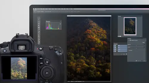
Let's take a look at how much I end up changing an image with Can Rob, because I would say that on average, with my travel, photography and landscape photography, probably about 75 to 80% of my images can be finished from start to finish using only camera or, in my case, light room. In the time that I need to go outside of Kameron use Photoshopped is usually when I need a stitch of Panorama. I need you HDR or, if I need you extensive retouching and then two other times would be I just need to fine tune every little thing in a picture. That would be like my final images, where I work on every little detail or I want a creative effect. But other not about 75% of time I can get it done in camera. But let me show you sometimes how far that takes it. Here's what this image looked like with default settings. I'll choose. Undo. There is what it looks like now, So part of what made this look different is what I do with the adjustment brush. Sometimes I do extensive changes with the adjustment ...
brush because I find whatever thing it is I'm capturing the lighting isn't exactly what I want. The lighting might be way too even, and I wish it was partly cloudy out so I could get shadowy areas and bright areas, which is usually more interesting on. And I'll try to create some of that look, sometimes with the adjustment brush. Now, when I go to the adjustment brush, you see all these little bitty circles on my image. Those represent different areas that been adjusted. I'm gonna hover over each one, and when I do, it should show covered a colored overlay to indicate what part of the image is being changed. So this parts applying to the top, I'll then click on it and we'll see the sliders on the right. Ah, that were applied. I'll hit the delete key to get rid of it, just so you can see what it would look like had I not done that and you see that there? I don't if you can see it easily on screen or not. But the darkest part of the image was looking kind of bluish purple and just had too much detail in it in so there. I ended up bringing the saturation down the shadows, even the highlights down to make them darker. Uh, and I wanted to make it less purple, so I moved it away from purple, this tiny little spot up here. I'll delete it. And it was just a spot a little bit too bright. Choose. Undo. I toned it down over here. Do you see these random kind of spots? That's usually either little areas that were too bright or I'm just trying to get the lighting to look mawr uneven. Let's find out if I delete it and I choose Undo. It looks like it was just some bright areas on the tips of some trees. If I come in there, another one here, delete it, whatever it is a subtle because I couldn't tell offhand small areas, big areas like this, but collectively adjusting all these tiny little areas can really add up. Let's see what it looks like with all of them gone. We'll hit the clear all button and you notice that the top you can see more detail and it looks more blue Afterwards. It's ah much where the way a like so sometimes it's the adjustment brush that ends up helping out other times, remember, I head over to camera calibration. Let's see if I ended up changing it. Uh, yes. I was down here at the very bottom choice in order to get the colors to render the way I wanted to. And I also come into hs l in this particular image, I'm actually surprised they didn't change it to fine tune the individual colors. But camera defaults to my end result. And if you look at the sliders that are in here when I choose, undo it. You'll see how far sometimes they get moved to give me the look that I'm looking for. I'll show you a different image where it had rather even lighting that I wanted to make look a little more interesting with the adjustment brush on this image. Let me first show you before and after Here's defaults. Do you see the lighting was just kind of blood. It was like an overcast day, and it wasn't the most exciting to me. Afterwards I made it. So it's much more uneven looking. Uh, and most of that, I believe, was done with the adjustment brush. If I hit the clear all button, you can see how even it was before. And then afterwards you see how much I changed it so often times. That's one thing I'll be doing is making the lighting less, even because I find it to be much more interesting. If you noticed some of these pins looking like they're outside the immense. That's because I cropped the image afterwards and made it so that the pins weren't. We're outside the frame that outside the frame is just where I originally clicked. Just one more for adjustment brush. Here's three different adjustments. If you want to see the difference, I'll hit clear all. If you look here the background, you see how it becomes darker and less colorful. That's through painting the middle part. You see how it's becoming more colorful unless green, that's painting it in with a white balance change and then just a little darkening in the corner. All right, now let's do something we haven't done. Oftentimes I get an image in the colors in the image aren't all that important to the image in this case, If I go to camera defaults, the colors in this picture just to me aren't exciting. So I processed the image in and part of processing it. If the colors aren't really helping that much, I will often convert to black and white. You can convert to black and white under the HSE L tab, right there's Convert to Grayscale, but then it could look a little bit sterile. I like to add some warmth to the image. So afterwards I go to the split, toning and with split toning, I'll put a little bit of color into my highlights in this kind, this case a little bit of a reddish, and I'll put a slightly different color into my shadows or, in this case, it quite different color, which is a kind of a bluish. But then I want to show you something else that I'll frequently do to get your eye to be attracted to one particular spot. I want to open this image in photo shop right now. If I hit the open image button, I'm gonna get a normal layer that just contains the picture with no special settings. But if I hold down the shift key, the open image button changes open object. That means it's gonna open it as a smart object. So I'm gonna do that. When you start with a raw file and you open it a smart object in your layers panel, you'll end up seeing the smart object icon, and if you double click on the thumbnail for that layer, it will send you into camera. What I want to do is create a second layer that can have different camera settings in it. I don't want to duplicate this layer because we've learned through other things that if I duplicate a smart object, it just thinks of it is two things that refer back to the exact same original. And if I make a change toe one, it will change any other duplicates. What I need to do instead is go to the layer menu, choose smart objects and choose new smart object via copy. That's gonna create what looks like a duplicate. But the duplicate will be independent of any other layers in here. Then, without duplicate active, I'll double click on the thumbnail for it to send me into camera. And what I'm gonna end up doing is I'm gonna turn off split toning, and I'm gonna go to hs cell and turn off the gray scale and click. OK, I could go under the basic tab and make it a little bit more colorful, but wanted to, but it's not critical. So now what I have is one that has the tinted black and white and the other one that doesn't This one doesn't have very much color variation in it, though, so it's not a huge difference. But what I'm gonna then Dio is at a mask. When I add my mask, I'm gonna hold down the option key. Holding out option gives you a black mask which will hide this layer and then I'll simply paint with white wherever I'd like you to see. This layer in your eye, I find, is drawn to areas that very in color. The rest of the image will have a tinted black and white effect on it, and even though this doesn't have much color variation in it, it should be enough to help want your eye to explore it. I can hit the backslash key to take that mask and overlay it so I can tell where I've painted. See if I missed any spots. Remember the backslash key. It's right, but right above the Returner n Tricky and a Macintosh, and it's also available on a PC. I just don't know if they put it in a different spot or not. I will show you on overlay of your mask so we can come find Tune it. All right, then, when I'm gonna hit the back like vax slash key again, let's see if you can notice a difference here I'll hide the top layer. Here's pure black and white, and here's just that little bitty tiny variation. And if it's not enough variation because it's just, you can really see much of a difference. I can always double click on the thumbnail for the layer, which will send me back in the camera raw, and I might make some additional changes thinking on Li about the Buddha that's there. Maybe what I'd end up doing is the highlight. Slider was turned down on the entire image to make that so the sky wasn't too bright. I might bring my highlights up to allow those bright portions of the Buddha to stand out more, and I might adjust my contrast a little bit if I lower it might not be quite as contrast in there, and I could also possibly adjust color tempter, make it warmed up just a little bit. Click OK, and it should update this. So I see it combining there and now my eye is drawn to that because it's different than the rest of the picture. The rest of the picture has one tone applied to it. Ah, black and white toning. But here it various more and it's different from its surrounding. So my I wants to explore it more. But that's one thing we didn't talk about. It's just dual raw interpretations. We have two different raw settings in the same file, and you masked men. Just remember, in order to do that, you click on the layer that contains the smart object. Choose layer smart objects in the new smart object via copy. That's the key to being held. Teoh have one independent of the other. Some of my images end up becoming quite complex because I need to build them up now. The ones they're simple. This one is in between gotta Okay, number of layers in it. Let's look at what the original looked like and actually wish I had the original individual files before the superstitions of Panorama because what was done in camera also changed it quite a bit. But I don't know where those files are at the moment. I don't know their file names. Uh, anyway, I'm gonna just just display the bottom most layer that's in here and we'll see what we started out with after stitching it to me that this doesn't look all that exciting compared to the end result, which I think has much more rich color. And it's much easier to see the detail that's in there. So let's see how it's built up Well, First, there's a retouch layer. I'm not sure exactly what's in that retouch layer, so what I can do is option. Click on it. Remember, option. Clicking on an eyeball hides all the others. Well, I should be able to see where it is, and what it tells me is I had a dirty camera sensor because there's just tiny little specks all over the sky, and that means I had sensor dust specks of my camera. This is an older image and might have been before they had the technology with the ultrasonic shaking of the sensor toe to get dust specks off. There is just a little bit right there and there on the rest of the image. See if you can see where that ISS I just retouched out a little dark speck in the sky right about here because it was distracting me. But other not it's mainly sensor dust specks. Then let's go back and slowly build it up again. The next one is one called Mountain Contrast, and this ihsaa curves adjustment layer most the time when I'm pulling out. Contrast the curves. It's two dots, one down on the dark part, one down on the bright part, and I make it steeper between the two. So if I turn this on, you see the contrast coming out. And if I double click on this adjustment icon, I'll see the curve. I'm just guessing is two dots. I might have gotten fancier, though it looks like three dots right near the end that's here. Well, the third dot is actually the one that's their by default, but two dots and I made it steeper, and that's it. To pull out that contrast. Then I did the same thing to the sky. It's a sky contrast. Looks to me like that's also turned on some other Do we go sky contrast dark ing it up little hue and saturation to make it more colorful, curved to darken up a little bit, just kind of building it up. But then here is one of the keys. Look at the way the top of the sky looks, how bluish purple it is. And after I put this in, how it looks like it's just pure sunset or sunrise. Ah, that was me choosing a color from near the base of where the sun is in, just painting on a layer, you see that paints on layer. Then I set the blending mode of the top of my screen to color mode. And remember, a color mode means take the color from this layer and use the brightness it's underneath so that by doing that, I was able to get it to look like a nice, unified color that's there. Having done that, I worked with a few of the transitions into various areas, and I just had a touch up the transition. You'd have to zoom up to 100% view to see anything that's in the next two layers. And then finally, at the very top, I darken the edge because right here that brightness kind of comes up and hits the edge. I wanted to look more like this so herbal darkening to the edge. So from this original to that end result, you get an idea of how it's built up. But if you look at the various layers that are there, it's all stuff. We talked about retouching, curves and human saturation. We did a lot of that in the 1st 3 day class, the essentials and then a lot of the other stuff we talked about then this next one is an image that I made for Wacom want Come came out with they small tablet. About the same size is this laptop that has a screen built into it. It's called the Sin Teak. That hybrid companion of the name is not as memorable as some others, and that's what I use thes days. They wanted me to make an image that with that particular product, and this is what I ended up coming up with. What I was doing here is I wanted this to look in general like a photograph. If you just glance at it and then the closer you look at it, the more you notice that it's not just a photo. So if we come in and look at it closer and closer, let's see what we get. When we get closer, you can start to see the painterly kind of look on the chair. If you start looking at the trailer, you can also see the painterly look there, but you'll notice that is completely different. Amount. This is very big strokes, these air, smaller ones. And then when you get to a detailed area, it's almost not painterly at all. And when you get to very detailed stuff, you can actually read the text in it right here. There's no painterly at all. Let's just see how that was built up. I did put in an extra layer down here at the bottom dis for demonstration purposes, which is the original image as it looked out of the camera. So this is what the original look like. Here's what my end result looked like. So I'm going to turn on the layers. One at a time. Let's see how it was built up. Here is our background layer, which it would usually be the true background. You don't wouldn't usually have the sexual one. This is what ended up happening in camera, kind of a dark interpretation of the image. I did a background retouched to get rid of elements that were there that I didn't want. You can see removing motorhomes and other things. Then I wasn't sure if I wanted to retouch out this other trailer that was here or some other elements. So I ended up working in a separate layer, and I did get rid of that trailer just to experiment. See if I liked it. I wasn't absolutely sure if I wanted it or not, so that's why I had it on the separate layer. Then I ended up starting to put some texture in the image. This texture is from a company called Flypaper. Flypaper, textures. I have one of their textures here, and then I painted in various areas to brighten it and shift its colors so that it's not as colorful in the middle where the trailer is. Then I ended up coming in here and all of these are layers that have the original image in it and has had the oil paint filter. Applied oil paint filter is one that we talked about today that comes with photo shop, and then I painted in the mass to make it so. It only effects one particular part of the image when I'm doing is what we have below. This is what I want is my backdrop just a kind of dark textured image and then duplicated the original, put it up on top and applied that oil paint to it. And then all I did is I looked various areas, and I said that share doesn't have a painterly enough look to it. So I duplicated the original image again and changed the oil paint settings in Mastered owned only into the chair so it could have different settings. And I ended up doing that to all these different areas. So here's a different settings for my flowers. Sometimes I had to end up adjusting things, and in this particular case I made it so it wasn't so bright where the vases were. And then I have another one for the fine details that ends up is a duplicate of the original again, and it is for the tiny little details here where I want you to see everything amassed it. So, uh, that area could have more and more detail. After that, I was just about done, and I decided to start adjusting it a little bit more. Here's a curves adjustment layer. We'll see what this looks like. That's just adding contrast. That's two points on my curve, making it steeper. The little part that you'd hook the trailer up to ah pickup truck with over here was too bright. So I just darken that up. I made the background pop a little bit because it was just a little bit too dull. Pop the image is a hole. The drapes, I thought, were a little bit overly colorful. Side, um, actually wanted them to be overly a couple from what I should say, and then a few other spots that I d saturated tiny little spots, though it's actually the nameplate on, so you can see how much this thing has. When it comes to layers, it looks overly complicated, but it really, as I built it up, didn't feel that complicated cause When I was adding new layers, I was really done with what was underneath it. It made it so I could just concentrate on the one element I was working on. So here was the original image. And here is the end result. So you can see how much stuff I sometimes due to an image. So my images air overly simple. Other images end up with quite a few layers like that. This one, I think we looked at briefing briefly before, but the main thing here is the retouching was extensive. He and I incorporated some tree pieces from another photograph, but if I turned on, you can see the extensive retouching, anything that I thought was a distraction that would pull your eye to something. I ended up trying to get rid of it. In order to get rid of some of the telephone lines going through the trees. I needed a copy from randomly from surrounding areas using darkened mode to cover them up over on this side. I ended up going out a bunch of information in here. In order to accomplish that, you see how much of the right side had to go away a lot of this part over here is copies from the part over here. Once I get it over there, though, I had to adjust it to try to get the color in the brightness to match. And that's what a lot of these adjustment layers might be doing. Or they're in general trying to get it so that your eyes drawn to particular areas. So let's turn those on. And then I did tinted black and white to make it so your eyes drawn to where there's more variation in color and is drawn less to where I've done a slight tinted black and white with this Siris on gas stations. I usually do a full tinted black and white on the skies and then 50% where the trees are. And then I control trying to bring it back to full color wherever I want your idol look. But you can see how much how many layers again might build it up. So it's weird to see the difference between when I use just photos or just camera, where it's just some sliders that build it up. And that's for most of my travel photography. When I switch over to my fine art photography, then end up having it in photo shop without kazillion layers to build things out. Another example here, and this is where again telephone lines through trees, and I don't always need to use dark and modes. Sometimes I need to switch over to lighten mode in order to get it to get to where the sky could show through. And in this case, you can see what I have here. I still have a tiny bit of work on this one because my tinted black and white that's applying to the sky the mask isn't precise so that right now the edge of the tree still have some tinted black and white in it. So end up having to do it just a little bit more work there down here. This house was not a fun thing to retouch, because if you look at what I started with when it came to the house, there was a car in front of it, and I needed to get rid of the car. If you look at how little of the house was visible in order to get that show up, I had to copy from this little bitty part of brick that was in the sun right there and do it over and over and over again to fill in all these areas. There was a little bitty part of ah pipe there. I did duplicate over and over and over again to get it to extend down. And I still think of a little bit of work on this tree cause it feels a little bit repeated with those dark areas. But that was not a fun retouch. The rest of this, the whole little edge of the rooftop. It's just a copy of this piece over and over again. And that's where that clone source panel makes it much easier Teoh deal with. And then, just like with the other ones, these were just optimizing individual little parts. And if you look, these are all curves, adjustment layers all the way up to here, then we have a black and white adjustment layer and some hue and saturation, all things that we talked about on the, um, a lot of it on the 1st 3 day course, but also some of it here. When I'm done, I'll often when I'm done enough where I need to close the file. I will often just create a layer at the top. You see what it says, and I'll just name it to remind me what's left. Color fixes and finery touch by color fixes what it means is also up to 100% view. And I zoom around my entire picture to see if there's anything that I introduced that messed up the image. The thing that I know of in this particular image would be that tree where I see a little hint of blue coming into the edge like right in here. And thats it means I need to look at that in the fine retouch means again, assuming up to 100% view and inspecting every little part of it. I only do that with my fine art images because they get reproduced five feet wide, and if it's five feet wide and there's something wrong with it, somebody's gonna notice. Whereas if it's reproduced really smaller just on a website, they'd never noticed that kind of detail. All right, well, hopefully that gives you some sense for how some of my images are built up simple from camera and then more complex when they're fine art and or if they have issues. Ah, and it really depends some images. Just take a minute or two to adjust with raw and then other images. I can spend a full day with Teoh. Get it to it's end result. You want a transition into any questions or some. Q. And finally, you know that sounds great. We always love to hit. Been up with some final Una and here's one from Jim, Kentucky. Where did you tune in from? I'd like to know, but what's the longest you've ever spent approximately from beginning to end on one of your images? They're really beautiful. Are you? Sometimes days. Can you spend a week on something like that? Really a week. But a few days? Yeah, it can be. It's I mean, it's not common, but on my fine art images, it can be that long. What happens is I work my image. Intel. I think it looks good on screen, and but on screen, when you're fit in window view, it's hard to really get a sense for. So then I make a print and I take a marker on my print, and I start marketed up with any change that bothers me. And I go make those changes in photo shop and then make another print. And once I get to the point where I don't have any marks on the print, I hang it up in what we call the gal. Ooh, re, which is that sounds funny, but our toilet room together a bus is the only place in the bus that has a lot of walls that have nothing on them. You know, as far as you can easily paste pictures on them. And so I'll hang them up there and there's a pen in there, and if they can sit in there for a least a week without me making a mark on it to say there's something wrong with it, then that image is probably done in. So that all depends how busy I am during the week, as far as how much how long they'll stay up there. But, yes, some of these images the really complex ones I might have spent up to baby about three days on. Okay, Awesome. And then this one is from Phil Birdie. Could you explain the difference between video timeline and frame animation. Okay. Can you actually add riel video into a time lapse slideshow? Can you add real video into a time lapse slideshow? Uh, yeah. See if I I can remember where I have. And just so you know, I'm not overly versed in photo shops, video features. I don't When I do video, I usually do it in my movie just because that's what I'm used to doing it in, in in photo shop. I have limited skills. So with that as a as a little, uh, warning. Yeah, I'm just trying to remember where when I talked about it, what session it was in. And I'm trying to recall on on I don't know how to be able to find it here, but in the video, Tomlin, you can have it. There's two different kinds of ah, animations or videos. If you have a frame based one, then it means is similar to a slide show. We're just saying show one image, pause a certain amount of time, and then show another, which is what we did when I had the, um the elephant trunk moving around and things like that. We're in the timeline area, you saw the individual frames. If that's what I have, I can't add normal video as well. But if the way I created my time lapse is to just go to the file menu and choose open in feed it the first image of a sequence in turned on a little check box at the bottom called It's called Image Sequence that creates a true video in that timeline. In It acts in general like any other video that you could put in that timeline and so you can put in additional videos before after that and do all sorts of other fancy ah effects in there. But those are things that I am not skilled at doing because I don't do a tremendous amount of video. Yeah, cool. And then I think we just got one really great question. It's smart objects before we before we head on out for the day, this is from Sam Cox, he says. Can I change a duplicated instance of a smart object to an independent copy that's not linked to the original? Hold on a minute. Let me get a smart of you. Thank you. And I can repeat it, if you will need it. Repeated tanker. OK, so the question waas can I change a duplicated instance of a smart object to an independent copy that's not linked to the original? Okay, I think what they're saying is if I accidentally duplicated it before I realized the fact that if I change one, it would change the other. Is there any way to get him? So they're independent of each other. I think that's what they mean. So let me do that and then see if I can figure out how to fix it. So I'm just gonna type command J here to duplicate this layer because it's a smart object and I'm gonna use the move tool, and I'm gonna move it over just beyond the edge of my screen. I'll go to the image menu and choose reveal all to make my document larger so I can see what's beyond the edge. No, zoom out. So right now we have to, uh, images side by side. One is the original smart object. The other is a duplicate of it. I'm gonna just make sure that both of them would change if I make a change to it, so I'll double click on either one of them. That should bring me in the camera, and I will just make this black and white click, OK, and let's see if they both change. Yep, because the way I got the 2nd 1 is by simply duplicating. So as far as I understand, what his question is, is, if I had done that, is there any way to now make the one on the right independent of the one of the left? And the answer is not directly, but all I need to dio is go to the Layer menu, choose smart objects in Choose New Smart Object via copy. It will copy. This one will be in the same position and scale. Even if I had scaled and rotated it in. That newly created one is independent, and now all it it would need to do is take the one that's underneath, and if I haven't done any special features to it, just throw it away. But if I had masked it dragged the mask up to the layer, that's above if I had applied filters to it, let's say it went up here and I applied just a blur filter. Just so you know you can if you apply to blur to it, to click on that blur and drag it up here if you can tell or not. But it moved up there. There it is in. So what that means is drag any accessories that you had attached to that layer up to that new one you just created. And once you've gotten any masks, filters or whatever else dragged up there, then dragged this one to the trash can, and now it's double check that they're independent of each other. I'll double click on either one in a camera. I'll make it black and white click. OK, and now hopefully only one changes. Yeah, cool. But now there's the question of Okay, what if I did that by accident? And now I want them both to be sync up to the same thing again. That one is more difficult. There's a chance that I'd have to check it. I could say, replace contents and feed it, feed them both the same image. But I think it still isn't goingto do it. So so long as all you did is duplicated first. Instead of go up to layer. Smart objects. New smart objects via copy. I'd have to have my layer selected. Uh, then you should be fine.
Class Materials
bonus material with purchase
Ratings and Reviews
Olga
The best investment I've made to improve my PS skills. Mr. Willmore is a skillful lecturer. English is my second language and I appreciate the clarity of his voice and the fact that he repeats several times what he's doing or what he did. It is great for note taking as well as for practicing. Just an Excellent workshop! Thanks Mr. Willmore!
a Creativelive Student
I absolutely love Ben Willmore's teaching style. He is clear and thorough. This class has a wealth of good info so I had to purchase this course. Thanks Ben and Creative Live!!! PS, Don't forget to forward the PDF. I am waiting patiently.
a Creativelive Student
AB FAB- Ben is an excellent teacher. He is very through and "down to earth" in his explanations. All his courses are worth the time and the money to view and purchase them!!! Please keep on teaching on CreativeLive. Thanks, Thanks, and more Thanks. Janet Bozgan 4-24-14