Clone Source Panel Part 2
Lesson 23 from: Adobe Photoshop for Photographers: Beyond the BasicsBen Willmore
Clone Source Panel Part 2
Lesson 23 from: Adobe Photoshop for Photographers: Beyond the BasicsBen Willmore
Lessons
Day 1
1Adobe Bridge: Metadata Panel
22:16 2Adobe Bridge: Keywords and Filter Panel
28:00 3Camera Tips and Essential Concepts
31:58 4Advanced Adobe Camera Raw Part 1
43:27 5Advanced Adobe Camera Raw Part 2
32:37 6Hybrid HDR Techniques
28:39 7HDR Q&A
15:38Difficult Panoramas Part 1
23:16 9Difficult Panoramas Part 2
19:19 10Time Lapse Effect
19:11 11Other Essentials
23:58 12Line Art and Pen Tool
34:10Day 2
13Masking, Selections, and Background Eraser
35:17 14Trees with Background Eraser
20:16 15Furry, Fuzzy, Hairy with Refine Edge
28:10 16Layer Masks
17:49 17Lab Mode to Separate Colors
34:32 18Colorizing and Make Metal More Shiny
19:33 19Partial B&W with Knockout
20:20 20Editing Lens Flares
21:33 21Separating Detail from Color and Linear Light Mode
18:41 22Clone Source Panel Part 1
26:21 23Clone Source Panel Part 2
22:43 24Telephone Lines Through Trees
17:25 25Little Things That Make a Big Difference
35:44Day 3
26Compositing with Simple Masking
34:12 27Aligning Layers and Warping
30:03 28Vanishing Point
21:05 29Masking Smart Objects
17:00 30Antique Color
30:13 31Color Lookup Adjustment and Faux Infrared
15:41 32Nik Silver Efex Pro
32:19 33Perfect Photo Effects Suite
18:34 34Alien Skin Snap Art 4
15:29 35Creating a GIF in Adobe® Photoshop®
18:01 36Camera Calibration and Post Crop Vignette
19:41 37Adjustment Brush on Steriods
34:20Lesson Info
Clone Source Panel Part 2
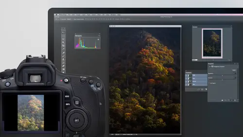
This is one of my fine art images in any time it's one of those I worked by a mention till there's nothing that bugs me about it this image I'm not done with yet but it just so you know it's been retouched to remove some logos for creative live specifically not supposed to show those but I thought I'd show you a little bit about how it was built up in how it uses like that black and white technique I talked about where I use multiple layers to control different areas in retouching and other things that you get an idea of how my images are built then we'll get into it more be touching techniques and we might actually do some of the retouching on this file so here is what the original image looked like after processing it and here is what my end result looked like you see it's considerably different there's quite a bit of retouching there so on here if you look I first have theory journal picture underneath and I usually don't touch the bottom layer and that's just in case I screw up wit...
h anything I ever do to the picture I can always get back to what I started with above that I usually have a layer in it's called my my standard name is weeds be gone because I think of retouching is pulling the weeds in the garden of my photo and it depends on what kind of photography do if you know how extensive retouching is acceptable or not, but for what I'm doing, I can do as I please s o that layer, if I turned on, is just a bunch of retouching that is removing all sorts of things from the image. Now, a lot of those things were not the easiest thing to get rid of over on the left side of the photograph, so we might look at that in some detail in a few minutes, but then there are some things I wasn't exactly sure if I wanted to retouch out or not, and so I put them on separate layers so here's, another layer called de clutter right side, and if you look at it, you see that that really cleaned up what's on the far right now, there wasn't anything that I could directly copy from it just put that there because looking the image, where do you find another full one of these little curb areas that doesn't have a hose on top of it or doesn't have something that makes it continue on in space, so that had to be constructed from the other pieces in the image, then we couldn't believe they put this huge elektronik sign on this vintage building, but they did, and I had to be able to get rid of that it make sure that the tree behind it, uh, looked appropriate didn't see a lot of repeated shapes, but then you see, you know, after I'm done doing my retouching, then I will start building up adjustments, and so these are all adjustments, and if you look at the icons that air there in the layers panel, any time you see this icon here that's a curves adjustment, so you see curves, curves, curves. I believe that this is a hue saturation adjustment because that's the second kind that I used the most, and if I just keep going here, there's a whole bunch of these, but other than this one, which is a black and white adjustment layer, all I'm doing is two kinds of adjustment curves and human saturation and that's why in the previous three day class that I did that was photoshopped for photographers, the essentials we concentrated on learning curves at an in depth level and learning human saturation has the two main adjustments that we concentrated on because I confined, I find they could do so much, so I'll turn those on one at a time if you'd like to see what they do. You notice that each one of them you see the mask has something in it on most of them in on a lot of them. The mask is almost completely black and that means that I'm working on a very small area the photograph so I'm going to turn on each one of these very quickly sometimes with this view we're zoomed out this far, you might not be able to tell, but this one says pop small sign if I view the masked by hitting the back slash kee, I can see where it is though it's right above the entrance to the gas station because that's the only area that's not covered in red, and so if I turn this layer often on now, it can see right above the entrance to the gas station I'm making it pop out in case it's too small for you. You see it there and so let's look at these other ones here, it says de orange the sidewalk because in the sidewalk little yellowish orange we'll see after that it doesn't then mohr green on the lamps uh, somewhere thing here the little lamps above the entrance to the garage are changing reflections in the door, and if you can see not the door in the window of the gas station uh, all sorts of things but also slowly build them up and I'm simply refining each little area and this is often the number of adjustments you end up kidding if you ever do images for advertising advertising agencies and things request every little part to be adjusted after that on top I have my tinted black and white and let me turn that on so you can see what it looks like where I was trying to direct your eye a little bit by controlling how much of the image has color so there it is with tinted black and white let's take a look at how that was done if you look here in my layers panel what I have is a black and white adjustment layer just like we had when I told you how I how I did this is a general concept in above that we have multiple layers that have mass on them. These are all curves adjustment layers but if I were to actually double click on one of those to show you the curve no adjustment has been made whatsoever to the image these air what I would call empty adjustment layers the adjustment itself isn't doing anything and they have there ah setting changed remember there was a setting called knock out when we can say knock out deep or knock out shallow well I wanted to describe the difference between knockout shallow and knock out deep because it could be important so these here are knocking through this black and white and just layer to prevent it from showing up in some areas and let's take a look at what each one of those does I'll turn them off one at a time so we could have all turned off so now the black of one adjustment layers applying everywhere the first one here is controlling the trees over there. When I turn on and off, you'll see the trees getting some color coming back the next one up is controlling the bus that's there and the pumps in sign they get full color, then up here those are the stars on the building and then finally the station itself feels too black and white. It feels like those elements have just been pasted into a black and white photo, so for the building itself, I brought it down a bit, so by the time I get that much color and the image my brain starts to think and I don't know if yours does or not it thinks is this a black and white photo or hasn't had some black and white applied instead of it looking like a blatant black and white, so what that does for me is it makes it so when I apply black and white selectively like that, I find that your brain is more interested in areas that vary in color and so you're drawn to the areas that vary in color or just colorful in general, in the areas that aren't all that colorful, the areas that don't vary that much, you just kind of pass by relatively quickly. Ah, with that now, in this particular case with this complex of a document, though, I had to use a different setting than a white are originally demonstrated. So let me show you what is different. I'm to click on one of these layers that's above that's what I call the empty adjustments because the adjustments themselves aren't doing anything it's the mask that's doing stuff with one of those active, I'll go down to the letters f x and I'll choose blending options that's where I find the setting that's called knockout and we have the choice of none shallow or deep. What the heck is a difference? Well, none means don't use this feature, so make a layer act normally deed it always means knock all the way down to the background layer, so if I were to change this to knock out deep, the problem is this layer would suddenly knock through all of these adjustment layers, preventing them from applying to my image it would also knock a hole straight through all of these. Retouching layers so they wouldn't be effective and you would get to the background in the fact in this particular image, there isn't even a layer called background, so it would most likely knock through and just show a checkerboard to say it's knocked all the way through and there is no background, so it's done its job. But if when I go down to the letters fx and I choose blooding options, I set this to knock out shallow what the heck does that mean? Well, what it means is it this layer should just knock a hole in whatever is in the folder, also known as a group that contains that. So what that means is these particular layers they're all set to knock out shallow and with knockout sallow, it means poke a hole through everything that's in this folder until you hit the bottom of the contents of that folder, then stop messing with the image. In that way. These particular empty adjustment layers and just have max masks applied to them can poke a hole through by black and white adjustment layer, preventing it from applying to various areas, but it does not mess with the layers that are below that, so that's the difference between knockout shallow in knockout deep knockout deep would knock through every single layer that's below it until it hit the background if there was even a background there. So if you look at each one of these I'll just show you the masks briefly saying see what? It's working on the first ones mainly the greenery in this shot the next one up is the bus, the pumps and the sign the next one up is just the stars and the little lamps on the building and the final one is the entire gas station with the bus. Each one of these has the opacity lowered to a different amounts of the top one we look at it is that fifty three the next one down seventy seven next one down, one hundred percent in the other, one's thirty seven and therefore I can control those various areas completely separately, and I try to give me a clue as to why did I do that? In case I open this again so here's the station itself I said, look a little less that's for the for those the stars and things in the building look here is for where you see it at full color and then the trees at any time I can click on those and adjust their opacity again too fine tune them so anyway, this is how I build up my documents the original images on the bottom, then usually one retouching later called weeds be gone and if I am not certain, if I want to retouch out certain elements, I will put him on a separate layer to decide later on if I want to keep them or not. I wasn't certain with that if that was too much clutter or not, then I mainly have adjustment layers to build up working on various areas of my picture and at the very top in this particular case, I have a black and white effect. The final thing I might do is at the very top of my document you'll frequently find another retouching layer, and that is to fix any problems that I introduced from all these layers being put in, maybe I zoom up really, really close on something in the transition between the tree and the sky looks weird or something. I might have one final retouch layer on the very top, but otherwise that's how my images are built so let's look at some other retouching issues, and I don't know if we really finished this image we've been working on. Let me see if I still have it open. I believe it do, but now you're getting a sense for how the upper right part of the photograph I've been able to replace most of the tree that's there and all I've been doing is copying from the left side of the photo it's been flipped it's been rotated and in some cases I need to scale it but all of that stuff happens in one panel that is called the clone source panel. Now a lot of people will ask questions about because they'll see options in there that they don't know what they do so you're like, wait, what is this d'oh? Let me just cover two of those things just so you know why I'm not going to cover them in general and that is frame offset in lock frame to the best of my knowledge those two settings have to do with the video do I want a copy from a frame of video that was three minutes ago and apply it on the current frame of video because you khun edit video and photo shop? Remember when we created a time lapse the other day um I could after I'm done with that time lapse re touch any part of it and I could say a copy from what was two minutes ago in this video and apply it here and so that would mean frame off said I believe would be how many frames back would it be? I'm not sure what lock frame does but has to with video and I don't retouch video so then we have a few other choice is in here which can help us try toe line things up and they're not always easy to demo and they're not always uh necessary for most retouching job so we'll see if we can get to a few of them but the main thing is the wn age has width and height if I were to lower these numbers we would scale things down, increasing the scale them up if you need to squish something horizontally instead of scaling it in both dimensions you'd have to turn off this link symbol so you could change one number without the other then these two icons here are flipping, flipping horizontal versus flipping vertical in the choice called offset simply moons how far did you move from the area originally option clicked to copy it from it to where you started to apply it so if you start to apply it and you're off just a teeny bit you come here and change these particular numbers ah lot of these settings do have keyboard shortcuts available like the setting for rotation and things but I never remember them unfortunately if you wantto ghoul it you could say cloning source keyboard char cuts and probably find them but you're there is a keyboard shortcut for scale in rotate I believe but it's that I don't need to use these every day so it's just not something that's stored in my brain so let's see if there's any other areas in here where this might be useful and we're pretty close to getting this done but just not quite so what I might do up here for this portion is that's touching the edge of my frame and you remember anytime you use something with the word healing attached, it won't do good with that, but if I make something like a selection like this think suri dont touch there then oftentimes going to the edit menu in choosing phil remember you have the choice called content where usually does pretty good job, but I should give you a warning that is, if you're working on empty layer where that's where you put your retouching sometimes this will complain that it doesn't like working in an empty layer let's see if I can get her to complain sometimes it does and how was it doesn't? And if it does complain I'll show you how to cheat who that doesn't look very good I I'm not sure why I did that because that doesn't make any sense whatsoever that's wild but if it did complain, what I would do is I would end up creating what's called emerged visible layer in fact it might make this work better cause sometimes it just won't work well so there's ah weird keyboard charcot what it does is it creates a new layer in that new layer contains what it would look like if you flattened your image meaning combined all the layers together and what it really is is there is a choice into the layer menu called merge visible it has a keyboard shortcut listed right here and if you hold on the option key in addition to these keys here you will keep a copy of the original layers so it's shift command e with option added so it's shift option command e watch what happens in my layers panel hey, I just got a new layer that contains thie entire concept of this document is if it's been merged altogether sometimes by doing that the retouching of the going to the edit menu in choosing phil content aware we'll actually be able to work in this case I wasn't expecting the results of that last time, so we'll see if it works at all hey much better and that now after you do that all you need to do if he wanted that to just be on that layer that's down below is jumped this to its own layer command j it and then throw away the layer directly below it that's the layer that had everything else in it we didn't need so now that's the retouching sitting right there it is just the area that was selected and now I'm going to choose merge down to deposited on the layer that's underneath uh mandy is murch down but okay, so if the content aware phil doesn't work on you it fails you what you need to do is what some people refer to his emerged visible layer that's where you could just hold on the option key and come down here and choose merge visible that'll create it for you do the retouching on that layer just make a selection because if it didn't work on an empty layer do this choose film content aware and then I don't want the entire rest of the picture in that layer so just to command j to jump that to its own layer throw away the layer you're working on previously so now that layer contains just that little piece of retesting and then finally you can choose merge down either fromthe layer menu or command e is the keyboard truck so that's how to kind of fix that um the edit phil command when it doesn't work it seemed to also fix it when it just created a completely unexpected results so that might have been due to the layer as well. All right now we still have a little part here to retouch out I'm not sure if I got this copy from what's down here and put it up there we'll find out I'll come and grab my clone stamp I will go to my clone source who I think I might have used them all up this one's flipping horizontally, but that's the main when I want to keep the last one is the one I used last and it's set to flip horizontal in, rotate a little bit. I want to make sure it remembers that, just in case I have to come back and reuse that I'm just going to go back to the first clone source and replace it because I think the very first time I used to call into I was getting rid of the base of the tree over here, and I don't think I'll need to come back to that point. All right? Now, let's, zoom up here with a smaller brush and I'm just gonna copy from down here. Option, click let's, see if I can get away with using that up here. Try to get that aligned up click who that doesn't line up. You see how it's done if you can tell it's too wide. Well, how can I fix it? Well, what I'm going to do is get a brush that is larger, the wider than this area, just so I could get a preview within my brush of what would apply and I can see that is too wide, then I'll go to the clone source and I'll come over here and click on the width or the height. And I'm just going to use the up and down arrow keys, and I'm scaling it down now intel I might be able to get it to match can't completely tell right there, but I might be close. Ninety one percent. Go down here and let me see if it's any better if it's not. And if I can't get this tow line up but that looks like it's blinding out relatively well, then I would copy from the other side of the document instead. Copy from this one. All right. I think the brightness needs to be adjusted a little bit. There a little curves adjustment layer were you just darken it the tiniest amount right there would be fine. Ah, here we got a little bit of tree and I can either copy from here or from right over here. I think right over here because I need to extend it up to that little green band that's there. So I changed in my next clone source. So therefore, if I need to get back and copy from the same area previously, I can option click. Uh, over here, bring it over this way, click and to see if I can use that all right, over here, this edge, I might be able to copy there from here. Or maybe from this window, whatever I think would be appropriate. This sedge looks a little bit on. I'm not sure if I like that little highlight that's on it. Let's. See, if I can copy from over here, I'd have to be careful with right around the edge of that window there. So if I choose undue, I got too much of the edge of the window. I need a smaller brush use kid in there. Anyway, you're getting this sense for how I can tackle a relatively serious retouch with this, because look at what we're getting rid of there's, only a few parts. We haven't finish and that's near the edge of the building here, but hopefully this gives you a pretty good sense for how the clone source could really help you out.
Class Materials
bonus material with purchase
Ratings and Reviews
Olga
The best investment I've made to improve my PS skills. Mr. Willmore is a skillful lecturer. English is my second language and I appreciate the clarity of his voice and the fact that he repeats several times what he's doing or what he did. It is great for note taking as well as for practicing. Just an Excellent workshop! Thanks Mr. Willmore!
a Creativelive Student
I absolutely love Ben Willmore's teaching style. He is clear and thorough. This class has a wealth of good info so I had to purchase this course. Thanks Ben and Creative Live!!! PS, Don't forget to forward the PDF. I am waiting patiently.
a Creativelive Student
AB FAB- Ben is an excellent teacher. He is very through and "down to earth" in his explanations. All his courses are worth the time and the money to view and purchase them!!! Please keep on teaching on CreativeLive. Thanks, Thanks, and more Thanks. Janet Bozgan 4-24-14