Color Lookup Adjustment and Faux Infrared
Lesson 31 from: Adobe Photoshop for Photographers: Beyond the BasicsBen Willmore
Color Lookup Adjustment and Faux Infrared
Lesson 31 from: Adobe Photoshop for Photographers: Beyond the BasicsBen Willmore
Lessons
Day 1
1Adobe Bridge: Metadata Panel
22:16 2Adobe Bridge: Keywords and Filter Panel
28:00 3Camera Tips and Essential Concepts
31:58 4Advanced Adobe Camera Raw Part 1
43:27 5Advanced Adobe Camera Raw Part 2
32:37 6Hybrid HDR Techniques
28:39 7HDR Q&A
15:38Difficult Panoramas Part 1
23:16 9Difficult Panoramas Part 2
19:19 10Time Lapse Effect
19:11 11Other Essentials
23:58 12Line Art and Pen Tool
34:10Day 2
13Masking, Selections, and Background Eraser
35:17 14Trees with Background Eraser
20:16 15Furry, Fuzzy, Hairy with Refine Edge
28:10 16Layer Masks
17:49 17Lab Mode to Separate Colors
34:32 18Colorizing and Make Metal More Shiny
19:33 19Partial B&W with Knockout
20:20 20Editing Lens Flares
21:33 21Separating Detail from Color and Linear Light Mode
18:41 22Clone Source Panel Part 1
26:21 23Clone Source Panel Part 2
22:43 24Telephone Lines Through Trees
17:25 25Little Things That Make a Big Difference
35:44Day 3
26Compositing with Simple Masking
34:12 27Aligning Layers and Warping
30:03 28Vanishing Point
21:05 29Masking Smart Objects
17:00 30Antique Color
30:13 31Color Lookup Adjustment and Faux Infrared
15:41 32Nik Silver Efex Pro
32:19 33Perfect Photo Effects Suite
18:34 34Alien Skin Snap Art 4
15:29 35Creating a GIF in Adobe® Photoshop®
18:01 36Camera Calibration and Post Crop Vignette
19:41 37Adjustment Brush on Steriods
34:20Lesson Info
Color Lookup Adjustment and Faux Infrared
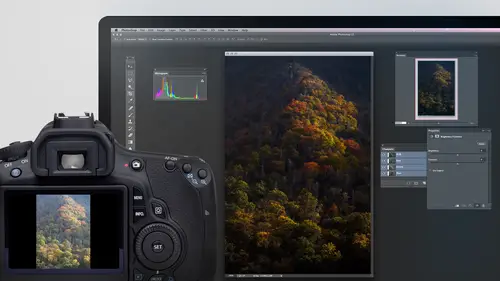
All right. Now let's look at another feature. And if this is a feature where I'm not sure where it is, what do I do? I come over here and see if I can search for it. It's under adjustments. It's called Color. Look up. Remember that any time you think about something I mentioned. If he says, I only told me to invert something. Where the heck was that? Well, just go to help and look for it. So here's an adjustment. This adjustment, I believe, is designed for folks that do video, but it can have application to us as well. And what it is is I come in here to the image menu, choose adjustments, and there's a choice called color. Look up. If I choose color, look up. We just have three pop up menus and I click on him and you have this list. Let all this stuff this is to simulate different types of film and other things that some video people would find to be useful. But then there are some others. If I go into a abstract that might start looking different. The problem is, it seems like I need...
to just hunt and pack in here to find what might look cool. And that looks interesting. The colors and that look quite different. But I'm not looking forward to coming to this in just randomly hunting and pecking at this, right? So here's what you can dio. I set up a special document. First, let me show you how it was set up, just in case you want to set up your own. What I did is I converted a smart filters. Then I duplicated this image many, many times. So what I'm gonna do is actually crop use crop tool. And I'm gonna pull it out like this to say, add this much space and with move tool, I don't if you're or not. But if you hold option, you pull a copy so I could go, Hey, once make a bunch of copies of this, then what I did was I applied that color look up to each one of these copies one of the time, grab all that whole row like that so that I could see what it looked like with every single one of the settings in one file. Well, let me open that. I don't feel like doing it right now. Here it is. So therefore, I can see what every single one of those color look up settings would do to this particular image. And so if I zoom up on this, I can just scroll around it now and see if there's any particular one that I find to be interesting for this particular image and that to me, makes the color look up much more useful because I don't feel like I'm going to just sit there and randomly hunt and Peck looking for things, hoping to see if it might look more interesting. Does that make sense? So then let me show you how I can try it on a different picture. So I'm gonna go. And since this was a smart object, if I look at my layers panel, what 1/2 here? Well, this is a smart object that contains one of those pictures. This up here is an adjustment layer called color. Look up and you see little down point narrow. That means Onley apply to that thing. It's got all the other set up the same way Each one uses a different color. Look up. Well, this is my smart object. I'm in a double click on it. It'll show me the original contents. There it ISS. So why not just go grab a different picture? Select on copy, Put it in here and it's too big or small. Scale it so it fits and saving close this, then shouldn't that other document update and put a different picture in and show you what the setting would be on every single one of those pictures And that nice compared to having to dis hunt and peck at that menu to see if you can find a choice that you like, so depends on the image you have. Some of these choices will be very nice for what you'd like to dio and for other images that might not be. But I think like this one here, the colors look quite different. If I was going for a creative look or if I want this really orangish look that kind of thing and once I find what I want, I don't if you remember or not. But there was a way with the move tool that you can target the top most layer. That's right, where your mouse is, what you do is you just hold on the command key and you click. So if I command click on this, it'll target that layer. If I command click here, it'll target that layer. And right there is the adjustment layer right above it that was causing this to happen. I can drag that to a different document it apply to that document, I can drag it to a whole bunch of documents. So if I had the other document open, I could click on this in Dragon to there. For those of you that purchased the course, you get this file and so therefore you'd be able to open this up. And if you want to try the color, look up filter on any of your images, All you do is you double click on any one of these to see its contents. Then go get your image. Select on copy. Switch to the other file, which I'm not sure why. I can't see it right now. I go to the window menu. It should list on my files here and shoes paste. Just make sure that it gets to be approximately right size and here doesn't have to perfectly fit, but I'll do command t and scale it down. Then if you save and close this, you'll see it with all those I switched to the other document, okay? And then in when you want to apply this, usually I can just drag it over there. I'm actually not certain exactly what's happened in photo shop, and usually you see tabs for the documents. And usually my document doesn't go underneath the layers panel so much. So let me check one thing quick. I'm gonna go to my window menu and there's a choice called workspace. I'm going to go in here and say Reset, which means reposition on my parents that where they usually are, and I'm going to see if I have. For some reason, the thing called application frame is great out because usually I could see the other document right now and have tabs. I'm not sure what's happened. Some odd has happened in photo shop. Sometimes that happens when you use it for a long time. You experienced that s so at the moment. I can't drag that to another document because I can't see the tab. I can't get to it. But what I could do instead is if I find the layer that I like. Let's say it's this one right here. I just look at the color look up layer layer that's directly above it right here. This guy in double click on this little symbol and I can see myself. Ah, what setting is being used? It's right here, this setting three D preset. It's called late Sunset, and I could manually apply it. But I might either need to acquit in restart Photoshopped to get my tabs working again or something else. I'm not exactly sure what has transpired. Let me see if it just works normally again. So anyway, that is color Look up adjustment layer and know that after you apply color, look up. You can also change its blending mode. So if you like part of the look, you could set it to like color blending mode, and then it would only use the color from one of these and keep the brightness of the original, uh, where you could set it to something like overlay mode. And it'll give you a more subtle look, that kind of thing. But it's ah, adjustment that I find that most people don't even know exists, so I want to make sure that I mentioned it there. Now, let's look at how we might be able to fake somewhat of an infrared look with infrared if you ever seen them. Usually blue skies go really dark, sometimes even black in green of plants. And things usually get really bright, even close to white. And it has this kind of noisy look to it as well. All depends how much of the effect you want. But let's look at one method for simulating it. This will work best if you have green and blue things in it, because that's what we're gonna target in. What I'm gonna do is come in here too. Create an adjustment layer and I'm gonna choose the one that's called Channel Mixer in Channel Mixer, usually an infrared images black and white. So I'm gonna turn on the monochrome check box and then this says, how much of what used to be in the Red Channel? Are we going to use how much of what used to be in the Green Channel and how much we used to be in the Blue Channel are we going to use? What I'm gonna end up doing is taking the blue in bringing it down That's gonna make our blue sky backo bring it all the way down to see what happens. Because now I'm gonna brighten the image up by grabbing the green slider and train it up. Once I've done that, then I congrats. The slider that's left over to control the overall brightness. Darker, brighter, whatever I'd like and I confined tune these of any areas too bright. If you find the greens to be too bright, you can tone him down a little bit. Bring down the green slider, that type of thing. But in the end, it's the reds. There is going to control the overall brightness of your image. And so I start off with green, turned all the way up blue turned all the way down, but on occasional mellow out on them because they're a little too extreme. You can also lower the opacity of this adjustment layer if you want to him to the color to come back or other things, but we're starting to get a blackish sky. We're starting to get really bright greens. If I turn off the eyeball, you see, before and after. And then let's see if we can do a little bit more. I'm going to duplicate the original image here, Command J. And then I'm gonna try to get a little bit of it. Almost has, like, a glowy feel to some of the infrared. So I'm gonna take that. And after duplicating it, I'm gonna go to the filter menu, choose Blur, and there's a choice called Box Blur that's gonna give me an interesting kind of blurry look. It's a little different. Can you bring that up a bit to try to get up? General Blur. Click. OK, and then I'm gonna change the blending mode of it so that all this does is lighten the picture. I can get it to light in the picture by going to the blending mode menu in changing to a choice called screen. When I do, it's going to be way too bright. That's way too bright. So I'm gonna lower the opacity. Ah, click on opacity, bring it way down and usually right around 20% is closer to what I need. And let's see what that layers doing. I'll turn off its eyeball before, after it's giving a little bit of a glowy feel to it, and it's lightening it up a bit. And so that's one thing that you can also do to get a little bit more of that look in the final thing you could do if you really wanted Teoh, is you go back to the original image layer and you could go to the filter menu and add some noise because infrared images air usually rather noisy. So do some add noise, and you usually need to use monochromatic so it doesn't chip the colors in. You could bring this down. So it's not all that much, just a hint. And in this particular case, I think I could mellow out the green slaughter because this area down here is a little on the bright side, but you get the general just of it. But we ended up doing was a channel mixer adjustment layer, which ended up crossing all the blues to go really dark, the greens to go really bright. We ended up adding a bit of a halo. We glow in a bit of noise, and that can often simulate your infrared help. Any questions? They're very cool. They're a bunch of other techniques you can use. And you can refine this one by using different slider settings, but can be nice Quick question. So when you're doing it, when you're doing something like that, when you're out shooting, do you ever have ah, specific concept in mind? When you're out in the field and you're looking at something and you're photographing, you're like, Oh, that's gonna look great in infrared. And if you do, do you ever adjust the settings in your camera for that purpose for this particular thing? Not as much in that I still want to make sure I don't want my highlights. Uh, with it. That's one of my main concerns. When I'm shooting is long as I can get a good difference between the blue sky and the greens. If there's uh, if the blue sky is looking a little bit little bit pale and stuff and might not be quite coming enough, I might try a polarizer filter, which will get it to look a little darker, more saturated, more saturated. It becomes the easier it is to separate it from the greens that are in there. But in general, I don't think for this particular technique all that differently. Yeah. Is there a similar technique for simulating a polarizing filter? Ah, well, polarizing filter will usually darken in. Saturate your skies a little bit. And in general with that, see if I can open one of these when I'm in a camera, I can do it where I could do it in the main part of photo shop. But if you go to the camera the HSE l sliders, which is under this tab right here, then all they would do is take the setting code luminous, which means brightness and take the blues and make them darker. You see the sky getting darker, and then I can take the saturation under the saturation tab and make it more saturated. And so that click, uh, that Then it's going Give me a sky that looks a bit more like what a polarizer would do, but it's not truly going to give you exactly what a polarizer would look. Is everything in the image that's blue is gonna be shifting that money. If I want to do this and Photoshopped, I would do it instead with human saturation adjustment layer. And what's nice about it is you can then paint in the mask to say, Don't effect over here, this blue that's on a blue car, something else. But if that's what you're thinking about, it's just the effect that it darkens and makes the sky a little bit more saturated. That's what I would do.
Class Materials
bonus material with purchase
Ratings and Reviews
Olga
The best investment I've made to improve my PS skills. Mr. Willmore is a skillful lecturer. English is my second language and I appreciate the clarity of his voice and the fact that he repeats several times what he's doing or what he did. It is great for note taking as well as for practicing. Just an Excellent workshop! Thanks Mr. Willmore!
a Creativelive Student
I absolutely love Ben Willmore's teaching style. He is clear and thorough. This class has a wealth of good info so I had to purchase this course. Thanks Ben and Creative Live!!! PS, Don't forget to forward the PDF. I am waiting patiently.
a Creativelive Student
AB FAB- Ben is an excellent teacher. He is very through and "down to earth" in his explanations. All his courses are worth the time and the money to view and purchase them!!! Please keep on teaching on CreativeLive. Thanks, Thanks, and more Thanks. Janet Bozgan 4-24-14