Lightroom® Develop Module
Lesson 21 from: The Professional Photographer’s Digital WorkflowMichael Clark
Lightroom® Develop Module
Lesson 21 from: The Professional Photographer’s Digital WorkflowMichael Clark
Lesson Info
21. Lightroom® Develop Module
Lessons
Class Introduction
08:17 2Shooting Workflow: Set-up The Camera
15:43 3Shooting Workflow: Histograms and Exposure
18:14 4Shooting Workflow: Sensor Cleaning
32:50 5Overview of Color Management
17:31 6Color Management: Monitor
11:49 7Color Management: Workspace
03:40 8Color Management: Monitor Calibration
25:52Color Management: Do I Need This?
03:42 10Introduction to Lightroom®
05:44 11Download & Import Images With Lightroom®
06:32 12Lightroom® Preferences
09:09 13Six Ways to Speed-up Lightroom®
14:02 14To DNG or Not to DNG?
06:47 15A Logical Editing Process in Lightroom®
08:56 16File & Folder Naming in Lightroom®
08:39 17Batch Renaming in Lightroom®
05:51 18Entering Metadata in Lightroom®
03:35 19Managing Images in Lightroom®
07:39 20Introduction to the Develop Module in Lightroom®
04:45 21Lightroom® Develop Module
24:01 22Sharpening, Chromatic Aberration & Vignetting in Lightroom®
12:34 23Graduated Filters & Spot Tool in Lightroom®
09:59 24Converting images to Black & White in Lightroom®
13:01 25Creating Panoramas in Lightroom
07:46 26Creating HDR Images in Lightroom®
09:29 27Lightroom® to Photoshop® Workflow
07:04 28Export Images to Photoshop®
08:54 29Finalizing Images in Photoshop®: Basic Adjustments
36:49 30Finalizing Images in Photoshop®: Retouching
15:16 31Finalizing Images in Photoshop®: Saving Master Files
09:45 32Make Fine Art Prints: The Cost
15:37 33Make Fine Art Prints: Ink Jet Printers
05:23 34Make Fine Art Prints: Ink Jet Papers
10:14 35Make Fine Art Prints: Understand ICC Profiles
08:44 36Make Fine Art Prints: Sharpen Image
18:26 37Printing From Photoshop®
09:11 38Printing From Lightroom®
05:07 39Compare Monitor to Physical Prints
06:33 40Printing Black & White Image
09:10 41Extended Workflow: Back Up Images
35:19 42Extended Workflow: Storage Options
18:32 43Extended Workflow: Archiving Images
15:55 44Submitting images to Clients
28:32 45Prepping Images for Social Media
08:44 46Alternative Workflows
08:49 47Final Q&A
19:56Lesson Info
Lightroom® Develop Module
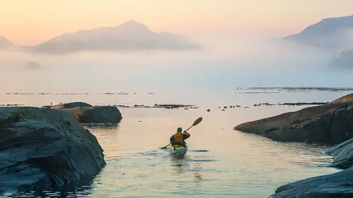
I'm gonna create a virtual copy and I'm gonna go over here and reset this image to how it came out of the camera. And just to make sure, I'm going to go over here and copy history steps settings to before. So that's a little thing, just because I mean typically you wouldn't have to do that because you didn't create a virtual copy, it just came out of your camera like we did with Tony's images and put them in here. But now if I make an adjustment, let me just make some crazy adjustment, like that and I hit the backspace key, it goes back to the before and after mode. And that's a horrible bright image, so we're gonna undo that. So first things, before we jump into the sliders and basically the rest of this 30 minute segment, we're gonna be talking about manipulating these sliders and how they adjust the image and what they're doing. I'm gonna get rid of this bottom panel here and my hope is to work up two or three images, maybe a portrait, this image which is kind of a landscape shot, o...
r maybe a pure landscape shot that doesn't have a person in it too. And we'll do a black and white, we'll do some panoramic, we'll do an HDR picture. We'll do a whole host of pictures in this segment. Before we get too crazy here though, there's things that people don't know about the background working color space of Lightroom. So in the preferences you note that we never selected what color space we're working in. These cameras were shot in Adobe RGB from the camera, downloaded, put into Lightroom. Lightroom has it's base color space. Which internally is called Melissa RGB, or it was at one point, I don't know what they call it now. It's a ProPhoto color space with an sRGB tone curve. All that is to say that it's a fairly generic color space that works for a wide variety of images whether shot in sRGB or Adobe RGB or whatever. When you export the image, as we'll do tomorrow or later today, if we get there. You actually choose the color space there. But that creates a conundrum. And that's why, as you'll note tomorrow morning, we're going into Photoshop, and I have to export every single image out of Lightroom in to Photoshop because of this conundrum. Because we're not working in a true, real world color space. We're working in Lightroom's color space which doesn't relate to anything else in the world. So when I export these images, and I put them into Photoshop, my histogram might have changed a little bit. In rare, rare instances, the colors might look a little different. So that's why for me, I always have to go to Photoshop. And I'm just aware of that in Lightroom. If we open an image in, here let me get out of this real quick. In Photoshop, I'm just gonna open let's find an NEF. Here and I'll just, whatever, this one, let's see what that one is. Can't find that one, okay. Let me go track down an NEF real quick. Open. And they're in my pictures folder. And here we go, raw images. I'll just pick a DNG image, doesn't really matter. Click this and open. So when I open this file, this is actually from Tony and I's Sika hiking trip a few years ago. You'll notice down here I can pick what color space I'm working in. And so if you watch this histogram over here, as I change this color space, the histogram changes. And so if you're gonna start working up your image in a ProPhoto color space, but you're exporting it in sRGB, it's gonna clip your histogram. So if you get too crazy on how you push your histogram corner to corner, and then you export into Photoshop, your white and black point settings will not be the same if you're not staying in that color space. So this is the conundrum of Lightroom, and it's capture one's the same way. Any of these softwares where you import your images into the software to start using it, they've simplified. And that's the original intent of Lightroom was to simplify all this stuff so we as photographers did not have to think about it. And for some crazy people like me who are really nuts about color, we pay attention to this stuff. For the average person you might just ignore this entire stuff that I just said and be like it looks fine to me, I don't need to worry about it. And that's totally fine and completely, go for it. I'm just trying to fill out some of these things that you might not know about, that might affect your images. Especially when you go to print them. So I'm gonna cancel out of this. Another little side note there, is if you don't shoot thousands of images, if you do a shoot, you're a seal photographer and you shoot like Jeff here, 60 to 80 images per shoot, you may not use Lightroom. You might just use Bridge and open those images into Camera Raw, and that's all you do. And maybe you import them into Lightroom later just to keep track of them, to archive them. We'll talk more about that tomorrow. But getting back to Lightroom here. I said all of that to say this. That I don't make super critical color, like black and white point settings here in Lightroom, and I leave a little room on the ends of that histogram that I will clip off in Photoshop later. Because I want you to understand why I'm not maxing stuff out in Photoshop. I'm kind of getting it to a known place, and then I perfect it in Photoshop because I'm then working in an accurate color space that's a real world color space that other people can see on their computers if they're not using Lightroom. So forgetting all of that just for a second. Let's go over here, see you have a histogram at the top. I pretty much always have the histogram at the top and also I do have a Wacom tablet, this one's a wireless one, with a Wacom pen. And I found, you know, if you've never used a Wacom tablet and you get one, you're gonna hate it for about two months. And I've seen this from every person who's ever used one and I hated it for two months. Until I got used to it and then I'm like how did I ever live without this thing? It's sometimes a little bit difficult, it takes a little while to get used to moving sliders with it and getting really precise with that. You know sometimes I'll come in here and do stuff on they keyboard or the track pad or on my computer at home I have a separate track pad and stuff, but once you get used to it, it's really fast and can save you a lot of time. Especially if we're dodging and burning, as you will see. So I kind of skip over all this stuff here, the localized adjustments, because if I'm gonna do those, I'll do those at the end. Maybe if I'm going to adjust this, you know if the horizon's not straight, though we can't even see the horizon in this image. Not a big deal, I'll adjust that or crop the image first. But otherwise I'm gonna skip over this stuff and come back to that later. Ideally, the way the engineers designed Lightroom, is you work from the top of the right hand panel, down. In that order. So I'm gonna keep the image a color image, very cool what Adobe just did with these color profiles, this used to be down in the calibration panel at the very bottom, but they have all these color profiles here that you can choose from, like Adobe color, Adobe standard, standard, color, monochrome. So right off the bat, this is like choosing different film stocks before you ever start moving sliders. The old school was Adobe standard, I think the new standard is Adobe color. It doesn't really matter to me because I'm gonna tweak the colors however I want them to be, or what I thought it looked like when I was there. And you'll notice as I mouse over them, I don't even have to click on them, it's changing them so I can see. Then there's all these favorites up here which are kinda the standards. There's camera matching. These are actually interesting to note. These are profiles that Adobe has created to mimic the Nikon profiles that you set in your camera or the Canon profiles, or whichever profile settings you have in your camera. I typically have mine set to standard. So you can look at these and see well is that a decent starting point, what looks best to you? Then there's all kinds of these artistic ones here. I mean you can kinda go crazy and if you find one of these, the cool thing now is that one of these might be way closer to where you wanna go with the image and get you there faster. So kudos to Adobe, this is a really cool new feature. There's a whole bunch of them, we won't go in to here. Black and white ones, which is really nice. I'm gonna go up here to favorites, I'm just gonna click Adobe Standard for this image since that's what I originally worked it up in. And then I'm gonna close this off, we'll just hit close up here. So one thing you will notice, just a little caveat here, this isn't my normal setup at home, I have it in a different arrangement. So I'm a lot slower than like Pritik Nayak or somebody who's doing this stuff all day long. And whatever, it's just how I, I'm a little slower intensely, and I'm also looking at the image a lot. Like that's why it definitely, you know I'm looking at my monitor, I need to remember to look back up here 'cause I have this monitor, and it's also much nicer to have a big monitor so you can actually see stuff. So other than that little guy, the other thing they did do in the last week is they moved the dehaze slider up here. And I'll get to that when we get down there. But that's kind of a very nice adjustment. 'Cause when it was way down at the bottom it was kind of in a weird place. So starting off, you know, typically you would adjust the white balance right off the bat. I skip that though. And the reason I skip that is because all of these sliders affect the white balance. So if I adjust the white balance right off the bat, I'm gonna have to come back and readjust it to where I wanted it to be. Unless it's egregious and way off, I'm typically gonna skip that and just start working up the image and then come back once I've gotten to the bottom of this panel, just the basic panel, and then I'll adjust the white balance. So that's how I've done it for a long time, it's not necessarily, again to say like I said at the beginning on the class, this is not the way to work up an image, this is a way to work up an image. However you're doing it, if it's working for you and your images look the way you want it to look, then that's great. Take what you want form this, leave the rest. What works for me, maybe, and I will say lots of caveats while I'm working up my images. I am kind of an traditionalist from film. I first want to get my image to look the way it did as I saw the scene, and then I'm gonna start tweaking it to get more creative with it if I want to. Just depends on the client, the subject, if it's National Geographic or some client, they don't want me doing much, and I'm not the one doing it, technically, I'll be sending images to them and they'll work it up for me for full control 'cause they know it's not manipulated. If it's a client like Red Bull or an advertising client, you know they could care less if I took that tree out or whatever. Typically I'm not compositing in a lot of my work just 'cause I'm an adventure sports photographer. If you're a portrait photographer you might be doing a lot of retouching on somebody's face or something. I am actually fairly minimal. As you'll see me work up a portrait, I try to keep it pretty real. I'm definitely not looking for Barbie doll faces. I want that skin texture to be real skin texture. And that's just my preference. So I'm not judging anybody, however they work up their images. I'm just giving you the precursor so you understand why I'm going a certain way. So let's get rolling here. So first thing I do is exposure. And this is overall. So I'm just looking at the image, I'm not worried about if things are blown out or anything here. I'm just getting it to where my subject is, this is actually an image of Tony here in the audience. We did this great Sika hiking trip, this is an image shot for Red Bull, if you can believe that. You don't think of a quaint, Sika hiking image as a Red Bull image, but we did a big assignment for them and we got so lucky this day. I mean we woke up after four or five days of not great weather, raining. And we had this morning of fog with these super subtle colors at dawn and it was like the planets aligned and god kissed us and it was just like wow. We can not get a bad shot out here this morning and Tony was gracious enough, and super experienced to go out all over the place, and go back and forth and back and forth and back and forth for about two hours. And we got this shot. And it's one of my favorite shots I've gotten in years I think, 'cause it's just, there's something about it, you know? The solo person out there, just going off in the distance. In the middle of nowhere. There were orcas all over the place. There were humpback whales breaching to my left. The memories are good, let's put it that way. So exposure's probably good there. Contrast I typically don't touch this slider because when we get down to here, this is a finer contrast adjustment than that sledgehammer contrast tool up top. If there's some massive contrast issues I might use this but typically I skip that. Highlights, you know, you can either push the highlights and watch what's happening to the histogram, 'cause often I'm not necessarily looking at the image, I'm looking at the histogram to see where those end points are falling. Typically with the highlights I'm coming down. If I'm going below negative 50, the software is actually kind of manufacturing some stuff to put in there. So if you're below negative 50 here, and more than plus 50 here in shadows, you're officially into HDR mode within Lightroom, without creating an HDR image. That's what I've been told by engineers, at least I understand. That's not to say don't go beyond those, it just depends on what look you're going for. So you know I'm looking at the highlights here in the sky and you know for you folks at home, one thing I wanna emphasize is I'm looking at this Adobe RGB monitor which is showing more colors than I see here, or that will be able to be seen there. So I'll try and occasionally look over here and see what you're seeing at home because you can't actually technically see what I'm seeing because that TV's sRGB, your computer at home is, 99% of you, probably sRGB. So you're not seeing all the colors I'm seeing on this monitor. Which is, sorry to say, that's just the reality of video for this live demonstration. But an image like this is where a monitor that shows all these colors is pretty critical 'cause if you guys come up here later today and look at both monitors, you'll be like wow I don't see that definition on my laptop but I definitely see it on here in terms of the reds that go into the subtle turquoise in the sky. We're not there yet. So typically the shadows, I'll open those up. I'm looking over here in this part, definitely Tony's jacket there, and just kinda see and whites. So the cool thing about Lightroom and Adobe Camera Raw is you hold down the option key here and we can push this, it should be option. There we go. I must have hit the wrong key. And if I got far out here, it shows you what's blowing out. Like I'm pushing those to pure white, anything that's pure white anything that's red means I'm blowing out to the red channel only, yellow the yellow channel only, blue. Now if it's green it means I'm blowing out the red and the yellow channel, so it gives you an idea. So I'm not gonna really blow out anything in the sky 'cause it was still fairly dark, I don't know how dark it was. So same with the blacks. Wherever it goes pure black that means I'm making that part of the image pure black so I'm looking at my histogram right now and I don't wanna get too close to either edge because the histogram may change when I go in to Photoshop because of the color space issue I was talking about. I just wanna make sure, it's not an issue, it's just something I'm very attentive to when I'm trying to dial things in to a very high level. So you know we'll get there. And honestly, usually when I've done these first four sliders, the highlights through the blacks and I do the before and after, it typically works worse than when we started out. And that's because I haven't added any contrast back to it, I haven't added a whole bunch of other stuff that I'm going to do right now. And when I pull up that shadow slider, that might mean I need to darken the image back down just because this is brightening a little bit, so is that white slider. By pulling the blacks down like this and the whites up, I'm effectively cutting some of the fog in the image because I'm taking a layer of fog out of the image so that you see the kayaker much more clearly for this effect. So that's a choice I'm making as I'm working up the image. So clarity. And for this round I'll go through and explain a bunch of these different sliders. The next round I'll just start moving stuff so it'll be a little bit faster. Clarity is like crack cocaine. I mean once you start using clarity, it's hard not to use it and I'm a total addict. I don't know if that's a very good (laughs) thing to say. But you know it's so good. And what clarity's technically doing is it's adding sharpening to edges, so it's adding contrast to edges. One thing I'll be sure to say is if you take clarity to 100%, you need to go in, or anywhere near it, and look at your edges, because it can definitely create some pretty vicious haloing on edges, especially high contrast edges. They've actually worked with it really well to really limit that. But it's something to be aware of. 'Cause if you crank your clarity up a lot and then you print an image, you might see these giant halos all over the place. So just be aware. So typically I'm looking for like, eh a little kiss. Not too much, not too little, somewhere there. Dehaze, I used to rail on this slider because if you watch what happens, if I do this it's expanding the histogram. If I go far to the left, which that's a pretty wild effect, it's bringing back a lot of fog, too much and it's just squelching the histogram. So it's kind of a sledgehammer tool, that's actually a million times more effective here than it was before. Because if I just wanna expand the histogram a little bit it does what it says, it cuts some haze. Because I know I'm gonna go into Photoshop and really accurately set those white and black points, I'm gonna back that off to zero and maybe even, let me make sure I'm not clipping the blacks there. So it's great that they moved it up. The vibrance is a non-linear saturation tool. So what that means is it looks to see which colors are not that saturated in the image and it saturates the less saturated colors faster than it does the already saturated colors. And it respects skin tones, to some degree. So I definitely use vibrance way more than I do any of the other saturation sliders. And here, you know I'm looking at the skies and again I might need to darken this image down. Just seeing that that sky is not really there. Somewhere in there and I might even pull up the shadow slider a bit, now that I'm working with that. So I'm constantly kind of fiddling, and I don't go crazy with this. I wanna very definitely say if there's only one, don't do this type thing in any software, not Lightroom specifically, is don't go crazy with saturation. Because you can easily create colors like we have here that are unreproducible anywhere else. On a printer, even on any other device. It's up to you how much saturation you wanna add and I'll just say I have oversaturated images just like everyone else on the planet has, I tend to under saturate my images more than saturate them. Some photographers really love a saturated image, it's up to you. It's part of the process. So I'll add a little bit, I know I'm going to Photoshop so I know I can add more. So that's the caveat, whoops, except I undid that. Saturation, so here's the only, don't ever go farther than X statement for all of Lightroom, is don't every go farther than plus 15 on saturation. Because if you go plus 15 or farther, if you go more than plus 15, especially if you're on an sRGB monitor with an Adobe RGB image, you do not see half the saturation you're adding. And you get in to like never never land really fast and when you try and print that image with plus 54 saturation it's gonna look horrific. Guaranteed. Trust me, I've done it. So if I wanna saturate the image more, I'll add a little bit here, you know, something like that. And then I'll go farther with vibrance because it's a softer tool. So I know I'm gonna do more to this image than you're seeing right here. And you know if I go before and after, depending on what you're seeing, it may or may not look that much better just yet. We've still got a ways to go. And I think one of the things is most people stop right here in Lightroom, that I've seen. They don't necessarily go down and explore the like 15 other panels down here where you can do all kinds of other stuff. And my whole thing is take it as far as I possibly can within the raw processing stage, and then finish it off in Photoshop where you're not making that many adjustments or maybe easy quick things. So let's keep going down. And the tone curve, these sliders kind of mimic the highlights, shadows, whites and blacks sliders above to some degree. You cannot recover highlights here like you can in those sliders above. So if I have blown out highlights, I can actually recover highlights using the whites or the highlights sliders here by pulling them to the left. And holding down the option key works for both of them to show me that. Or I can turn on these little arrows up here which are actually your warnings for highlights and so you see I just blew out the sky just to give you an example. Undo that. So there's many different ways to do the same thing both here in Lightroom and in Photoshop. Typically what I do here is I just do a little midtone contrast, and I just, you know, plus 10, negative five, something like that, just to add a little pop to the image. It's a very subtle thing. If I go over here to the, let me get rid of this panel for just a second and show you before and after, you'll see, that's like, well it's not quite so subtle here, it's a little bit more. But it's just adding a little pop, a little more contrast to the image in a very fine-tuned way. And you know honestly, how did I figure out some of this stuff? I watch other people work up images. Other pro photographers, other amateur photographers, and not all the time, but I will definitely tune in and see if they're working up images, I'm fascinated to see how they do it. And that's one that I picked up from a friend of mine, Tyler Stableford, who's a very well-known photographer. Shoots for Canon a lot. And I'll just like oh, that's brilliant. I should do that, so I'll start doing that to some images if it looks like it needs it. So here, again, the HSL, hue, saturation, luminance. You can adjust any of the colors you want here. Right now I'm not really feeling the need to adjust any specific color. So I'll probably come back to that if I'm gonna do it. Split toning, most of the time for color images I'm not using split toning. So I'm gonna close that panel. That's typically a black and white tool, though on some of my portraits I do use it to add a color cast. Detail, so moving on down.
Class Materials
Bonus Materials with Purchase
Bonus Materials with RSVP
Ratings and Reviews
a Creativelive Student
Michael is a true professional and readily explains all of the nitty gritty issues of a photographer's digital workflow, including important things like Color Management, Lightroom workflows, Printing, and more. He is eager to answer your questions and has a thorough knowledge (after all, he worked with the original engineers at Adobe and wrote a book on it) and passion that he loves to share. He can get way deep into the subject, which I found fascinating. You can tell Michael has great experience in teaching and also likes to learn from his students. He is very authentic, honest, and direct. I highly recommend this class, and look forward to another one of Michael's courses in the future!
a Creativelive Student
This is an excellent course. It reinforced what I already knew and enhanced my spotty skills with new knowledge. I really like Michael's explanation of saving the document for print and web and the importance of doing these differently. Using the histogram to show this was terrific. Each session there is some valuable gem.
Elizabeth Harrigan
This class is fantastic and is just what I was looking for! The teacher knows the subject WELL and he makes it understandable and easy to follow along. In each segment, he gets right to the point explaining just enough content to make it understandable. He doesn't waste your time. I highly recommend this class. It's the best tech class I have watched on Creative Live.