Lessons
Day 1 Pre-Show
05:29 2About Us: Post Theory
19:41 3FreePreview: Tools We Use
22:15 4File Management
22:24 5Photo Mechanic
17:02 6Building Proxy DNGs
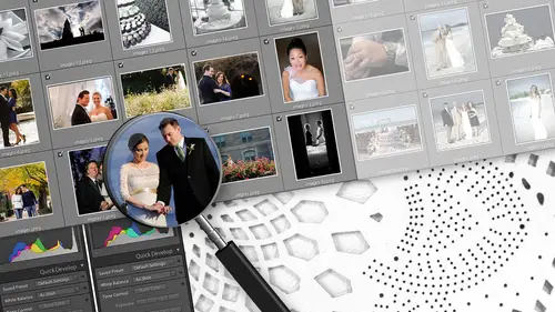
31:18 7Metadata in Lightroom
38:49 8Catalog Editing
36:37Lesson Info
Editing Detail Photos
we can't, uh, we can't demonstrate editing photos without getting to some Susan Stripling ring photos. I know everyone's to see that. So this is another category. Details. Every category has rules. Like we said, we've gone through getting ready slash portrait's. In a way, there's specific guidelines that we go by for editing them. Details are the whole rule set under themselves, however, is bring. This is it's really nice. I don't think it was that 17 year old bottles, right? So that was from Michael's. It's a very nice, easy. I was looking very large to May. Now I know why that macro one of five minute look great. So details to us are anything that is a ring shoes. We've got dress jaunts, we've got the flowers we've got, got wine glasses, all these things that don't have people in them. The reason is we're generally going for a big punch on these photos. We want a lot of clarity when a lot of sharpness, we want a lot of like super detail. We're going a lot of brushwork do a lot of thi...
ngs toe work, these photos that if there's people in them, it's just gonna ruin it. You can't put a huge amount of clarity in a photo with someone's face because they're gonna look 20 years older than they really are. Yeah, upping the clarity around the Mother of the Broads eyes you will not get hired for the next daughter's wedding. The other thing that we like, we like to group the detail shots together so I might actually use the collecting resume technique. Go through my entire catalog and grab every detail shot, mostly because we're gonna use the same processing methodology, but also because sometimes it's more fun to just work on these because you're not necessarily worried as much about a perfect white balance for skin tone. Or you're not worried about trying to fix weird problems. It's more of a creative outlet like you can do whatever you feel like doing with these as long as you're consistent, of course, but there aren't as many rules as far as how this thing should look. When you're done, you can do what you want, so I tend to group those together because it kind of it's a nice break in between doing all the other stuff of the wedding. So for us. We've obviously hit this with a standard import preset. We have a specific set of pre sense to handle these kinds of photos, and one of them is a kind of 1/3 tier. It's the next step, which is a punchy. We have a punchy and we have a punchy details and their two variants, which we've also mapped, you know, to our key. We could do a punchy we could punchy details, or we can turn it off completely and go back to the way it waas. And what this is doing is it's. Actually it's leaving all of the basic adjustments that we've set, and it's altering the tone curve of the image. So I get to keep the work that I've done so far. But tweak the tone curve to get a little more zip to it. So we'll go ahead and do punchy details because we kind of design that one. For this in mind, to just the tone curve. It's a lot more popular. It drops the black levels. It's just got a lot more contrast that started with at some point to me, this looks very, very green on my screen I'm gonna try to get rid of that because I don't I don't like that green cast. Um, and I really believe in, you know, trying to make the diamonds the stone itself, at least not look too yellow unless it's a canary diamond. But if it's a regular diamond, you know, obviously the value of a diamond is cut. Clarity color. Naomi's husband knows a lot about this. He's a jeweler, but essentially, you don't want to make the diamond look bad quality by using some kind of stylized thing. You kind of have to be a little careful, even though Susan deliver some bring shots where there's a warm color tone. We try to keep the actual stone itself looking like it's like the best diamond in the world, because every you know, every girl wants to look at that and think that her diamond is awesome and beautiful and high quality, even if it's for Michael's, still looks pretty good. I mean, if he doesn't tell her, you know, maybe she won't know. So once we get this white balance styled in a two this point, I mean the photo is looking pretty good. The one thing that we do as well with these kind of shots, especially with a stone. This large or a component of the photo is the detail. We have a brush created specifically for this. Um, these are all the brushes that we use, by the way, this one in particular is for details We used to call a diamond, but I figured we shouldn't even something a little more. I like to calling it the diamond brush. It is the diamond brush, that's what it's for. This is whatever clarity you've got on this image. This now adds a bunch more, so you do have to be somewhat careful. Use it sparingly. Don't brush someone's face with this. It's really, really bad. But what we do is we feather it. We drop it right in the center of the stone, and then we just work it from center out to the edge with something that is shot with a very shallow depth of field. Don't fight the depth of field clarity. You're not trying to sharpen what's behind or necessarily the reflection. You're trying to make the diamond really pop out as this amazing stone right after as we as we go through it as this. Like, for example, your reflection. It's a little bit out of focus. I guess it's got, you know, a lot of blurring. I'm not going to try to bring that clarity back just because I brought the stone back. Leave it. I'm not gonna fight that. It might be a little difficult to see on screen or through the feed men a little bit. The, um, difference is pretty large. It's much more contrast in much more detail. There's a lot more clarity to it. So much so that on a cheap diamond, you might actually tell you can sometimes see the flaws in a cheap diamonds. Sometimes you gotta back up off without a little bit. Yeah, be someone careful. You're flattering to the diamond, right? Although no 105 This looks pretty good. So again, white balance isn't It's not set in stone. What this needs to be Make it look good to you. To us. I don't like yellow diamonds. It was green originally to start. I compensated that with a little bit of purple. Um, but really just kind of dial this and where you need to. The other thing you could you should do on these detail shots and I don't see a lot. Well, actually, I do now, Um, what's going on here on this edge is Susan's dirty macro lens. And some of you who are watching the last couple days may have seen me mock her about that. He's kind of notorious for it so I can see these spots. And actually, as I'm looking closer, you can see their spot here. Here, you're this whole edge has a bunch of spots. This, although it's probably not a spot to reflection to me and kind of out of place. If it takes away from the diamond, it might be worth just getting rid of it if it's easy to get rid of right, So spot fix. Um, this is my only complaint about light room five. I don't like their spot tool. It's really slow, But what you are supposed to do is basically just drop this thing down. It makes a dot. Come on. There we go. And then it covers up the spot, and what you basically do is just drop this thing down. Well, he's fighting with the spot tool. What can we do for your time wondering about, um, the temperature. I'm noticing that you're not using the dropper. Is there a conscious decision behind? I use the dropper in a situation where I don't know what's going on, and I'm trying to get a sense, and it would happen to me most often. You would find me using the dropper in a church when I get to the ceremony photos, when I don't really understand what's going on with lighting, because what's been happening a lot recently is churches have been replacing their bulbs, but they've been replacing them gradually with the new energy efficient bulbs. You've got a mix of like incandescent led, and then a lot of times you've got natural light coming in through the stained glass windows. So I mean, you kind of just want to lay down and die in there because it's really challenging. And so in that situation, if I know that the broad was in a white dress, I might use the dropper to kind of give me a baseline idea, and then I'll use that look for the rest of the ceremony. Makes sense. I'll show you real quick, and you're correct I mean, we have We have our key specifically set up for this scenario. When you're doing white balance, you can do it essentially one of two ways entirely visually, where you just dial it in, how you see fit or you can use way, have a key for it. The picker, this spot tool, which when you hover over an area, it will use that as the reference point for the white balance. So in a situation like this, with a really bad lighting situation mixed white balance, you can actually get lucky and hit on something that you know is supposed to be white, like his shirt. You hit the tool, you drop it on and it neutralizes it. It's a good guest. Doesn't always work. I mean, it's it's hit and miss because it depends. How much color Castries on that white object, how wide it is, how neutral it really is. Did you use flash and there's a certain amount of artistic license. I mean, if you back out of this photo and again we're not entirely and calibrated monitor. To me, this still looks a tiny that green little greener than I would want it So even though I might have just used the dropper to make a baseline pick and still gonna use my eye to make an adjustment, And I think that the key is as long as you use your eye, you look at something, you make sure that it looks good and then you're consistent. So the next photo of the bridesmaids coming on the aisle, I'm not gonna make about a completely different color balance. Gonna be matching things as closely as I can because that takes away that it creates that consistent quality. It takes away any questions on the client's mind about what's going on, because if you're putting together an album, somebody mentioned about album design, you know earlier you're putting together an album. Sometimes these photos, we're gonna go side by side. And if they're consistent, it's gonna be a much better looking album than if you suddenly realized the groom coming in with his mom is a little green and the bridesmaids coming in a little pink. That doesn't look as good. So your workflow in that scenario, if you if you had a difficult white balance like this, you start out, you hit the phone. If you couldn't figure out what the white balance should be, you'd hit your tool. You dial it in, it would neutralize it. Maybe it's not quite how you want it. You fix it a little bit, maybe get rid of the green cast, give it a slight warming, and at this point, grab it, paste it to this one. Assuming this was the same situation, right? This is formal. It's formal. So we switched. If there was, there's gonna be a Siris of 15 or 20 of these processional shots. So while you guys are bringing that, quite a few people have asked throughout today. And right now, boys A and Dallas eel are wondering about the presets you have. And if they're for sale, yes, you are for sale or for so they on your website as well. They are on our website. Yes. And then So what we've done with our presets it's a little bit different than maybe what you get with a typical preset package is for each phase of the workflow. We have a Siris of presets, so we have to for important ones of blank and one's kind of a rolled up baseline standard as well. We have our three baseline, which are the next step in the workflow one for ah normally exposed photo, one for a overexposed one for under, and then one. That's kind of Ah, a utility which resets the white balance back to as shot. So in case you've actually made a mistake through this whole process, you could just quickly reset and fix it. Um, and as well as you go through once you've applied the import, the baseline, you've got your photo pretty much 80% of the way there. You might have to do a few tweaks to it. So we've got one that, actually, you know, recovers the highlights. And white point, we've got one on the other end of the spectrum that does, you know, a shadow in a black save. We have our punchy sh presets that we just discussed. You know, one that's punchy, punchy, Maurin, punchy off measure. Typically what we'd be using on Seasons images while we were editing those, they would have any details would have those presets on their right, and then, as well as we go through, you've got the ability to add a vignette Ah, stronger Vinje and then turn a vignette off. And then a split tone. Siri's same thing. It warms the photo, warms it some more and then turns it off. So it's It's this mix of like style presets, utility, pre sense and workflow prison. The package that we offers all of this stuff is heavily documented, so you know what to do when it comes with a pdf actually tell you when you want to use this. I've had presets in the past where there's a long line of names and the names are kind of witty and cool, but they don't really tell me. You know what it is about, you know, so I can use this interestingly named thing, but I basically have to try them all to figure out what they are. So we really wanted to do something where we could give instructions and tell you what this is meant to be used for, and they're still stackable. But at least it gives you an idea of what it is that this is intended to dio. Instead of having to go down a long list and try to, like, try each one out to see which one might work for you? We had some other ceremony pictures if you all wanted to see because I think ceremony is a challenging lighting situation. So let's pick. Uh, probably These are the most difficult, I would say. Yeah, put these in a collection. Let's take a look. Okay. White balance nightmare. So the other images from a wedding that I shot because season didn't have a lot of there was no actual ceremony happening. So So in this case, what we started with is a blank import preset for this particular catalogue. As you can see, my adjustment settings zeroed out. We've got nothing in it. So what I want to do is actually give this a baseline. This is the next step in our workflow will pick from our base. And to me, this looks properly exposed. I'm gonna go with the standard baseline. This gets its close. A little bit of clarity, a little bit contrast. We've just some of these sliders. The photos pretty close. White balance is still still way off. So what we could do is we could try the spot. We could hit her dress and see if that helps which on my screen actually seemed like it made a pretty big difference. Really shows which to me seemed like this photo could be salvageable. We're not gonna just auto forces to black and white. We could actually work with us. We've lost a little contrast. It's a little hazy, so I might try punchy, which seems like it worked. Okay, while you're talking about white balance keeps me for interrupting, by the way, but s p N c in Dallas eel both want to know about you. If you use color passport files for your white balance, where you eyeballing it? Wear whatever pleasing to your eye? Yeah, we're eyeballing it with within the context of a calibrated monitor. Okay, Exactly. So we take a little color test routinely to make sure we're not seeing color inaccurately. But it's the color calorie to monitor, and then we're eyeballing the white balance. And probably a lot of that comes from experience of being in those exact same lighting conditions in those same churches or venues. So you know what that light looks like? Absolutely. Maybe it's coming from a background of being a wedding photographer. It definitely helps, you know and I think it helps You know what the photographer might be looking for when it's not your own work, which is really helpful, Right? Right. So we could probably keep these color. I would say that's probably once we've got this white balance styled in, it actually might work. Um, the blue in the back is pretty distracting this back here. Um, at this point, you could decide whether the blue really distracts too much that you want to get rid of it and go to black and white anyway. But you know that the white balance is dialed in and you can actually pick it up and use it for these other photos. If you didn't want to go to black and white right now throughout the ceremony, I would want to try to keep it as consistent as I could, because I want them to see the photos and have them all be consistent and look good. Obviously, there's always the problem. If you get with it, you have a huge laid on the altar, and then it's dark and the pews always have to balance that. But I think the critical item is obviously that you're focusing on the bride and groom, and you want to try to be consistent with a more neutral balance. So in this case, what? What actually has happened? This is where company pays can go wrong. Um, just to illustrate what I did is I took this one. It didn't look as contrasting as I wanted. I applied a punchy to change the tone, Kerr. I picked it up and I actually copied that to this one, and I think I made it to punch. I've actually kind of made this way to contrast. He I don't actually want it. So what I can do is turn it. Oh, I can remove just that split tone area, keep the white bounds, keep everything else the same and just fix the tone curve. So I reset this back to normal, and then I can carry on with, you know, bringing up the shadows if I wanted to on just seeing, you know, how I wanted it. This photo. At this point, her face is really, really in the shadows. And if I start really elevating shadow levels in black levels, I'm gonna start losing his suit. It's gonna go from black to Grey, and it's gonna look kind of strange. This is probably a situation where you bring in a local adjustment like a Brighton brush, resize it down, come in and actually brighten up her face a little bit because she's got the recognized for the overhead lighting in the church. And there's not too much you can really do about that during the ceremony because typically, they get a little mad when you use flash. Right? So you white balance was set tone curto have tone curve. I had to reset. Go into the Brighton brushing. That's it. Move on so we don't have to do too much more to that photo. Same thing here. We can carry the previous one forward to this one. It's a little bit dark. It needs the brush as soon as I toggle the brush. It's the last used brush, which makes it handy. Come in and brighten it up a little bit.
Class Materials
bonus material with purchase
bonus material with enrollment
Ratings and Reviews
Misty Angel
AMAZING! Jen and John are humble pioneers in their expertise of business, photography and workflow! Sharing their workflow secrets, along with offering their manual, presets and brushes (via their website) has already been an enormous timesaver in my own workflow! The workshop will get you THINKING and FOCUSED on how you manage your time, considering all that goes into running a successful photography business. While they focus on weddings, this is applicable to ALL photography! The introduction of the DNG proxy process is critical to optimizing LightRoom's functionality! THANK YOU! Love the process, the delivery of the workshop and their honest method of sharing their brilliant business structure!
a Creativelive Student
This workshop is fantastic. Being a creative is not synonymous with being organized, and this course has helped to begin to bridge the gap. I love how easy it is understand and follow. If you are looking for help in getting and staying organized, this course if for you. P.S., I purchased the Sidecar Post LR presets, and they are as good as advertised as well. Definitely as class to add to your CL collection.
Tracy Hope
They show a great workflow that can be modified as required. It shows the benefits of being organized and how not to have 3 versions of each photo clogging up your back up files. it shows how an editing company can be efficient and I have learned a great deal of how to speed up the work flow.