Lessons
12 Pre-Show
11:05 2Why Infrared?
18:54 3Infrared: Behind the Image
26:56 4Infrared Q and A
33:41 5Fake vs. Real Infrared
22:19 6Types of Infrared Cameras
22:31 7White Balancing Infrared Cameras
16:57 8Infrared JPEG vs. RAW
20:01Lesson Info
Digital Darkroom: Hand Tinting
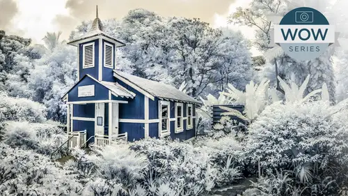
we're going to do some hand tinting And this, like most things that we've done so far, is better done in a CR in light room than inside of photo shop. Even though Photoshopped does great painting and all sorts of things real painting I'm hand tinting I find is, um, not only as good as, but even better inside of light room in a CR than it isn't Photoshopped. And I'll show you why taking that adjustment brush, I'm gonna come over here and I'm gonna take advantage of this little option right here. The color area and this color area, just like all these adjustments are going to take advantage of our, um, brush options, which are size, feather flow and density. I am not gonna take advantage of the auto mask whenever I do hand tinting, because that would Presuppose. I'm trying to find, you know, um, follow a hard edge and do what would be a stencil or frisk it. And that's really not how hand tinting was done in the old days. The olden days you had a whole line of, you know, Civil War soldier...
s or, you know, 40 Niner gold miners out the door. Um, you wanted to do them as quick as possible. You There wasn't a whole range of dies as much as you may think. And so what you did is the artist who was doing the hand tinting would have a skin tone, would have the blue for, you know, a Civil War uniform. It had a green for, you know, foliage. If it was outside, it would have read for breaking. It would have, you know, basically work on half a dozen colors. Here. She would work on half a dozen palette and also were quite quickly because of not wanting to go in there and doing individual portions. It was never considered to make it look like real life. It was to add a little bit of dimension. People weren't even thinking in terms of making it look like the real world. It was making it look like a painting. So it was done with soft edge brushes, adding of them limited colors quickly, and what that's going to give you is actually a uhm beautiful hand tinting effect, the size you can use. I'm here with the slider, or you can use your square bracket keys square bracket. Keys on the keyboard is the size for brushes, both in a CR light room and in photo shop. Shift square bracket keys changes the feather of your brush in both Photoshopped a CR in light room, so you have both feather and size at your disposal. If you have one of the walk ums, you've got a click wheel that you can use to change the size of your brush inside a photo shop. You can also use your different gestures to change the size of the brush, all sorts of ways of doing it. I like keeping my fingers on the square bracket key so I can just change it. Interactive Lee flow is how quickly it goes upto whatever the density is. And why is this called density? Not opacity real quick? Because in a CR and light room, these air procedural processors it's different than in photo shop. It's opacity and photoshopped, because if you take a brush that set to 25% opacity with pure black ink into a brushstroke, you will get 25% gray. You take the same brush to a secondary stroke, and you will now have 50% gray because you double the amount to it. You go stroke stroke your now at 100% and you could stroke all day. And that's never going to go beyond 100%. And here, if you have your density set to 25% and you do a stroke, believe it it 100% flow stroke and then another stroke. It's your telling it. 25. That area is 25 you can do that all day, and it will never go beyond that. You can set it to 50 do a stroke, do a stroke and then say, You know what? That should really be to another stroke, and it actually removes it and takes it down to 25 which, of course, you'd never get with photo shop. If you have your brush at a pass 100% you can change it to, you know, capacity of the brush. 25. It ain't gonna change your already at whatever you're at. It can add to it. A can subtract this because this area is being painted with whatever these settings are. Whatever the setting is, it will paint that area and nothing other than that area. So if I have this at 50% density and a 50% flow, it will start at 50% of whatever this is, which would be 25. And as I continue to stroke, it will build up to 47% density. So flow is how quickly it will build up to that. But it will not start at that density. I actually leave my brushes at a flow of 100. So when I do a brushstroke, I know what it is. I control the addict, the intensity of the effect, either by density or by just changing the sliders themselves. I need less exposure, arm or whatever. Okay, so anyway, that and for now, just set that density, flow, feather, all of that is 100. I work with a big soft brush. I'm gonna click in here and I'm gonna come up and I'll start off with the sky and will be confined to knit. You only have hue saturation at your disposal. You don't have lightness or luminosity. Interesting. Why one? Because the luminosity is coming from the file itself. All you're doing is this beautiful, luscious, translucent, adding of a hue with its own saturation. The nice thing is, because you have an adjustment brush, you've got 50 ways of changing the luminosity in this brush, so you do have access to really change the color. But the color picker here is just doing a beautiful soft translucent a tent of the file about the color where it is white. You'll notice that specially if I don't I did not reset number that ability to reset. I should have reset by clicking on the little plus for my color slider, which I didn't. So that was actually darkening it. So now I've got a beautiful little blue cast, which I can now come over here, and just to show you, I can intensify it. Where there is no tone known luminosity, no pixels. It is not going to color it because it's on Lee. It's not changing the luminosity. If that luminosity was that beforehand, it stays afterward, which is nice. That actually is a nice translucent die would be like tinting it with the dye, a supposed to opaque pigments so these air translucent dies. And I don't mind up here that it's actually a big and sloppy over the trees because as I now come over here and say new and choose a different color, that's actually let's take that cause that blue is even obnoxious for me saying a lot. I'm going to say new and I'll come over here and now click some kind of green and I can come up here that, um green and the overlap with the blue is what would happen in somebody who's working quickly with dies. It would just come over there and they were just, you know, it would just overlap. So I'm gonna allow that overlap. That's fine. For May, it's part of the process. I'm also in terms of things like Green. I'm gonna say, OK, the palm fronds And here and the highlights are gonna have that green. Normally in a something like a landscape, they would have two different little greens at their disposal. So I kind of find too in that green, I don't want it quite so aqua. We'll add a little bit of green, say new come up here and now I'm going to do a different green will say that one is even mawr of a yellow green, a little bit of a a lemon green. And now I'm gonna come up here and now I'm painting the rest of my green with this secondary color because everything is nondestructive. When I come up here, I can continue to find tune it after the fact. That's what I'm gonna do here. But you can see already these two different greens are giving me that hand tinted, you know, jungle look that I'm going for And you see that up there? It's a little bit more saturated up there, which I'm not crazy about. But we've got our two greens going on there, for time's sake will say new come over here. And now, when you add will make the church red this time because it's not going to manipulate the lights of the file on, go ahead and do a, um, overall, including just over the white. Sometimes I do depend upon how I'm doing this. I'll go ahead and we'll try and be a little bit more specific where it's just working on the dark portions off now the church. But we'll go ahead and we'll do the entire file here. Okay, so here is that and again I'm getting super sloppy, but I don't mind. Okay, So there is, um, the church now where it kind of gets fun and why we have this benefit. Aside from just coming up here and changing the church to, you know, whatever color that I happen to to feel like is I also have aspect, of course, to everything else. That's part of the adjustment brush brush parameters. So I can come up here and exaggerate, say, the clarity or the shadows or anything else within that portion of the church. So I'm not limited to just color tinting where I would be in photo show off. If I was doing a little layer set to hue or saturation, I'd have to somehow use that mask to do something else in there. And now I can see rather than that I want to go a little bit toward a warm, you know, maybe a brick red church, or I can come up here to the sky here and not change the blue of the sky. But maybe I'll use that clarity. And by taking that down, I'm actually kind of throwing that cloud out of focus or making it kind of Misty again, as if it was an old antique shot. Or I could exaggerate that and pulling more detail in the clouds. Or I could come over here and change the exposure if I wanted that to be darker or blowout detail in the clouds. Okay, so I love it for that reason, just because it allows me and let's come over here and we'll do that. Another little snapshot. So here is our kind of CPU time. We didn't do a black and white. Let's go ahead and do we'll do one mawr that has no black and will have no tempting you can. There's nothing stopping you from doing a color over a CP atoning or adding one after the fact, but we'll go ahead just for teaching purposes. Let's go ahead and remove the saturation, which is basically how you turn off. Um, the split toning and we will come up here and we'll make a snapshot for that. So here is hand tinting, and here is our black and white image. Okay, so I I love doing it. I love it for Portrait's again. I would keep a very limited number of colors for each one. And I would do it quick, and I would do it pretty sloppy. Probably not a sloppy is this Even this is getting me a little bit, you know. Okay. Yes. Not being sloppy. Is this probably about two or three hour job? If you were really to just really dig in with Jack and you know, no, I'd say if you can't do it in 60 seconds. Great. You're doing it wrong. Okay? It really should be once you get colors and you can actually use those color palettes inside here, and you can come up with your, you know, five pick five colors that you always use. It really is skin, maybe a race, eyes and teeth. If you're doing a portrait Little red for the cheeks and the lips, hair colors. We all know Superman's hair color is blue because it black ink. So black hair, you had a little blue to it, and it should take very, very quick. So it's up to you. But I say if you're going in there and getting all you know, anal retentive about that, it's a different technique, and you probably have a color version of the photograph to begin with. So, yeah, there are different ways to imitate a color file and folks out there if you guys are interested, you know, in Mawr of this type of thing, Jack has some fantastic, you know, classes where you taught, he taught specifically an entire workshop in a CR and Jack, you did to one of your mom. Correct? Yes. That's usually that is actually in hand tinting I have in my a c r class, my leg room class, and I have an entire class on painting natural media inside a photo shop. Yeah, which I also put that in there just because it it does fit into the painting scenario hurt. So we're going to come up here, open this object inside a photo shop, which we haven't done yet. And now we're going to do that swamp, because again, for some people, it's disconcerting. Toe have the orange skies. So how can we swap that tonal range quickly and easily inside a photo shop? And there are two main ways that you're gonna do it, and each one is slightly different, so there's no right or wrong. This is a simple, easy way. I love doing that. Come over here and make a levels adjustment and do what we did before when we did a little teaser. So you come up here and you can invert not only the tone of the file but the color as well. By swapping out what's known as the output levels, not the input levels. You actually say what was white make black? What was black make white is what you're telling photo shop to do. It gives you a negative, the image great for Halloween. But we only like the color in there. And that's where blend modes come in. Blend modes, air giving footer shop permission to use one portion of an adjustment and not another or one portion of a layer and not another. So I simply come over here to my layers palette. Zoom up here and I'm gonna tell it. Would you please just use you can either use Hugh or color in here. Come over here and I'm moving down and, um, use Hugh and you'll notice that what it does isn't undo this. So that is an inversion of everything. And now I'm just giving it permission to change the hue of that file, but clicking on cue. Okay. Oh, and again if we come over here to color virtually the same thing Okay, so, um, that is a simple, easy way of doing it. Now that's going to give you a set. Complete reverse of whatever you have now that's based upon whatever your white balance was, which is based upon your camera in your jiggery pokery before. So if you want toe fine, tune that blue. This is where simply coming up here and using another adjustment like you saturation and shift that you slide over here, simply move it one side or the other ever so slightly. And that's going to give you that ability to fine tune the blues and the warms and cools in the files. If you don't want to do it globally, if you go well, I want it to be, you know, blue here. But I don't like that the church is going kind of greenish rather than do it globally. Remember, you have the same targeted adjustment tool inside a photo shop that you do inside of a CR in light room, and that is by clicking on this tool and coming over here and clicking in the sky. That little tool with the command key on the Mac or the control key on the PC you'll notice, is shifting my cools and leaving the church alone so I can shift that over there. Click on the church, and I can change the church independently of the sky. So that is, using shoes saturation, slider. If you want to do a targeted adjustment inside of Photoshopped, hold down the command here in the macro control key on the PC in concert with this little tool. And it allows you to fine tune that color, especially in these nice little limited colors to whatever you'd like. So we've got one. Our first adjustment here. Levels inverting our output levels and changing it to the Hugh Space is going to allow us to give us our cool skies and warm foliage. And then we can continue to fine tune that, using a traditional HS l adjustment layer and Photoshopped the other way of doing this and let me go ahead and I'll just take these and we're going to call this and Virginia put these into a layer set cause I can, and this is called invert, and now we're going to do a different one, and this is going to be taking advantage of what's known as the Channel Mixer, and this is gonna take advantage that we have our red, green and blue channels at our disposal. We have what's known as the Output Channel, so these are the red green blue channels. You'll notice that as an example, let's start off with Red Red is set up 400% red and no red or green. In other words, the Red Channel is the Red Channel, and that's the way it is. So the Channel Mixer doesn't do anything as a default. But what we want to do is we actually want to come up here and we want to say, You know what? For what you're using for the Red Channel, Um, we actually want it to not use the Red Channel. We'll take it. Let's go ahead and we'll just put in zero, and we actually want you where you're using Red. Go ahead and use the Blue Channel. In other words, we're messing with Mother Nature, and we're saying Don't use what was naturally part of the Red Channel for Red. We actually want you to use what's currently sitting on the Blue Channel. This is based upon our channels here, inside of photo shop. So that's what the Channel Mixer is doing. I want you for the Red Channel. Use the blue. Okay, now we're going to go down. The Green Channel is exactly the same. We're not going to change that at all. When we get down to the Blue Channel, we don't want the Blue Channel to do. The Blue Channel will take that Set that to zero None of the blue. And we set the Red Channel Toby the blue. In other words, you physically, In the olden days before Channel Mixer, you would swap those channels you'd physically copy and paste and move them around. In this case, by telling used the Red Channel for Blue and the Blue Channel for red. We're getting a very similar effect. What we got with the inversion it is slightly different if we take a look at this. Look at this right here. And here's the inversion process. Let's turn on those. So here is our inversion. Actually, let's turn off our hue saturation because that's giving us a slightly different version. So here is using the inversion trick. Here is using the Channel Mixer. You'll notice that the church is more orange in this one, and in this one it's got a little bit more of a rest color in it. There's no right or wrong. They both do good quality. It's not like one is going to corrupt the image more. You are using different channels in the Channel mixer, and therefore there is different. You will see a different noise pattern because of the fact that you're using as an example the Blue Channel in place of the red and vice versa. Um, but both of those. Or find ways what I do and what I recommend that you guys dio Let's go ahead and I'm revert this file using her history pelant how we opened it up, and any time you do anything, even once in photo shop, right, you should figure out how to automate that process. This is something you guys they're going to do all the time, for your inference that the blue ing of your skies is a standard little trick. And if you've never written in action before we're gonna come over here to our actions palette, and we'll just come over here and we'll put it in, um great. A new folder. We're gonna call this creative life and inside that folder will click on our new little dog eared page icon. If you've never been to the actions palate down to the bottom of it, we have create folders or sets of actions we can see. I'm working on actions as part of the final creativelive. Wow, creative photography Siri's. There will be a whole set of actions that will relate to all 10 classes. So that will be part of the process in addition to the workbook so that I love presets. I do that all the time. So in here I'm going to click on the new dog eared page icon. We're going to call this invert. We're gonna come. I are sky invert. We'll say, OK record and simply that. Now all you do is those exact same steps that we did before. It's recording right now. So I go over to my layers. I go. I mean to levels go to levels. I swap out these two sliders go to the palate go and set it to Hugh. Go back over to my actions palette. It still has a red light. Think of that as your little red light on your VCR recorder or on your video camera. Stop it. And now I have for all posterity, a little teeny action that if I throw this one away and go back to what I started with, go to the actions palette. Ir sky invert makes the adjustment layer sets the adjustment to the inversion, sets the current layer to Hugh and I simply hit the play button, and I'm done so these sorts of things. Whenever you do something you do more than once inside of photo shop for all, please write an action or by my class and I'll give you all my actions as an example, is part of what I'd also do for the actions that I'm working on for this class that are currently in beta. Not only do I have the multiple ways of inverting that, but I also have things like high pass popping technique that convert further, exaggerates things like the tonal range of the file. They're gonna get that hdr look to it. I've got actions that do antique noise I doom or ones that do halos or vignettes. Soft focus, grungy noise. Just things that will add to that traditional infrared look, the diffuse glow. So anyway, those are things that I also do, Um, just cause I can.
Class Materials
bonus material with purchase
Ratings and Reviews
a Creativelive Student
This was an excellent course, clear and informative. I teach Photoshop but learned some new tricks as well as the great info on infrared photography. As one of the 5 people left in the world who isn't on Facebook, a link to his Actions would be appreciated!
a Creativelive Student
I thought this workshop was great, and really enjoy the creative uses of the gopro. There is a gear segment, and gear guide to download. But what I want to know is what card reader he was using. For some reason I can't find it.