Lessons
12 Pre-Show
11:05 2Why Infrared?
18:54 3Infrared: Behind the Image
26:56 4Infrared Q and A
33:41 5Fake vs. Real Infrared
22:19 6Types of Infrared Cameras
22:31 7White Balancing Infrared Cameras
16:57 8Infrared JPEG vs. RAW
20:01Lesson Info
Digital Darkroom: High Key and Sepia
Let's dio a, uh, portrait Just because it's a little before we go into some hand tinting will crop that that's directly out of it are wonderful. Dakota. Here I'll go ahead and doing optimize. I like again using that auto the middle tone values when you're dealing with a portrait or usually your skin tones. So that is going to be your exposure slider. You can see where I, you know again, like doing that high key. So I'm gonna take that up, you know? Well, that's, you know, really blowing out your background. Well, I'm gonna look at that middle tone value, knowing that I have highlights as its own separate adjustment. So if I want to pull in a little bit again, I like high key when I'm doing Portrait's with infrared. So I really don't need that background. I like that. That's fine with me, just a subtle little portion of that background. What I like doing is kind of exaggerating that, um, contrast in the facial figures, so its eyes and mouth and things like that is what I like exaggerati...
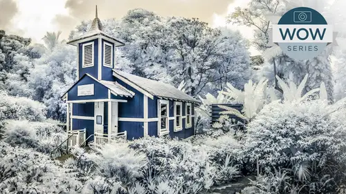
ng because infrared has softened the skin tone so much where normally I would never use contrast for coming in. It could be that you can actually get away with a portrait with adding, especially if you're blowing out the subtleties by doing a high key effect. Even actually add clarity to the file, even on a portrait taking it down. That's where we're gonna get our misty stuff. But I may even take that up a little bit in terms of our shadows begin. If I'm trying to flatten it out, I can, you know, lighten up those shadows on the file. Hey, knowing that I've got my black and white sliders at my disposal, the nice thing about again having access to all these quadrants. Look at my history and I really don't have some true blacks in here. So for me to come up here and say I want those shadows up Hey, I'm really not helping my cause in terms of getting that nice contrast in your eyes and lips, but that is where I can come down here, and I can set the total range of the file by taking my blacks down while taking my shadows up things that are close to each other in in terms of the tonal range. I can actually stretch in completely opposite directions, which allows me to have a nice, crisp black in the file and yet have this very overall high key effect. That also is something where I can come up here and continue on if I really want that high key. There's nothing stopping me from increasing that contrast to exaggerate that even more so I am. This is definitely Jacks. High key. Look going on here. Okay, before, after before after. Okay, let's take that highlight even further down. Um, I mentioned the skin tone. Let's go ahead and take that vibrance up. We've mentioned before that Vibrance is kind of intelligent saturation. It's gonna look at what's already saturated and pull it up to match. What's what's unsaturated matches up with what's already saturated. In this case, it wasn't much saturation, so it's probably not a whole lot different from regular saturation, but it will be a little cautious in terms of the oranges and a scene all skin tone, no matter what ethnicity kind of fits into the orange range. So it's always cautious with that. The one thing I can see here is that I'm getting a lot of the yellow again. I haven't even done a white balance on here. So here, I'm gonna come up here and manually maybe do a little fine tuning, Teoh. Help with that yellow. And also, I often don't like this kind of an aqua color. So how can I shift this aqua and maybe even the yellow tomb or of a middle tone orange and Morva blue? What was that method in light room and a cr R H s L panel that's going to allow us to not only do what we're doing in terms of changing our color, which is what we're gonna do right now. So let's take that Hugh and I can simply come over here using that t a t tool. And I'm gonna shift that orange that yellow mawr toward orange. You can see how I can shift. It can go actually toward red. I'm gonna shift that away from the yellow a little bit more toward the orange clicking on the blue up here I can actually come up and make that blue, you know, less aqua and more toward the blue purple. I can even do what I mentioned before where I can come over here in saturation, clicking on the skin tone. I can take that down, which is gonna kind of neutralize the John dis effect. Click on the skin, shone and really exaggerate the blue that is actually inherent as part of the infrared process. So here, that's this is how I was getting that kind of exaggerated color in the previous portrait. I can even come over here because I've separated. I have cools and warms at my disposal again. Why? I'm going with an enhanced IR conversion rather than the true black and white. Why would have no differentiation between one and have no color, but to I wouldn't have the ability to even come up here and fine tune things like luminosity. So I can even come up here and I can lighten up that skin tone, even mawr, by doing it via color rather than the overall tonality of the scene. Now I'm separating out this skin tone because of its orange from the blue. So now I'm actually darkening the blue hair as opposed to the warm skin tone. Okay, and going back here, I've got that down getting a little carried away with my high key. Let's go back and bring that back in a bit. And here again, Now is our before after before, after again. Definitely a Jack Davis high key effect. And so we will call that for one. A conversion. Again. Coming up here, tap one. And, uh, here is our preview of the default setting called that zero. Here's our before and afters. So that is that if I wanted to do one that is more neutral, it could be that I come up here and again fine tune my exposure, not get so carried away with the blacks, okay? And ah, over here and do more traditional one without so much contrast. Hey, something a little bit more, you know, vanilla in terms of that. And I may even come over here and take that vibrance down. Or that even the vibrance and saturation and do a more traditional black and white. And there I've got now a another option, and that takes us to if we've got black and white. So here is our high key with color. Let's do a black and white version will just go ahead and say convert to grayscale So now we've got a grayscale, a version of it using that darker hair and lighter skin. So now we've got another version. You can see how snapshots can get so addicting. So now we've got, you know, three different versions of it. Don't even get me started in doing my INSTAGRAM versions of these. But now let's come up here and do a sepia tone or scion a typing because that's one thing that we've mentioned before that we haven't done yet. And actually, let's do that rather than with a portrait. Let's go ahead and do a landscape with that. So is one of our versions here. Let's go ahead and do that grayscale conversion. With that, I can do just what I did before with a targeted adjustment tool. If I want the warms in the file, I can actually dark in that even further. By taking that down, I've just got the targeted adjustment tool and those subtleties in terms of, um, the warms in the sky, Aiken dark and even further. I can lighten up the cools in the file by lightening up the church here, or it could reverse that process. It actually lighting up the sky, blow that out and darken up the church even more so again the HSE l panel. Whether you're working with a traditional color image or you're working with your infrared, it's how you're gonna find, too in your image. It's absolutely amazing. It's fantastic. It's great. Um, it is how you will find Tune not only the color but the luminosity of your file. Okay. And to be able to shift it, we go back to that conversion thing here. Remember, if for some reason I'm going, you know what terms of that hue I really want that to be mawr of a awkward color in terms of the church where I wanted to be more of a purple for some reason, fine tuning as much as that are white balance is essential to making sure that we have enough color in the file. In terms of our fine tuning of that particular color rendition of the file, your ability to come in and fine tune that on either an image for image basis or by using presets is going to be, um, greatly enhanced. But you coming up here and taking advantage of hs l the here we've lightened the church and now making it more of a dusty purple in here by just switching between hue, saturation and luminosity. Whatever Penhall or tab is currently active is what you're targeted. Adjustment tools automatically gonna manipulate you can also, if you want to. If you're of the shortcut persuasion, um, you'll notice up here. Each one of these different parameters has a short cut. So, uh, command option shift. H s l lets you automatically go to that or control all shift in like one. Okay. Makes sense of your head. Bouziane. Stickley. Let's go. So again, come up here. I'm gonna come up here. We'll say one. We like that here. Let's go ahead and do a pure black and white. So we'll take color out of the equation completely for this next one. Right here. Through a quick question for you. Certainly. I just want to make some clarification. A 14 h u d wanted to know our snapshots sort of the same as virtual copies in light room. They're kind of like it in the sense that they keep track of whatever you're currently looking on, right? And that they take up very little memory and that they don't actually exist anywhere in the sense of a file. Light room actually has, um, both virtual copies as well. A snapshots. The benefit of a virtual copy, which isn't available inside of a CR is that because they're in the filmstrip when you go to export? Whatever is a virtual copy acts just like a riel image. You can almost also exported into a Photoshopped as if it was a real file. Where snapshots would I tend to do is I use the snapshots to keep track of my fooling around with an image by do 10 snapshots. Three of them really are the only keepers. What I'll do then is take that file, go back to the bridge and duplicate the file three times, and then I'll turn on those three snapshots. If this is my work flow inside of light room, what I'll do is I'll do those 10 snapshots realize only three of them are keepers. I'll make three virtual copies and then just eat, since each virtual copy contains all the snapshots from the original, I just turned on the ones that I want, and I'm ready now to export or going to photo shop? Yeah. Yeah, you're welcome. Okay, so let's do a CP tuning on this file and this takes us over into the split toning panel, which again? Talking about our a c r. Light room. Every single thing that I've done in a CR is exactly the same in light room. All the sliders work exactly the same. They're in a different location, and they made look prettier or more subtle. Certainly more sexy in light room, you know, gray on gray, but certainly gray on gray on gray. At some point you go. Really? Could you be more subtle? You know that t a teacher tool is this big? Very sexy. Very useless for most people to go that this, you know, incredibly useful tool is sitting there. But anyway, I digress. So split toning is part of the panels in light room that obviously go vertical down. The right hand side is supposed to lift, right? Okay. And we are in split, toning split. Tony is fantastic. The two things that you're gonna use primarily split toning four is your traditional cp atoning or scion a typing. Cool or warm the file. But you can also use it for cross processing effects. Across processing is in the olden days where you would take slide film and develop it as if it was negative film or negative film and develop it if it was slide film completely different chemicals, completely unnatural process, nothing that got it ever intended. But that's what artists do, right. We get funky and freaky, and then you get into Seoul arising and all sorts of things. But by messing up the chemicals, you're able to do all sorts of fun stuff with color. So that goes way back specifically, some of the things that were done with cross processing I'm depending upon the technique that was used is you would warm up your highlights and cool down your shadows. So that little warming and cooling, which has seen a lot in your instagram and hips, dramatic effects, pseudo cross processing is what can be done here. Um, because we have both highlight and shadow sliders. If you are doing a just a traditional CP atoning, you really don't need both of these sliders. As a matter of fact, I recommend you don't use both of these sliders. You really only need the shadow slider for doing a monochrome tinting of your file and I'll show you why. First off, if you come over here and choose a Q or balance, nothing will happen to your file and tell you increase the saturation because it is no color, it has no effect until you said a saturation. So your first thing is usually to add a little bit of saturation to your file and then start planning. You can exaggerate it if you want to help, find out what color you want, so I'll exaggerate that saturation. And now I'm gonna come over here and find a hue. And if I'm going for a typical sepia tone, then that is going to be in my orange range. So somewhere in here, if you're going for kind of a scion a type, then you're going to be coming up into this Cool. Now this is exaggerated and by increasing the saturation Onley exaggerated because I'm trying to figure out what color I want. So subtlety. Oftentimes this is a great general tip. In terms of Photoshopped, exaggerate your adjustment, get what you want and then go back down to the amount or the in this case, the intensity is the saturation and then fine tune that. But until you exaggerate the effect, you really can't see the mask. You can't see what you're working on. You don't know what's going on, so I'm gonna always exaggerate it. But the great thing here for this case right now, even though that is mawr saturation and I'm just gonna crank that up the really great thing about doing split toning or C p a. Tony inside of light room in a CR that makes it infinitely better than doing inside a photo shop you will never, ever, ever, ever, ever wanna tend to file in photo shop unless you know some special jiggery pokery. Because as a default, when you do it and you've probably seen it, your image is going to look like this, right? Does that look familiar? If you've done some CPU Tony inside a Photoshopped, even though that's exaggerated contrast, exaggerated saturation is that the color is throughout the entire file. It muddies up your highlights even though you I do have some pure highlights in here. The color is throughout the entire scene, and that really doesn't make for a good print. What you want is nice, rich color throughout. But you want your highlights a little bit more neutral so as not to get this exaggerated effect. Let me show you the converse. What I'm basically doing is I'm saying that that color has permission looking over here. That color is going to emphasize in the shadows of the file. I'm not protecting it. It is in throughout the entire file, including the highlights. So the entire file is getting this effect here, Down in the shadows. Watch what happens when I come over here and take that balance one back up to the beginning. Even a very saturated color becomes nice and pleasant once we allow it to be subtly transitioned into our highlights. But we can even take it over here to our right hand side. We still have color throughout the file. It is a smooth transition between what's richly colored and what's not. And that allows us to, especially on print, get thes beautifully rich colors throughout the file. And yet, and we can even exaggerate that saturation even mawr. So we've got this, you know, beautiful, monochromatic file. But these beautiful, crisp highlights throughout, makes for a much more beautiful print as opposed to. This is the sort of thing we would get in photo shop if we were using the exact same color for doing our tenting. So it's wonderful. And this is also why you don't need to have the highlights in the shadows. Because if you wanted throughout, let's take our saturation down to something more pleasant. If you want it throughout, you get it. That is throughout the entire file, including the highlights. Um, you don't need to put color into the highlights, so anyway, so we'll use it if I'll come over here and shift my balance a little bit here and fine tune it and I get a nice you know, beautiful. Um cp Tony on the file. If we do want split toning, what would be a do a tone in the printing process? Then we can take advantage of the highlights. And if we were going for across processing effect than what we'd probably do is at the opposite of what we've got in our, um, background color or a shadow color, and come up here and increase the saturation so we can see what we're working on and maybe put again some sort of cool in that file. So now we've actually got the opposite will actually go to it more of a blue. And now we've got a cool in the highlights and a warm in the shadows. And now the balance actually is doing a dramatic differentiation between these two colors. You can also now see where I'm gonna be a lot more subtle if I am using two colors. So now I'm cool with some warm shadows now warm shadows with very little cooling going on to it. So the ability to split tone is, um, great, Unnecessary. If you're going for a C Peotone effect, I would tend not to do that. You can. There's nothing stopping you from coming up here and using to settle versions amount. Now I've got a yellow as well as kind of an orange red in here and again. Now I can shift that to allow for, you know, a subtle variation in what are basically the same general family of colors. Hey, so you can do that if we were going for across processing effect, which is some of the things that I do here inside of these sorts of colors. Let's go ahead here and I don't want any of those. So let's go back to our full color image. You can come up and take advantage of our split toning. You don't have to be working with a monochromatic image. You can come up here and do the same sorts of things where we're gonna come up here and will warm up our highlights to the file again, making it look like an old image that has faded over time. That's what's going on with a lot of our instagram and hips. Dramatic effects is we're imitating the degrading of the color emotion or the print over time. So we're adding just this warmth to the highlights of the file. But we can also do that same sort of thing where we take the cools of the file. And now what we're basically doing is this, you know, unnatural manipulation of the color by adding a tent either to just the shadows, just the highlights or both with file. So again you can go into this and taking effect, which I do a lot for my aunt taking presets by I'm doing that? The sort of split. Tony, we've got a natural kind of cp atoning going on in here. There's nothing stopping you. If we wanted to exaggerate that again by adding it to something that you already has, um, you know, some color to it. So here we can kind of find tune that color if we want taking advantage of our split toning slider, whether it's on for an infrared or we are working on a full color image, okay? And last but not least in terms of that, before we do some other split toning, Let's do now a, um and we can do it on top of this if you want. Ah, see Peotone that's actually saved this office a preset, and in this case, there is a little variation on it. Our default. This is already the image that has been processed for prints, so it's already even cooked as it were. We'll use that as a starting point here. Some variations on that. Let's go ahead and do one where we do take off that, um split toning completely. So by double clicking on any slider in either light room or a CR, you're resetting that slider to it's default setting. So double click on the slider for any slider in inside of a CR in light room, and it will always automatically set back to its default. Speaking of resetting images, another little nerdy tip for you all. I mentioned auto, which is going to go ahead and try and change all the six parameters as part of this basic panel. If you only want it as an example to set the black or white point for you shift DoubleClick on any of these parameters will have given permission just to change those sliders so you can shift double click on any of these, and it will just make an attempt. Had that one parameter nerdy tip for that photo shop cocktail party you're going to tonight. All right. So, OK, um, what I want to do now is going to our adjustment brush. I want to do a hand tinting of the file, which for me, is one of the most fun things that you can dio inside of a cr light room. Which, by the way, if you didn't know, you could also collapsed that filmstrip over on the left hand side and a CR you can obviously collapse everything inside of light room on the people don't know that you can actually give yourself more screen real estate by collapsing your filmstrip inside of a CR.
Class Materials
bonus material with purchase
Ratings and Reviews
a Creativelive Student
This was an excellent course, clear and informative. I teach Photoshop but learned some new tricks as well as the great info on infrared photography. As one of the 5 people left in the world who isn't on Facebook, a link to his Actions would be appreciated!
a Creativelive Student
I thought this workshop was great, and really enjoy the creative uses of the gopro. There is a gear segment, and gear guide to download. But what I want to know is what card reader he was using. For some reason I can't find it.