Lessons
Class Introduction
01:56 2Understanding the Basics of Color
04:10 3Color Contrast and Hierarchy
15:18 4Saturation or Vibrancy of Color
09:27 5Ground or Surface Color
07:32 6What is Color Harmony?
11:00 7Color Palette
11:11 8Set-up Chalk & Charcoal Demo
03:40Demo: Sketch Simple Still Life
05:48 10Demo: Establish Value Structure
09:06 11Demo: Find Temperature Balance
09:47 12Demo: Shadow & Highlight Placement
17:10 13Demo: Establish Dimensional Form of Object
04:49 14Set-up Watercolor Demo
11:50 15Demo: Establish Color Ground
05:26 16Demo: Establish Colors for Object
05:30 17Demo: Sketch Object onto Watercolor
03:20 18Demo: Color Subtraction & Value Range
04:42 19Demo: Color Blocking for Composition
04:25 20Demo: Establish the Shadow Tone
05:11 21Demo: Utilization of Opaque Color
11:51 22Desaturate Image in a Picture
05:37Lesson Info
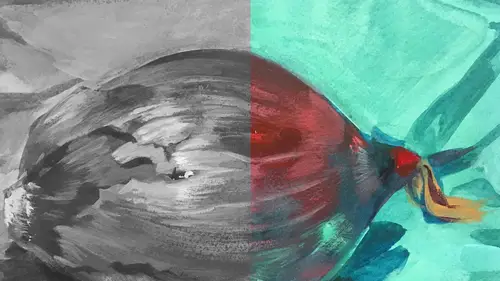
Demo: Establish Dimensional Form of Object
This is from Ti-zi-ana, who is tuning in from France, and she says, "How do you actually choose your paper "for a particular project, would the kind of paper "change the effect that you want to achieve?" Yes, absolutely, excellent question. Sometimes I use watercolor paper, which is what we'll use next. If I feel like I want a really textural start... Because the color reacts to the watercolor... The watercolors to the watercolor paper creates more grain texture and variation, sometimes very surprising variation. Like things that are unexpected. But with this Canson paper, it's super smooth, it's one consistent tone, if I want something that's not gonna have too much textural reaction I might choose the paper. And sometimes, honestly speaking, it's just whim. I don't know, it just feels good to use this paper versus that. But typically my two go-tos are water smooth hot-press, and I'll give you the exact type of watercolor paper, 'cause I'll show you in a minute. The hot-press is Arc...
hes watercolor paper. And it's the smooth, the hot-press is smooth, and it's 140-pound, which is a really nice weight, because you could still run it through a printer. And I like to do that. 'Cause I print my sketches right on my surface. So I tend to use the 143-pound is really heavy, it's great, you don't even need to stretch, 'cause it's so heavy, but it does not go through a printer, and I found out the hard way. Jammed. Jammed the Kinko's printer with that. So I don't recommend it. Okay, so I'm pushing the highlights in the front, I made an executive decision. That's what you do when you're making art. I think our pepper's pretty good, I think it's in the zone, it feels dimensional. I'm just gonna do a little tweaking thing down here. And make sure that the shape and the form make sense to me. That the shadows look good. I'm just going to lean back a little bit. Pull this way... Yeah, it feels pretty good to me. Yeah... And I might cast... Well, there's no highlight on that side. The one thing you want to make sure when you're creating a light system is, and this is a very common problem, is people will put highlights all over the picture on the dark underside, round-side. 'Cause it's so exciting to put a highlight on something. You know, that pop is really fun. But it denied volume and form. So you really wanna pay attention to the hierarchy of your light and your highlights, if you're talking about focal point, or where attention is landing. And for this one I sorta kept the highest light as this one here, I might pump it a little bit more. Make sure that it's super contrasty for what's around it. Make it a little smoother. This is the noodly detail stuff. I mean I can sit and draw on this thing for several hours. But we don't really have that time (sarcastically). So I'm just gonna stop right there, take a look, make sure it's all smooth and looks good. Yeah, I think it's pretty decent, it works for me. M.J. I'm not sure if this is what you were just referring to, but I have a question that'd come in from Re-an, in Peirson, who said, "What about reflection of the bottom "that usually picks up the color-bounce?" Yes, that's a really good question. This on doesn't really have that. But when that happens... And actually I'm gonna darken this shadow, 'cause it's something that's bugging me here. That's called rim-lighting, or it can be called ambient light, or secondary light source. And the secondary light source is where it's either a reflection of the light from some other surface, something that's casting a color note, or a light note. Or it can be literally a secondary light that's just softer. When that happens my recommendation is to make sure that your highest light has more contrast than that secondary light. Also, a different color. If your highest light is super cool that secondary light should be lower in contrast and warmer. 'Cause if it's cool and the full light's cool, they'll just fight each other and the whole thing flattens out. But yeah, I often use secondary lights to create dimensional form. I think I mentioned it in the keynote. I was doing that with Narwally. He had a cool blue underpinning light on his large white shimmery body, and the top was really really warm. So that is our value study of our pepper.
Class Materials
Bonus Materials with Purchase
Ratings and Reviews
Anna Kotzè
I really liked the informal demonstrations and I also liked the way she set out her pallet with warm and cold colors. This was not only an informative class but inspiring. The casual and relaxed working style, encourage playfulness. Thank you for an awesome class.
Laura
I’ve had foundations in many of the color instruction that was presented here so the information was a very good revisit. I also think it was explained better in this presentation than in the other training I’ve had. I enjoyed listening to the lecture, thankfully they weren’t drawn out until you want to stop listening. The demonstration was best after we moved off the charcoal drawing (although that was interesting to watch) because using the paints really brought home to me the application some of the lessons learned. I wish that part would have been more robust so that all of the elements in the lecture could have been directly called out in the demonstration. The instructor was most effective when not trying to multitask too much. Overall, I recommend this course.
Robin B.
I had previously learned basic color theory, but this instructor took my knowledge beyond with layered instruction about value-contrast-complements-hierarchy, etc., and she does it in such a fun way with her own examples of work and great stories! I like her poise and confidence and think this series is a terrific value.
Student Work
Related Classes
Illustration