Lessons
Class Introduction
01:56 2Understanding the Basics of Color
04:10 3Color Contrast and Hierarchy
15:18 4Saturation or Vibrancy of Color
09:27 5Ground or Surface Color
07:32 6What is Color Harmony?
11:00 7Color Palette
11:11 8Set-up Chalk & Charcoal Demo
03:40Demo: Sketch Simple Still Life
05:48 10Demo: Establish Value Structure
09:06 11Demo: Find Temperature Balance
09:47 12Demo: Shadow & Highlight Placement
17:10 13Demo: Establish Dimensional Form of Object
04:49 14Set-up Watercolor Demo
11:50 15Demo: Establish Color Ground
05:26 16Demo: Establish Colors for Object
05:30 17Demo: Sketch Object onto Watercolor
03:20 18Demo: Color Subtraction & Value Range
04:42 19Demo: Color Blocking for Composition
04:25 20Demo: Establish the Shadow Tone
05:11 21Demo: Utilization of Opaque Color
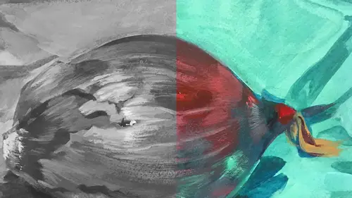
11:51 22Desaturate Image in a Picture
05:37Lesson Info
Understanding the Basics of Color
So we're gonna start with a really basic thing which is the color wheel. On the color wheel we have the red, blue, and yellow, which are considered your primary colors. And the reason why they're considered primary colors because you cannot break them down further. It's like a prime number. So there's red, there's blue, and there's yellow. But there's not just one red, one blue, or one yellow. This is a particular blue. It's kind of almost the color of my shirt. But the blue of your shirt is also a primary blue and it's not the same color. Yours is a warm blue. Mine's a cool blue. So that's something I want to demonstrate when I show with the painting that there's different types of blues and they function differently with the other primaries and secondary colors. Which gets me to the secondary colors which are green, orange, and violet. And there are many different greens, oranges, and violets that can land between those primaries. But basically they're made from two primaries. That's...
how the secondary is created. The next thing is called a complimentary color. It's I think one of my favorite aspects of color by the way compliments work with each other. And we'll talk more about that through the keynote and then the demonstration. But basically a compliment is the color that's opposite the color on the color wheel which is yellow violet, blue orange, and red green. And what makes them really potent as color is they're absolutely contrasting opposites. When they sit next to each other, they vibrate like crazy. And if one is on top of the other, they tend to neutralize or cancel each other out. So it's a really interesting aspect of color. But we'll talk more about that later. Now tertiary colors, I don't have an example here, but basically is all your browns and your grays. And those are made in two ways, either by mixing all three primaries, or by mixing all three secondaries or two compliments that makes browns and grays or neutralized color. So the next thing I wanna talk about is value. And value is the relative lightness or darkness of a color. And you can see here there's a scale that goes from black all the way to it's nearly white. But we want you to be able to see it against the white. And generally speaking, value is one of those things that people are really, really comfortable with. Most people can work in pencil or they can work in marker, and they understand a value system. So that's where we're starting. And in a piece, you typically wanna have a nice value range, which just means you have tones that go all the way from your darkest to your lightest color. Is that kind of like whatever tool you're using? Like how much like what percentage of it you're using or-- Yeah. Like the hardness of a pen or pencil or saturation or is that what the value is? Actually, when you talk about value, and I'm showing a piece. This is one of my pieces from The Wind In the Willows. It's called The Piper at the Gates of Dawn. And I am showing it here in its color form. And this is in all in value in the blacks to the grays to the whites. And it can be affected. You're adjusting value, whether you're on a digital like a Wacom tablet where you're using traditional materials by pressure. The harder you push that pencil on that surface, the darker that pencil mark will be. So pressure is an issue with value. 'Cause saturation is a definitely different issue, but we'll talk about that. So in this image, value variation is what allows us to discern the image. In this illustration that I created for this tale, I've tried to establish a solid range of values to make various parts really distinguishable. So you can see the goat figure is clearly a separate element from the sky in the background or the hoof color or the trees in the back. Each of these elements, these parts of the whole piece, are different values. So light and shadow affects a very light form like the goat a little differently than say the ground. And that's really important to consider. And we'll talk a little bit more about that.
Class Materials
Bonus Materials with Purchase
Ratings and Reviews
Anna Kotzè
I really liked the informal demonstrations and I also liked the way she set out her pallet with warm and cold colors. This was not only an informative class but inspiring. The casual and relaxed working style, encourage playfulness. Thank you for an awesome class.
Laura
I’ve had foundations in many of the color instruction that was presented here so the information was a very good revisit. I also think it was explained better in this presentation than in the other training I’ve had. I enjoyed listening to the lecture, thankfully they weren’t drawn out until you want to stop listening. The demonstration was best after we moved off the charcoal drawing (although that was interesting to watch) because using the paints really brought home to me the application some of the lessons learned. I wish that part would have been more robust so that all of the elements in the lecture could have been directly called out in the demonstration. The instructor was most effective when not trying to multitask too much. Overall, I recommend this course.
Robin B.
I had previously learned basic color theory, but this instructor took my knowledge beyond with layered instruction about value-contrast-complements-hierarchy, etc., and she does it in such a fun way with her own examples of work and great stories! I like her poise and confidence and think this series is a terrific value.
Student Work
Related Classes
Illustration