Lessons
Class Introduction
01:56 2Understanding the Basics of Color
04:10 3Color Contrast and Hierarchy
15:18 4Saturation or Vibrancy of Color
09:27 5Ground or Surface Color
07:32 6What is Color Harmony?
11:00 7Color Palette
11:11 8Set-up Chalk & Charcoal Demo
03:40Demo: Sketch Simple Still Life
05:48 10Demo: Establish Value Structure
09:06 11Demo: Find Temperature Balance
09:47 12Demo: Shadow & Highlight Placement
17:10 13Demo: Establish Dimensional Form of Object
04:49 14Set-up Watercolor Demo
11:50 15Demo: Establish Color Ground
05:26 16Demo: Establish Colors for Object
05:30 17Demo: Sketch Object onto Watercolor
03:20 18Demo: Color Subtraction & Value Range
04:42 19Demo: Color Blocking for Composition
04:25 20Demo: Establish the Shadow Tone
05:11 21Demo: Utilization of Opaque Color
11:51 22Desaturate Image in a Picture
05:37Lesson Info
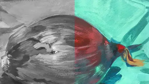
Demo: Find Temperature Balance
Okay, so the next thing is the background, and I sort of feel like with the background, it's brown but in this picture I kind of want to make it, I want to make it, like, lighter. I think I want to add some white to it to really make a little more contrast. I'm just gonna add a little bit of this. And I won't leave it super white because I don't want it to compete with the highlights. That's really important. I'm gonna give it a little contrast. And my finger has charcoal and pencil on it. So I'm gonna leave that there because it's gonna push it back. A little bit of that pencil and charcoal will land on the surface of this background. Let me move that right there. I also brought with me a gray, it's not a charcoal pencil but a pastel pencil. I could use that too. One thing I wanna call attention to, which is kind of cool. We haven't talked about temperature yet. We're still talking about value construction and the whole picture. But the really neat thing is if you take this little pie...
ce of white and rub it onto the surface of the brown paper, which is warm, that white pops, right? If I take my, where's my gray pencil? Oh, there it is, way over here. If I take this, this is black and white, but if I take that and put it on the surface of this paper it appears blue. It's like a blue tone. Right? So all's that is, it's gray, it's not blue. All's that is is two things. You have the opacity of the color. It's so opaque and it appears cool on a warm thing. So the cool warm thing, they react, and the opaque versus the paper is transparent. The paper doesn't have that opacity in it. So they're reacting in that way, so already, without even using any color at all, we've got that color reaction. It's such a nifty color. I think I might wanna throw that in the background as well. Just to add a little, it's like color even though it's black and white. I might turn it on its, actually turn the white on its side. I'll smudge it. I might even land my little highlight there. So we can create a hierarchy already. And again I'm gonna have to decide where I want the focus to be. I sort of haven't decided yet, because when I look at the pepper, the ones on the front look so much stronger but when I look on the screen it's the ones in the back. But I'm just gonna establish them so I understand my form. And the thing about what we're doing too is we're creating a kind of dimensionality to the forms. People often ask me, how do you make things look 3D? And light is the key. Light is what makes everything look dimensional. So when I establish that in a 2D surface I create the illusion of that by using light and shadow. It tricks the eye into believing. We already believe that there's some dimensionality there even though it's just a piece of paper. There's no real dimension at all. Now I'm gonna smudge this. Add a little more blue. I'm also gonna soften that edge back there a little bit because I don't want the eye to be traveling to that little, that edge could be a distraction and send the viewer right out of the picture. This edge right here, just because it's hard. It's black against white. So I have to make sure that that... I soften that relationship, I reduce the value so the hierarchy is where it needs to be somewhere on the pepper. Watch your back, it's gonna be on the pepper, because the pepper is our subject matter. And you can also see that I'm using some opacity in the color in the background. Opaque colors tend to jump forward in space. Like you can see these look like they're jumping, they're hovering above the brown. So I have to be careful how much opacity I use in the background. If I use too much opacity, that whole background will pop forward, and we don't want that. This is meant to frame the beautiful pepper. So let me just establish that. When we do the painting, the biggest distraction won't be the scratching on the surface but the fact that I have to use a blow dryer to dry the ground and some other colors. But that will be okay. When I'm making things, sometimes in a color piece I might actually start with a value study, just to make sure that when I have a complex image my value system makes sense. I think I showed that with the dragon, I did it all in blue and I pulled out the lights. This is a really simple setup. So it's not, you know, I don't have to do studies first. But I recommend people doing any kind of an illustration, anything that has a lot of elements in it, do a study, it relieves the pressure. You can do several studies. Try different palettes and little tiny, like, thumbnail type studies, I think is super useful. And I recommend it because it removes some of the fear of starting and it also gives you a guideline for what's next. It's a little more... Try to use the mush factor. Again I'm using my finger. I can also use the stump. And already we have a hierarchy of values based on what's there but not exclusively based. I've pushed this color in the background to be just a little bit lighter so that there's a little more contrast. I think I'll push this, yeah (mumbles) I do have a question for you. Going back to when you actually took this black and white image to develop the values, how did you choose which black and white tones to use? Because black and white has so many different variables as well. I think you said something like this looks the closest to it, but how did you determine that? So in other words, how did I determine like from this scale which value each thing would be? When you took this black and white photo of the color version and you changed it from color to black and white, how did you choose what form of black and white, if you know what I mean? 'Cause there were multiple choices. Right. You know that. Right. Yeah, on that alive pad there was probably ten choices. Well, there was the choice that was really high key that showed very little value contrast. Okay. Then there was the extreme version on the other end, which showed a lot of value contrast, but it almost felt like heavy. It didn't feel quite right. I landed about in the middle so that I would have enough contrast to see elements that would create an interesting, you know, darkest middle. I wanted that gray pepper to be really in the middle, a 50% value, right about between these two. So I was kind of thinking about, is the pepper in this middle zone? Okay, I think we're in that, and it literally landed right in the middle, it was the middle shot of the whole picture. No, that's a really good question. I made it intuitively. I just did it but I didn't think about why do I have that question? I'm also doing something here with the gray versus the pure white, and I'll push it a little bit further. When you have a background, you know, there's a shifting light on this. You can't see it in the black and white photograph, but it's happening in real time with the setup in front of me. I'm going to push this lighter on one side, a little deeper on the other, just to keep the color interesting. So a color can vary in value throughout a surface, whether it's the pepper or it's the background, and it's okay to capture that or to push it. Use your artistic license and push it, just for the sake of interest. And that's what I'm doing right now. Mush it a little bit more. Maybe a little more blue in here, and then I'll step into the pepper. And bring that to life. 'Cause that's the most important part. Okay. And I can use my stump, but I might want to grab a different one. 'Cause that one has a lot of black on it. And basically the stump is doing the same exact thing, it's pushing the color into the surface. I'm not worrying about the direction of my stroke because it's a background and it doesn't really have, there's nothing there to go by. It's smooth but it's not that interesting, so I'm just going to play with the texture by doing swirling marks. I've done some, you know, straight on marks. I want this to be an interesting background. So that's where it doesn't matter if you're working digitally or traditionally. Even when I'm on the iPad, I'm gonna play with the kind of marks I'm gonna make, the way that I twist that tool around and different directions because I want to keep it interesting. If you make all of your marks in the same direction, A, it doesn't tell you necessarily about the texture of a surface of an actual thing, the texture of that purple cloth is really different than the pepper. The second thing is, it just doesn't make for a very interesting picture. Now here's a good example right here, I'm just gonna smudge this, so this relationship is a little bit softer. I'm almost done with that background. Background's the hardest part because it's large. Large expansive tone. Okay. And soon we'll talk about opacity transparency because we haven't really hit that note yet, but that's gonna happen in the form of the pepper.
Class Materials
Bonus Materials with Purchase
Ratings and Reviews
Anna Kotzè
I really liked the informal demonstrations and I also liked the way she set out her pallet with warm and cold colors. This was not only an informative class but inspiring. The casual and relaxed working style, encourage playfulness. Thank you for an awesome class.
Laura
I’ve had foundations in many of the color instruction that was presented here so the information was a very good revisit. I also think it was explained better in this presentation than in the other training I’ve had. I enjoyed listening to the lecture, thankfully they weren’t drawn out until you want to stop listening. The demonstration was best after we moved off the charcoal drawing (although that was interesting to watch) because using the paints really brought home to me the application some of the lessons learned. I wish that part would have been more robust so that all of the elements in the lecture could have been directly called out in the demonstration. The instructor was most effective when not trying to multitask too much. Overall, I recommend this course.
Robin B.
I had previously learned basic color theory, but this instructor took my knowledge beyond with layered instruction about value-contrast-complements-hierarchy, etc., and she does it in such a fun way with her own examples of work and great stories! I like her poise and confidence and think this series is a terrific value.
Student Work
Related Classes
Illustration